My first Tutorial!
Coloring tutorial for the GIMP! Translatable, I hope.
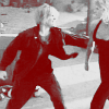
Make this icon:

from:

1. prepare your base (crop - then sharpen, blur bad looking bits - whatever it needs. Though, make sure not to over sharpen it! it's easy to do, but just looks bad.)
2. duplicate base, set to 'screen'
3. duplicate screened layer
4. duplicate base again, set to 'soft light'
5. new layer - fill with white, set to 'saturation'
6. edit visible layers (Edit>Copy Visible), paste into new layer
(I usually get rid of the white layer now; makes it less cluttered)
9. new layer: fill with 7c0000; set to "lighten only"
7. play around with the brightness/contrast (Layer>Colors>Brightness-Contrast) of the b/w layer till your icon looks the way you'd like it to. (I usually up the contrast, turn down brightness; but it depends on your image)
so your layers will look like this:
7c0000 (lighten only)
base - black/white
base (soft light)
base (screen)
base (screen)
base
...and you're done!
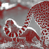
other examples:


This works great for bigger graphics, too. Check out my layout to see an example.
Let me know if this tut is confusing, I've never done a tutorial before and welcome feedback!
I would also love to see anything you come up with. :)
Make this icon:
from:
1. prepare your base (crop - then sharpen, blur bad looking bits - whatever it needs. Though, make sure not to over sharpen it! it's easy to do, but just looks bad.)
2. duplicate base, set to 'screen'
3. duplicate screened layer
4. duplicate base again, set to 'soft light'
5. new layer - fill with white, set to 'saturation'
6. edit visible layers (Edit>Copy Visible), paste into new layer
(I usually get rid of the white layer now; makes it less cluttered)
9. new layer: fill with 7c0000; set to "lighten only"
7. play around with the brightness/contrast (Layer>Colors>Brightness-Contrast) of the b/w layer till your icon looks the way you'd like it to. (I usually up the contrast, turn down brightness; but it depends on your image)
so your layers will look like this:
7c0000 (lighten only)
base - black/white
base (soft light)
base (screen)
base (screen)
base
...and you're done!
other examples:
This works great for bigger graphics, too. Check out my layout to see an example.
Let me know if this tut is confusing, I've never done a tutorial before and welcome feedback!
I would also love to see anything you come up with. :)