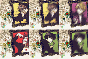
September Icon Post!
New layout (YAY! xxxHolic XD! No Doumeki through... T^T!) and another icon post from different icontest communities' challenges!
20 [Saiyuki]
32 [Miscelanous Clamp]
29 [Final Fantasy and Kingdom Hearts]
Teasers:
.:01:.
.:02:.
.:03:.

( Read more... )
20 [Saiyuki]
32 [Miscelanous Clamp]
29 [Final Fantasy and Kingdom Hearts]
Teasers:
.:01:.
.:02:.
.:03:.

( Read more... )
Comments 29
And OMG, isn't glam!Sanzo pretty. In a kinda scary way... XD
Thanks for sharing these!
Reply
And yes! Cherry Sanzo is so gorgeous, don't you think?
I'm so proud of that monstrosity icon O.o!!
Reply
Reply
Reply
I'm not sure if you're looking for constructive criticism, so if you aren't feel free to ignore this bit. ^^ I think most of your icons are really lovely. They're really original and there isn't really one particular style that you stick to, which is something you don't really see often in icon-makers today. I find some of the icons are a little too bright and perhaps over-saturated, though. (It could also be my screen...) But other than that, they look ~fabulous~! Thanks for sharing! =D
Reply
I agree with you a lot: when I'm about to post them (the preview button is my friend, baby!) and see all of them together I think yep, nice bunch... but this one is far to sharpened/pixeled, and look! this one is really saturated! And GOSH! Another one here! :( And that's when I want to remake all of them... but at the end I think it's OK, the new icon post will be better! ... which is not, but well, that's the spirit, right? XD I guess I'm a bit crazy saturating things... I love colorful things... And I think I over-use light textures... T^T!
And about them being original, I guess that's because they're done for different icon challenges, so they tend to be quite different... even when it's for the same challenge, so voters don't recognise my work (that I think they do, by the way! O.o).
Thanks again for your comment! ♥
Reply
Reply
Reply
Reply
Thank you!! ♥
Reply
Leave a comment