Icon Tutorial #5: Sakura & Syaoran
Because...everyone wants a tutorial for this icon. Which is really old. But nevertheless, it's a lot simpler than it looks, rly. Especially requested 203948320948234 times by catastrophiel XD! Oh, and of course, it's my first EVAR animanga tutorial. I only just realised XD
We'll be going from
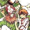
to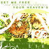
Made in Adobe Photoshop CS 8.0, 100% translatable. Beginner-friendly-ish. HOWEVER, I will say it really ISN'T that simple to get it to work on all images. It definitely requires someone who knows what they're doing when they play around with this tutorial.
This tutorial will work on any light coloured image, as far as my experiments have brought me. I was once 100% convinced I couldn't make this work on another icon, but I was wrong. I haven't tried it on anything but CLAMP images, but hey, surprise me :D?
Anyway, fix up your base. Sharpen, curves, whatever. Until it looks kind of bright and contrasted like this:

Since the scan was of REALLY awesome quality, and the colours was really nice and bright already, all I did was sharpen the base.
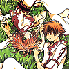
Add this gradient, made by me, 5_09am (Actually, I just used a greenish colour and a blue-grey colour and created a gradient layer) and set it on colour burn, 20%

-->
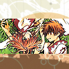
Next, add this texture, by gender and leave it on normal. Mask/erase off a block in the center, so it becomes a nice frame for your icon.

-->
Paste the same texture again, and set it on overlay, 100%. This time, don't erase off anything. This way, it colourises both the texture and the base.

-->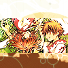
Uhm...it looks odd now. Don't you agree it should be greener, like the grass? You do? Well then, proceed!
I then went and recolourised the texture which was used to frame the icon (The one set on normal, not overlay). I left the overlay layer, so that it doesn't obstruct my colouring up until now. This recolouring is subjected to the type of base you're using, really. I mean, you want more blue? Make it blue. Want more red? Make it red! For me, I wanted it green.
So I went to Image >> Adjustments >> Hue/Saturation (or just CTRL+U), and changed the hue setting to +86 (This was a guess, actually. Since I made the icon absolutely ages ago, I don't know the exact colours. I spent ages trying to figure it out XD)

-->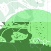
(looks dreadful like that, but trust me, the overlay layer saves it all)
Which will give you this:

Much better. But where's the kick? it's so...boring!
Never fear! Add this gradient (Again, by me, 5_09am) and set it on soft light, 100%

-->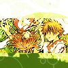
Now that's what I'm talking about! Then, I added text and what not. I used Arial on the top, and Times New Roman on the bottom. But really, personal preferences! You can even use the same font for both if you like. You might choose not to have anything on the bottom (But be honest, it's plain...right? XD). This is what I ended up with:

Hrm. It's missing something. So you know when THAT happens, we throw in brushes! Or well, I used fonts. I don't remember, but whatever it is, it filled in the space.
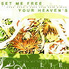
Then, I obsessively nudged the base layer up a bit, because I didn't like how it looked, damnit! That's just being obsessive, feel free to ignore this step. In fact, really, it's not necessary. But it might be a good idea to readjust your base, since we did add that thick frame earlier, and it might not look at all that perfect, right :D?
This is my final result:

Other icons made using a similar technique
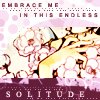
...Please tell me you can tell where I modified the tutorial :D? Also, apart from recoloursing the texture used as the frame, I also recolourised the one set on overlay to a bright purple, to bring out...the purpliness of the icon 8D.

Now thaz just ch34tz. I didn't really do anything different from the Sakura example above. Apart from recolour the frame, and the overlay texture. AH FUN. :D
As you can see, I did have to recolourise them textures. A lot. This is just something which needs a lot of experimenting. It's easy to go wrong with the colours, if you don't have a good sense of colouring. But it's not difficult to fix :)
We'll be going from

to

Made in Adobe Photoshop CS 8.0, 100% translatable. Beginner-friendly-ish. HOWEVER, I will say it really ISN'T that simple to get it to work on all images. It definitely requires someone who knows what they're doing when they play around with this tutorial.
This tutorial will work on any light coloured image, as far as my experiments have brought me. I was once 100% convinced I couldn't make this work on another icon, but I was wrong. I haven't tried it on anything but CLAMP images, but hey, surprise me :D?
Anyway, fix up your base. Sharpen, curves, whatever. Until it looks kind of bright and contrasted like this:

Since the scan was of REALLY awesome quality, and the colours was really nice and bright already, all I did was sharpen the base.
Add this gradient, made by me, 5_09am (Actually, I just used a greenish colour and a blue-grey colour and created a gradient layer) and set it on colour burn, 20%

-->

Next, add this texture, by gender and leave it on normal. Mask/erase off a block in the center, so it becomes a nice frame for your icon.

-->

Paste the same texture again, and set it on overlay, 100%. This time, don't erase off anything. This way, it colourises both the texture and the base.

-->

Uhm...it looks odd now. Don't you agree it should be greener, like the grass? You do? Well then, proceed!
I then went and recolourised the texture which was used to frame the icon (The one set on normal, not overlay). I left the overlay layer, so that it doesn't obstruct my colouring up until now. This recolouring is subjected to the type of base you're using, really. I mean, you want more blue? Make it blue. Want more red? Make it red! For me, I wanted it green.
So I went to Image >> Adjustments >> Hue/Saturation (or just CTRL+U), and changed the hue setting to +86 (This was a guess, actually. Since I made the icon absolutely ages ago, I don't know the exact colours. I spent ages trying to figure it out XD)

-->

(looks dreadful like that, but trust me, the overlay layer saves it all)
Which will give you this:

Much better. But where's the kick? it's so...boring!
Never fear! Add this gradient (Again, by me, 5_09am) and set it on soft light, 100%

-->

Now that's what I'm talking about! Then, I added text and what not. I used Arial on the top, and Times New Roman on the bottom. But really, personal preferences! You can even use the same font for both if you like. You might choose not to have anything on the bottom (But be honest, it's plain...right? XD). This is what I ended up with:

Hrm. It's missing something. So you know when THAT happens, we throw in brushes! Or well, I used fonts. I don't remember, but whatever it is, it filled in the space.

Then, I obsessively nudged the base layer up a bit, because I didn't like how it looked, damnit! That's just being obsessive, feel free to ignore this step. In fact, really, it's not necessary. But it might be a good idea to readjust your base, since we did add that thick frame earlier, and it might not look at all that perfect, right :D?
This is my final result:

Other icons made using a similar technique
...Please tell me you can tell where I modified the tutorial :D? Also, apart from recoloursing the texture used as the frame, I also recolourised the one set on overlay to a bright purple, to bring out...the purpliness of the icon 8D.

Now thaz just ch34tz. I didn't really do anything different from the Sakura example above. Apart from recolour the frame, and the overlay texture. AH FUN. :D
As you can see, I did have to recolourise them textures. A lot. This is just something which needs a lot of experimenting. It's easy to go wrong with the colours, if you don't have a good sense of colouring. But it's not difficult to fix :)