Harry Potter and the Goblet of Fire
So these were originally supposed to be icons of the trailer. In actuality, the trailer icons are only a third of this post. Oh well. I like the poster ones better.
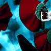
Comment. Credit. Don't Hotlink. The Holy Icon Trilogy. (And noms are cool, too).
( Read more... )
Comment. Credit. Don't Hotlink. The Holy Icon Trilogy. (And noms are cool, too).
( Read more... )
Comments 24
I LOVE the effect on the posters. How did you do them? (yeah I'm so curious, but I'm so attached to 'em)
Taking 03,04,12, and 22.
Reply
Okay, so I did the same thing for all of the poster icons, though there are differences in opacity, depending on how I wanted it.
1. Sharpen, up the contrast, whatever it is that you like to do to prepare your icon. Don't resize yet.
2. Duplicate the layer and soften it twice.
3. Resize to 100x100. Sharpen the bottom layer.
4. Set the softened layer's opacity to about 60%.
5. Make a new raster layer. Set it to burn and around 50%.
6. Flood fill the layer with black.
7. Depending on how clear the face of your subject is, you might want to duplicate the very bottom layer and put it on top of everything. Set the opacity to no higher than 40%.
8. Erase everything on the top layer, except for what you need to see more of (probably the middle of the face; it's okay if you accidentally erase some hair or something like that).
(This applies to these pictures specifically. If you do this with other ones, you could probably fiddle with opacity a lot more. It also depends on how you want it to look. If you want it really blurry ( ... )
Reply
Reply
they are so gorgeous!
Reply
Reply
Reply
Reply
Reply
Reply
Leave a comment