(no subject)
This was requested for an icon I entered over at trusteveryone. I think this is my first "real" tutorial, so my apologies if it sucks or rambles on too long.
Going from this: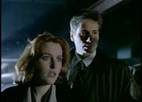
to this: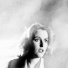
Using Photoshop Elements 6
As I said before, this was a request for a tutorial of an icon I entered in an icon challenge. I did a bit of experimenting before I got to the final icon. I tried to stream-line this a bit and eliminate the unnecessary steps that didn't end up being visible in the final icon, but some of the steps may not seem necessary, or may seem like they're in an odd order. But, I figured it was best to try to describe the process I went through to get the final result.
1) First, croped and resized the image:
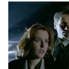
2) The way I cropped the image, it left a white edge on the left and top of the icon. To fix that, I needed to extend the image to fit the entire 100x100 pixels. To do that, I first duplicated the layer and hid the original. (I always keep an untouched original in case I screw up) Then, I used a small, soft brush and gradually smudged from the edge of the image until I filled the entire icon. I got this:
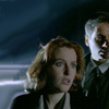
3) The image is really dark, so I duplicated it twice and set the two duplicates to screen:
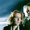
4) Now, it needs more contrast. So I did a new adjustment layer.
Levels:
RBG input: 0, 0.68, 230
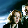
5) The coloring looks a bit dull, so I did a new adjustment layer.
Levels:
RBG: default setting
Red: 0, 1.21, 244
Green: 6, 0.91, 245
Blue: 6, 0.84, 240
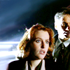
6) I still wasn't happy with the icon, so I started to play with adding some textures. I used this texture: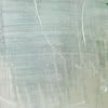
by rhcp_csi, set to soft light 100%, and erased the part of the texture that is over Scully's face.
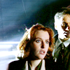
7) Then I used this texture: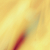
by cielo_gris, set to hard light 100%. I picked this texture because it flowed/angled in the same direction/angle that Scully is standing, if that makes sense.
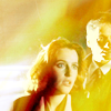
8) I like how the texture looks, just not the color. The yellow is waaaay overpowering. So I decided to make the icon black and white. I used a black and white gradient map adjustment layer.
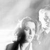
9) And then I erased the part of the new texture that is over Scully's face so she doesn't look so washed out.
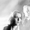
10) I felt like the icon needed a liiiittle more definition and brightening. So I made a new black and white gradient map layer, set at soft light, 50% opacity.
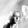
11) I'm a texture whore and the icon still felt like it needs something to give the background a bit more definition and interest, so I tried another texture: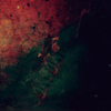
by cielo_gris, set to screen 100%. And I deleted the part of the texture over Scully's face. I put this texture underneath the gradient map layer, because I wanted the pattern and light from the texture, not the color.
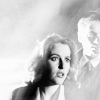
12) And because I'm a texture whore, I decided to throw one more onto the icon. I used this texture:
from Fractured Sanity, set to color burn 100%. I picked this texture because it also had the same angle to it that I saw in the image. Again, I put this texture underneath the gradient map layer.
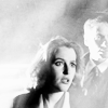
13) At this point, I thought it would look better if Scully was the sole focus of the icon. The image quality of Mulder's face was never very good to start with, so I decided to get ride of him. I used the smudge tool, with a small, soft brush and blended inward from the area around him. I did this in the base layer and both of the screen layers. I kept tweaking it until I got this:
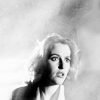
14) The area where Mulder was still didn't look quite right to me, and I thought that side of the icons could use a little brightening, so I created a new layer, took a soft brush, and dabbed a very light grey over the area like this:
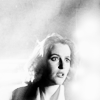
And then I set that layer to soft light, 100% and got this as my endpoint:

And that's it. I hope that made sense. I'm not the best at putting my creative process into words. And of course, this is just a guideline to give ideas on how to achieve similar effects on other icons, since these same textures won't work on every image.
Please comment here
Going from this:

to this:

Using Photoshop Elements 6
As I said before, this was a request for a tutorial of an icon I entered in an icon challenge. I did a bit of experimenting before I got to the final icon. I tried to stream-line this a bit and eliminate the unnecessary steps that didn't end up being visible in the final icon, but some of the steps may not seem necessary, or may seem like they're in an odd order. But, I figured it was best to try to describe the process I went through to get the final result.
1) First, croped and resized the image:

2) The way I cropped the image, it left a white edge on the left and top of the icon. To fix that, I needed to extend the image to fit the entire 100x100 pixels. To do that, I first duplicated the layer and hid the original. (I always keep an untouched original in case I screw up) Then, I used a small, soft brush and gradually smudged from the edge of the image until I filled the entire icon. I got this:

3) The image is really dark, so I duplicated it twice and set the two duplicates to screen:

4) Now, it needs more contrast. So I did a new adjustment layer.
Levels:
RBG input: 0, 0.68, 230

5) The coloring looks a bit dull, so I did a new adjustment layer.
Levels:
RBG: default setting
Red: 0, 1.21, 244
Green: 6, 0.91, 245
Blue: 6, 0.84, 240

6) I still wasn't happy with the icon, so I started to play with adding some textures. I used this texture:

by rhcp_csi, set to soft light 100%, and erased the part of the texture that is over Scully's face.

7) Then I used this texture:

by cielo_gris, set to hard light 100%. I picked this texture because it flowed/angled in the same direction/angle that Scully is standing, if that makes sense.

8) I like how the texture looks, just not the color. The yellow is waaaay overpowering. So I decided to make the icon black and white. I used a black and white gradient map adjustment layer.

9) And then I erased the part of the new texture that is over Scully's face so she doesn't look so washed out.

10) I felt like the icon needed a liiiittle more definition and brightening. So I made a new black and white gradient map layer, set at soft light, 50% opacity.

11) I'm a texture whore and the icon still felt like it needs something to give the background a bit more definition and interest, so I tried another texture:

by cielo_gris, set to screen 100%. And I deleted the part of the texture over Scully's face. I put this texture underneath the gradient map layer, because I wanted the pattern and light from the texture, not the color.

12) And because I'm a texture whore, I decided to throw one more onto the icon. I used this texture:

from Fractured Sanity, set to color burn 100%. I picked this texture because it also had the same angle to it that I saw in the image. Again, I put this texture underneath the gradient map layer.

13) At this point, I thought it would look better if Scully was the sole focus of the icon. The image quality of Mulder's face was never very good to start with, so I decided to get ride of him. I used the smudge tool, with a small, soft brush and blended inward from the area around him. I did this in the base layer and both of the screen layers. I kept tweaking it until I got this:

14) The area where Mulder was still didn't look quite right to me, and I thought that side of the icons could use a little brightening, so I created a new layer, took a soft brush, and dabbed a very light grey over the area like this:

And then I set that layer to soft light, 100% and got this as my endpoint:

And that's it. I hope that made sense. I'm not the best at putting my creative process into words. And of course, this is just a guideline to give ideas on how to achieve similar effects on other icons, since these same textures won't work on every image.
Please comment here