coloring tutorial
per request
important note: the original coloring is one i have from a tutorial myself. however I can't find the link so I'll just mine which is slightly modified so it fits and works with my caps.
Go from

to
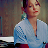
- done in PS CS3 -
ok, first take the base, crop it as you wish. First I made it a bit brighter by changing the lvels (ctrl+l). I set the white point of my input levels to 230! Here's what it looks like
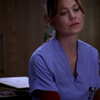
it's dark, it's flat, it's boring!
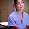
I want to lighten it up so I dublicate the base twice and set them both to screen at 100% op. I always start with 2 screen layers and after the coloring is done I usually add more to bring out more colors. It depends on the caps you use! Now my icon looks like this:
To bring out a little bit more of the contures I dublicate the base, desaturate the layer (shift+ctrl+u) and set it to soft light at 30% op.
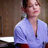
Now to get my redish color tone in the end I need to set a base color which in this case is yellow! Make a new layer and fill it with #fffc00 and set it to soft light at 100% op.
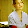
Selective Coloring #1
Reds: -100 | 0 | 100 | 100
Yellows: - 25 | 0 |- 20 | 0
Magentas: -100 |-100 |-100 | 0
Neutrals: 60 |- 20 |- 80 | 15
result:

way too pale! I need more color and more contrast
Selective Coloring #2
Reds: 0 | 100 | 100 | 100
Yellows: 0 | 0 |- 65 | 0
Neutrals: 0 | 0 | 0 | 15
Blacks: 0 | 0 | 0 | 20
result:

looks better. but I want a tad more contrast done with another selective coloring.
Selective Coloring #3
Blacks: 0 | 0 | 0 | 20
result:

I am happy with the colors but the forehead and cheeks are too shiny and so I add a new layer and fill it with #a1a19b and set it to multiply at 30% op.
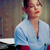
For the last touch just dublicate the base, drag it on top of all layers, set it to luminosity at 28% op. and you're done!

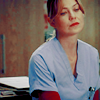
although here I want to know what happens when I add another screen layer. I usually get wonderful results when adding more screen layers. It sometimes brings out the best of the coloring! So try it out, see what happens and also play with the selective coloring layers! Ever icon is new and different with its colors and I never use the exact same coloring. I always change the amount of screen layers and the selective colors. Mostly the reds I change.
Here's my result after adding another screen layer and then sharpen the luminosity layer!
Other icons done with the same coloring but slight changes in handeling the cap -> levels at the beginning (when it's too dark), screen layers (when it's too dark and the colors are purplish or greenish), selective coloring (control of colors).

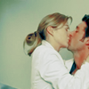

basically my whole last batch of icons here was done with this coloring! see yourself HERE
okies, hope it all works. please let me know if there are probs :)
and a piece of advice. if there's not enough contrast, you can always add a light grey layer on top and set it to color burn. it works wonders ;)
you may check the tut and add comments here @ snoopified_art
important note: the original coloring is one i have from a tutorial myself. however I can't find the link so I'll just mine which is slightly modified so it fits and works with my caps.
Go from

to

- done in PS CS3 -
ok, first take the base, crop it as you wish. First I made it a bit brighter by changing the lvels (ctrl+l). I set the white point of my input levels to 230! Here's what it looks like

it's dark, it's flat, it's boring!
I want to lighten it up so I dublicate the base twice and set them both to screen at 100% op. I always start with 2 screen layers and after the coloring is done I usually add more to bring out more colors. It depends on the caps you use! Now my icon looks like this:

To bring out a little bit more of the contures I dublicate the base, desaturate the layer (shift+ctrl+u) and set it to soft light at 30% op.

Now to get my redish color tone in the end I need to set a base color which in this case is yellow! Make a new layer and fill it with #fffc00 and set it to soft light at 100% op.

Selective Coloring #1
Reds: -100 | 0 | 100 | 100
Yellows: - 25 | 0 |- 20 | 0
Magentas: -100 |-100 |-100 | 0
Neutrals: 60 |- 20 |- 80 | 15
result:

way too pale! I need more color and more contrast
Selective Coloring #2
Reds: 0 | 100 | 100 | 100
Yellows: 0 | 0 |- 65 | 0
Neutrals: 0 | 0 | 0 | 15
Blacks: 0 | 0 | 0 | 20
result:

looks better. but I want a tad more contrast done with another selective coloring.
Selective Coloring #3
Blacks: 0 | 0 | 0 | 20
result:

I am happy with the colors but the forehead and cheeks are too shiny and so I add a new layer and fill it with #a1a19b and set it to multiply at 30% op.

For the last touch just dublicate the base, drag it on top of all layers, set it to luminosity at 28% op. and you're done!

although here I want to know what happens when I add another screen layer. I usually get wonderful results when adding more screen layers. It sometimes brings out the best of the coloring! So try it out, see what happens and also play with the selective coloring layers! Ever icon is new and different with its colors and I never use the exact same coloring. I always change the amount of screen layers and the selective colors. Mostly the reds I change.
Here's my result after adding another screen layer and then sharpen the luminosity layer!

Other icons done with the same coloring but slight changes in handeling the cap -> levels at the beginning (when it's too dark), screen layers (when it's too dark and the colors are purplish or greenish), selective coloring (control of colors).


basically my whole last batch of icons here was done with this coloring! see yourself HERE
okies, hope it all works. please let me know if there are probs :)
and a piece of advice. if there's not enough contrast, you can always add a light grey layer on top and set it to color burn. it works wonders ;)
you may check the tut and add comments here @ snoopified_art