Tutorial
Here is another requested tutorial from the movie Nick & Nora's Infinite Playlist. This was requested by jess_unlimited. The original icon and several others can be found at this post.
Program: Photoshop CS2
Involves: Selective Coloring, Color Balance, Channel Mixer, Levels
Level: Easy, depending on the image.
Example-
From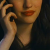
to
Other similar examples:


KAT DENNINGS TUTORIAL.
I started with an image of Kat Dennings from the movie Nick and Nora's Infinite Playlist.
1. Duplicate your base image and set the copy to 'Screen'. This is a basic step I use on most of my icons. I set the opacity of the copy to 53%, adjust yours accordingly.
to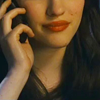
2. I created a new Color Balance layer (Layer - New Adjustment Layer - Color Balance) I used the following settings:
Midtones: -13, +2, +26
Shadows: -8, +3, +5
Highlights: +5, -1, +10
This step is crucial. If you image is still very yellow do not start making drastic changes. I good tip is to keep each change subtle and stack them.
to
3. Create a new Levels layer (Layer - New Adjustment Layer - Levels) I used the following settings:
RBG: 14, 1.03, 248
Red: 12, 1.00, 249
Green: 13, 1.05, 255
Blue: 2, 1.10, 255
This layer will add some nice contrast to the darker ares of the image. Also the added blue will dull the vibrant yellows.
to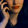
4. Create a new layer and fill it with the color #dc8f00 change the layer to 'Soft Light' and adjust the opacity accordingly. I used 23% to keep some of the yellow that is necessary for realistic skin tone.
to
5. Create a new layer and fill it with the color #250202 change the layer to 'Exclusion' and adjust the opacity accordingly. I used 100% on this particular icon.
to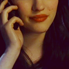
6. Create a new layer and fill it with the color #0a0f01 change the layer to 'Exclusion' and adjust the opacity accordingly. I used 80% on this icon, any higher and the image would lose to much contrast.
to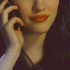
7. Create a new layer and fill it with the color #141414 change the layer to 'Exclusion' and adjust the opacity accordingly. I used 47% on this icon.
to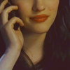
8. I created a new layer and filled it with a gradient using the colors #cfcfcf and #b4b4b4. I set the layer to 'Multiply' and the opacity to 19%. This layer isn't meant to add extreme contrast so keep the opacity relatively low.
to
9. This layer is where I started making more drastic changes. I am sure the next two steps could be translated to Color Balance if needed. I used Selective Coloring because I thought it yielded the best result. Ok so make a new Selective Color layer (Layer - New Adjustment Layer - Selective Color) I used the following settings:
Reds: -13, +1, -9, +10
Yellows: -12, +10, -17, +25
Whites: +29, -3, -20, +5
Neutrals: +9, +8, +1, -1
Blacks: 0, 0, 0, +2
to
10. Create a new Channel Mixer layer (Layer - New Adjustment Layer - Channel Mixer) I set the layer to 'Lighten' and used the following settings:
Red: +94, +9, -5, 0
Green: -4, +96, +10, 0
Blue: -6, +12, +98, 0
to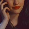
11. I duplicated the previous layer and set the layer to 'Normal' and left the opacity at 100%.
to
12. I selected the entire image and copied the merged (Ctrl+A), (Ctrl+Shft+Alt+E). I sharpened this copied layer (Filter - Sharpen - Sharpen) and I adjusted the opacity of the layer until I thought it looked alright.
to
13. This is where your creativity comes in! I created a series of black and white 'Soft Light' layers. I used white blobs to highlight Kat's cheekbones and lips. I used black blobs to add shadow to the face and hair. These layers are set to very low opacity (5-15%)
Any comments/questions? Please post them here.
Program: Photoshop CS2
Involves: Selective Coloring, Color Balance, Channel Mixer, Levels
Level: Easy, depending on the image.
Example-
From
to
Other similar examples:
KAT DENNINGS TUTORIAL.
I started with an image of Kat Dennings from the movie Nick and Nora's Infinite Playlist.
1. Duplicate your base image and set the copy to 'Screen'. This is a basic step I use on most of my icons. I set the opacity of the copy to 53%, adjust yours accordingly.
to
2. I created a new Color Balance layer (Layer - New Adjustment Layer - Color Balance) I used the following settings:
Midtones: -13, +2, +26
Shadows: -8, +3, +5
Highlights: +5, -1, +10
This step is crucial. If you image is still very yellow do not start making drastic changes. I good tip is to keep each change subtle and stack them.
to
3. Create a new Levels layer (Layer - New Adjustment Layer - Levels) I used the following settings:
RBG: 14, 1.03, 248
Red: 12, 1.00, 249
Green: 13, 1.05, 255
Blue: 2, 1.10, 255
This layer will add some nice contrast to the darker ares of the image. Also the added blue will dull the vibrant yellows.
to
4. Create a new layer and fill it with the color #dc8f00 change the layer to 'Soft Light' and adjust the opacity accordingly. I used 23% to keep some of the yellow that is necessary for realistic skin tone.
to
5. Create a new layer and fill it with the color #250202 change the layer to 'Exclusion' and adjust the opacity accordingly. I used 100% on this particular icon.
to
6. Create a new layer and fill it with the color #0a0f01 change the layer to 'Exclusion' and adjust the opacity accordingly. I used 80% on this icon, any higher and the image would lose to much contrast.
to
7. Create a new layer and fill it with the color #141414 change the layer to 'Exclusion' and adjust the opacity accordingly. I used 47% on this icon.
to
8. I created a new layer and filled it with a gradient using the colors #cfcfcf and #b4b4b4. I set the layer to 'Multiply' and the opacity to 19%. This layer isn't meant to add extreme contrast so keep the opacity relatively low.
to
9. This layer is where I started making more drastic changes. I am sure the next two steps could be translated to Color Balance if needed. I used Selective Coloring because I thought it yielded the best result. Ok so make a new Selective Color layer (Layer - New Adjustment Layer - Selective Color) I used the following settings:
Reds: -13, +1, -9, +10
Yellows: -12, +10, -17, +25
Whites: +29, -3, -20, +5
Neutrals: +9, +8, +1, -1
Blacks: 0, 0, 0, +2
to
10. Create a new Channel Mixer layer (Layer - New Adjustment Layer - Channel Mixer) I set the layer to 'Lighten' and used the following settings:
Red: +94, +9, -5, 0
Green: -4, +96, +10, 0
Blue: -6, +12, +98, 0
to
11. I duplicated the previous layer and set the layer to 'Normal' and left the opacity at 100%.
to
12. I selected the entire image and copied the merged (Ctrl+A), (Ctrl+Shft+Alt+E). I sharpened this copied layer (Filter - Sharpen - Sharpen) and I adjusted the opacity of the layer until I thought it looked alright.
to
13. This is where your creativity comes in! I created a series of black and white 'Soft Light' layers. I used white blobs to highlight Kat's cheekbones and lips. I used black blobs to add shadow to the face and hair. These layers are set to very low opacity (5-15%)
Any comments/questions? Please post them here.