Another Tut.
Here is another tutorial requested by dreamt_too_late. Program is PSC2, and it uses curves, selective coloring & color balance.
Example-
From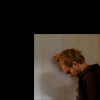
to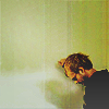
CHARLIE PACE TUTORIAL.
So we are starting with this picture of Charlie Pace from Lost. *Cries* I miss Charlie, a lot.
*Note that black is actually blank canvas.
1. The first step is too fill in the negative space with the smudge tool and keep it looking natural. That can all be explained in greater detail HERE. Actually the tutorial uses this specific picture, so much easier!
to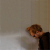
2. Create a new Curves layer (Layer - New adjustment layer - Curves). I used the following settings. If it is too bright play with the settings, every image is different.
RGB:
1st dot (In-6, Ou-0)
2nd dot (In-90, Ou-162)
3rd dot (In-189, Ou-231)
4th dot (In-253, Ou-246)
to
3. Create a new Selective color layer (Layer - New adjustment layer - Selective color). I used the following settings. This layer is supposed to be subtle so if you have lots of green in your image then lower the settings closer to 0 in the green option.
Reds: -4, -3, +3, +2
Greens: -55, -39, +65, -23
to
4. Create a new layer and fill it with the color #cdcdcd change the layer to 'Darken' and adjust the opacity accordingly. I used 100% but if you find the alteration to drastic then play with the opacity setting.
to
5. Create a new layer and fill it with the color #00aeef change the layer to 'Luminosity' and adjust the opacity accordingly. I used 12% but if you would like to decrease the contrast then raise the opacity setting.
to
6. Create a new Color balance layer (Layer - New adjustment layer - Color balance).
I used the following settings.
Midtones: -2, -4, -12
Highlights: +3, +10, +17
to
7. Duplicate your base image and drag it to the top. Set the layer to 'Soft Light' too add some color and contrast to the image. I left my opacity at 100% but for most images that will be too much.
to
8. Create a new Curves layer (Layer - New adjustment layer - Curves). I used the following settings. Don't worry if it looks too bright, we will fix that later.
RGB:
1st dot (In-187, Ou-221)
2nd dot (In-255, Ou-249)
to
9. Fill a new layer with a gradient with these two colors #e6e6e6 and b8b8b8. I set the layer to 'Overlay' and set the opacity at 17%. The higher he opacity the brighter the result, in most cases leave the opacity really low.
to
10. Create a new Selective color layer (Layer - New adjustment layer - Selective color). I used the following settings. If the whites appear to dark or gray then lower the white closer to 0.
Whites: -10, -11, -12, +100
to
11. Next hit Ctrl+A to select your entire image, next hit Shift+Ctrl+C to copy your entire image and finally paste it will Ctrl+V. This is the layer you will sharpen. Go Filter - Sharpen - Sharpen and adjust the opacity of the layer to your preference. I set mine to 62%.
to
12. Take this texture
and set the layer to 'Color Burn' I set my opacity at 26% and the fill at 43%.
to
13. Create a new Selective color layer (Layer - New adjustment layer - Selective color). I used the following settings.
Reds: +2, -1, -3, +2
to
14. To highlight Charlie I took a soft-edged brush at about 25 px with the color #e9e9e9 and placed a blob on his upper body. I set the layer to 'Screen' and lowered the opacity to 41%. Because it is a light background the blob isn't to noticable, if you have a darker background lower th opacity.
to
15. Create a new Selective color layer (Layer - New adjustment layer - Selective color). I used the following settings. My colors are subtle so big changes in the settings are necessary, if your image looks to green or yellow (aka radioactive) then lower your settings.
Reds: +26, +9, -12, +53
Yellows: +73, -14, -10, +48
Whites: -6, -5, +65, +19
Neutrals: +17, +9, -10, +11
Blacks: 0, 0, 0, +8
to
16. Create a new Selective color layer (Layer - New adjustment layer - Selective color). I used the following settings. Again these changes are fairly drastic, if your image is already green than just skip this step.
Reds: +47, -33, -22, +49
Yellows: +19, -16, +16, +55
Blacks: 0, 0, 0, +16
to
17. Create a new layer and fill it with the color #e0e0e0 change the layer to 'Linear Burn' and adjust the opacity accordingly. I used 61% but if you find the picture too light than you can increase the opacity.
to
18. Create a new layer and fill it with the color #e0e0e0 change the layer to 'Color Burn' and adjust the opacity accordingly. I set my layer at 49% opacity.
to
19. Fill a new layer with a gradient with these two colors #424242 and #000000. I set the layer to 'Lighten' and lef the opacity at 100%. The layer will cover any black on your icon with the hazy gray color, if you find the effect to strong lower the opacity.
to
20. LAST STEP! -_- Create a gray blob #dfdfdf with the same settings as step #14 and place it anywhere on the icon that needs highlighting. I set my layer to 'Screen' and set the opacity to 30%.
to
And we are done! Finally!
If you have any questions/comments please post Here! so I can respond quickly!