Tutorial - Gradient Maps
Gradient maps are a fantastic way to add colour and contrast to an icon, so I wrote a basic tutorial on how to use them. Since it's not the "from... to..." kind of walk-through, here are a few examples of icons that rely on gradient maps for their colour:


Gradient maps are one of the quickest and easiest ways to add colour and contrast to an icon. I'm not particularly up-to-date with the latest icon trends, but I haven't seen a good tutorial for their use yet, so here's one. Well, a tutorial - you decide if it's any good. It's relatively detailed, so you should be ok with beginner to medium Photoshop skills.
(Disclaimer: I use these often, but it's completely possible that I don't know as much as I think I do. Additions and corrections are very welcome. Also, excuse any leftover grammatical mistakes, heat has fried my brain.)
01. What are gradient maps and where can I find them?
To be quite honest, I lack the technical knowledge to tell you what exactly gradient maps do. From what I can tell they take the tonal value (or something along those lines) of your image and match it to the colours of a gradient? Anyway, it colours your image according to a gradient, and because the map is on an adjustment layer, you can tweak it in several ways to achieve some nice effects - from simply enhancing the colour and contrast to a stark black/white/red look to looking almost stenciled.
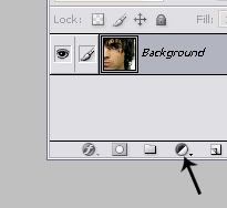
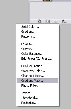
To add a gradient map to an image, simply click the "adjustment layer" icon at the bottom of your layer tray and choose "Gradient Map":
The default setting uses your foreground and background colours:
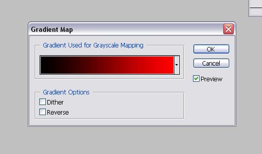
This can be useful if you have a particular colour scheme in mind that only uses two base colours, as you don't need to search for a pre-made gradient to match your idea. You can also create a more complex gradient yourself by clicking on the current gradient and playing with the gradient editor, but that's a whole different topic.
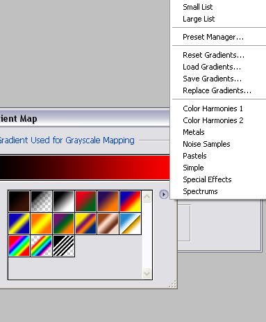
When you click on the arrow to the right of the current gradient, a little preview pops up to let you select a gradient from the set that's currently being used:
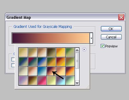
(The set in question was made by oxoniensis, the arrow points to the gradient used in the next part.)
Photoshop comes with a few default sets, not all of which are useful for icon making, but of course you can also download a set of gradients from your resource maker of choice and use those by clicking on the little arrow symbol and selecting "replace gradients":
02. What do they do to my icon?
For all examples I used a gradient by oxoniensis and a randomly picked image, cropped and slightly sharpened, but not otherwise altered:

By default, the blending mode of any new layer is normal. This tends to look good with a gradient that consists of two base colours with a high contrast. The less contrast in the gradient, the less contrast in your image, and the more base colours in the gradient, the weirder your icon will look. Examples:
a.
b.
c.
d.
a. Soft, but high-contrast gradient - A nice and clear image
b. Stronger colours, relatively high contrast - The image is still relatively clear.
c. Soft colours, little contrast - The image is hard to see.
d. Several bright colours - ... Well, you get what I mean.
The normal blending mode comes in most handy when you want a black/white image, as it produces a crisper image than normal desaturation does. Compare:
a.
b.
a) B/W Gradient Map vs. b) Desaturation
Now, the other blending modes are worth experimenting with, and which ones work best always depends on the image and what effect you want to achieve. The rule of thumb about contrasting, not too dark colours applies here, too, but sometimes gradients that look horrible in one mode look great in another - so experiment! But here's an overview over most blending modes and what they generally do to your icon. (There are better tutorials on blending modes in general out there, I'm sure, but my bookmarks are not helping right now.)
Darkening:
01.
02.
03.
04.
01. Darken - Actually darkens least of all. Results tend to be pretty muted, but also clearer than the other ones.
02. Multiply - Darkens more and with a higher contrast. Depending on the image this can work really well or darken it so much that all detail gets lost. Rule of thumb: Works with close-ups with few details, doesn't work with small images or lots of details.
03. Color Burn - Very dark and highly saturated. I generally wouldn't recommend using this.
04. Linear Burn - Dark like Color Burn, but less contrast. Again, I don't recommend it.
Brightening:
01.
02.
03.
04.
These are pretty much equivalent to the darkening modes, only... well, brightening.
01. Lighten - Again, lightens least of all. This can work if you want a soft tone on dark-ish images.
02. Screen - Adds more contrast than "lighten". While "screen" can be useful when preparing dark images, it often doesn't work well with gradient maps. Unless the gradient is pretty dark, the image will usually look too bright and washed-out.
03. Color Dodge - Very bright and high in contrast. I don't recommend using this EVER, really.
04. Linear Dodge - Bright, but lower in contrast. Not recommended.
"Light" (more like contrast/saturation):
01.
02.
03.
04.
05.
06.
01. Overlay - High contrast and saturation, works pretty well with icons that lack either.
02. Soft Light - Adds colour and a bit of contrast. This might be the one you'll use most often, since it's the most natural and works on almost any image, particularly ones that lack saturation. If the colours end up too bland for your liking, you can still tweak it nicely by adding another gradient map layer, selective color or even curves.
03. Hard Light - Similar to Overlay. It doesn't always work, but can be worth experimenting with.
04. Linear Light - Usually very high saturation, I don't recommend using it.
05. Pin Light - Mildly brightens the image and messes with colours a bit, but mostly isn't of much use.
06. Hard Mix - Yeah, well. Please don't use this.
(I forgot "Vivid Light", but it amounts to pretty much the same as Linear Light.)
Other:
01.
02.
03.
04.
05.
06.
01. Difference - Messes with colours and brightness. Depending on the image this can make for an interesting background, but otherwise it's not very useful.
02. Exclusion - Messes with the colours. In itself it's not very useful, but if you merge it with a copy of the base layer and fiddle with the blending modes on that, you can sometimes get pretty good results.
03. Hue - Matches the image's colours to the gradient, but with the original colours shining through. Depending on the gradient, you can get good results with this.
04. Saturation - Does not actually saturate the image that much more, but changes the colours slightly. Results can be good or bad, depending on the image and gradient.
05. Color - Applies the colours of the gradient to the image. Unlike the "Normal" setting it doesn't affect whites, so it can be pretty useful.
06. Luminosity - To be honest, I never got what this does except add a grey-ish hue. Who knows, it might be useful some time.
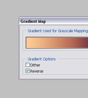
Generally you get the best results from a gradient that goes from dark to light, as that applies the darker colour to the dark parts of the icon, and the lighter ones to the lighter parts. You can reverse a gradient by simply clicking the "Reverse" checkbox:
Using a light-to-dark gradient usually results in a very unnatural colouring. Some examples, using the same gradient as above:
01.
02.
03.
04.
05.
01. Normal
02. Multiply
03. Screen
04. Soft Light
05. Hue
To sum it up:
- Choose a gradient with a lot of contrast, especially if you're working in "normal" mode.
- Make sure the gradient goes from dark to light if you want to achieve a natural colouring.
- Blending modes that usually work well: Darken, Overlay, Soft Light, Hard Light, Color
- Blending modes that should be avoided: Color Burn, Linear Burn, Color Dodge, Linear Dodge, Linear Light, Hard Mix, Exclusion
- Most importantly: EXPERIMENTING IS YOUR FRIEND.
03. What else can I do with gradient maps?
- If you want to erase parts of the map, a layer mask is "built in" with all adjustment layers, so you can just paint on that in black to erase everything you don't want.
- You can group the gradient map with another layer (STRG+G) so it only applies to that layer.
- You can merge the gradient map with your base by pressing "STRG+E". Sometimes you can achieve interesting effects by setting a gradient map to one of the blending modes that don't look good on their own, merging them with a copy of the base, and then setting this merged layer to "soft light" (or maybe some other blending mode) on top of the base. (It's also useful for uncluttering your layers.)
- If you want a specific part of the image to be in colour, while the rest stays b/w (or the other way around), it's really easy to use a b/w gradient map and erase the colourful part by painting on the layer map. (Magnifying the image several times helps, of course.)
- Try combining more than one gradient map, or add other adjustment layers, and play with the opacity.
- And once again: Experiment. I don't want this tutorial in a rant, but maybe a PSA? Please step away from the .psds and cookie-cutter icons. Try blending modes and adjustment layers you haven't before, use new textures, BE CREATIVE. After all, isn't that what icon making is about?
04. Some more examples of icons using gradient maps



In all of these one or more gradient maps were used prominently, either to desaturate the image, achieve a bright, pop-arty look, or just to enhance the colours. It's one of the most useful, versatile tools Photoshop has to offer for icon making.
Questions, corrections, additions? Please let me know! (P.S. Sorry for the wrong post, mods! I'm ridiculously paranoid about that kind of thing, but even skimming the rules, just to make sure, I missed that change. *headdesk*)
Gradient maps are one of the quickest and easiest ways to add colour and contrast to an icon. I'm not particularly up-to-date with the latest icon trends, but I haven't seen a good tutorial for their use yet, so here's one. Well, a tutorial - you decide if it's any good. It's relatively detailed, so you should be ok with beginner to medium Photoshop skills.
(Disclaimer: I use these often, but it's completely possible that I don't know as much as I think I do. Additions and corrections are very welcome. Also, excuse any leftover grammatical mistakes, heat has fried my brain.)
01. What are gradient maps and where can I find them?
To be quite honest, I lack the technical knowledge to tell you what exactly gradient maps do. From what I can tell they take the tonal value (or something along those lines) of your image and match it to the colours of a gradient? Anyway, it colours your image according to a gradient, and because the map is on an adjustment layer, you can tweak it in several ways to achieve some nice effects - from simply enhancing the colour and contrast to a stark black/white/red look to looking almost stenciled.
To add a gradient map to an image, simply click the "adjustment layer" icon at the bottom of your layer tray and choose "Gradient Map":
The default setting uses your foreground and background colours:
This can be useful if you have a particular colour scheme in mind that only uses two base colours, as you don't need to search for a pre-made gradient to match your idea. You can also create a more complex gradient yourself by clicking on the current gradient and playing with the gradient editor, but that's a whole different topic.
When you click on the arrow to the right of the current gradient, a little preview pops up to let you select a gradient from the set that's currently being used:
(The set in question was made by oxoniensis, the arrow points to the gradient used in the next part.)
Photoshop comes with a few default sets, not all of which are useful for icon making, but of course you can also download a set of gradients from your resource maker of choice and use those by clicking on the little arrow symbol and selecting "replace gradients":
02. What do they do to my icon?
For all examples I used a gradient by oxoniensis and a randomly picked image, cropped and slightly sharpened, but not otherwise altered:
By default, the blending mode of any new layer is normal. This tends to look good with a gradient that consists of two base colours with a high contrast. The less contrast in the gradient, the less contrast in your image, and the more base colours in the gradient, the weirder your icon will look. Examples:
a.
b.
c.
d.
a. Soft, but high-contrast gradient - A nice and clear image
b. Stronger colours, relatively high contrast - The image is still relatively clear.
c. Soft colours, little contrast - The image is hard to see.
d. Several bright colours - ... Well, you get what I mean.
The normal blending mode comes in most handy when you want a black/white image, as it produces a crisper image than normal desaturation does. Compare:
a.
b.
a) B/W Gradient Map vs. b) Desaturation
Now, the other blending modes are worth experimenting with, and which ones work best always depends on the image and what effect you want to achieve. The rule of thumb about contrasting, not too dark colours applies here, too, but sometimes gradients that look horrible in one mode look great in another - so experiment! But here's an overview over most blending modes and what they generally do to your icon. (There are better tutorials on blending modes in general out there, I'm sure, but my bookmarks are not helping right now.)
Darkening:
01.
02.
03.
04.
01. Darken - Actually darkens least of all. Results tend to be pretty muted, but also clearer than the other ones.
02. Multiply - Darkens more and with a higher contrast. Depending on the image this can work really well or darken it so much that all detail gets lost. Rule of thumb: Works with close-ups with few details, doesn't work with small images or lots of details.
03. Color Burn - Very dark and highly saturated. I generally wouldn't recommend using this.
04. Linear Burn - Dark like Color Burn, but less contrast. Again, I don't recommend it.
Brightening:
01.
02.
03.
04.
These are pretty much equivalent to the darkening modes, only... well, brightening.
01. Lighten - Again, lightens least of all. This can work if you want a soft tone on dark-ish images.
02. Screen - Adds more contrast than "lighten". While "screen" can be useful when preparing dark images, it often doesn't work well with gradient maps. Unless the gradient is pretty dark, the image will usually look too bright and washed-out.
03. Color Dodge - Very bright and high in contrast. I don't recommend using this EVER, really.
04. Linear Dodge - Bright, but lower in contrast. Not recommended.
"Light" (more like contrast/saturation):
01.
02.
03.
04.
05.
06.
01. Overlay - High contrast and saturation, works pretty well with icons that lack either.
02. Soft Light - Adds colour and a bit of contrast. This might be the one you'll use most often, since it's the most natural and works on almost any image, particularly ones that lack saturation. If the colours end up too bland for your liking, you can still tweak it nicely by adding another gradient map layer, selective color or even curves.
03. Hard Light - Similar to Overlay. It doesn't always work, but can be worth experimenting with.
04. Linear Light - Usually very high saturation, I don't recommend using it.
05. Pin Light - Mildly brightens the image and messes with colours a bit, but mostly isn't of much use.
06. Hard Mix - Yeah, well. Please don't use this.
(I forgot "Vivid Light", but it amounts to pretty much the same as Linear Light.)
Other:
01.
02.
03.
04.
05.
06.
01. Difference - Messes with colours and brightness. Depending on the image this can make for an interesting background, but otherwise it's not very useful.
02. Exclusion - Messes with the colours. In itself it's not very useful, but if you merge it with a copy of the base layer and fiddle with the blending modes on that, you can sometimes get pretty good results.
03. Hue - Matches the image's colours to the gradient, but with the original colours shining through. Depending on the gradient, you can get good results with this.
04. Saturation - Does not actually saturate the image that much more, but changes the colours slightly. Results can be good or bad, depending on the image and gradient.
05. Color - Applies the colours of the gradient to the image. Unlike the "Normal" setting it doesn't affect whites, so it can be pretty useful.
06. Luminosity - To be honest, I never got what this does except add a grey-ish hue. Who knows, it might be useful some time.
Generally you get the best results from a gradient that goes from dark to light, as that applies the darker colour to the dark parts of the icon, and the lighter ones to the lighter parts. You can reverse a gradient by simply clicking the "Reverse" checkbox:
Using a light-to-dark gradient usually results in a very unnatural colouring. Some examples, using the same gradient as above:
01.
02.
03.
04.
05.
01. Normal
02. Multiply
03. Screen
04. Soft Light
05. Hue
To sum it up:
- Choose a gradient with a lot of contrast, especially if you're working in "normal" mode.
- Make sure the gradient goes from dark to light if you want to achieve a natural colouring.
- Blending modes that usually work well: Darken, Overlay, Soft Light, Hard Light, Color
- Blending modes that should be avoided: Color Burn, Linear Burn, Color Dodge, Linear Dodge, Linear Light, Hard Mix, Exclusion
- Most importantly: EXPERIMENTING IS YOUR FRIEND.
03. What else can I do with gradient maps?
- If you want to erase parts of the map, a layer mask is "built in" with all adjustment layers, so you can just paint on that in black to erase everything you don't want.
- You can group the gradient map with another layer (STRG+G) so it only applies to that layer.
- You can merge the gradient map with your base by pressing "STRG+E". Sometimes you can achieve interesting effects by setting a gradient map to one of the blending modes that don't look good on their own, merging them with a copy of the base, and then setting this merged layer to "soft light" (or maybe some other blending mode) on top of the base. (It's also useful for uncluttering your layers.)
- If you want a specific part of the image to be in colour, while the rest stays b/w (or the other way around), it's really easy to use a b/w gradient map and erase the colourful part by painting on the layer map. (Magnifying the image several times helps, of course.)
- Try combining more than one gradient map, or add other adjustment layers, and play with the opacity.
- And once again: Experiment. I don't want this tutorial in a rant, but maybe a PSA? Please step away from the .psds and cookie-cutter icons. Try blending modes and adjustment layers you haven't before, use new textures, BE CREATIVE. After all, isn't that what icon making is about?
04. Some more examples of icons using gradient maps
In all of these one or more gradient maps were used prominently, either to desaturate the image, achieve a bright, pop-arty look, or just to enhance the colours. It's one of the most useful, versatile tools Photoshop has to offer for icon making.
Questions, corrections, additions? Please let me know! (P.S. Sorry for the wrong post, mods! I'm ridiculously paranoid about that kind of thing, but even skimming the rules, just to make sure, I missed that change. *headdesk*)