Using Negative Space.
Ok so lately on many icon communities I have seen question regarding negative space. So I decided to write another tutorial.It's a general tutorial explaining different techniques and how to use them. So here we go.
Some of the examples-
1. From
to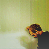
2. From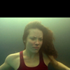
to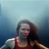
3. From
to
4. From
to
5. From
to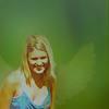
Alright I am no 'master' of Photoshop but I thought I would write a tutorial on using negative space because it is on of my favorite current techniques. There is many ways to use this technique.
In my opinion 'negative space' can outreach its definition. It doesn't have to be one blank color, it's good to use textures and other techniques to make it interesting.
Selecting the image
Lets start with what pictures are good for this technique and which are not.
Good:
1.
2.
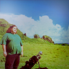
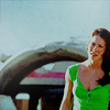
You want to choose an image with background and -most- of the figure or focus point visible. In example one Charlie is surrounded by a basic color palette above him, on his left and to some extent, on his right. This gives you lots of room to extend the space. In example two Jack and Kate are the main focus with a mountain behind them. Above that there the sky which in -most- icons is easy to work with.
Bad:
1.
2.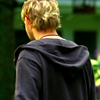
Example one is the obvious bad choice. It is a close up of a face with little or no negative space around the focus. The second example is not impossible, I have seen more difficult pictures used. The picture would require much work and focus. In this case I would not use the picture for this technique.
Your options & Basic rules
There are several techniques used to create negative space. Each individual picture requires different steps to make it look complete.
Some rules I like to stick by so my final product will be my best.
1. Do all your negative space work (smudge tool, blurring) at the biggest possible size. For example if your image is 300x300 then work with that until your have reached your coloring then change it to 100x100. That way smaller details will not be left out.
2. ALways duplicate your base layer and work on that; that way if you make any mistakes you still have your base.
Technique 1: Resizing
In this technique the basis is that you re size your image from 100x100 to a smaller size (ex: 60x60) but still keep the image on a 100x100 canvas. If you are using this technique make sure the focus is surrounded by a basic color palette that will be easy to work with.
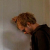
to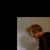
In this case the blank canvas is black.
After you re size there are several ways you approach to make the icon look good. For this paticular icon I used the 'Smudge tool'
I set the brush to a soft-edged 7px and set the opacity at 80%. For above Charlie I gently smudged upward and for the white 'blob' beside Charlie I smudged outward. Make sure not to blend to much or it will look unnatural.

to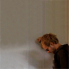
By simply adding negative space I have made Charlie seem isolated and even more alone. After this I added my coloring.

to
Technique 2: Smudging, creating background
This technique is on the most common for filling negative space. There are several ways to create background the most common being the smudge tool
or layer masking. I mostly use the smudge tool because you can create softer edges. Your first step is to set the picture at the position you want and then fill in as much blank space as you can with your desired color.
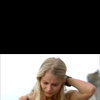
to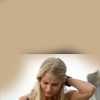
Next use your smudge tool
I had the settings at soft-edged, 11px, 100% opacity. I carefully (and gradually) moved the color until it surrounded the figure.

to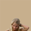
So what is Claire thinking? Not sure, that's why I added so much negative space to the icon, to add a little 'something'. Next is my coloring.

to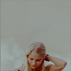
Other examples:
Technique 3: Smudging, keeping the background
This is one my favorite techniques because it looks the most natural. I use this technique when there is a variety of colors to work with and I want to keep them in the icon. I took my selection of the icon and moved it down until I got the cropping I wanted. The black is the blank canvas.

Next, using both the smudge tool
and the clone stamp tool
I filled in the background. I used the clone stamp tool to fill in the darker areas that had a grainier 'water' texture and I used the smudge tool
on the lighter areas. For both tools I used a soft-edged brush at 100% opacity.

to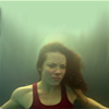
As you can see the lighter area looks unnatural so I filled a new layer with a darker color #93b07d.

to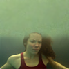
This looks even worse, but have no fear. Set this new layer to 'Darken' and set the opacity of the layer to 58%.

to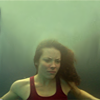
Finally it looks good, except for the coloring. Almost every underwater screencap from Lost is too green, but I am going to change that.

to
Other examples:

Technique 4: Creating Sky
For this technique You will need sky to work with, obviously. Crop your picture and in this case move the base image down. Black is blank canvas.

to
Next use the smudge tool and smudge the colors to fill in the negative space. In this icon I simply filled it in with white but in other icons I complete the clouds.

to
One of the most crucial steps is to create the blue of the sky. For most icons I simply google 'clouds' and copy it onto my picture. I re size it to get the cropping I like and erase everything that isn't sky.

to
It looks more like sky but it still isn't perfect. I -usually- set sky layers to 'Darken' or 'Multiply' for this example I set the opacity to 58%

to
Next I add my coloring. I wanted to highlight the sky and give it a 'hazy' appearance.

to
Other examples:

Technique 5: Fixing 'Cut-offs'
I previously talked about not using pictures that were cut-off. In some cases they are usable. If a small portion is cut-off than it is -probably- fixable. In my image part of Kate's hair and the tree in the background is cut-off.
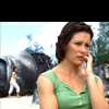
Your first step is too gradually blend the sky above Kate's head using the smudge tool
I set the brush to soft-edged at 8px with 77% opacity.

to
Next to make it look natural I zoomed closely on Kate's head and very carefully completed her head bu smudging. For the tree I used the clone stamp tool

to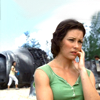
Now that it looks natural I added my coloring. I decided to focus Kate more in the foreground because I love her expression and her mannerisms in this picture.

to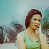
Other examples:

to
Technique 6: Blurring to create interesting background
In this paticular icon I will not only extend the negative space but I will also create an interesting background that is fun to work with. In this example black is the blank space, as always.

Using the smudge tool
set at soft-edged, 20px, 100% opacity I smidged the green all around Shannon to create a background. Don't worry about getting it perfect.

to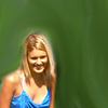
I duplicated the layer and on the duplicate I covered Shannon's face with smudging.

to
Next I blurred the duplicate by going Filter-Blur-Gaussian Blur I set it to 3.9 and hit 'Ok'.

to
Very carefully I started to erase the blurred layer over Shannon with the eraser tool set at a low opacity. At the edges I used the brush at a VERY low opacity so that the background merging with Shannon was suttle.

to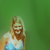
Now that it is complete I finally finished my coloring.

to
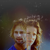
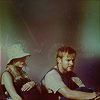
Other examples:
Any question? Want a specific coloring tutorial for one the icons? Please ask here at my journal.
Some of the examples-
1. From

to

2. From

to

3. From

to

4. From

to

5. From

to

Alright I am no 'master' of Photoshop but I thought I would write a tutorial on using negative space because it is on of my favorite current techniques. There is many ways to use this technique.
In my opinion 'negative space' can outreach its definition. It doesn't have to be one blank color, it's good to use textures and other techniques to make it interesting.
Selecting the image
Lets start with what pictures are good for this technique and which are not.
Good:
1.

2.

You want to choose an image with background and -most- of the figure or focus point visible. In example one Charlie is surrounded by a basic color palette above him, on his left and to some extent, on his right. This gives you lots of room to extend the space. In example two Jack and Kate are the main focus with a mountain behind them. Above that there the sky which in -most- icons is easy to work with.
Bad:
1.

2.

Example one is the obvious bad choice. It is a close up of a face with little or no negative space around the focus. The second example is not impossible, I have seen more difficult pictures used. The picture would require much work and focus. In this case I would not use the picture for this technique.
Your options & Basic rules
There are several techniques used to create negative space. Each individual picture requires different steps to make it look complete.
Some rules I like to stick by so my final product will be my best.
1. Do all your negative space work (smudge tool, blurring) at the biggest possible size. For example if your image is 300x300 then work with that until your have reached your coloring then change it to 100x100. That way smaller details will not be left out.
2. ALways duplicate your base layer and work on that; that way if you make any mistakes you still have your base.
Technique 1: Resizing
In this technique the basis is that you re size your image from 100x100 to a smaller size (ex: 60x60) but still keep the image on a 100x100 canvas. If you are using this technique make sure the focus is surrounded by a basic color palette that will be easy to work with.

to

In this case the blank canvas is black.
After you re size there are several ways you approach to make the icon look good. For this paticular icon I used the 'Smudge tool'

I set the brush to a soft-edged 7px and set the opacity at 80%. For above Charlie I gently smudged upward and for the white 'blob' beside Charlie I smudged outward. Make sure not to blend to much or it will look unnatural.

to

By simply adding negative space I have made Charlie seem isolated and even more alone. After this I added my coloring.

to

Technique 2: Smudging, creating background
This technique is on the most common for filling negative space. There are several ways to create background the most common being the smudge tool

or layer masking. I mostly use the smudge tool because you can create softer edges. Your first step is to set the picture at the position you want and then fill in as much blank space as you can with your desired color.

to

Next use your smudge tool

I had the settings at soft-edged, 11px, 100% opacity. I carefully (and gradually) moved the color until it surrounded the figure.

to

So what is Claire thinking? Not sure, that's why I added so much negative space to the icon, to add a little 'something'. Next is my coloring.

to

Other examples:


Technique 3: Smudging, keeping the background
This is one my favorite techniques because it looks the most natural. I use this technique when there is a variety of colors to work with and I want to keep them in the icon. I took my selection of the icon and moved it down until I got the cropping I wanted. The black is the blank canvas.

Next, using both the smudge tool

and the clone stamp tool

I filled in the background. I used the clone stamp tool to fill in the darker areas that had a grainier 'water' texture and I used the smudge tool

on the lighter areas. For both tools I used a soft-edged brush at 100% opacity.

to

As you can see the lighter area looks unnatural so I filled a new layer with a darker color #93b07d.

to

This looks even worse, but have no fear. Set this new layer to 'Darken' and set the opacity of the layer to 58%.

to

Finally it looks good, except for the coloring. Almost every underwater screencap from Lost is too green, but I am going to change that.

to

Other examples:

Technique 4: Creating Sky
For this technique You will need sky to work with, obviously. Crop your picture and in this case move the base image down. Black is blank canvas.

to

Next use the smudge tool and smudge the colors to fill in the negative space. In this icon I simply filled it in with white but in other icons I complete the clouds.

to

One of the most crucial steps is to create the blue of the sky. For most icons I simply google 'clouds' and copy it onto my picture. I re size it to get the cropping I like and erase everything that isn't sky.

to

It looks more like sky but it still isn't perfect. I -usually- set sky layers to 'Darken' or 'Multiply' for this example I set the opacity to 58%

to

Next I add my coloring. I wanted to highlight the sky and give it a 'hazy' appearance.

to

Other examples:


Technique 5: Fixing 'Cut-offs'
I previously talked about not using pictures that were cut-off. In some cases they are usable. If a small portion is cut-off than it is -probably- fixable. In my image part of Kate's hair and the tree in the background is cut-off.

Your first step is too gradually blend the sky above Kate's head using the smudge tool

I set the brush to soft-edged at 8px with 77% opacity.

to

Next to make it look natural I zoomed closely on Kate's head and very carefully completed her head bu smudging. For the tree I used the clone stamp tool


to

Now that it looks natural I added my coloring. I decided to focus Kate more in the foreground because I love her expression and her mannerisms in this picture.

to

Other examples:

to

Technique 6: Blurring to create interesting background
In this paticular icon I will not only extend the negative space but I will also create an interesting background that is fun to work with. In this example black is the blank space, as always.

Using the smudge tool

set at soft-edged, 20px, 100% opacity I smidged the green all around Shannon to create a background. Don't worry about getting it perfect.

to

I duplicated the layer and on the duplicate I covered Shannon's face with smudging.

to

Next I blurred the duplicate by going Filter-Blur-Gaussian Blur I set it to 3.9 and hit 'Ok'.

to

Very carefully I started to erase the blurred layer over Shannon with the eraser tool set at a low opacity. At the edges I used the brush at a VERY low opacity so that the background merging with Shannon was suttle.

to

Now that it is complete I finally finished my coloring.

to

Other examples:


Any question? Want a specific coloring tutorial for one the icons? Please ask here at my journal.