Basic icon tutorial
Here it comes. Mostly because I'm bored. Don't expect it to be sth fresh&new :P IMAGE HEAVY! It's suitable for all sorts of graphic programs.
The basic icon tutorial on:
a/ choosing a picture
b/ cropping
c/ basic information about coloring
d/ use of texture
e/ text
a/ choosing a picture
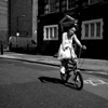
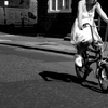
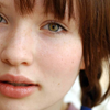
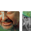
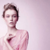
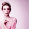
The rule is simple: always use the best quality photos that you're able to find. You don't want your icons to look pixeleted or too sharpened or otherwise, too blurred. Also if you can use big pictures, you'll than have more possibilities to crop it and make it more interesting. If you choose a small photo you'll only have one or two possibilities of cropping. The theme of icons is of course up to the maker. You iconize what you like. But remember that HQ pictures are your friends.
The example to support the thesis:
small picture->
You can only make about 2-3 croppings and they're not really interesting.
If you'd like for example to crop her face it would be too pixelated.
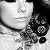
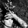
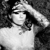
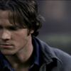
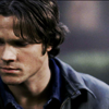
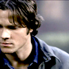
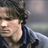
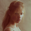
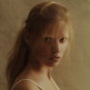
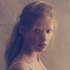
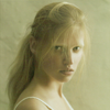
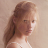
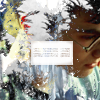
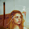
big picture->
Five possible cropping out of gazillion:

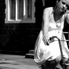
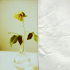
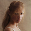
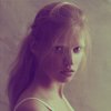
The other important thing when chosing a picture is: Less is more. It means never choose those photos which are overcolored, you won't have much things to do with it. You should opt for pictures with subtle, natural colors rather than vivid ones in order to have easier task when it comes to changing the colors.
There's a difference between what you can do with
this
and f.e. this
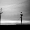
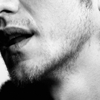
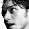
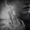
Last, but not least: don't be afraid of b&w photos. There's a lot of things you can do with them. Sometimes it's just a cropping that makes a b&w icon pretty:

-->
In other cases you have to adjust contrast of the photo (new adjustment layer->brightness/contrast, or just copy the base and set the copied layer to soft light)

-->
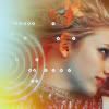
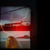
Some effects like text or texture make the icon unique so don't be afraid to add them:
colorfull texture set to lighten (search for textures that are rather dark with just some lighter elements so that it only covers a part of an icon like in the example)

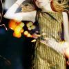
i've just added some simple text
the texture is set to normal but I've got rid of the upper part of it with the background eraser tool
b/ cropping
Cropping is something rather personal and it depends on makers' preferences but there are few simple rules. First of all play with it. Go wild and creative, don't make what others do, try focusing on parts of the picture rather than on a whole thing. The most important thing to remember while cropping is the visibility, you have to be sure that the viewers will know what the icon shows. I'm not much of a cropping queen but Let me try and show you what I mean.
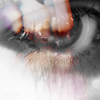
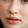
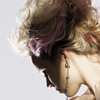
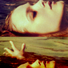
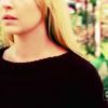
Cropping a person.
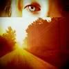
Focus on good features of a person, show what's worth looking at. I for example really like crops with a person turning back so that you can see a neck of a person perfectly. The icons focusing on specific elements like eyes, lips or less ordinary things like ears are far more eye-catching than those showing a person standing straight, pasted in the center of an icon. And remember that you can get tons of different crops from one picture- you like the first crop you made from a photo? great! edit it and than get back to the original picture to crop some more. You can be amazed how many icons better than this first one ,that you thought was perfect, you can make.
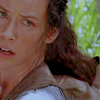
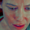
Examples of bad cropping, well according to me:

Examples of good cropping, well maybe not good but better:


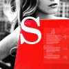
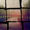
Cropping a stock photo.
That is a completely different matter. First of all before cropping you need to know what you want to do with the icon. If you want to put some text on it than you need a fragment which is 'empty', where's less elements and the text will be visible.
Example:
Like here you have some empty space so the text is perfectly visible:

-->
But here the biggest empty spot is on a person which is bad, because you can't really say what the text says:

-->
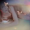
When you feel like posting a texture that will cover half of an icon you have to think of it before cropping as well. So that the texture covers the less significant part of a photo and you can still see what the picture shows
Example: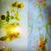
You can as well try cropping an image into two different sizes (however it works better for pictures of people i think) than blend them both into one icon like here:
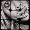
Cropping screencaps.
That's hard work because on most of them characters are cut out in some place, for instance they don't have a top of head:P It narrows the number of possible crops but if you're clever enough you'll be able to even make use of it. Personally I'm not clever, i usually don't waste my time on drawing a top of head so that i can have a person in the lower part of my icon and a nice background in the upper part (like here
).
I usually just make an icon featuring a part of a persons' silhuette or head
Examples:


The other problem with screencaps is that they're often blurred. You than have to cropp them so that's the less visible or just cover big parts of them with texture.

I'm not really sure if it works on all the caps but in my opinion if you show a smaller amount of things like just a part of a face so that there's less colors and things visible in the background it looks less blurred. Know what I mean? I'm not sure I know what I mean.
Btw, If you still find cropping too difficult go to dont_be_so_base or other community where people post bases. There are thousands of good pictures already cropped waiting for you to do sth creative with them. This way you can focus more on practicing other things for example texture and text placing or coloring.
c/ basic information about coloring
So first the obvious stuff- coloring is something that depends totally on a picture, no coloring tutorial out thereon the internet is perfect because you can't predict if what looks perfect on one picture will look as good on the other. Basically all you need to remember is not to make your coloring too vivid(it will look pixelated) nor too washed out(wievers won't be able to see what the icon shows) and of course you need to find a balance between too light and too dark.
Lightening the picture.
Especially useful for screencaps, but for other pictures that you think are too dark as well. There are several ways to make your icon lighter, which one you chose depends on your preferences and the picture, sometimes you just need to check which one looks best.
Copy your base and set it to screen(do it more than once if it's necessary)
-->
New adjustment layer->Curves. Play with the curves. Personally I never make more than 2, 3 points and I usually stay with changing RGB only, but if you wish to have one particular color more visible than the others or lighter or darker or whatever than try and create points on RED, BLUE & GREEN as well. Anyway creating more than 3 points might be confusing and deffinitely more difficult, in most cases creating a zigzag out of the curves line doesn't work out fine as well.
-->
You might use levels if you prefer. New adjustment layer->Levels. All you need to do is to change the numbers 0, 1.00, 255 . It's mostly changing the last one(255) into a lower one for example if you set this one to 146 your image will be way lighter, you can play with the rest of them as well to set the contrast right. In my example I set numbers to: 20, 1.59, 134.
-->
The other way to make your icon lighter is to use brightness/contrast. My settings are brightness: +60, contrast: +39
-->
Making icon more vivid.
If you feel that your base is too washed out, too light or just not vivid enough just copy the base and set it to soft light(opacity depends on a picture of course). I often make double copy and set the first one to soft light around 80% opacity and the upper one I set to multiply at 30% opacity. This way the icon is a little bit darker and than the coloring is more visible. Also you might want to play with saturation(New adjustment layer->Hue/Saturation/Lightness)
-->
The actual coloring.
You can alter the colors of an image in many ways, I usually end up playing with Selective coloring or Color Balance, but I'm not gonna write here about it. To find actual coloring tutorials by me look here, but I suggest you to do sth smarter and go to the community where more talented people who know more about coloring post their tuts, that's what I often do (icon_tutorial).
Anyway you can change the look of your image by filling it with color as well and here are few examples of it:
-->
Dark purple(#2e004f here but any other will work)set to exclusion
-->
Dark brown set to exlusion (#300000)
-->
Beige set to multiply (#d6d1a7)
-->
Dark blue set to exlusion (#00194c)
-->
If you want more 'romantic' feeling try setting really light colors like pastel pink, yellow, green to soft light (light green here #cafabb)
-->
light pink here (#ffdee3)
-->
Really vivid yellow set to darken (#fdff67)
-->
Dark red set to lighten (#890000)
-->
Light grey set to color burn will make your icon more vivid (#e5e5e5)
There're numerous other examples like that but you'll just have to figure them out on your own 'cause I'm too lazy to help you with it:P
d/ use of texture
The textures you're using depend totally on you. I mostly use the most recently downloaded ones, and a few that I use almost everytime because well, they're perfect:P Anyway if you like textures add them, if don't don't botter, personally I think they make icons more interesting(in most cases) but sometimes if a cropping and coloring is interesting itself the texture might only spoil the result. The kind of texture you'll use is up to you, just be carefull, you don't want your icon to look overloaded with textures, do you?
Adding textures is a rather time-consuming process, but definitely worth the fuss. Here's how my photoshop looks while I'm working, and believe me I really hate opening all of those textures but they change the icon completely.

Light textures.
For a bit of magical feeling you might want to try and put a nice light texture on top of your icon set to screen or lighten.


Stock picture as a texture.
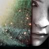
You might want to try and combine your icon with a stock photo, it gives a completely new look. Another way is to use a photo of polaroid or a frame or for example a spider's web looks great set too screen, as well as pictures of a moon.

Grungy textures.
If your icon is just too 'clean' you might put on a grungy texture, in most of the cases I set them to multiply, it will create the effect of dust.
Text textures.
Sometimes you just feel like sth is missing but you don't know what, you try to come up with a text but you can't think of anything, text textures are of great help in such situations.

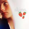
The other good idea in this situation is to put on an icon some matching shape, or a cute little texture, or just a rectangle with tiny text inside, lately I happen to use a lot a texture with little, cute strawberries, tey fit almost everywhere

Texture as your background.
All you need to do is cut out a person and put onto a nice, simple texture(it looks weird on textures with big ornaments and elements on it), you can also simply put a texture on top of your image and erase it with eraser where you don't want it. Here's a great tutorial on working with texture, it's quite time-consuming but the result is great TUTORIAL


Paper textures.
Post a paper texture set to normal on top of your icon, just move it or erase a bit of it so that it doesn't cover the whole thing.
Scribble textures.
The best way to achieve this look is to set a b&w texture to screen, if the cribles are not white just invert the colours on the texture layer.


Romantic feeling.
For a romantic feeling set colorfull but rather light textures to lighten and erese a part of it, it works best with icons of people
Texture as a mask layer.
Use your texture as a layer mask by using its shape, b&w textures with big elements(preferably geometrical) work best. If the element you want to be your shape is black set the texture to screen, this way the rest of the icon will remain white, if the element is white set the texture to multiply, that way the rest of the icon will be black.

Texture as a divider.
You can divide your icon into many little pices to make it look more original
Can't think of anything more right now, for inspiration you should just wander artound lj where a lot of talented people posts their stuff, you can always use some of their ideas, just adjust it to your picture, and the textures you use, don't use the same as them 'cause that's just stealing, and there's nothing creative about that.
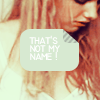
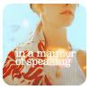
e/ text
I used to have a lot of trouble with this part of graphic making but I've learned to deal with it, so here's my advice: use lyrics, quotes or whatever you've heard. I often just put on some nice music and use on the icons the lyrics, it doesn't matter if it suits or not, it's supposed to look good and not be superinteligent. When I hear sth interesting, a song, a quote from a movie or a tv show I usually just write it down so that I don't forget in the future, it's really useful, and I might reuse it as many times as I want.
Now, about font. When you're making icons you ought to use simple fonts like arial, I use almost only century and arial black, but really any simple font will do. The thing is if you use a fancy decorational font it will be hard to read because the icon is too small for it. Fancy fonts are good for banners, header and really any bigger graphics, just not for icons.
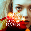
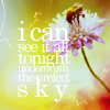
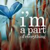
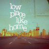
Another thing, personally I think that 3-4 lines of text look way better than just one word, it really depends on an icon, sometimes the simple word is perfect, other times a single letter is just what you need, but most of the times it just looks weird. Try and put on your icon a whole sentence instead of one word, just don't make it too long.
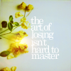
Also, what I think looks best is 3 to 5 lines of text that start, or end in one place, if you know what i mean, they somehow look better, it creates a feeling of a square or a rectangle.
EXAMPLES:
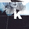
Single letter.
Just one word.
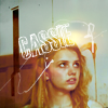


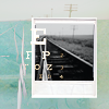
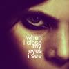
Few lines starting in one place.

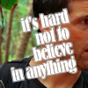
Few lines ending in one place.
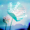
Few lines starting&ending in one place.(my personal favourite)
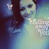
Irregular text.

THE END.
If you don't get sth or just want to know more let me know and I'll gladly answer the questions.
The basic icon tutorial on:
a/ choosing a picture
b/ cropping
c/ basic information about coloring
d/ use of texture
e/ text
a/ choosing a picture
The rule is simple: always use the best quality photos that you're able to find. You don't want your icons to look pixeleted or too sharpened or otherwise, too blurred. Also if you can use big pictures, you'll than have more possibilities to crop it and make it more interesting. If you choose a small photo you'll only have one or two possibilities of cropping. The theme of icons is of course up to the maker. You iconize what you like. But remember that HQ pictures are your friends.
The example to support the thesis:
small picture->

You can only make about 2-3 croppings and they're not really interesting.
If you'd like for example to crop her face it would be too pixelated.
big picture->

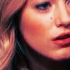
Five possible cropping out of gazillion:
The other important thing when chosing a picture is: Less is more. It means never choose those photos which are overcolored, you won't have much things to do with it. You should opt for pictures with subtle, natural colors rather than vivid ones in order to have easier task when it comes to changing the colors.
There's a difference between what you can do with
this

and f.e. this

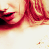
Last, but not least: don't be afraid of b&w photos. There's a lot of things you can do with them. Sometimes it's just a cropping that makes a b&w icon pretty:

-->
In other cases you have to adjust contrast of the photo (new adjustment layer->brightness/contrast, or just copy the base and set the copied layer to soft light)

-->
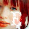
Some effects like text or texture make the icon unique so don't be afraid to add them:
colorfull texture set to lighten (search for textures that are rather dark with just some lighter elements so that it only covers a part of an icon like in the example)
i've just added some simple text
the texture is set to normal but I've got rid of the upper part of it with the background eraser tool
b/ cropping
Cropping is something rather personal and it depends on makers' preferences but there are few simple rules. First of all play with it. Go wild and creative, don't make what others do, try focusing on parts of the picture rather than on a whole thing. The most important thing to remember while cropping is the visibility, you have to be sure that the viewers will know what the icon shows. I'm not much of a cropping queen but Let me try and show you what I mean.
Cropping a person.
Focus on good features of a person, show what's worth looking at. I for example really like crops with a person turning back so that you can see a neck of a person perfectly. The icons focusing on specific elements like eyes, lips or less ordinary things like ears are far more eye-catching than those showing a person standing straight, pasted in the center of an icon. And remember that you can get tons of different crops from one picture- you like the first crop you made from a photo? great! edit it and than get back to the original picture to crop some more. You can be amazed how many icons better than this first one ,that you thought was perfect, you can make.
Examples of bad cropping, well according to me:
Examples of good cropping, well maybe not good but better:
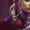
Cropping a stock photo.
That is a completely different matter. First of all before cropping you need to know what you want to do with the icon. If you want to put some text on it than you need a fragment which is 'empty', where's less elements and the text will be visible.
Example:
Like here you have some empty space so the text is perfectly visible:
-->
But here the biggest empty spot is on a person which is bad, because you can't really say what the text says:
-->
When you feel like posting a texture that will cover half of an icon you have to think of it before cropping as well. So that the texture covers the less significant part of a photo and you can still see what the picture shows
Example:
You can as well try cropping an image into two different sizes (however it works better for pictures of people i think) than blend them both into one icon like here:
Cropping screencaps.
That's hard work because on most of them characters are cut out in some place, for instance they don't have a top of head:P It narrows the number of possible crops but if you're clever enough you'll be able to even make use of it. Personally I'm not clever, i usually don't waste my time on drawing a top of head so that i can have a person in the lower part of my icon and a nice background in the upper part (like here
).
I usually just make an icon featuring a part of a persons' silhuette or head
Examples:
The other problem with screencaps is that they're often blurred. You than have to cropp them so that's the less visible or just cover big parts of them with texture.
I'm not really sure if it works on all the caps but in my opinion if you show a smaller amount of things like just a part of a face so that there's less colors and things visible in the background it looks less blurred. Know what I mean? I'm not sure I know what I mean.
Btw, If you still find cropping too difficult go to dont_be_so_base or other community where people post bases. There are thousands of good pictures already cropped waiting for you to do sth creative with them. This way you can focus more on practicing other things for example texture and text placing or coloring.
c/ basic information about coloring
So first the obvious stuff- coloring is something that depends totally on a picture, no coloring tutorial out thereon the internet is perfect because you can't predict if what looks perfect on one picture will look as good on the other. Basically all you need to remember is not to make your coloring too vivid(it will look pixelated) nor too washed out(wievers won't be able to see what the icon shows) and of course you need to find a balance between too light and too dark.
Lightening the picture.
Especially useful for screencaps, but for other pictures that you think are too dark as well. There are several ways to make your icon lighter, which one you chose depends on your preferences and the picture, sometimes you just need to check which one looks best.
Copy your base and set it to screen(do it more than once if it's necessary)
-->
New adjustment layer->Curves. Play with the curves. Personally I never make more than 2, 3 points and I usually stay with changing RGB only, but if you wish to have one particular color more visible than the others or lighter or darker or whatever than try and create points on RED, BLUE & GREEN as well. Anyway creating more than 3 points might be confusing and deffinitely more difficult, in most cases creating a zigzag out of the curves line doesn't work out fine as well.
-->
You might use levels if you prefer. New adjustment layer->Levels. All you need to do is to change the numbers 0, 1.00, 255 . It's mostly changing the last one(255) into a lower one for example if you set this one to 146 your image will be way lighter, you can play with the rest of them as well to set the contrast right. In my example I set numbers to: 20, 1.59, 134.
-->
The other way to make your icon lighter is to use brightness/contrast. My settings are brightness: +60, contrast: +39
-->
Making icon more vivid.
If you feel that your base is too washed out, too light or just not vivid enough just copy the base and set it to soft light(opacity depends on a picture of course). I often make double copy and set the first one to soft light around 80% opacity and the upper one I set to multiply at 30% opacity. This way the icon is a little bit darker and than the coloring is more visible. Also you might want to play with saturation(New adjustment layer->Hue/Saturation/Lightness)
-->
The actual coloring.
You can alter the colors of an image in many ways, I usually end up playing with Selective coloring or Color Balance, but I'm not gonna write here about it. To find actual coloring tutorials by me look here, but I suggest you to do sth smarter and go to the community where more talented people who know more about coloring post their tuts, that's what I often do (icon_tutorial).
Anyway you can change the look of your image by filling it with color as well and here are few examples of it:
-->
Dark purple(#2e004f here but any other will work)set to exclusion
-->
Dark brown set to exlusion (#300000)
-->
Beige set to multiply (#d6d1a7)
-->
Dark blue set to exlusion (#00194c)
-->
If you want more 'romantic' feeling try setting really light colors like pastel pink, yellow, green to soft light (light green here #cafabb)
-->
light pink here (#ffdee3)
-->
Really vivid yellow set to darken (#fdff67)
-->
Dark red set to lighten (#890000)
-->
Light grey set to color burn will make your icon more vivid (#e5e5e5)
There're numerous other examples like that but you'll just have to figure them out on your own 'cause I'm too lazy to help you with it:P
d/ use of texture
The textures you're using depend totally on you. I mostly use the most recently downloaded ones, and a few that I use almost everytime because well, they're perfect:P Anyway if you like textures add them, if don't don't botter, personally I think they make icons more interesting(in most cases) but sometimes if a cropping and coloring is interesting itself the texture might only spoil the result. The kind of texture you'll use is up to you, just be carefull, you don't want your icon to look overloaded with textures, do you?
Adding textures is a rather time-consuming process, but definitely worth the fuss. Here's how my photoshop looks while I'm working, and believe me I really hate opening all of those textures but they change the icon completely.

Light textures.
For a bit of magical feeling you might want to try and put a nice light texture on top of your icon set to screen or lighten.
Stock picture as a texture.
You might want to try and combine your icon with a stock photo, it gives a completely new look. Another way is to use a photo of polaroid or a frame or for example a spider's web looks great set too screen, as well as pictures of a moon.
Grungy textures.
If your icon is just too 'clean' you might put on a grungy texture, in most of the cases I set them to multiply, it will create the effect of dust.
Text textures.
Sometimes you just feel like sth is missing but you don't know what, you try to come up with a text but you can't think of anything, text textures are of great help in such situations.
The other good idea in this situation is to put on an icon some matching shape, or a cute little texture, or just a rectangle with tiny text inside, lately I happen to use a lot a texture with little, cute strawberries, tey fit almost everywhere
Texture as your background.
All you need to do is cut out a person and put onto a nice, simple texture(it looks weird on textures with big ornaments and elements on it), you can also simply put a texture on top of your image and erase it with eraser where you don't want it. Here's a great tutorial on working with texture, it's quite time-consuming but the result is great TUTORIAL
Paper textures.
Post a paper texture set to normal on top of your icon, just move it or erase a bit of it so that it doesn't cover the whole thing.
Scribble textures.
The best way to achieve this look is to set a b&w texture to screen, if the cribles are not white just invert the colours on the texture layer.
Romantic feeling.
For a romantic feeling set colorfull but rather light textures to lighten and erese a part of it, it works best with icons of people
Texture as a mask layer.
Use your texture as a layer mask by using its shape, b&w textures with big elements(preferably geometrical) work best. If the element you want to be your shape is black set the texture to screen, this way the rest of the icon will remain white, if the element is white set the texture to multiply, that way the rest of the icon will be black.
Texture as a divider.
You can divide your icon into many little pices to make it look more original
Can't think of anything more right now, for inspiration you should just wander artound lj where a lot of talented people posts their stuff, you can always use some of their ideas, just adjust it to your picture, and the textures you use, don't use the same as them 'cause that's just stealing, and there's nothing creative about that.
e/ text
I used to have a lot of trouble with this part of graphic making but I've learned to deal with it, so here's my advice: use lyrics, quotes or whatever you've heard. I often just put on some nice music and use on the icons the lyrics, it doesn't matter if it suits or not, it's supposed to look good and not be superinteligent. When I hear sth interesting, a song, a quote from a movie or a tv show I usually just write it down so that I don't forget in the future, it's really useful, and I might reuse it as many times as I want.
Now, about font. When you're making icons you ought to use simple fonts like arial, I use almost only century and arial black, but really any simple font will do. The thing is if you use a fancy decorational font it will be hard to read because the icon is too small for it. Fancy fonts are good for banners, header and really any bigger graphics, just not for icons.
Another thing, personally I think that 3-4 lines of text look way better than just one word, it really depends on an icon, sometimes the simple word is perfect, other times a single letter is just what you need, but most of the times it just looks weird. Try and put on your icon a whole sentence instead of one word, just don't make it too long.
Also, what I think looks best is 3 to 5 lines of text that start, or end in one place, if you know what i mean, they somehow look better, it creates a feeling of a square or a rectangle.
EXAMPLES:
Single letter.
Just one word.
Few lines starting in one place.
Few lines ending in one place.
Few lines starting&ending in one place.(my personal favourite)
Irregular text.
THE END.
If you don't get sth or just want to know more let me know and I'll gladly answer the questions.