Simple Cropping Guide
Okay, I think it's about time I did something like this. I'm not sure if I'm any good at explaining my thought process, but it's worth a shot.
Your base image is the most significant step to your icon, it's what you are building on (thus the term base). What do you look for in a base? Good image quality, interesting subject, possibly nice colors to work with...and CREATIVE CROPPING. (For more on bases, check out my Basemaking Tips and The Difference Between Icons and Bases)
Cropping makes the icon. It's as simple as that.
Even if you have great coloring, beautiful textures, and the perfect text, it all means nothing if your base is cropped poorly.
So how do you crop creatively? How do you crop at all for that matter? Well, that's a hard thing to explain. Every image is different, so you have to adjust to what works for each individual picture. When cropping, you have to look at all four lines of the 100x100 square. Is the nose too close? Is the hairline disappearing? Where are the hands? The legs? The feet? Who/what is in the background? Is the neck too long or too short? There's so many things to consider! It's all about experimentation. I usually try out several different cropping ideas on one image before I pick the best one. All you can really do is know the guidelines and take it from there.
GUIDELINES: (I'll be using SCC for examples, simply because it's a set I'm currently working on, haha).
1. Do not center your image. It's boring, leaves little room for creative text placement, and it's not aesthetically pleasing. Always try to put it off center. Sometimes the best focal points are found in the way the subject works with the negative space (background).
BAD GOOD



>>



2. Do not cut your subjects off at the neck/chin. They look headless and awkward. Try raising the image, it's nice to show a little neck.
BAD GOOD

>>

3. Don't be afraid to take away half of your subject, but do it carefully so that a viewer may still be able to tell who/what it is. Don't just leave a little hair and skin, so no one knows what the hell your icon is of. It still needs a focus, such as the mouth or the eyes. Pay attention to facial alignment. Don't cut away half of the nose. It's all or nothing.
BAD GOOD



>>




4. Watch the hairline. If you cut them off at the top of their head, they look scalped or bald. Either show the top of the head with hair or raise it to just above the eyebrow line (it gives it focus). Just a few nudges up/down will take care of the problem!
BAD GOOD

>>


>>

*****There is also an added difficulty when the subject has his/her head tilted. The hairline issue becomes more pronounced; see how the forehead looks unusually long and floats off the page? Like a funhouse mirror! You have also cut off his neck, making him look stumpy and awkward. A little more maneuvering with this type of image is neccessary until you find the best position.
BAD GOOD

>>


5. Be aware of the other subjects/objects in the picture. You can choose to use them or not, but just be aware of their presence because it does affect the icon. (The "bad" examples below says that you were unaware of the person in the back because you carelessly cut them off.)
BAD GOOD

>>

(using background)

(not using background)

>>

(using background)

(not using background)
6. Have a purpose for your base. Make it mean something, elicit an emotion, have it say something even without text. Don't just slap any old picture on there.
That's pretty much all I can think of for now. I hope it's somewhat helpful. If anyone has any suggestions, perhaps something I missed, please let me know! I might add to this later if I can remember anything more. I make mistakes with cropping just like everyone else (if not more). No one is perfect. It's just about experimentation and utilizing the 100x100 space as best you can. If you have any questions, I'd be happy to answer them to the best of my knowledge! Please make any comments to the original post at my journal.
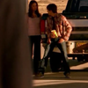
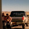
Here are some more SCC bases that use the guidelines effectively:
BAD GOOD

>>

>>

>>


>>


>>


>>



>>



>>

REMEMBER!
Any comments, please make them at the original post!
Oh! And be sure to check out
dont_be_so_base for all your base needs!