Tutorial #4 [Yoshiko Endo]
I've made another icon I'm proud of and decided to put together a tutorial for it. I hope it's of some use to you. :)
Turn this:
into this:
Made with PSCS -- not translatable to other programs since it involves Selective Coloring [sorry if you don't like that :P]
Level of difficulty, I think is around medium -- you need to have a basic knowledge of PS and the way it works because I'm not going to explain how to get to these things -- if you want to know, ask, but yeah, I won't explain it in the tutorial.
\^___^/ Here we go!
1. Starting off with our base image, let's crop it down to 100x100. Don't do anything to the image.

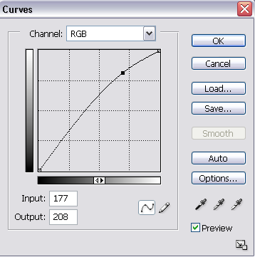
2. Next, make a new Curves Adjustments Layer and use the following settings:

Result:
3. Our image is really yellow (if yours isn't, either skip this step or play with the settings on Color Balance), so let's make a new Color Balance Adjustment Layer and use the following settings:
Midtones: -57 0 +52
Shadows: +10 0 +11
Highlights: +5 0 -10
Result:
4. Our icon looks better now, ne ^^ It's a little dark, but nothing a little Selective Coloring won't fix! ^^ Make a new Selective Color Adjustment Layer and use the following settings [Note: play around with the numbers since every picture will create a different effect!]:
Reds:
-38
0
+44
-14
Yellows:
-51
0
+19
-32
Whites:
0
0
0
-34
Neutrals:
-12
0
-24
-10
Result:
Almost done!
5. Make another Selective Color layer and use the following settings:
Reds:
-17
0
+16
+9
Yellows:
-17
0
-17
-27
Neutrals:
-14
0
-18
-15
And your finished result:
I hope it's of some help to some of you =\ Let me know if you like it :3
Posted in my community as well:
starfruit_icons
Turn this:

into this:

Made with PSCS -- not translatable to other programs since it involves Selective Coloring [sorry if you don't like that :P]
Level of difficulty, I think is around medium -- you need to have a basic knowledge of PS and the way it works because I'm not going to explain how to get to these things -- if you want to know, ask, but yeah, I won't explain it in the tutorial.
\^___^/ Here we go!
1. Starting off with our base image, let's crop it down to 100x100. Don't do anything to the image.

2. Next, make a new Curves Adjustments Layer and use the following settings:

Result:

3. Our image is really yellow (if yours isn't, either skip this step or play with the settings on Color Balance), so let's make a new Color Balance Adjustment Layer and use the following settings:
Midtones: -57 0 +52
Shadows: +10 0 +11
Highlights: +5 0 -10
Result:

4. Our icon looks better now, ne ^^ It's a little dark, but nothing a little Selective Coloring won't fix! ^^ Make a new Selective Color Adjustment Layer and use the following settings [Note: play around with the numbers since every picture will create a different effect!]:
Reds:
-38
0
+44
-14
Yellows:
-51
0
+19
-32
Whites:
0
0
0
-34
Neutrals:
-12
0
-24
-10
Result:

Almost done!
5. Make another Selective Color layer and use the following settings:
Reds:
-17
0
+16
+9
Yellows:
-17
0
-17
-27
Neutrals:
-14
0
-18
-15
And your finished result:

I hope it's of some help to some of you =\ Let me know if you like it :3
Posted in my community as well:
starfruit_icons