Coloring Tut PSP7
Program: Good ol' PSP7
Difficulty: It's easy. NO Color Balance.
From:

To:
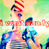
Another outcome, same tut:
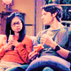
Hello again!
...and so it begins.
My base:

This base is bright enough, so we'll just add one Screen layer, opacity 100.
On my other examples 2 Screen layers were needed since they were considerably darker. [This will depend on your base and your taste. :)]
Now we'll add 4 color layers:

-#83BFF7: Set at Soft Light, opacity 100.

-#52A9B6: Set at Overlay, opacity 46.

-#839CF7: Set at Burn, opacity 100. [This layer can totally overwhelm an image. But stay with the opacity at 100 until you finish all the steps. After they're finished, you can readjust the opacity as it works best. :)]

-#FE9732: Set at Multiply, opacity 32.
Now we'll add the Hue/Saturation/Lightness layer.
Leave Hue and Lightness blank. For Saturation, we'll need a 20.
After you make the Saturation layer, duplicate it.
First Saturation layer: Set at Burn, opacity 40.
Second Saturation layer: Set at Color, opacity 100.
After that, duplicate your base, drag it to the top at set it Screen, opacity 32. Or you can just merge the image like you're done, duplicate it, then set it to Screen. :) Same thing. [This Screen layer can vary. For example, the Lane/Dean icon needed the opacity set at 52 instead of 32. Play around with it.]
With that, you're done with the coloring. :D
Results with different bases: [I like adding the base so you can get an idea on which kind of image this tut will work.]

-
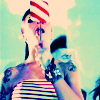
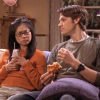
-

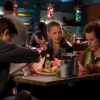
-
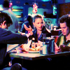
To get to this icon ->
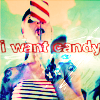
we'll add some text.
I used the Soopafresh font, size 12. To make it hollow, I just left the left "Fill" empty, using only "Stroke." After you add the text, leave it selected so the next step will take. :) [The next step is totally optional, though. If you're not using PSP7, you can do what you always do to make your text stand out on a busy icon.]
We'll go to browser and choose "Effects," then all way in the bottom we'll choose "Drop Shadow" from the "Plug-in Filters." Once there, from the drop down list, select "Slight Grey Outline," just change the grey to white in the color section. Now that the text is highlighted, we'll need this light texture ->
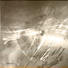
Overlay, opacity 100.
And just because we love color, we'll add yet another Saturation layer (20 again) set this Sat layer at Color, opacity 100. Heh. :)
Finished result:

And that's it. Fin del camino.