Fourth Tutorial: Brightening a Dark Icon (feat. Denzel from AC)
Another tutorial coming at you! We're going to turn this cap into this 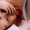
today.
* uses Selective Coloring and Color Balance layers.
* not translatable!
* done using Adobe Photoshop CS2
Hey guys! So I'm back again, with another tutorial, this time, my fourth one! I've always found the colors in Advent Children a litte too dark, so I messed around a little and I got this as a result! ^^;; I hope you guys enjoy it, and I hope it'll help with any dark cap you've got that you wanna brighten up.
1.) First things first, grab your base. The base I used is Denzel from the movie Final Fantasy VII: Advent Children and prep it up a little. Use Auto Levels and Auto Contrast and we're all set to go! (Do not sharpen unless completely necessary! I didn't sharpen, though.)
2.) Next off, we duplicate the base and set the blending mode to Screen at full opacity. This is so the icon is nice and bright. ^^;; (Mess with the opacities.)
3.) Afterwards, we duplicate the base again and drag this to the top, putting the blending mode on Soft Light at full opacity. This enhances the darkness and the shadows of the icon, giving it a nice mysterious effect. ^^
4.) Now, we move on to floodfill layers. We use this to add some pizzaz to the icon and give later steps a base to work on. We can't work with nothing now, can we? (XD) So, make a new layer and floodfill with #A49C78, setting this layer to Multiply at 33%.

5.) Make another layer and floodfill this with #75715D putting the blending mode to Darken at 30%. These two brown layers will compensate for the lack of skin color Denzel has right now and will have a lot of effect in the final product. ^^;;

6.) One more layer and floodfill this with #FB9DED putting the blending option to Soft Light at full opacity. Don't fear the pinkness, because this helps in the developing balance on the other layers we're going to add. ^^;;

7.) Now we're getting somewhere! Duplicate your base, drag it to the top and set it to Screen at 45% opacity. It'll brighten up any dark spots and, basically the whole icon, just enough to suit the lighting. (Mess with the opacities, again, to suit your icon.)
8.) Okay, so here we put some color in the icon. If you use just floodfill layers on the icon, it'll be hard for you to obtain a certain kind of coloring without having to lose the other aspects of the icon's colors. This is what our Adjustment Layers are for! (Whee. Fun! XD) See the little yin-yang symbol on the bottom of the Layers palette, next to the new layers button? That's our Adjustment Layers button. Click it and choose Selective Coloring. Put the settings to this:
RED:
C= -100
Y= 100
CYAN:
C= 100
M= -100
Y= 100
B= -100
NEUTRALS:
C= 20
M= -15
Y= -15
B= 3
And leave the layer on Normal at full opacity. (Note that not all icons agree with these settings. Try and mess with the settings to suit the icons' needs. XD)
9.) We make another Adjustment Layer and we once again choose Selective Coloring, this time, changing the settings to this:
RED:
C= -100
Y= 100
YELLOWS:
C= 45
M= 16
Y= -50
B= 11
NEUTRALS:
C= 11
M= -1
Y= 9
B= -3
And we leave this layer on Normal at full opacity as well.
11.) Okay, last Adjustment Layer! Promise! XD Click it again and this time, choose Color Balance and put the settings to this:
MIDTONES:
0, 0, 25
HIGHLIGHTS:
-12, -4, 14
SHADOWS:
12, 0, 0
Again, the layer should be on Normal at full opacity. Starting to look way better than the original picture right? X3 Remember to mess with the settings to suit your icon!
12.) When I was working with this, I realized it's a little too much with the skin and the colors, so we mellow it down a little with an exclusion layer. An exclusion layer is most suitable for the mellow parts of the icon and gives it a nice antique effect. For this icon, it balances out everything, so it's not too razzle dazzle. Make a new layer and floodfill this with #070622. Set this to Difference at 50%. I know, it's not really using the exclusion blending option but it sounds better when I say that, and plus, it has similar effects. ^^;;

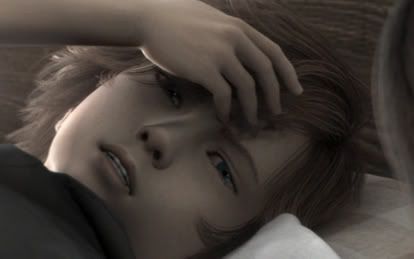
Flatten your image and add brushes, texts and borders to your choosing and you're done! I decided to leave this one textless for one of my icon batches at squaresoft_icon though. This is my final product:
Like it? Hate it (hopefully not XD)? Comment me and tell me what you think! ^^V Try it out sometime and show me your final product too! Remember to mess with the opacities and settings and note that not all icons agree with this tutorial. It all really depends on your icon. Experiment and you'll be surprised on what you'll come up with! ^^ You can use the final product of this tutorial with credit. :D
^^V
today.
* uses Selective Coloring and Color Balance layers.
* not translatable!
* done using Adobe Photoshop CS2
Hey guys! So I'm back again, with another tutorial, this time, my fourth one! I've always found the colors in Advent Children a litte too dark, so I messed around a little and I got this as a result! ^^;; I hope you guys enjoy it, and I hope it'll help with any dark cap you've got that you wanna brighten up.
1.) First things first, grab your base. The base I used is Denzel from the movie Final Fantasy VII: Advent Children and prep it up a little. Use Auto Levels and Auto Contrast and we're all set to go! (Do not sharpen unless completely necessary! I didn't sharpen, though.)
2.) Next off, we duplicate the base and set the blending mode to Screen at full opacity. This is so the icon is nice and bright. ^^;; (Mess with the opacities.)
3.) Afterwards, we duplicate the base again and drag this to the top, putting the blending mode on Soft Light at full opacity. This enhances the darkness and the shadows of the icon, giving it a nice mysterious effect. ^^
4.) Now, we move on to floodfill layers. We use this to add some pizzaz to the icon and give later steps a base to work on. We can't work with nothing now, can we? (XD) So, make a new layer and floodfill with #A49C78, setting this layer to Multiply at 33%.
5.) Make another layer and floodfill this with #75715D putting the blending mode to Darken at 30%. These two brown layers will compensate for the lack of skin color Denzel has right now and will have a lot of effect in the final product. ^^;;
6.) One more layer and floodfill this with #FB9DED putting the blending option to Soft Light at full opacity. Don't fear the pinkness, because this helps in the developing balance on the other layers we're going to add. ^^;;
7.) Now we're getting somewhere! Duplicate your base, drag it to the top and set it to Screen at 45% opacity. It'll brighten up any dark spots and, basically the whole icon, just enough to suit the lighting. (Mess with the opacities, again, to suit your icon.)
8.) Okay, so here we put some color in the icon. If you use just floodfill layers on the icon, it'll be hard for you to obtain a certain kind of coloring without having to lose the other aspects of the icon's colors. This is what our Adjustment Layers are for! (Whee. Fun! XD) See the little yin-yang symbol on the bottom of the Layers palette, next to the new layers button? That's our Adjustment Layers button. Click it and choose Selective Coloring. Put the settings to this:
RED:
C= -100
Y= 100
CYAN:
C= 100
M= -100
Y= 100
B= -100
NEUTRALS:
C= 20
M= -15
Y= -15
B= 3
And leave the layer on Normal at full opacity. (Note that not all icons agree with these settings. Try and mess with the settings to suit the icons' needs. XD)
9.) We make another Adjustment Layer and we once again choose Selective Coloring, this time, changing the settings to this:
RED:
C= -100
Y= 100
YELLOWS:
C= 45
M= 16
Y= -50
B= 11
NEUTRALS:
C= 11
M= -1
Y= 9
B= -3
And we leave this layer on Normal at full opacity as well.
11.) Okay, last Adjustment Layer! Promise! XD Click it again and this time, choose Color Balance and put the settings to this:
MIDTONES:
0, 0, 25
HIGHLIGHTS:
-12, -4, 14
SHADOWS:
12, 0, 0
Again, the layer should be on Normal at full opacity. Starting to look way better than the original picture right? X3 Remember to mess with the settings to suit your icon!
12.) When I was working with this, I realized it's a little too much with the skin and the colors, so we mellow it down a little with an exclusion layer. An exclusion layer is most suitable for the mellow parts of the icon and gives it a nice antique effect. For this icon, it balances out everything, so it's not too razzle dazzle. Make a new layer and floodfill this with #070622. Set this to Difference at 50%. I know, it's not really using the exclusion blending option but it sounds better when I say that, and plus, it has similar effects. ^^;;
Flatten your image and add brushes, texts and borders to your choosing and you're done! I decided to leave this one textless for one of my icon batches at squaresoft_icon though. This is my final product:
Like it? Hate it (hopefully not XD)? Comment me and tell me what you think! ^^V Try it out sometime and show me your final product too! Remember to mess with the opacities and settings and note that not all icons agree with this tutorial. It all really depends on your icon. Experiment and you'll be surprised on what you'll come up with! ^^ You can use the final product of this tutorial with credit. :D
^^V