Second Tutorial: Tinkering with Tifa!
**Second Tutorial!
**Done in Adobe Photoshop CS2; translatable!
**Involves Color Balance!
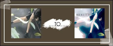
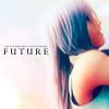
Hey guys! This is my second tutorial and today we're going to turn this:
into this
or without the text, this:
Be easy on me ^^;;
Note that not all icons may agree with this tutorial! Feel free to tinker with the opacities!
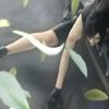
1.) First step is always the easiest isn't it? Crop your base to 100 x 100 or whatever size you need or want. Do all the necessary things you need to prep up your base but do not sharpen! In my case, I used a screencap of Tifa Lockheart from Final Fantasy VII: Advent Children I found at AdventChildren.net and cropped it to 100 x 100!
2.) Duplicate the base twice. The first one should be on Screen at 77% and the second one on Overlay at 100%.
3.) Create a new layer and floodfill with 1C192C and set it to Exclusion.
4.) Create a new layer and floodfill with 9AEAF6 and set this layer to Colorburn.
5.) Create another layer and floodfill with F34E0D. Set this color layer to Soft Light.
6.) Duplicate your base again and drag it to the top. Desaturate and afterwards, go to Filter >> Blur >> Gaussian Blur and set the radius to 3.5. Put this on Screen at 50%.
7.) Duplicate that last layer and drag it to the top. Set it on Overlay instead of Screen at 100%.
8.) This step is important! Create a new layer between the orange soft light layer and the Screen desaturated/gaussian blur base layer and floodfill with A7F7F0, setting this to Soft Light at 43%.
9.) Go to Image >> Adjustments >> Color Balance (or just click the little yin yang symbol at the bottom of the Layers palette and choose Color Balance). Put the settings like this:
MIDTONES:
-21, -9, 7
SHADOWS:
-22, -12, 20
HIGHLIGHTS:
-13, -7, 13
10.) You can stop at this point if you're okay with the results but I decided to do some more touching up. Next step, go to Image >> Adjustments >> Hue/Saturation and set the saturation at 20. It gives the icon that extra glow. (Well, at least it did to me XD)
11.) Last layer promise! Create a new layer and floodfill with white and set this to Soft Light at 30%. (This part can be edited if you're icon is too bright already)
12.) Lastly, to touch it up, get this texture by joyfulsong:
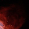
and slap it on between the light blue color burn layer and the orange layer setting it on Color Dodge. Play with the opacities on this one!
And thats it! You're finished! Flatten your image and add texts and brushes as you please! More textures? Go crazy!
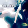
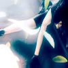
This is my final result without the text:
and with text:
[The font is Perpetua, the 'reality' at 18 px and the small text at 2 px. It's mostly just gibberish]
OTHER ICONS USING THIS TECHNIQUE:

to


to
Comments are very appriciated! Lemme see the icons you guys made with this tutorial! ^___^V Enjoy! :D