First Tutorial! Coloring with Cloud!
**first tutorial! involves selective coloring; not translatable
**using Adobe Photoshop CS2
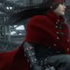
Hello everyone! Today we're turning this
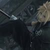
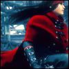
into this
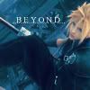
or without the text, this
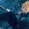
!
Be nice on me, this is my first ever tutorial! ^^;;
1.) Well first things first, grab your base and touch it up as much as you want but what ever you do, do not sharpen! In my case, my base is Cloud from Final Fantasy VII: Advent Children I got from AdventChildren.net.
2.) Duplicate your base thrice. Put the first duplicate on Screen at 80% opacity. The second duplicate should also be on Screen but make its opacity 11% and as for the last one, it should be on Soft Light at 66%.
3.) Create a new layer and floodfill it with 151332 and set it on Exclusion at 74%.
4.) Create another layer and floodfill with D969D5 at Soft Light. (Do not fear the pinkness XD)
5.) Create one more layer and floodfill with A5F8F1 at Colorburn.
6.) Okay last color layer! Create another layer and floodfill with E2D653 and set this to Soft Light.
7.) Now the fun part begins! You can stop here if you want but as for me, I went on and experimented and got this. See the little yin-yang symbol below the Layers palette next to the New Layer button? Click it and choose Selective Coloring. Put the settings on this:
REDS:
C= -100
Y= 100
YELLOWS:
C= -40
M= 52
Y= 12
B= 32
NEUTRALS:
C= 23
M= 9
Y= -13
B= 0
Also at this point, you can stop already but this is still unsatisfactory for me so...XD Yeah.
8.) Click the yin yang symbol again and this time, choose Hue/Saturation and set it at these settings ONLY for the saturation bar.
MASTER:
S= 20
RED:
S=-13
YELLOW:
S=26
CYAN:
S=14
BLUES:
S=-31
MAGENTA:
S=9
9.) We're almost done! Click the yin yang symbol again and choose Brightness/Contrast. Put the brightness at -6 and the contrast at 20.
10.) Phew! Almost done! Last, duplicate your base and drag it to the top and set it on Soft Light at 55%. Duplicate this layer and click Filter >> Blur >> Gaussian Blur, setting the radius to 3.00. Put this on Screen at 44% and you're done! Flatten your image and add brushes and texts.
This is what I got:
And with text:
(If you're wondering what the font is, its Times New Roman MS at 18 px.)
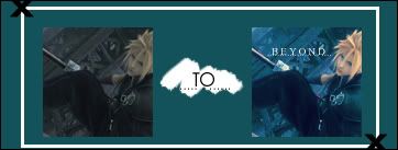
OTHER ICONS USING THIS TECHNIQUE:
to

to

I'd really like to know how your icons turned out! Comments are very much appriciated! Note that not all pictures may agree with this tutorial so don't start wondering why your icon turned out different then what I got. ^^ It all really depends on the picture you're using! Enjoy! :)