Slideshow icons
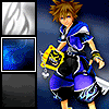
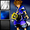
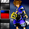
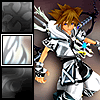
Today, we'll be making this icon:
Look like fun?
All you need for this is the ability to use layers and animation. I'm using Photoshop Elements 2.0 for the actual graphics editing (so you don't need anything terribly advanced) and the free demo of Gif Construction Set Professional to set the time of each frame separately. This tutorial assumes you are familiar enough with your program(s) to use these functions.
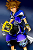
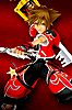
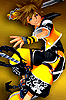
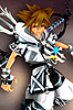
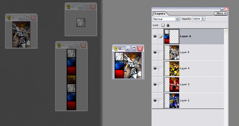
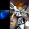
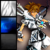
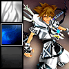
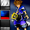
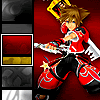
First, you'll want to pick the large pictures that appear on the right side. From this point on, I'll call them the base pics. I've found that for photographs and pictures that use a lot of colors, you generally don't want more than four. Any more than that, and you'll have to sacrifice too much picture quality for it to fit the LJ icon standard. For pictures that use fewer colors like cartoons or comics, you can use more. Alternately, if you want to apply a color filter or use black and white pictures like sketches, you'll use less memory and can use more pictures that way as well. The base pics need to measure 66 by 100 pixels. The base pics I've chosen are Sora's four power-up forms from Kingdom Hearts II.
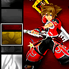
Second, we choose the teeny pictures that scroll up the left side, known as the thumbnail pics from this point on. You'll want as many of those as you have base pics. I like to choose one aspect that each picture contains but is different in each picture, which sounds weird, but I can't think of a better way to phrase it. So I'll give an example: in photos, I like to use eyes, because I like eyes, and nearly everyone has a couple of them, and even people who don't have a patch or scar or something equally cool in their place.
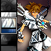
Example: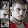
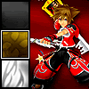
Note how each thumbnail serves as a sort of identifier for the base pic it represents. It shows enough of the picture to make it different from the other thumbnails without giving too much of the picture away.
Anyway, back to the task at hand. Thumbnail pics should be 30 by 30 pixels. That's another reason not to try to put too much picture in them; there's not a lot of room. Each of Sora's outfits has different pattern on the sleeve and leg, and I'll be using a sample of each of those as the thumbnail pics.


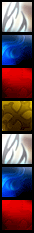
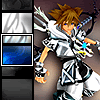
Third, we'll make the scrolling bar. Decide how many pictures you want to show at any point in time. I'm very fond of the number three because it's just a nice number. One in the middle and one on either side. I like it. Plus, I've already worked out the math for it. If you want more or fewer than three thumbnail pics showing, you'll have to figure out the dimensions and movement on your own. If you want three, you can use this handy template. ("Thank you, Lia." "Why, you're very welcome, class.")

I have my order already laid out in my head because I'm anal that way. I want blue, then red, then yellow, then white because that's the way they go in the game. You can do whatever order you want. Just remember that whatever base pic comes last is the thumbnail pic that comes first.

Then all the thumbnail pics in whatever order you want the base pics to appear, including the last one.
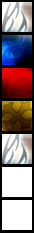
Then the thumbnail pics that go with the first two base pics again. That should fill up your bar.
Flatten that layer. You won't be editing it any more.
Fourth, it's time to put them together. See how we're moving right along? Open a new image that's 100 by 100 pixels. Make each of your base pics a layer. They should be sitting on the far right. Then your scrolling bar should be a layer on top of them. The top left corner of your bar should meet with the top left corner of the new image.
Now, we get to the part that's completely optional, but I think it adds a really nice touch.
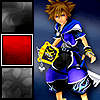
Fifth, we want to desaturate the top and bottom thirds of the scrollbar. That's the nifty part where only the middle is in color. The easiest way to do this is make a new layer at the far left on top of the bar with just this:

It should look like this:
Now, change the layer visibility from "Normal" to "Saturation". It should look like this:
I don't know if this works on all programs. I figure it probably does on most. If it doesn't on yours, I'm sorry.
Sixth, we want to further set apart that middle third of the bar. I just add this as a new layer, left center:

It's effective in setting apart that middle section and simple to conserve space. So now you have this:
Back to the required part for this particular icon.
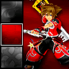
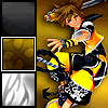
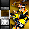
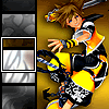
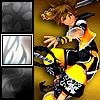
Seventh, it's time to start animating. The base pic you want is the one that goes with that middle thumbnail pic, so make all the other base pic layers invisible. Flatten the image and copy it to a new image. This will be the first frame of your icon.
Now, go back and undo the "Flatten Image". Click on the layer with the scroll bar and move it up 11 pixels. Flatten it and copy the layer to the image where you copied the previous one. This will be the second frame of your icon.
Do this twice more. You should now have a layer where a complete thumbnail pic is in the center square instead of part of one and part of another. For your next frame, instead of moving the bar up again, find the base pic that goes with the thumbnail pic that's now in the center and make it a visible layer. Flatten the image and copy it over. That should be the fifth frame of the icon.
-->
I do it this way so that there's a tiny pause between the time that the thumbnail pic gets to the center and the time the base pic pops up. It gives it a cause-and-effect feeling -- like because the thumbnail pic is in the center, that base pic will come up. I think it makes it transitional, a little smoother.
Anyway, continue like this until you get to the end of the bar. You should have a frame that looks exactly like your first one, which is where the perfect loop comes in. You don't need any repeats. That's how you know when to stop. You should have 16 frames total.
Ninth (and finally), save it, and be sure to check "Animate" and "Loop". Adjust the number of colors used until it's less than 40kb total (or whatever the rules are for where you plan to use it). The frames should be timed like this (in 100ths of a second):
-- 150
-- 10
-- 10
-- 10
-- 150
-- 10
-- 10
-- 10
-- 150
-- 10
-- 10
-- 10
-- 150
-- 10
-- 10

-- 10
Variations:
If you don't want the bar going up the side, you can have it along the top or bottom moving 11 pixels to the left instead like this:
If you only have three pics, you can move the thumbnail pic border and saturation layers and leave the bar still to get this effect:
If you only want to use one base pic, you can fit more thumbnail pics, like this:
You can also apply various effects to the the bar like a filmstrip:
Edit: I thought I'd add this example as well. If you mess with the dimensions of the pictures, you can play with transparency. In this one, the scrolling bar is the same size, but the base pics are 100 pixels by 49 pixels. You can also put an effect on the thumbnail pic border. Here I applied one of the chrome layer effects from Photoshop Elements. Keep in mind, though, that space is an issue. It's difficult to find effects that work because the border isn't that wide.

Just so everyone knows, this is my first tutorial. I did it because I posted a bunch of Harry Potter, X-Men and Narnia-related ones at my icon journal iconnaissance and people kept asking about them. I got a bunch of requests and then I got busy and thus very bad at filling them. I tried to make it easy, so I'm sorry if I failed and it's all WTF? or if I overachieved and it came off as condescending. Feedback and credit are always appreciated. Also, I'd love to see what you guys used this for if you'd like to comment with a link to what you made. Thanks!
Look like fun?
All you need for this is the ability to use layers and animation. I'm using Photoshop Elements 2.0 for the actual graphics editing (so you don't need anything terribly advanced) and the free demo of Gif Construction Set Professional to set the time of each frame separately. This tutorial assumes you are familiar enough with your program(s) to use these functions.
First, you'll want to pick the large pictures that appear on the right side. From this point on, I'll call them the base pics. I've found that for photographs and pictures that use a lot of colors, you generally don't want more than four. Any more than that, and you'll have to sacrifice too much picture quality for it to fit the LJ icon standard. For pictures that use fewer colors like cartoons or comics, you can use more. Alternately, if you want to apply a color filter or use black and white pictures like sketches, you'll use less memory and can use more pictures that way as well. The base pics need to measure 66 by 100 pixels. The base pics I've chosen are Sora's four power-up forms from Kingdom Hearts II.
Second, we choose the teeny pictures that scroll up the left side, known as the thumbnail pics from this point on. You'll want as many of those as you have base pics. I like to choose one aspect that each picture contains but is different in each picture, which sounds weird, but I can't think of a better way to phrase it. So I'll give an example: in photos, I like to use eyes, because I like eyes, and nearly everyone has a couple of them, and even people who don't have a patch or scar or something equally cool in their place.
Example:
Note how each thumbnail serves as a sort of identifier for the base pic it represents. It shows enough of the picture to make it different from the other thumbnails without giving too much of the picture away.
Anyway, back to the task at hand. Thumbnail pics should be 30 by 30 pixels. That's another reason not to try to put too much picture in them; there's not a lot of room. Each of Sora's outfits has different pattern on the sleeve and leg, and I'll be using a sample of each of those as the thumbnail pics.
Third, we'll make the scrolling bar. Decide how many pictures you want to show at any point in time. I'm very fond of the number three because it's just a nice number. One in the middle and one on either side. I like it. Plus, I've already worked out the math for it. If you want more or fewer than three thumbnail pics showing, you'll have to figure out the dimensions and movement on your own. If you want three, you can use this handy template. ("Thank you, Lia." "Why, you're very welcome, class.")
I have my order already laid out in my head because I'm anal that way. I want blue, then red, then yellow, then white because that's the way they go in the game. You can do whatever order you want. Just remember that whatever base pic comes last is the thumbnail pic that comes first.
Then all the thumbnail pics in whatever order you want the base pics to appear, including the last one.
Then the thumbnail pics that go with the first two base pics again. That should fill up your bar.
Flatten that layer. You won't be editing it any more.
Fourth, it's time to put them together. See how we're moving right along? Open a new image that's 100 by 100 pixels. Make each of your base pics a layer. They should be sitting on the far right. Then your scrolling bar should be a layer on top of them. The top left corner of your bar should meet with the top left corner of the new image.
Now, we get to the part that's completely optional, but I think it adds a really nice touch.
Fifth, we want to desaturate the top and bottom thirds of the scrollbar. That's the nifty part where only the middle is in color. The easiest way to do this is make a new layer at the far left on top of the bar with just this:
It should look like this:
Now, change the layer visibility from "Normal" to "Saturation". It should look like this:
I don't know if this works on all programs. I figure it probably does on most. If it doesn't on yours, I'm sorry.
Sixth, we want to further set apart that middle third of the bar. I just add this as a new layer, left center:
It's effective in setting apart that middle section and simple to conserve space. So now you have this:
Back to the required part for this particular icon.
Seventh, it's time to start animating. The base pic you want is the one that goes with that middle thumbnail pic, so make all the other base pic layers invisible. Flatten the image and copy it to a new image. This will be the first frame of your icon.
Now, go back and undo the "Flatten Image". Click on the layer with the scroll bar and move it up 11 pixels. Flatten it and copy the layer to the image where you copied the previous one. This will be the second frame of your icon.
Do this twice more. You should now have a layer where a complete thumbnail pic is in the center square instead of part of one and part of another. For your next frame, instead of moving the bar up again, find the base pic that goes with the thumbnail pic that's now in the center and make it a visible layer. Flatten the image and copy it over. That should be the fifth frame of the icon.
-->
I do it this way so that there's a tiny pause between the time that the thumbnail pic gets to the center and the time the base pic pops up. It gives it a cause-and-effect feeling -- like because the thumbnail pic is in the center, that base pic will come up. I think it makes it transitional, a little smoother.
Anyway, continue like this until you get to the end of the bar. You should have a frame that looks exactly like your first one, which is where the perfect loop comes in. You don't need any repeats. That's how you know when to stop. You should have 16 frames total.
Ninth (and finally), save it, and be sure to check "Animate" and "Loop". Adjust the number of colors used until it's less than 40kb total (or whatever the rules are for where you plan to use it). The frames should be timed like this (in 100ths of a second):
-- 150
-- 10
-- 10
-- 10
-- 150
-- 10
-- 10
-- 10
-- 150
-- 10
-- 10
-- 10
-- 150
-- 10
-- 10
-- 10
Variations:
If you don't want the bar going up the side, you can have it along the top or bottom moving 11 pixels to the left instead like this:
If you only have three pics, you can move the thumbnail pic border and saturation layers and leave the bar still to get this effect:
If you only want to use one base pic, you can fit more thumbnail pics, like this:
You can also apply various effects to the the bar like a filmstrip:
Edit: I thought I'd add this example as well. If you mess with the dimensions of the pictures, you can play with transparency. In this one, the scrolling bar is the same size, but the base pics are 100 pixels by 49 pixels. You can also put an effect on the thumbnail pic border. Here I applied one of the chrome layer effects from Photoshop Elements. Keep in mind, though, that space is an issue. It's difficult to find effects that work because the border isn't that wide.
Just so everyone knows, this is my first tutorial. I did it because I posted a bunch of Harry Potter, X-Men and Narnia-related ones at my icon journal iconnaissance and people kept asking about them. I got a bunch of requests and then I got busy and thus very bad at filling them. I tried to make it easy, so I'm sorry if I failed and it's all WTF? or if I overachieved and it came off as condescending. Feedback and credit are always appreciated. Also, I'd love to see what you guys used this for if you'd like to comment with a link to what you made. Thanks!