Coloring Tutorial
This will show you to go from:

to
in PS7.
Difficulty: Easy/Intermediate
1. Start out by cropping your base to 100x100 (or whatever size you want your image to be.
2. Duplicate layer, set to screen 100%
3. Create new Layer--> New Adjustment Layer--> Hue Saturation. Set the Saturation to anywhere from 20-40% (depends on your icon, if it's extremely bright and looks ugly, decrease it a bit).
4. Create new Layer-->New Adjustment Later-->Selective Color.
Reds:
-100
0
+100
0
Yellows:
+100
0
-100
0
Neutrals
(this will vary depending on what you want your icon to look like)
+50 to +100 (again this will depend on your icon)
0
-30- to -100 (however blue you want it to be)
0
5. Create new fill layer #DEDEDE, set it to color burn 100%. Depending on your icon, you can duplicate this layer it you want it to be darker.
6. If by some chance your icon looks darker than you'd like it (and it might depending on the picture quality), duplicate your base layer again and set it to screen (i.e if you use this you will have three "base layers total"). That should help lighten the image if it is too dark.
And that's it! :)
Other icons made using this tutorial:
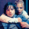
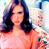
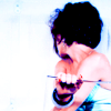
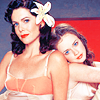
I hope this tutorial helps! I'd love to see what results you get with it!

to

in PS7.
Difficulty: Easy/Intermediate
1. Start out by cropping your base to 100x100 (or whatever size you want your image to be.
2. Duplicate layer, set to screen 100%
3. Create new Layer--> New Adjustment Layer--> Hue Saturation. Set the Saturation to anywhere from 20-40% (depends on your icon, if it's extremely bright and looks ugly, decrease it a bit).
4. Create new Layer-->New Adjustment Later-->Selective Color.
Reds:
-100
0
+100
0
Yellows:
+100
0
-100
0
Neutrals
(this will vary depending on what you want your icon to look like)
+50 to +100 (again this will depend on your icon)
0
-30- to -100 (however blue you want it to be)
0
5. Create new fill layer #DEDEDE, set it to color burn 100%. Depending on your icon, you can duplicate this layer it you want it to be darker.
6. If by some chance your icon looks darker than you'd like it (and it might depending on the picture quality), duplicate your base layer again and set it to screen (i.e if you use this you will have three "base layers total"). That should help lighten the image if it is too dark.
And that's it! :)
Other icons made using this tutorial:


I hope this tutorial helps! I'd love to see what results you get with it!