(no subject)
Tutorial Numero Four, PSPx, under cut.
Fourth ever tutorial. c :.
Going from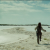
to
.
Step One//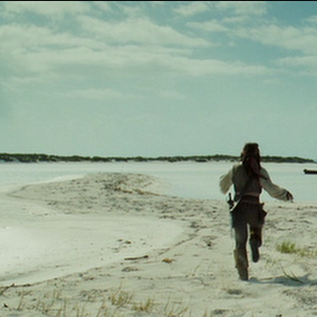
is the start image. If you want to work on an image in large scale, or small scale, that's fine. But personally, I prefer to work on a large scale image, zoomed to about the size of a hundredxhundred icon. It just makes erasing and stuff easier. But images can look different from large scale, to small scale.
Now, I know that the top of this image has a black line. D:, I hate that, but through the editing it's small enough to not be noticed.
Now! To start, go Adjust>Color>Fade Correction. I do this to ALL of my icons. It makes the colors significantly nicer. I put the settings at 45.
After that go to Adjust>Smart Photo Fix. I also use this tool on all of my icons. And the settings REALLY depend on the icon you're using, and the colours you want.
For instance, on this icon, I didn't touch the brightness for the overall image, or the highlights, but increased the brightness on the shadows. I NEVER sharpen my image, on personal perference, and I made the image more colourful.
But, on icons that are close ups on people faces or something? I do almost the complete opposite. After this the icon looks like
Step Two// Now, we're going to duplicate this background layer twice. Set the first to SCREEN at 50% opacity. Set the second to SOFT LIGHT at 65% opacity.
The image now looks like
.
Step Three//
set to EXCLUSION at 55%.

set to COLOR(L) at 25%.
The image now looks like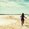
.(NOTE: that little black line is still there, but it is fading quite a bit.)
Step Four//I love this step. c : You copymerge your icon so far [ctrl+shift+c] and paste it as a new layer. Set this layer to BURN at 50%. Now, it's hard to see that it's Jack Sparrow a bit. And while I'll always know who it is, I want anyone who sees it to be able to tell too.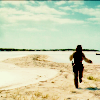
. So, I erase the area covering Jack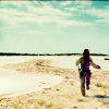
. Better, no?
Step Five//
set to SOFT LIGHT at 35%.

set to SOFT LIGHT at 25%.
Now the icon looks like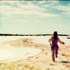
.
Step Six//
(unfortunetly the background on this was transparent for me, so the easiest way to do this is to make a new layer, paint a white line around the icon, and gaussian blur it) set to SOFT LIGHT at 50%.
Make a new Hue/Saturation/Lightness layer, and up the saturation to a level that's appropriate to your icon. Then set that layer at 50%. Haha, or an opacity that suits your icon. D:
Step Seven//Now, copy merge this image into a new canvas.Mirror it, and paste it back onto the original icon. Move it down to the bottom lefthand corner [or wherever is appropriate for your icon]. Desaturate it, use the soften tool on the edges, and the smudge tool on them as well.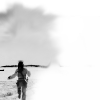
Set it to NORMAL at 75%. The icon now looks like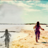
. c : [Note: Maybe I was wrong about that line? D:]
Step Eight// Now, use your rectangle tool to create a box. Use your pick tool to put it on an angle and adjust it whichever way you please. My box looks like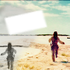
. I also put the soften tool over it once or twice because it was a little jagged.
Step Nine// And throw in your text. I used Beccaria at 24 PIXELS, and put it on a similar angle as the box, within the box.
Step Ten// I got sad because of that line. So, I copy merged the layer, pasted it on top, and used feathered the dodge tool along the top of the image. Set the copymerge layer to NORMAL at 60%, and got
. It's still there, I know, but less noticable, I hope.
Step Eleven// Set this scratch layer I made
[use it if you want, I made it in five minutes, and it's not that nice. Haha. D:], make a duplicate of the layer and set one to Lighten and one to Screen. c: Finishing the icon, and giving you
. Fun stuff. Comments are uber appreciated, LOVE to see what you make. And, if you wanted to use this icon, that would be fine as long as you comment and credit. Thanks a lot, and let me know if there's anything missing. : c.
Oh, and, if you want to see some more of my POTC icons, add my journal, I'm making an icon post involving them today. [=
Fourth ever tutorial. c :.
Going from

to

.
Step One//

is the start image. If you want to work on an image in large scale, or small scale, that's fine. But personally, I prefer to work on a large scale image, zoomed to about the size of a hundredxhundred icon. It just makes erasing and stuff easier. But images can look different from large scale, to small scale.
Now, I know that the top of this image has a black line. D:, I hate that, but through the editing it's small enough to not be noticed.
Now! To start, go Adjust>Color>Fade Correction. I do this to ALL of my icons. It makes the colors significantly nicer. I put the settings at 45.
After that go to Adjust>Smart Photo Fix. I also use this tool on all of my icons. And the settings REALLY depend on the icon you're using, and the colours you want.
For instance, on this icon, I didn't touch the brightness for the overall image, or the highlights, but increased the brightness on the shadows. I NEVER sharpen my image, on personal perference, and I made the image more colourful.
But, on icons that are close ups on people faces or something? I do almost the complete opposite. After this the icon looks like

Step Two// Now, we're going to duplicate this background layer twice. Set the first to SCREEN at 50% opacity. Set the second to SOFT LIGHT at 65% opacity.
The image now looks like

.
Step Three//

set to EXCLUSION at 55%.

set to COLOR(L) at 25%.
The image now looks like

.(NOTE: that little black line is still there, but it is fading quite a bit.)
Step Four//I love this step. c : You copymerge your icon so far [ctrl+shift+c] and paste it as a new layer. Set this layer to BURN at 50%. Now, it's hard to see that it's Jack Sparrow a bit. And while I'll always know who it is, I want anyone who sees it to be able to tell too.

. So, I erase the area covering Jack

. Better, no?
Step Five//

set to SOFT LIGHT at 35%.

set to SOFT LIGHT at 25%.
Now the icon looks like

.
Step Six//

(unfortunetly the background on this was transparent for me, so the easiest way to do this is to make a new layer, paint a white line around the icon, and gaussian blur it) set to SOFT LIGHT at 50%.
Make a new Hue/Saturation/Lightness layer, and up the saturation to a level that's appropriate to your icon. Then set that layer at 50%. Haha, or an opacity that suits your icon. D:
Step Seven//Now, copy merge this image into a new canvas.Mirror it, and paste it back onto the original icon. Move it down to the bottom lefthand corner [or wherever is appropriate for your icon]. Desaturate it, use the soften tool on the edges, and the smudge tool on them as well.

Set it to NORMAL at 75%. The icon now looks like

. c : [Note: Maybe I was wrong about that line? D:]
Step Eight// Now, use your rectangle tool to create a box. Use your pick tool to put it on an angle and adjust it whichever way you please. My box looks like

. I also put the soften tool over it once or twice because it was a little jagged.
Step Nine// And throw in your text. I used Beccaria at 24 PIXELS, and put it on a similar angle as the box, within the box.

Step Ten// I got sad because of that line. So, I copy merged the layer, pasted it on top, and used feathered the dodge tool along the top of the image. Set the copymerge layer to NORMAL at 60%, and got

. It's still there, I know, but less noticable, I hope.
Step Eleven// Set this scratch layer I made

[use it if you want, I made it in five minutes, and it's not that nice. Haha. D:], make a duplicate of the layer and set one to Lighten and one to Screen. c: Finishing the icon, and giving you

. Fun stuff. Comments are uber appreciated, LOVE to see what you make. And, if you wanted to use this icon, that would be fine as long as you comment and credit. Thanks a lot, and let me know if there's anything missing. : c.
Oh, and, if you want to see some more of my POTC icons, add my journal, I'm making an icon post involving them today. [=