(no subject)
A reposting of one of my first tutorials. cant say its particualy good but it is talk you though most of the steps so its good for beginners
Go from
to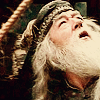
or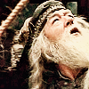
1)I started out with a screen cap from the lovely teh_indy
Sceencap: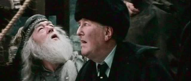
2)Cropped my base to a 100x100 square. I made sure to off center Dumbledore a bit so if I wanted to I could add brushes, text and what not. Its a good idea for any icon not to center the focus of your graphic unless you have a specific idea or reason for doing so. This here would be a bad example of cropping: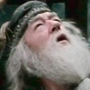
. See how hard it would be to put text on? It would have to be on the beard or across the face and that would definitly muck up the quality of the icon.
This:
is better. See how that frees up the left side of the image? Leaves room for brushes and text thus balancing it.
3)Sharpen this base twice: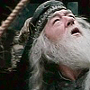
It may look a little too sharp but when we start adding color and brightening the icon up it will soften it a bit.
4)This next step, I believe is only on PSP. Im certain that PS has something like this but Im not sure what it is.
*This base is quite dark, we have to lighten it up so it doesnt get too dark. Select the Brightness/Contrast option found under Adjust.
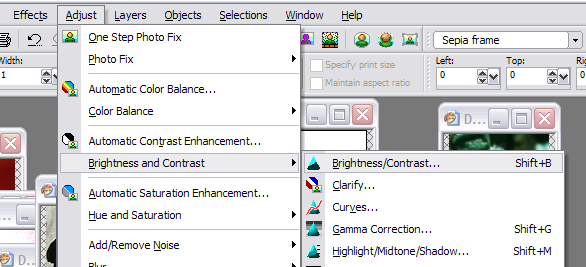
Set the brightness to: 30 and the Contrast to:25

This is a new thing that I recently discovered how to use. :D
Our base: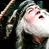
5)Next is another handy tip that is relativly easy. Adjust the color balance of the icon.
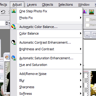
>>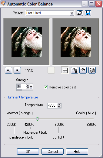
Theres no definite number or opacity that works best with icons. I adjusted the illumination temp to 4750 at about 35%
Our icon: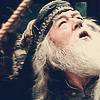
6)Next create a new layer on top of our base. Flood fill it with a dark navy blue and set to exclusion (100%). This is always a great thing to do when going to a warmer look to your base.
Our color:
Our icon: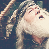
7)Create another new layer and flood fill it with a very very light peachy color and set to softlight at 100%.
Color:
Our icon: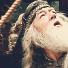
8)Duplicate the peach layer again and set to burn.
Icon: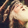
And thats basically it! Now you can add brushes and text a plenty. I find this method works wonders with lots of pictures.
Something that I was just playing with is, if you wanted a bit sharper is: Merge all the layers>duplicate >set opacity to 50%>adjust>sharpen> unsharp mask set to Radius:5 , Strength:25 , Clip2
Icon:
Go from
to
or
1)I started out with a screen cap from the lovely teh_indy
Sceencap:
2)Cropped my base to a 100x100 square. I made sure to off center Dumbledore a bit so if I wanted to I could add brushes, text and what not. Its a good idea for any icon not to center the focus of your graphic unless you have a specific idea or reason for doing so. This here would be a bad example of cropping:
. See how hard it would be to put text on? It would have to be on the beard or across the face and that would definitly muck up the quality of the icon.
This:
is better. See how that frees up the left side of the image? Leaves room for brushes and text thus balancing it.
3)Sharpen this base twice:
It may look a little too sharp but when we start adding color and brightening the icon up it will soften it a bit.
4)This next step, I believe is only on PSP. Im certain that PS has something like this but Im not sure what it is.
*This base is quite dark, we have to lighten it up so it doesnt get too dark. Select the Brightness/Contrast option found under Adjust.
Set the brightness to: 30 and the Contrast to:25
This is a new thing that I recently discovered how to use. :D
Our base:
5)Next is another handy tip that is relativly easy. Adjust the color balance of the icon.
>>
Theres no definite number or opacity that works best with icons. I adjusted the illumination temp to 4750 at about 35%
Our icon:
6)Next create a new layer on top of our base. Flood fill it with a dark navy blue and set to exclusion (100%). This is always a great thing to do when going to a warmer look to your base.
Our color:
Our icon:
7)Create another new layer and flood fill it with a very very light peachy color and set to softlight at 100%.
Color:
Our icon:
8)Duplicate the peach layer again and set to burn.
Icon:
And thats basically it! Now you can add brushes and text a plenty. I find this method works wonders with lots of pictures.
Something that I was just playing with is, if you wanted a bit sharper is: Merge all the layers>duplicate >set opacity to 50%>adjust>sharpen> unsharp mask set to Radius:5 , Strength:25 , Clip2
Icon: