First Tutorial using Photoshop 7.0

» » »

+ Using Photoshop 7.0 +
My first tutorial, so I hope it's understandable; I tried to keep it pretty organized.
:: I M P O R T A N T ::
Before proceeding, please download the awesome Sunset gradient set made by __kali__ found here and upload them to your gradients folder. Not only are they a beautiful set, but it's important for you to be able to access these gradients for the purpose of this tutorial. If you had Photoshop open when you saved the gradient file to your presets, make sure to close PS and reopen it so that you can access the gradients.
That being said, mush on! ♥ *cracks whip*
:: Step .01 ::
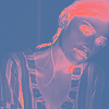
Choose your picture and crop it, resizing to 100x100 pixels. Here, I chose a lovely picture of the gorgeous Almudena Fernandez.
:: Step .02 ::
» » »

Sharpen your base (Filter > Sharpen > Sharpen). Then, select your Smudge tool and with a small (about 4-5px), soft round brush and your strength set to 8%, make small circles over her skin. We want to get rid of all the areas that look a little pixelated after the sharpening of the image, but we don't want to blur her completely, so be careful not to smudge over any defined edges.
NOTE: Before smudging, if your base is sharpened too much, you can go to Edit > Fade Sharpen and tone it down a bit.
:: Step .03 ::
Duplicate your base (Ctrl + J) three times.
:: Step .04 ::
» » »

Set the bottom duplicated layer to Screen at 100% opacity.
:: Step .05 ::
» » »

Set the middle duplicated layer to Multiply at around 40% opacity.
:: Step .06 ::
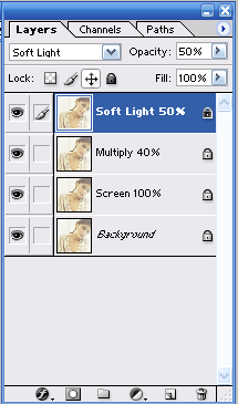
» » »

Set the top duplicated layer to Soft Light at 50% opacity. Your layer palette should now look something like this:
:: Step .07 ::
Yay, okay time for the fun part. Or not so fun, but I'm just trying to keep your attention without doing a skerry dance. Normally, you could probably skip this step, or merely merge your layers and move on, but for the purpose of this tutorial, you actually need to do this. I know, I know, getting all Nazi, but you'll see why shortly. XD
First, make sure your top layer (the Soft Light layer) is selected. Then create a new layer (Ctrl + Shift + N) and name this new layer "Merged Base". Now, with this new layer selected, you're going to hit Ctrl + Alt + Shift + E. What this does is automatically merges all your layers, copies it and pastes it into the new layer without physically merging your layers, leaving your originals safely nestled below like so:
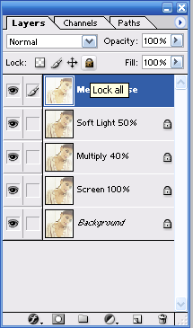
As you can see, I also locked my merged base, but you don't have to. I only did it because I'm accident prone and would totally muck up my icon if I didn't.
:: Step .08 ::
» » »

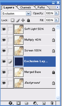
With the top layer (your Merged Base Layer) selected, create a new layer and name it "Exclusion Layer". Flood fill with #02274A, then set the blend mode to Exclusion at 100% opacity.
:: Step .09 ::
» » »

This is where the significance of Step 7 comes in. One at a time, move your Merged Base layer and your Exclusion Layer down beneath your Soft Light, Multiply and Screen layers. Your layer palette should look like this:
:: Step .10 ::
» » »

Now, with your top layer selected, create a new Adjustment Layer with a Gradient Map. (Layer > New Adjustment Layer > Gradient Map)
This is where our lovely gradients we downloaded from __kali__ (located here) come in handy. After you've clicked on the Gradient Map option, a dialogue box will pop up. Click the arrow next to the default gradient and switch to __kali__'s Sunset gradient set, then select the very first gradient:
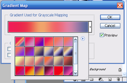
Once you've selected that, make sure that "Dither" and "Reverse" are unchecked, then click OK. You should end up with something like this:
Now set this new adjustment layer to Soft Light at 90% opacity. You should result in a soft magenta tint:
:: Step .11 ::
» » »

Time for another new Adjustment Layer, only this time, we want to click "Selective Color" instead of "Gradient Map". A dialogue box will pop up:
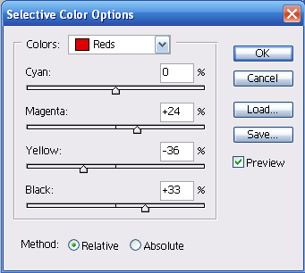
Make sure the "Reds" are selected in the drop down menu and enter the numbers above.
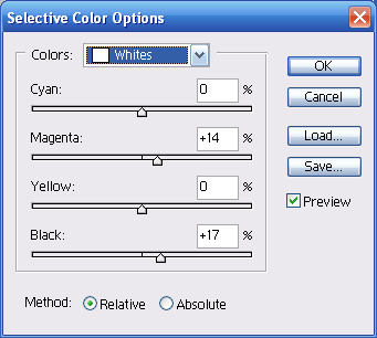
Next, from the drop down menu, select "Whites" and enter these numbers:
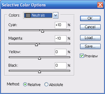
Finally, select "Neutrals" from the drop down menu and enter these numbers:
Click OK.
Note: These numbers are specific to my particular icon. I suggest that for the ones you make personally to play around with the Selective Color Adjustment Layer until you get the look you want. It can produce some lovely results.
:: Step .12 ::
» » »

With the top layer selected, take the mask below made by gender and paste it twice.

Set the bottom mask layer to Soft Light at 70% opacity.
Set the top mask layer to Screen at 50% opacity.
:: Step .13 ::
» » »
Ahhh, the finishing touches. Create yourself a new layer, take any text brush you'd like and slap it on there where you think it would look nice.

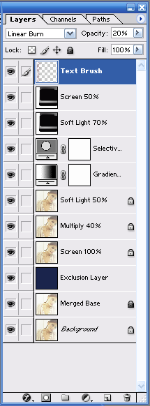
For this icon, I set my foreground color to #9D4557, selected my text brush and put it on my icon. I wasn't satisfied with the horizontal position or the darkness of the color, so I went to Edit > Transform > Rotate Clockwise 90%, then set my text flush against the left side of my icon. to remedy the sharpness caused by the color, I lowered my opacity to 20% and set the layer to Linear Burn.
Your layer palette should now look something like this:
:: Step .14 ::
File > Save For Web. Once the dialogue box pops up, make sure "PNG-24" is selected from the drop down menu, and Transparency is checked. Click save.
That's it, you're done! I hope that even if the steps in this tutorial didn't help you create a similar icon with a different picture that it at least gave you a few cool tricks to use in the future! ;)