(no subject)
Tutorial for 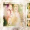
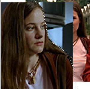
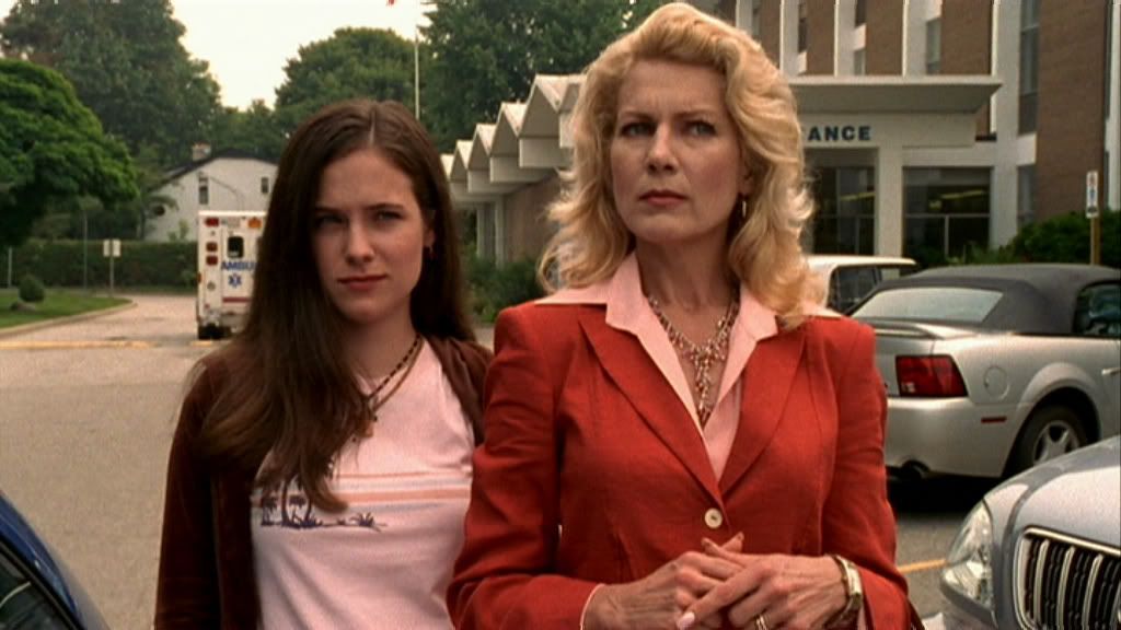
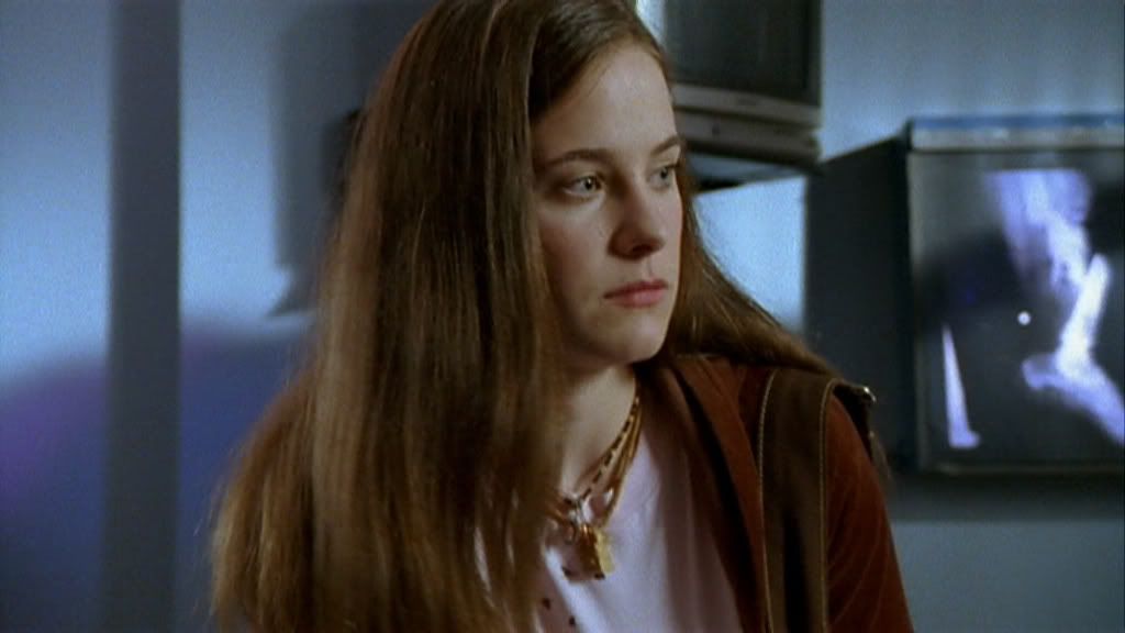
First, we will start off with two images. For this icon I picked these images (this and this). (caps from _jems_)
To start out with, I will crop both images to 100 x 100, making sure that the main focus of each image is in the center (I only say this for blending purposes). Then sharpen both of them.


Next, copy one of the images and paste it on the other one (so there are two layers). Now you can lower the opacity of the top layer to around 50%. This will let you see the placement of both images. As of now, it is okay to have white space.
Now, I will select the more prominent image (the one with just the girl) and increase the opacity 100%. I will take the lasso tool (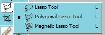
) with the feather at the top set to 1 (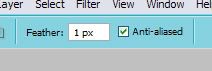
).
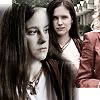
I will take the lasso tool and start to outline the background. You will now see the marching ants:
Press delete, and that area will be taken off. You should now be able to see the other image clearly.

Now, flatten the image. Duplicate the base and desaturate the duplicated layer; set it to "screen". If you use other images, be sure to mess around with the opacity.
Duplicate the desaturated layer and set the second desaturated layer to soft light.

It's still not that great, but it's getting there. Flatten your image again. Now, take the smudge (or blur) tool set at 8% to 11% and blur/smudge the facial features (especially if the two images merge - as in her head).
Duplicate the layer again, desaturate and set it to screen at 50%
Now it's looking better...sort of. Here comes the coloring. Flatten your image again (many people don't like flattening images because you can't go back and change something. I don't care, though. Call me daring).
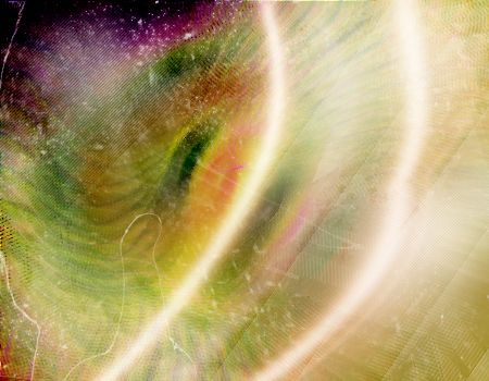
Find a good gradient, and set it to hard light. I used the following

(by checkmate__)
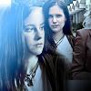
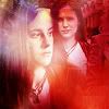
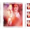
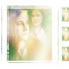
To produce this:

at hard light to make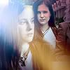

at COLOR at 20% for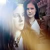

at SOFT LIGHT (100%) for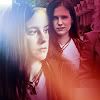
Enough of that for now.
Now it is texture time!!
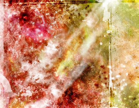
I took this texture by dorky_duck, decreased the saturation -50% and set it on HARD LIGHT. Of course, I moved the larger texture around to find a good place for it, then erased some to make the subjects visible.
Now, it's time for everyone's favorite thing - light images! Wait! I'm kidding!!!! No light images this time.
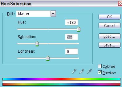
I flattened the image again. Duplicate the new base. Using the Hue/Saturation tool, move the hue up to the very largest it can go (making the icon turn blue), then decrease the saturation a little.
and this makes:
It's time to flatten the image again. Now, create a whole new layer and fill it with white. Decrease the opacity to 50% Duplicate the base image (the actual icon) and put the duplicated layer ABOVE the white layer. Take your eraser tool and set the eraser opacity to 50% Erase a little from the top layer. Then flatten.
Now, make a new layer of just white. Duplicate the bottom layer (the actual icon) and place that ABOVE the white. Instead of erasing, this time move the top layer (the icon above the white) and mess around with placement. Feel free to change the size of the image (ctrl t). Making sure the little link at the top is checked (
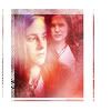
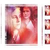
). Change the size of the icon or placement. This is what I ended up with:
Take any border brush you wish to use. I will use this border:
By spiralling
Flatten the image. Duplicate the layer three times. Make then duplicated images reallllllly tiny, and place them on the side.
You may want to sharpen the three smaller duplicated bases before you flatten the image again.
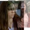
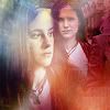
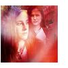
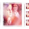
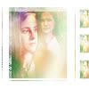
This gives me:
Feel free to put the texture back on (with soft light) to give it a more cloudy look.
Flatten. Duplicate. Set to linear burn at 40%
Now, I'll add another gradient

to SCREEN at 100%
Don't flatten yet! Erase some of the gradient (eraser set at 50%) around the faces.
Now you may flatten.
Now, add my favorite texture by dorky_duck
Set it to linear burn, then erase some of the areas.
Flatten. Duplicate base. Desaturate and set to Overlay. Once again, erase some of the parts around the faces.
That is all...I'm not going to do anything with text. This tutorial is already bad - why make it worse. It started out when I was trying to replicate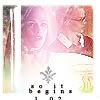
Same process, different icon.
First, we will start off with two images. For this icon I picked these images (this and this). (caps from _jems_)
To start out with, I will crop both images to 100 x 100, making sure that the main focus of each image is in the center (I only say this for blending purposes). Then sharpen both of them.
Next, copy one of the images and paste it on the other one (so there are two layers). Now you can lower the opacity of the top layer to around 50%. This will let you see the placement of both images. As of now, it is okay to have white space.
Now, I will select the more prominent image (the one with just the girl) and increase the opacity 100%. I will take the lasso tool (
) with the feather at the top set to 1 (
).
I will take the lasso tool and start to outline the background. You will now see the marching ants:
Press delete, and that area will be taken off. You should now be able to see the other image clearly.
Now, flatten the image. Duplicate the base and desaturate the duplicated layer; set it to "screen". If you use other images, be sure to mess around with the opacity.
Duplicate the desaturated layer and set the second desaturated layer to soft light.
It's still not that great, but it's getting there. Flatten your image again. Now, take the smudge (or blur) tool set at 8% to 11% and blur/smudge the facial features (especially if the two images merge - as in her head).
Duplicate the layer again, desaturate and set it to screen at 50%
Now it's looking better...sort of. Here comes the coloring. Flatten your image again (many people don't like flattening images because you can't go back and change something. I don't care, though. Call me daring).
Find a good gradient, and set it to hard light. I used the following
(by checkmate__)
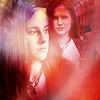
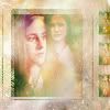
To produce this:
at hard light to make
at COLOR at 20% for
at SOFT LIGHT (100%) for
Enough of that for now.
Now it is texture time!!
I took this texture by dorky_duck, decreased the saturation -50% and set it on HARD LIGHT. Of course, I moved the larger texture around to find a good place for it, then erased some to make the subjects visible.
Now, it's time for everyone's favorite thing - light images! Wait! I'm kidding!!!! No light images this time.
I flattened the image again. Duplicate the new base. Using the Hue/Saturation tool, move the hue up to the very largest it can go (making the icon turn blue), then decrease the saturation a little.
and this makes:
It's time to flatten the image again. Now, create a whole new layer and fill it with white. Decrease the opacity to 50% Duplicate the base image (the actual icon) and put the duplicated layer ABOVE the white layer. Take your eraser tool and set the eraser opacity to 50% Erase a little from the top layer. Then flatten.
Now, make a new layer of just white. Duplicate the bottom layer (the actual icon) and place that ABOVE the white. Instead of erasing, this time move the top layer (the icon above the white) and mess around with placement. Feel free to change the size of the image (ctrl t). Making sure the little link at the top is checked (
). Change the size of the icon or placement. This is what I ended up with:
Take any border brush you wish to use. I will use this border:
By spiralling
Flatten the image. Duplicate the layer three times. Make then duplicated images reallllllly tiny, and place them on the side.
You may want to sharpen the three smaller duplicated bases before you flatten the image again.
This gives me:
Feel free to put the texture back on (with soft light) to give it a more cloudy look.
Flatten. Duplicate. Set to linear burn at 40%
Now, I'll add another gradient
to SCREEN at 100%
Don't flatten yet! Erase some of the gradient (eraser set at 50%) around the faces.
Now you may flatten.
Now, add my favorite texture by dorky_duck
Set it to linear burn, then erase some of the areas.
Flatten. Duplicate base. Desaturate and set to Overlay. Once again, erase some of the parts around the faces.
That is all...I'm not going to do anything with text. This tutorial is already bad - why make it worse. It started out when I was trying to replicate
Same process, different icon.