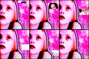
FULL ICON TUTORIAL: Sliding Glow Box Effect + Building A Grungy Background
Let's make this icon:

Tutorial type: FULL ICON TUTORIAL including The sliding glow box effect + Building a grungy background
Written for: Adobe Photoshop 7.0 & Image Ready 3
Requirements: Basic knowledge of Photoshop, Image Ready and their tools.
About this tutorial: This tutorial is very lengthy and detailed so that you can understand every step, even with the most basic photoshop skills. If you have advanced skills you can skip past the "easy" parts. This tutorial is also loaded with images to make it easy for you to follow along with. You can see the icon progress as it's happening, making it easier to follow for "visual learners." If you make a mistake it'll be easier to catch since you can see the progress. The total time spent to write this tutorial and create the images contained within it was approximately 6 hours. Feedback is appreciated and any questions are welcomed. The only stupid question, is the one not asked. I will do my best to answer everything.
STEP ONE:
Select an image
I'm gonna work with this image of Angelina Jolie:

STEP TWO:
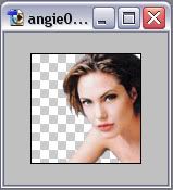
Crop image and cut from background
Pretty self explanatory, but incase you're unsure:
Crop the image to 100x100 using your crop tool (
)
Erase angie from the background with your eraser tool (
) or whichever method you prefer.
STEP THREE:
Create a background
We're gonna do a few different things here. When I make icons, no two icons are created the same. What people don't realize about these types of icons are that they really are not difficult to make and don't require any special talent or knowledge once you get used to them. The trick is to just play around. Become familiar with your blending modes and various tools. 100x100 brushes are your friend. Get lots of them.
I'll show you step by step what I did to achieve the main base look for this icon now:
[STEP 3.1]
I've choosen to go with the color red as the main color for my icon.
So I create two new layers and flood fill them red. [EDIT >> FILL]
I put one layer above the angie layer, and one layer below it.
I set the blending mode for the top layer to soft light and leave the other two layers at normal.
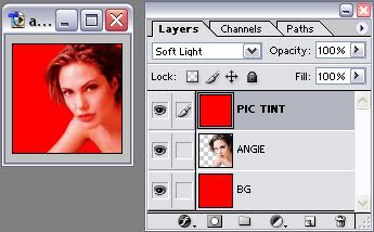
The reason for this is one layer is going to be our main background layer and the top layer is used only to tint. There are so many different ways to tint a picture, we're using this particular method because it's quick, easy and will ensure that we're using the exact same shade of red for both the background and pic tinting.
[STEP 3.2]
Here's what you do:
Turn off visibilty on the BG layer. (You don't have to do this, but it allows you to see the results of the next step.)
Select the Angie layer to work with in your layers pallette.
Now hold down CTRL + RIGHT-CLICK on the Angie layer in your layers pallette.
If a menu pops up when you ctrl + right click, ignore it and left click in any empty space to get rid of it.
You'll now see that Angie, all of Angie & only Angie is selected.
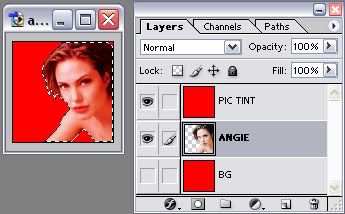
Now inverse your selection. [SELECT >> INVERSE]
Now everything except for angie is selected.

Go back to your layers pallette and click on the Pic Tint layer to work with.
Hit your DELETE button.
You've now erased all the red around Angie.
Press CTRL + D to deselect the area.
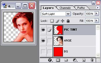
If you're wondering why we're going through this when the background layer is red as well, it's because if we left that extra red on the tinting layer it will tint anything we add between the tint and background layers and we don't want to do that.
[STEP 3.3]
Turn visibility back on for the BG layer and shut it off for the Angie & Tint layers.
I now create a new layer above the BG layer.
[note: I cannot remember where any of the following brushes came from. I lost my credit list after some computer problems so your guess is as good as mine.]
I apply this brush in BLACK on the new layer:
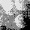
RESULT:
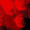
Create a new layer above the last one.
I apply this brush in a LIGHT RED [#FF4949] on the new layer:
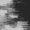
RESULT:
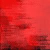
Create a new layer above the last one.
I apply this brush in BLACK on the new layer:

RESULT:
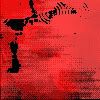
Create a new layer above the last one.
I apply this brush in BLACK on the new layer:

RESULT:
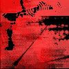
Create a new layer above the last one.
I apply this brush in BLACK on the new layer:

RESULT:
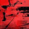
Create a new layer above the last one.
I apply this brush in BLACK on the new layer:
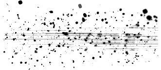
RESULT:

Create a new layer above the last one.
I apply this brush in a HOT PINK [#FF2D63] on the new layer:
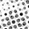
RESULT:

Merge down all visible layers (if you have followed along correctly the only layers that should be visible right now are the background layer [BG] and the 7 new layers with the brushes we just made) LAYER >> MERGE VISIBLE or SHIFT + CTRL + E Rename the layer to "BG"
You can build any background you want, any way you want it. Play with brushes. I usually play with blending modes and various tools while building a background, but I kept away from doing that here in this tutorial so that we don't make it too long & complicated. But you can go experiment your butt off during or after this tutorial. Feel free.
Okay, turn the visibility back on for the angie and tint layer and now we've got this so far:

STEP FOUR:
Adjust image quality
Back to the angie layer.
Duplicate it twice.
The first duplicated layer:
Change the blending mode. BLEND MODE = SCREEN @ 60% Opacity
Now sharpen the layer. [FILTER >> SHARPEN >> SHARPEN]
The second duplicated layer:
Desaturate it [IMAGE >> ADJUSTMENTS >> DESATURATE]
Change the blending mode. BLEND MODE = SOFT LIGHT
Now add a gaussian blur to the layer with @ a 3.0 radius. [FILTER >> BLUR >> GAUSSIAN BLUR]
Change the "PIC TINT" layer.
After coming this far, it's apparent that the layer does us no good on soft light. I have changed the blending mode to OVERLAY @ 60% Opacity
DO NOT MERGE THE ANGIE LAYERS TOGETHER YET
Now we've got this:
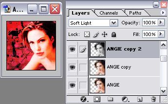
STEP FIVE:
Make image stand out from background
Make a 2 new layers and place them between the Pic Tint layer and the 3rd Angie layer. Call the top one OUTLINE and the bottom one SCREEN.
Select the first Angie layer (the original one) to work with and hold down CTRL & RIGHT-CLICK it to select Angie again. DO NOT INVERSE YOUR SELECTION THIS TIME.

With Angie still selected, choose the new layer "OUTLINE" we just created to work with from your layers pallette.
Stroke the selection with 5 px of RED on the Outside [EDIT >> STROKE]
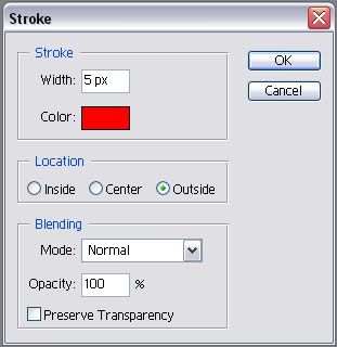
Now with Angie still selected, Stroke the selection again, this time with the color BLACK @ 2 px still OUTSIDE
Now, Angie is still selected, choose the layer "SCREEN" to work with from the layers pallette.
Then apply this brush to the layer:
As you may have noticed the brush was only applied to selected area. This is exactly what we wanted to happen. We did not want the "screen" brush to be applied over the background. Because we kept the selection area around angie, only the selection area was filled with the brush.
Press CTRL + D to deselect the area
Now change the blending mode of the "SCREEN" layer to SOFT LIGHT.
And this is our result so far:
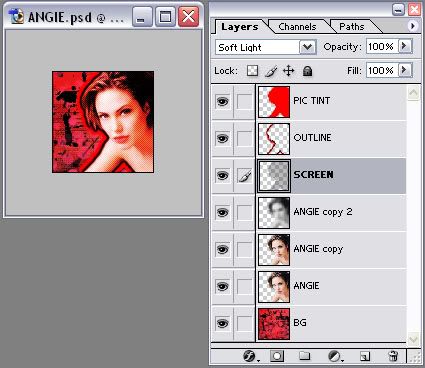
Now the final step to make the image stand out from the background:
Right-click on the "OUTLINE" layer in the pallette and select BLENDING OPTIONS from the menu.
Put a check in and select "DROP SHADOW" from the menu on the left and put in the following settings:
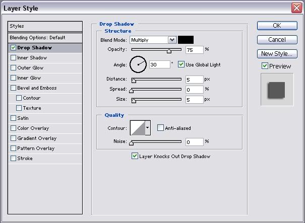
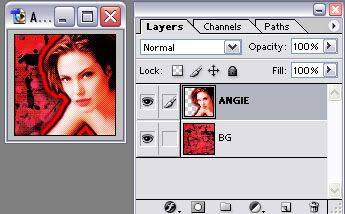
Now shut the visibility off of the BG layer and merge all the visible layers together [SHIFT + CTRL + E] Rename the layer to "ANGIE"
Turn the visibility back on for the BG layer and here's what we have so far:
STEP SIX:
Create a border
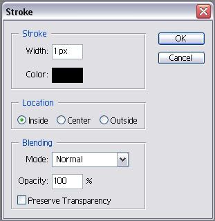
We're gonna go with a simple 1px black border here.
Make a new layer above the Angie layer. Call the new layer BORDER. Select this layer to work with.
The easiest way to do this (other than using a premade brush) is to press CTRL + A to "select all" and stroke the area with the following settings:
CTRL + D to deselect the area.
The border layer will remain the top layer. No layer should be above it at anytime in this tutorial. Do not merge it with the other layers yet.
STEP SEVEN:
Add text
This is the final step for our base. It's optional, but I rarely make icons without text. Keep in mind when making an icon that text should add to the icon, not take away from it. Being too wordy is no good. Keep the context of it simple. Also pick your fonts and size of the font wisely. Position of the text is everything. If you think it looks like crap, it probably does and it's taking away from the icon. Text should catch the eye, not blind it. =]
Here's what I did for my font:

The words "shut up" using the font blackcastle [download here] size = 28 px with the anti-alias set to strong and the color set to a medium red [#FF3C3C]

I rotated the font slightly pointing downward. EDIT >> TRANSFORM >> ROTATE
Next I right-clicked on the text layer and choose BLENDING OPTIONS from the menu.
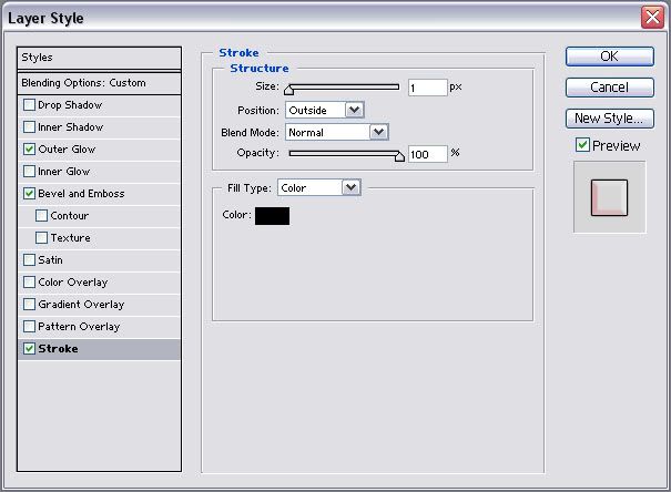
I applied the following settings for STROKE (the color shown in the "select color" box is black):
Then I applied the following settings for OUTER GLOW (the color shown in the "select color" box is black):
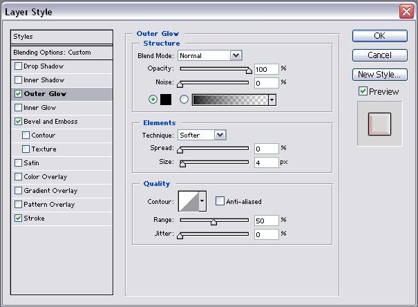
FYI: The reason I did a 1 px stroke and a black glow instead of just doing a thicker stroke without the outerglow is because the stroke often looks harsh and takes away from the graphic. A thinner stroke with a wider glow of the same color looks much softer and is more pleasing to the eye.
Lastly I applied the following settings for BEVEL and EMBOSS:
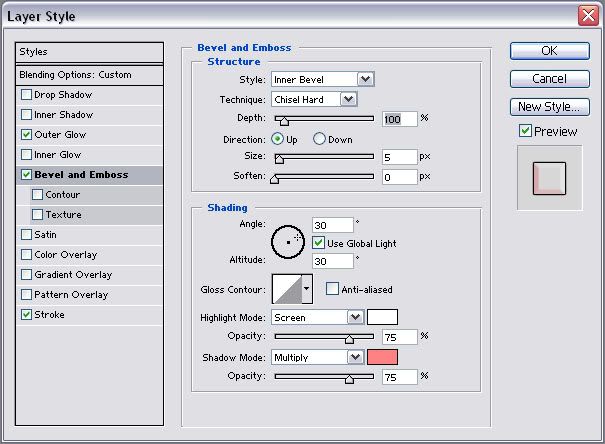
The highlight mode color is white
The shadow mode color is a light red [#FF8383]
The last thing I did after closing the blending options box was: I changed the blending mode for the text layer in the layer pallette to LIGHTEN
Turn visibility off of the BG layer and merge the 3 remaining visible layers (border, text layer, angie) together. [LAYER >> MERGE VISIBLE] or [SHIFT + CTRL + E]
Turn the visibility back on for the BG layer.
Voila! The base is complete! You should have 2 layers at this point. No more, no less. The ANGIE layer and the BG layer.
STEP EIGHT:
Add effect
Here's where we prepare the frames for our final animation.
Open a new window with a WIDTH of 100 pixels and the height is your choice, but I went with a HEIGHT of 15 pixels.
NOTE: I will continue to write this tutorial assuming you also choose 15 pixels for your height.
Flood fill this new file with a LIGHT PINK [#FFC8F4]. I commonly use the color white for this box, but I'm going with a light color relevant to our main color (RED) because it looks better than the white in this case.
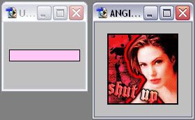
Now using the move tool [
], click & drag the pink box we just made into our main angie file. (for future reference, a helpful tip is if you hold down SHIFT while clicking and dragging a layer into a different file, it will AUTO-CENTER) Place the new pink box layer inbetween the Angie and BG layers. You can turn visibilty off for the Angie layer to make things easier in the next steps, it's your choice. Name the pink box layer "01" and position it at the very top of the frame like so:
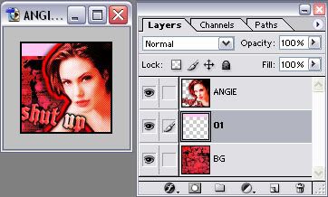
You can go ahead and close the window with the pink box we made. We don't need it anymore because we can just duplicate the pink box layer over and over again right from the main Angie file window.
Have your move tool [
] selected before begining the next steps.
Set the blending mode for the layer 01 to OVERLAY
Duplicate the layer 01
Name this new layer 02
Choose the layer 02 to work with in the layers pallette.
Press the DOWN ARROW on your keyboard 8 TIMES to nudge the pink box down. It should half overlap the layer "01" and the other half should be below layer "01".
I'm turning the blending mode back to normal for the layer 02 in the example below just so you can see where it should be laying:
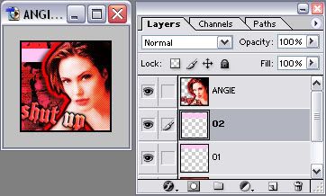
Duplicate the layer 02
Name this new layer 03
Choose the layer 03 to work with in the layers pallette.
Press the DOWN ARROW on your keyboard 8 TIMES to nudge the pink box down again.
Okay, now we continue the process of duplicating, renaming and nudging 8 pixels down over and over until we get to the point where we've got a pink box all the way at the bottom of the frame and the pink box is barely visible at the bottom of the frame, like so:
(Again, the last layer is on normal blending mode in the picture below just to make it easier for you to see)
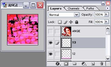
If you did a 15 pixel box and nudged 8 times every time you duplicated just like the tutorial instructed you to do, this will make a total of 13 pink box layers before you reach the bottom like me.
Guess what? We're done creating layers!
Turn visibilty off for all the layers except for these 3 layers: ANGIE, 01 & BG
STEP NINE:
Animate Part 1: The basics
Open up image ready [
] cause we're ready to animate.
There will be 25 frames total in this animation.
First we will start out with 13 frames. One frame for each pink box layer.
IMPORTANT: The Angie layer and BG layer will have their visibility on for every single frame so DO NOT turn them off ever!
All frames will be set to 0 seconds delay.
Frame #1 = Visibility on for the layers BG, 01 & Angie
Frame #2 = Visibility on for the layers BG, 02 & Angie
Frame #3 = Visibility on for the layers BG, 03 & Angie
and so on and so forth...
You may have questions about basic Image Ready things so let's clarify a few things right now:
LAYERS PALLETTE
It looks just like your layers pallette in Photoshop. This is what you use to control which layers appear in each frame. You make a layer appear in a frame simply by turning the visibility on and you keep the layer OUT OF the frame by turning the visibility off.
For your first frame in the animation your layers pallette would look like this:

ANIMATIONS WINDOW
Click this button to make a new frame:

Click here to change the delay on an icon:

Click this button to add a tween effect between frames:

And speaking of tween that's just what we're gonna do next:
STEP TEN:
Animate Part 2: Tweening
At this point you should have created the main 13 frames. If you haven't, do that now and then proceed.
Select the 2nd frame in the animation window to work with. Click the tween button and tween at the following settings:
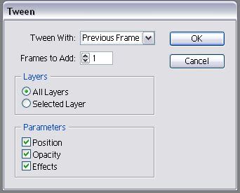
You'll notice that that frame that was originally frame #2, has now moved over and become frame #3. This is because the tweened image has been placed between the frames that were #1 & #2 and therefore has become frame #2.
You need to add a tweened frame between every frame. Frame #3 is highlighted because that's the frame we just tweened with, choose the frame next to it (#4, previously known as frame #3 before you did the first tween) and tween again at the same settings. Every time you tween, just move over to the frame to the right of the frame that is currently selected and tween it.
Stop at the last frame (which will be called frame #25 when you are done tweening the other frames before it). We are not tweening the last frame and first frame together for this animation. But in case you are curious on how you'd do that for future reference, after you tweened the last frame you'd click the tween button again FOR THE SAME EXACT FRAME except this time for the setting you'd choose this:
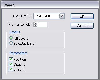
You'd have a frame added after the last frame at that point which would be the tweened frame of the first and last frames. But again, we are NOT doing that with this animation. That was just completely FYI for future animations.
Okay after you have completed tweening
YOU ARE DONE!!!
Finished Product:

Save your icon and upload!
Incase you're wondering my optimization settings were set at the following:
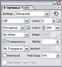
And my icon has a total file size of: 19.13K
Yours may be higher or lower depending on how you cropped the image, your text variations and the exact configuration of your background.
I hope you enjoyed the tutorial and if you have any questions do not hesitate to ask!
- Shara [rotncandy]
Feedback is appreciated, so please take my poll:
Poll Feedback
Let me know if you find any errors with this tutorial and please do not reproduce, redistribute or claim as your own. I worked very hard on it and I'll be discouraged from making more tutorials if my hard work is abused.
If you're wondering if you can use the finished product (the Angie icon) of this tutorial, the answer is yes. All I ask is you credit me [rotncandy] in your icon keywords. If you take the icon and don't credit, I won't bother you in any way shape or form, I'm not a credit nazi by any means, but I will pray that you get a terrible case of the flu that lasts for 5-10 years. =]
NEW ROTNCANDY TUTORIALS:


Tutorial type: FULL ICON TUTORIAL including The sliding glow box effect + Building a grungy background
Written for: Adobe Photoshop 7.0 & Image Ready 3
Requirements: Basic knowledge of Photoshop, Image Ready and their tools.
About this tutorial: This tutorial is very lengthy and detailed so that you can understand every step, even with the most basic photoshop skills. If you have advanced skills you can skip past the "easy" parts. This tutorial is also loaded with images to make it easy for you to follow along with. You can see the icon progress as it's happening, making it easier to follow for "visual learners." If you make a mistake it'll be easier to catch since you can see the progress. The total time spent to write this tutorial and create the images contained within it was approximately 6 hours. Feedback is appreciated and any questions are welcomed. The only stupid question, is the one not asked. I will do my best to answer everything.
STEP ONE:
Select an image
I'm gonna work with this image of Angelina Jolie:

STEP TWO:
Crop image and cut from background
Pretty self explanatory, but incase you're unsure:
Crop the image to 100x100 using your crop tool (

)
Erase angie from the background with your eraser tool (

) or whichever method you prefer.

STEP THREE:
Create a background
We're gonna do a few different things here. When I make icons, no two icons are created the same. What people don't realize about these types of icons are that they really are not difficult to make and don't require any special talent or knowledge once you get used to them. The trick is to just play around. Become familiar with your blending modes and various tools. 100x100 brushes are your friend. Get lots of them.
I'll show you step by step what I did to achieve the main base look for this icon now:
[STEP 3.1]
I've choosen to go with the color red as the main color for my icon.
So I create two new layers and flood fill them red. [EDIT >> FILL]
I put one layer above the angie layer, and one layer below it.
I set the blending mode for the top layer to soft light and leave the other two layers at normal.

The reason for this is one layer is going to be our main background layer and the top layer is used only to tint. There are so many different ways to tint a picture, we're using this particular method because it's quick, easy and will ensure that we're using the exact same shade of red for both the background and pic tinting.
[STEP 3.2]
Here's what you do:
Turn off visibilty on the BG layer. (You don't have to do this, but it allows you to see the results of the next step.)
Select the Angie layer to work with in your layers pallette.
Now hold down CTRL + RIGHT-CLICK on the Angie layer in your layers pallette.
If a menu pops up when you ctrl + right click, ignore it and left click in any empty space to get rid of it.
You'll now see that Angie, all of Angie & only Angie is selected.

Now inverse your selection. [SELECT >> INVERSE]
Now everything except for angie is selected.

Go back to your layers pallette and click on the Pic Tint layer to work with.
Hit your DELETE button.
You've now erased all the red around Angie.
Press CTRL + D to deselect the area.

If you're wondering why we're going through this when the background layer is red as well, it's because if we left that extra red on the tinting layer it will tint anything we add between the tint and background layers and we don't want to do that.
[STEP 3.3]
Turn visibility back on for the BG layer and shut it off for the Angie & Tint layers.
I now create a new layer above the BG layer.
[note: I cannot remember where any of the following brushes came from. I lost my credit list after some computer problems so your guess is as good as mine.]
I apply this brush in BLACK on the new layer:

RESULT:

Create a new layer above the last one.
I apply this brush in a LIGHT RED [#FF4949] on the new layer:

RESULT:

Create a new layer above the last one.
I apply this brush in BLACK on the new layer:

RESULT:

Create a new layer above the last one.
I apply this brush in BLACK on the new layer:

RESULT:

Create a new layer above the last one.
I apply this brush in BLACK on the new layer:

RESULT:

Create a new layer above the last one.
I apply this brush in BLACK on the new layer:

RESULT:

Create a new layer above the last one.
I apply this brush in a HOT PINK [#FF2D63] on the new layer:

RESULT:

Merge down all visible layers (if you have followed along correctly the only layers that should be visible right now are the background layer [BG] and the 7 new layers with the brushes we just made) LAYER >> MERGE VISIBLE or SHIFT + CTRL + E Rename the layer to "BG"
You can build any background you want, any way you want it. Play with brushes. I usually play with blending modes and various tools while building a background, but I kept away from doing that here in this tutorial so that we don't make it too long & complicated. But you can go experiment your butt off during or after this tutorial. Feel free.
Okay, turn the visibility back on for the angie and tint layer and now we've got this so far:

STEP FOUR:
Adjust image quality
Back to the angie layer.
Duplicate it twice.
The first duplicated layer:
Change the blending mode. BLEND MODE = SCREEN @ 60% Opacity
Now sharpen the layer. [FILTER >> SHARPEN >> SHARPEN]
The second duplicated layer:
Desaturate it [IMAGE >> ADJUSTMENTS >> DESATURATE]
Change the blending mode. BLEND MODE = SOFT LIGHT
Now add a gaussian blur to the layer with @ a 3.0 radius. [FILTER >> BLUR >> GAUSSIAN BLUR]
Change the "PIC TINT" layer.
After coming this far, it's apparent that the layer does us no good on soft light. I have changed the blending mode to OVERLAY @ 60% Opacity
DO NOT MERGE THE ANGIE LAYERS TOGETHER YET
Now we've got this:

STEP FIVE:
Make image stand out from background
Make a 2 new layers and place them between the Pic Tint layer and the 3rd Angie layer. Call the top one OUTLINE and the bottom one SCREEN.
Select the first Angie layer (the original one) to work with and hold down CTRL & RIGHT-CLICK it to select Angie again. DO NOT INVERSE YOUR SELECTION THIS TIME.

With Angie still selected, choose the new layer "OUTLINE" we just created to work with from your layers pallette.
Stroke the selection with 5 px of RED on the Outside [EDIT >> STROKE]

Now with Angie still selected, Stroke the selection again, this time with the color BLACK @ 2 px still OUTSIDE
Now, Angie is still selected, choose the layer "SCREEN" to work with from the layers pallette.
Then apply this brush to the layer:

As you may have noticed the brush was only applied to selected area. This is exactly what we wanted to happen. We did not want the "screen" brush to be applied over the background. Because we kept the selection area around angie, only the selection area was filled with the brush.
Press CTRL + D to deselect the area
Now change the blending mode of the "SCREEN" layer to SOFT LIGHT.
And this is our result so far:

Now the final step to make the image stand out from the background:
Right-click on the "OUTLINE" layer in the pallette and select BLENDING OPTIONS from the menu.
Put a check in and select "DROP SHADOW" from the menu on the left and put in the following settings:

Now shut the visibility off of the BG layer and merge all the visible layers together [SHIFT + CTRL + E] Rename the layer to "ANGIE"
Turn the visibility back on for the BG layer and here's what we have so far:

STEP SIX:
Create a border
We're gonna go with a simple 1px black border here.
Make a new layer above the Angie layer. Call the new layer BORDER. Select this layer to work with.
The easiest way to do this (other than using a premade brush) is to press CTRL + A to "select all" and stroke the area with the following settings:

CTRL + D to deselect the area.
The border layer will remain the top layer. No layer should be above it at anytime in this tutorial. Do not merge it with the other layers yet.
STEP SEVEN:
Add text
This is the final step for our base. It's optional, but I rarely make icons without text. Keep in mind when making an icon that text should add to the icon, not take away from it. Being too wordy is no good. Keep the context of it simple. Also pick your fonts and size of the font wisely. Position of the text is everything. If you think it looks like crap, it probably does and it's taking away from the icon. Text should catch the eye, not blind it. =]
Here's what I did for my font:

The words "shut up" using the font blackcastle [download here] size = 28 px with the anti-alias set to strong and the color set to a medium red [#FF3C3C]

I rotated the font slightly pointing downward. EDIT >> TRANSFORM >> ROTATE
Next I right-clicked on the text layer and choose BLENDING OPTIONS from the menu.
I applied the following settings for STROKE (the color shown in the "select color" box is black):

Then I applied the following settings for OUTER GLOW (the color shown in the "select color" box is black):

FYI: The reason I did a 1 px stroke and a black glow instead of just doing a thicker stroke without the outerglow is because the stroke often looks harsh and takes away from the graphic. A thinner stroke with a wider glow of the same color looks much softer and is more pleasing to the eye.
Lastly I applied the following settings for BEVEL and EMBOSS:

The highlight mode color is white
The shadow mode color is a light red [#FF8383]
The last thing I did after closing the blending options box was: I changed the blending mode for the text layer in the layer pallette to LIGHTEN
Turn visibility off of the BG layer and merge the 3 remaining visible layers (border, text layer, angie) together. [LAYER >> MERGE VISIBLE] or [SHIFT + CTRL + E]
Turn the visibility back on for the BG layer.
Voila! The base is complete! You should have 2 layers at this point. No more, no less. The ANGIE layer and the BG layer.
STEP EIGHT:
Add effect
Here's where we prepare the frames for our final animation.
Open a new window with a WIDTH of 100 pixels and the height is your choice, but I went with a HEIGHT of 15 pixels.
NOTE: I will continue to write this tutorial assuming you also choose 15 pixels for your height.
Flood fill this new file with a LIGHT PINK [#FFC8F4]. I commonly use the color white for this box, but I'm going with a light color relevant to our main color (RED) because it looks better than the white in this case.

Now using the move tool [

], click & drag the pink box we just made into our main angie file. (for future reference, a helpful tip is if you hold down SHIFT while clicking and dragging a layer into a different file, it will AUTO-CENTER) Place the new pink box layer inbetween the Angie and BG layers. You can turn visibilty off for the Angie layer to make things easier in the next steps, it's your choice. Name the pink box layer "01" and position it at the very top of the frame like so:

You can go ahead and close the window with the pink box we made. We don't need it anymore because we can just duplicate the pink box layer over and over again right from the main Angie file window.
Have your move tool [

] selected before begining the next steps.
Set the blending mode for the layer 01 to OVERLAY
Duplicate the layer 01
Name this new layer 02
Choose the layer 02 to work with in the layers pallette.
Press the DOWN ARROW on your keyboard 8 TIMES to nudge the pink box down. It should half overlap the layer "01" and the other half should be below layer "01".
I'm turning the blending mode back to normal for the layer 02 in the example below just so you can see where it should be laying:

Duplicate the layer 02
Name this new layer 03
Choose the layer 03 to work with in the layers pallette.
Press the DOWN ARROW on your keyboard 8 TIMES to nudge the pink box down again.
Okay, now we continue the process of duplicating, renaming and nudging 8 pixels down over and over until we get to the point where we've got a pink box all the way at the bottom of the frame and the pink box is barely visible at the bottom of the frame, like so:
(Again, the last layer is on normal blending mode in the picture below just to make it easier for you to see)

If you did a 15 pixel box and nudged 8 times every time you duplicated just like the tutorial instructed you to do, this will make a total of 13 pink box layers before you reach the bottom like me.
Guess what? We're done creating layers!
Turn visibilty off for all the layers except for these 3 layers: ANGIE, 01 & BG
STEP NINE:
Animate Part 1: The basics
Open up image ready [

] cause we're ready to animate.
There will be 25 frames total in this animation.
First we will start out with 13 frames. One frame for each pink box layer.
IMPORTANT: The Angie layer and BG layer will have their visibility on for every single frame so DO NOT turn them off ever!
All frames will be set to 0 seconds delay.
Frame #1 = Visibility on for the layers BG, 01 & Angie
Frame #2 = Visibility on for the layers BG, 02 & Angie
Frame #3 = Visibility on for the layers BG, 03 & Angie
and so on and so forth...
You may have questions about basic Image Ready things so let's clarify a few things right now:
LAYERS PALLETTE
It looks just like your layers pallette in Photoshop. This is what you use to control which layers appear in each frame. You make a layer appear in a frame simply by turning the visibility on and you keep the layer OUT OF the frame by turning the visibility off.
For your first frame in the animation your layers pallette would look like this:

ANIMATIONS WINDOW
Click this button to make a new frame:

Click here to change the delay on an icon:

Click this button to add a tween effect between frames:

And speaking of tween that's just what we're gonna do next:
STEP TEN:
Animate Part 2: Tweening
At this point you should have created the main 13 frames. If you haven't, do that now and then proceed.
Select the 2nd frame in the animation window to work with. Click the tween button and tween at the following settings:

You'll notice that that frame that was originally frame #2, has now moved over and become frame #3. This is because the tweened image has been placed between the frames that were #1 & #2 and therefore has become frame #2.
You need to add a tweened frame between every frame. Frame #3 is highlighted because that's the frame we just tweened with, choose the frame next to it (#4, previously known as frame #3 before you did the first tween) and tween again at the same settings. Every time you tween, just move over to the frame to the right of the frame that is currently selected and tween it.
Stop at the last frame (which will be called frame #25 when you are done tweening the other frames before it). We are not tweening the last frame and first frame together for this animation. But in case you are curious on how you'd do that for future reference, after you tweened the last frame you'd click the tween button again FOR THE SAME EXACT FRAME except this time for the setting you'd choose this:

You'd have a frame added after the last frame at that point which would be the tweened frame of the first and last frames. But again, we are NOT doing that with this animation. That was just completely FYI for future animations.
Okay after you have completed tweening
YOU ARE DONE!!!
Finished Product:

Save your icon and upload!
Incase you're wondering my optimization settings were set at the following:

And my icon has a total file size of: 19.13K
Yours may be higher or lower depending on how you cropped the image, your text variations and the exact configuration of your background.
I hope you enjoyed the tutorial and if you have any questions do not hesitate to ask!
- Shara [rotncandy]
Feedback is appreciated, so please take my poll:
Poll Feedback
Let me know if you find any errors with this tutorial and please do not reproduce, redistribute or claim as your own. I worked very hard on it and I'll be discouraged from making more tutorials if my hard work is abused.
If you're wondering if you can use the finished product (the Angie icon) of this tutorial, the answer is yes. All I ask is you credit me [rotncandy] in your icon keywords. If you take the icon and don't credit, I won't bother you in any way shape or form, I'm not a credit nazi by any means, but I will pray that you get a terrible case of the flu that lasts for 5-10 years. =]
NEW ROTNCANDY TUTORIALS:
