tutorial: stargate atlantis // textures & text
A tutorial requested by library_of_sex for an icon from this post.
to
Photoshop CS3, probably easily translatable.
Intermediate difficulty
1. Choosing the cap and cropping

This icon was originally made for Round 5, Challenge 6 "Boys Will Be Boys" at lantis_lims. You can go here to see the other entries and some different things that were done with the same screencap.
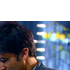
From the caps available, I quickly chose this cap of John Sheppard as having the most potential for pretty colors, dynamism, and interest.
To start, I cropped it down to 100x100. Initially I cropped it so his entire head was visible, and was planning on putting that in a sea of blue, then I realized that was a stupidly obvious thing to do, and so cropped it so that his nose was in the bottom-left corner, leaving lots of blank space for whatever text, decoration, or other pictures I wanted to put there.
2. Basic coloring/brightening and sharpening
>
>
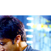
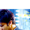
Here I used curves layers to brighten and color the icon. The colors of the cap were already pretty good, so I didn't need to do much. In the first curves layer, I brightened it considerably, upped the greens by a tad and the blues by a bit more, and dragged down the reds by a tiny bit (like so). For the next curves layer, I decided I wanted more contrast, so I increased the darkness of the very darkest parts, and then increased the brightness of the rest (like this). I'm not giving you the exact numbers because it's the overall arc of the line that's most important, and how it relates to the colors and brightness levels in your individual image.
Then to sharpen the image I used high pass. I copy-merge - ctrl-shift-alt-e (or if you're on a mac, command-shift-alt-e) - to create a new layer that looks like all the layers below it, merged. Then Filter>Other>High Pass with a radius of 0.5, and set it to soft light. Then I copy-merge again just so I have a finished layer I can drag around and alter later, which is important since I want to be cutting John out of the background.
3. Constructing the blue background
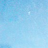
+
+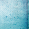
I picked out a bunch of textures by discolore, whose blue textures I am always in love with. I left the first one on Normal, 100% opacity, and set the second two on soft light. This set was only reached, however, after I opened up pretty much every blueish or greenish texture in my folder and dragged it onto the icon and tried a billion layer settings. Uncharacteristically, I then deleted them all, so I can't show you a comical lineup of a billion texture-hopefuls.
The result looked like this:
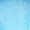
It's got the basic idea of what I want, but is too light and too cyan. So, to the trusty Hue/Saturation tool! Hue +10 to make it more blue, and Saturation +30 because I want it to be REALLY BLUE.
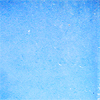
Still not dark enough. I sort of want to match the blue behind John's head. It's a lovely color, and it's what I want in my icon. I use curves to darken it (like this). Once I do that, it's too grainy. For most things, I'd actually like that, but for this icon I want something softer and smoother, so I blur it several times.

It's still not as dark as I'd like it, so I use another curves layer similar to the previous one to make it even darker. What I end up with is a nice blue with enough variation to be an interesting background.
4. Putting the pieces together
So now we have John and a background. I copy the extra "finalized" John layer from below the background layers (which I put in a group together) and bring it to the top. Now, to get John onto the background, you can use whatever cutting-out technique you most prefer. I use layer masks because they're easy, quick, and forgiving of mistakes. To add a mask to your layer, you can either go to Layer>Layer Mask>Reveal All, or else just hit the button on the layer palette that is like a circle inside of a rectangle. Now, the basic idea of layer masks is that anything that is white on the mask is visible on the layer, and anything that is black is INvisible, like it's been erased. Shades of grey are different levels of visibility. So you make sure you have the layer mask selected, then color with black everywhere you don't want to show (it'll look like you're erasing, but if you mess up, you can just color with white to make it show up again).
This is easy to understand but can be difficult to do sometimes, as people's tendency seems to be not to get close enough in to the subject. You're not going to hurt the pixels or lose them, so don't be afraid to get right up on the line between your subject and the background and then go over it. No one is going to notice that you shaved a pixel or two off someone's hair, but, believe me, people ARE going to notice if you leave a chunky line of the background in your cutout.
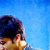
His hair is just too much. TOO MUCH. It's throwing the balance of the entire icon and it's all I can look at. So I resize his head so the dark blob of hair takes up less space. Then, because John Sheppard's crazy hair got cut off a little in the cap, I use the smudge tool on tiny tiny size to smudge up some stray strands of hair at the top (look closely for the difference!).

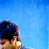
Then I decided that his skin was too red or too dark or something. Selective Color with the Yellows having these settings: 0, -15, -20.

Then, because I like to fade the fuck out of my icons, I added a generic smoky texture on Lighten, 85% opacity. Then I added a curves layer like this to bring back a little contrast.
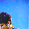

Then I added a pretty standard thing I do, #2c2114 on Exclusion 100% opacity, #b2b2a3 on Color Burn 30% opacity, and then a curves layer with settings 180,160 and 0,35 (output,input) - the whole thing in a group on 25% opacity.

These differences may look small, but I think it's the tinkering that can often make or break a good idea.
5. Adding text (aka, the hardest part)
I am going to start this out by saying I HAVE NO EFFING CLUE WHAT I AM EVER DOING WITH TEXT, EVER. I always go into it completely confused, make a billion different layers saying different things in different ways, resize them and move them around, change colors/layer settings/opacity/whatever, and generally make a mess of my entire layers palette. Which is why I actually usually do it in a different file.
Just in case you think I'm lying about trying out a billion things, look at this:
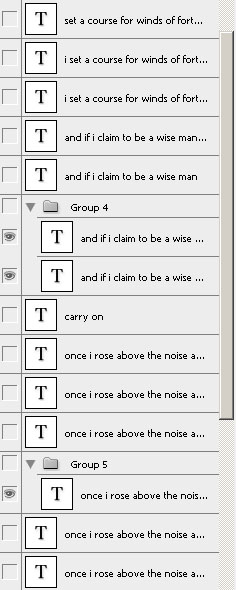
That is my cleaned up layer palette, with only the text layers that I thought were actual options remaining.
So, when I decided to put text on the icon, I was listening to my Supernatural playlist, and Kansas's "Carry On My Wayward Son" came on and I decided the lyrics sort of fit John Sheppard and the tone of the icon. It's VERY RARE that I am able to so quickly come up with words that fit, so this was something pretty strange and spectacular for me.
The particular lyrics I liked most were these:
Once I rose above the noise and confusion
Just to get a glimpse beyond this illusion
I was soaring ever higher, but I flew too high
and
Masquerading as a man with a reason
My charade is the event of the season
And if I claim to be a wise man
Then it surely means that I don't know
On a stormy sea of moving emotion
Tossed about I'm like a ship on the ocean
I set a course for winds of fortune
So I picked a font, 078MKSD (which fit the sleek look I was going for with the icon), and started typing.
The first thing I came up with was this:
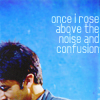
But you know what's amazing? SLANTY TEXT. Oh Rotate tool, here I come.
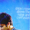
I wasn't quite satisfied. I tried more text, less text, bigger text, DIFFERENT text, all manner of things. Here's a sampling of the many things I tried:
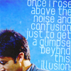
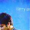
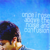
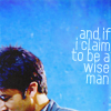
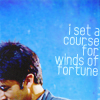
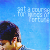
I decided I liked the one that said "If I claim to be a wise man" best. I'm not sure why, but it probably has something to do with the light text offsetting and balancing the dark of John's hair. But the thing I didn't like about it? A LOT OF BLANK SPACE. Since I have a weird crop, I can't really leave your focus jumping from John's cornernose to hover on the text and then back to the nose. The text needs to be like BAM and the back of John's head should be just another decoration. Which means... more decorations are needed!
6. Decorating the goddamned thing
By this point I was sick of making this icon. I hated it. It had to be finished and submitted soon, but I just wanted to go to sleep. There was no way on earth I was going to go trawling through texture or stock folders to find things that would fit. I didn't know what was needed, as I was tired and my brain was photoshop-fried, so I couldn't draw it by hand. What to do, what to do?
OH WAIT.
WE HAVE THINGS WE CAN USE TO ADD DECORATIONS ALREADY.
Where? you may ask.
Don't we have a cap? Don't we have a billion discarded text layers? CORRECT ON BOTH COUNTS.
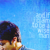
The first thing I decided to do was spice up the background by smashing my second-favorite text layer into the thing on softlight.

+
=
The other thing you should know at this point is that my text isn't white, it's a light blue set to screen. I find that using a color set to some sort of layer thingy often gives you more options in terms of the look of the text... though I'm also a big fan of white. Anyway, at this point, I was noticing that the text on top was kind of difficult to read and looked scratchy on the soft-light layer, so I duplicated it and put that layer on screen 40% opacity.
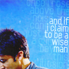
At this point I apparently decided that the icon was too sharp, because I copy-merged, blurred that layer, then set it to 32% opacity.

So then I wanted to add some splashes of color. I decided I was going to use the original cap, or something like it, on lighten. When I first dragged it on, it was too recognizable, so I altered it using curves layers to these things (click for full size):
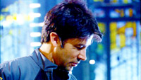
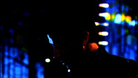
After some fiddling around, moving them, resizing them, trying them on different layer settings and opacities, etc, I ended up with these things on my icons like so:
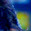
You may recognize them as John's hair + wall, John's ear + neck, and John's forehead + nose. They were set on lighten 100%, screen 60%, and screen 20%, to give a nice balance of color splashes. John's ear was masked out of the layer it was on, since the pink spot it made just looked out of place. If we get into rationalizing these choices - I liked the pinkish blob the first one added (it also added a bunch of other little spots, but I liked that one best), and I wanted another in the top right corner. After that, I wanted something at the center of the top to make that text blend in more.
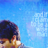
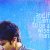

7. Final touches
IT'S DONE, IT'S DONE, you may think. Except not.
I mean, look at those crazy sharp pixels on his eyelid. wtf is that? Why is it there? Why hasn't it been gotten rid of? So I head to my tiny smudge brush and smudge until it's doing something acceptable. Like blending in with the other colors.
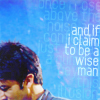
Then - is his skin too saturated? Maybe it's too saturated. Hue/Saturation, saturation -10, then mask away everything except his face. Not a huge difference, but it's enough for me (but then, I'm a tinkerer).

Slap a black&white gradient map on it to ensure that the dark to light ratio is pretty good...
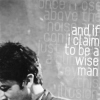
(That's actually something I do all along - If I don't I sometimes make icons that... look funny. idk, there's something about the b&w gradient map layer that forces me to ensure there's a good range of brightness.)
And... that's it. I run out of things to correct, so the icon is finished.

I hope you like this and it's helpful.
I will not give out the psd, so please do not ask. I have taken the time to write out all the stops and why I did them, and it is my belief that is far more useful for learning than the PSD would be.
Originally posted here at iconzero.

to

Photoshop CS3, probably easily translatable.
Intermediate difficulty
1. Choosing the cap and cropping

This icon was originally made for Round 5, Challenge 6 "Boys Will Be Boys" at lantis_lims. You can go here to see the other entries and some different things that were done with the same screencap.
From the caps available, I quickly chose this cap of John Sheppard as having the most potential for pretty colors, dynamism, and interest.
To start, I cropped it down to 100x100. Initially I cropped it so his entire head was visible, and was planning on putting that in a sea of blue, then I realized that was a stupidly obvious thing to do, and so cropped it so that his nose was in the bottom-left corner, leaving lots of blank space for whatever text, decoration, or other pictures I wanted to put there.
2. Basic coloring/brightening and sharpening

>

>

Here I used curves layers to brighten and color the icon. The colors of the cap were already pretty good, so I didn't need to do much. In the first curves layer, I brightened it considerably, upped the greens by a tad and the blues by a bit more, and dragged down the reds by a tiny bit (like so). For the next curves layer, I decided I wanted more contrast, so I increased the darkness of the very darkest parts, and then increased the brightness of the rest (like this). I'm not giving you the exact numbers because it's the overall arc of the line that's most important, and how it relates to the colors and brightness levels in your individual image.
Then to sharpen the image I used high pass. I copy-merge - ctrl-shift-alt-e (or if you're on a mac, command-shift-alt-e) - to create a new layer that looks like all the layers below it, merged. Then Filter>Other>High Pass with a radius of 0.5, and set it to soft light. Then I copy-merge again just so I have a finished layer I can drag around and alter later, which is important since I want to be cutting John out of the background.
3. Constructing the blue background

+

+

I picked out a bunch of textures by discolore, whose blue textures I am always in love with. I left the first one on Normal, 100% opacity, and set the second two on soft light. This set was only reached, however, after I opened up pretty much every blueish or greenish texture in my folder and dragged it onto the icon and tried a billion layer settings. Uncharacteristically, I then deleted them all, so I can't show you a comical lineup of a billion texture-hopefuls.
The result looked like this:

It's got the basic idea of what I want, but is too light and too cyan. So, to the trusty Hue/Saturation tool! Hue +10 to make it more blue, and Saturation +30 because I want it to be REALLY BLUE.

Still not dark enough. I sort of want to match the blue behind John's head. It's a lovely color, and it's what I want in my icon. I use curves to darken it (like this). Once I do that, it's too grainy. For most things, I'd actually like that, but for this icon I want something softer and smoother, so I blur it several times.


It's still not as dark as I'd like it, so I use another curves layer similar to the previous one to make it even darker. What I end up with is a nice blue with enough variation to be an interesting background.

4. Putting the pieces together
So now we have John and a background. I copy the extra "finalized" John layer from below the background layers (which I put in a group together) and bring it to the top. Now, to get John onto the background, you can use whatever cutting-out technique you most prefer. I use layer masks because they're easy, quick, and forgiving of mistakes. To add a mask to your layer, you can either go to Layer>Layer Mask>Reveal All, or else just hit the button on the layer palette that is like a circle inside of a rectangle. Now, the basic idea of layer masks is that anything that is white on the mask is visible on the layer, and anything that is black is INvisible, like it's been erased. Shades of grey are different levels of visibility. So you make sure you have the layer mask selected, then color with black everywhere you don't want to show (it'll look like you're erasing, but if you mess up, you can just color with white to make it show up again).
This is easy to understand but can be difficult to do sometimes, as people's tendency seems to be not to get close enough in to the subject. You're not going to hurt the pixels or lose them, so don't be afraid to get right up on the line between your subject and the background and then go over it. No one is going to notice that you shaved a pixel or two off someone's hair, but, believe me, people ARE going to notice if you leave a chunky line of the background in your cutout.

His hair is just too much. TOO MUCH. It's throwing the balance of the entire icon and it's all I can look at. So I resize his head so the dark blob of hair takes up less space. Then, because John Sheppard's crazy hair got cut off a little in the cap, I use the smudge tool on tiny tiny size to smudge up some stray strands of hair at the top (look closely for the difference!).


Then I decided that his skin was too red or too dark or something. Selective Color with the Yellows having these settings: 0, -15, -20.

Then, because I like to fade the fuck out of my icons, I added a generic smoky texture on Lighten, 85% opacity. Then I added a curves layer like this to bring back a little contrast.


Then I added a pretty standard thing I do, #2c2114 on Exclusion 100% opacity, #b2b2a3 on Color Burn 30% opacity, and then a curves layer with settings 180,160 and 0,35 (output,input) - the whole thing in a group on 25% opacity.

These differences may look small, but I think it's the tinkering that can often make or break a good idea.
5. Adding text (aka, the hardest part)
I am going to start this out by saying I HAVE NO EFFING CLUE WHAT I AM EVER DOING WITH TEXT, EVER. I always go into it completely confused, make a billion different layers saying different things in different ways, resize them and move them around, change colors/layer settings/opacity/whatever, and generally make a mess of my entire layers palette. Which is why I actually usually do it in a different file.
Just in case you think I'm lying about trying out a billion things, look at this:

That is my cleaned up layer palette, with only the text layers that I thought were actual options remaining.
So, when I decided to put text on the icon, I was listening to my Supernatural playlist, and Kansas's "Carry On My Wayward Son" came on and I decided the lyrics sort of fit John Sheppard and the tone of the icon. It's VERY RARE that I am able to so quickly come up with words that fit, so this was something pretty strange and spectacular for me.
The particular lyrics I liked most were these:
Once I rose above the noise and confusion
Just to get a glimpse beyond this illusion
I was soaring ever higher, but I flew too high
and
Masquerading as a man with a reason
My charade is the event of the season
And if I claim to be a wise man
Then it surely means that I don't know
On a stormy sea of moving emotion
Tossed about I'm like a ship on the ocean
I set a course for winds of fortune
So I picked a font, 078MKSD (which fit the sleek look I was going for with the icon), and started typing.
The first thing I came up with was this:

But you know what's amazing? SLANTY TEXT. Oh Rotate tool, here I come.

I wasn't quite satisfied. I tried more text, less text, bigger text, DIFFERENT text, all manner of things. Here's a sampling of the many things I tried:


I decided I liked the one that said "If I claim to be a wise man" best. I'm not sure why, but it probably has something to do with the light text offsetting and balancing the dark of John's hair. But the thing I didn't like about it? A LOT OF BLANK SPACE. Since I have a weird crop, I can't really leave your focus jumping from John's cornernose to hover on the text and then back to the nose. The text needs to be like BAM and the back of John's head should be just another decoration. Which means... more decorations are needed!
6. Decorating the goddamned thing
By this point I was sick of making this icon. I hated it. It had to be finished and submitted soon, but I just wanted to go to sleep. There was no way on earth I was going to go trawling through texture or stock folders to find things that would fit. I didn't know what was needed, as I was tired and my brain was photoshop-fried, so I couldn't draw it by hand. What to do, what to do?
OH WAIT.
WE HAVE THINGS WE CAN USE TO ADD DECORATIONS ALREADY.
Where? you may ask.
Don't we have a cap? Don't we have a billion discarded text layers? CORRECT ON BOTH COUNTS.
The first thing I decided to do was spice up the background by smashing my second-favorite text layer into the thing on softlight.

+

=

The other thing you should know at this point is that my text isn't white, it's a light blue set to screen. I find that using a color set to some sort of layer thingy often gives you more options in terms of the look of the text... though I'm also a big fan of white. Anyway, at this point, I was noticing that the text on top was kind of difficult to read and looked scratchy on the soft-light layer, so I duplicated it and put that layer on screen 40% opacity.

At this point I apparently decided that the icon was too sharp, because I copy-merged, blurred that layer, then set it to 32% opacity.

So then I wanted to add some splashes of color. I decided I was going to use the original cap, or something like it, on lighten. When I first dragged it on, it was too recognizable, so I altered it using curves layers to these things (click for full size):


After some fiddling around, moving them, resizing them, trying them on different layer settings and opacities, etc, I ended up with these things on my icons like so:


You may recognize them as John's hair + wall, John's ear + neck, and John's forehead + nose. They were set on lighten 100%, screen 60%, and screen 20%, to give a nice balance of color splashes. John's ear was masked out of the layer it was on, since the pink spot it made just looked out of place. If we get into rationalizing these choices - I liked the pinkish blob the first one added (it also added a bunch of other little spots, but I liked that one best), and I wanted another in the top right corner. After that, I wanted something at the center of the top to make that text blend in more.


7. Final touches
IT'S DONE, IT'S DONE, you may think. Except not.
I mean, look at those crazy sharp pixels on his eyelid. wtf is that? Why is it there? Why hasn't it been gotten rid of? So I head to my tiny smudge brush and smudge until it's doing something acceptable. Like blending in with the other colors.

Then - is his skin too saturated? Maybe it's too saturated. Hue/Saturation, saturation -10, then mask away everything except his face. Not a huge difference, but it's enough for me (but then, I'm a tinkerer).

Slap a black&white gradient map on it to ensure that the dark to light ratio is pretty good...

(That's actually something I do all along - If I don't I sometimes make icons that... look funny. idk, there's something about the b&w gradient map layer that forces me to ensure there's a good range of brightness.)
And... that's it. I run out of things to correct, so the icon is finished.

I hope you like this and it's helpful.
I will not give out the psd, so please do not ask. I have taken the time to write out all the stops and why I did them, and it is my belief that is far more useful for learning than the PSD would be.
Originally posted here at iconzero.