(no subject)
Back to Basics - PSP8 (possibly transferrable to other programs)
So I have no idea how helpful this might be-- it's a tutorial for people very, very new to icon/graphics-making; it's just a few of the basic tricks I like to use, stuff like image selection, cropping, brushes, gradients. Most people will already know all these tricks; newbies will not. If there are already 109838 tutorials out there like this, I apologize! But let's continue.
01 Quality Image
The first rule of graphics-making is this: quality images make for a quality result. Quality means, usually, BIG. Unfortunately, these sorts are the most difficult to come by. A couple sites I like to rely on are the Anime Project Alliance Gallery, and Outnow (for movies). Searching for these sorts of scans and pictures does, I admit, take lots and lots of patience sometimes. But it will pay off in the end, believe me.
02 PNG versus JPG
The second rule applies to how you SAVE your image when you're done with it. PNG will preserve MUCH more of pristine quality than, say, JPG or GIF. The problem is, it does use a bit more memory. Like many others, I use Photobucket for image hosting, and they don't allow images bigger than 250kb. Which will happen if you save your larger graphics, like banners and wallpapers and headers as PNG. So usually I have to make the sacrifice and go to JPG, for those. But for icons, you are usually safe with PNG-- so stick to it.
(btw-- for the purposes of saving PB some bandwidth, all images used in this tutorial are JPG. So bear than in mind when looking at them critically.)
03 Cropping
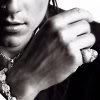
On to the tricks of the trade. This one you are probably all familiar with: Cropping. The trick is this: centered images are-- hate to break it to you-- visually blase and boring. So when cropping, try to pick ways of cropping your image that put it off-center, or focused on a particular part of the subject. It will add more interest and appeal to your icon. I'll show you what I mean:
You see here I've started with a big picture (Ioan Gruffudd, of King Arthur fame. Isn't he pretty? <3 Moving on.)
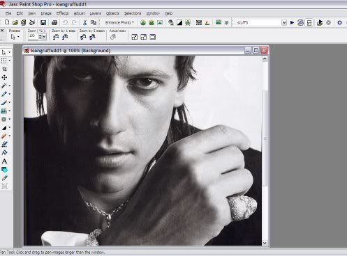
Now to pick a crop for my icon: I'll use the selection tool, choose out a portion, copy, paste it to a new image, and resize it to 100x100 to get an idea of what it would look like as an icon. I'll do this several times, till I get a crop I'm happy with. Here are some examples:
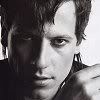
your basic, centered image:
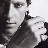
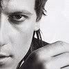
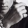
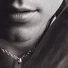
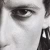
some off-centered and subject-focused examples:
04 Image Enhancement
Once you've picked the crop you like, undo the resize and spiffy the image up a bit. This means, usually, applying all or just some of the following adjustments:
+Adjust---> Add/Remove Noise---> Edge Preserving Smooth
+Adjust---> Brightness and Contrast---> Hightlight/Midtone/Shadow
+Adjust---> Brightness and Contrast---> Clarify
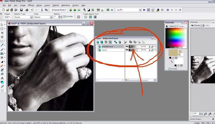
+Duplicate the layer; then apply Gaussian blur (radius: 1.00) and Brightness/Contrast (approx. 15/15); then lower the opacity of the altered layer to somewhere around 50%
The Automatic Contrast/Saturation/Color Balance Enhancements can work well, too-- you have to be careful of them, though, they can turn out. . . drastic.
Once you get it resized to 100x100, you'll usually want to Sharpen it, just because resizing sometimes has that affect of blurring it a bit. What I have after all this looks like so:
(Something else I did to it was run the Soften brush set at a low opacity all the harsh edges, making it nice and smooth.)
05 Gradients
I heart gradients. They're not always applicable, but they can add a lot of pizazz in the right situation. The simplest way they work is like so:
pick a foreground and background color:
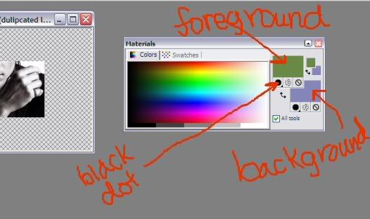
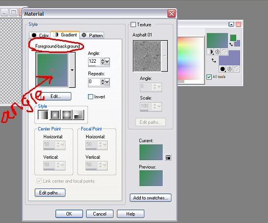
select "gradient" by clicking the little "black button" and choosing the circle that has white/gray/black. If it doesn't automatically turn out as a foreground/background blend, click the eyedropper in the middle of the foreground box and the edit screen should pop up. hit the Edit button and find the "foreground-background" gradient. Then drag on the little line to shift the angle of the gradient.
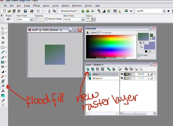
Once you've got that, make a New Raster Layer for your image, and Flood Fill it with your gradient.
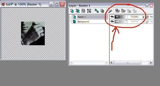
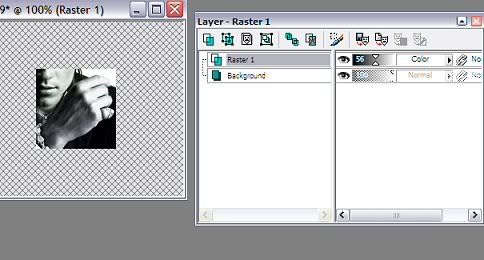
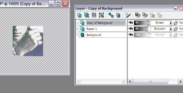
Having accomplished that, there's several things I like to do with this layer's Blend Mode (found on the Layer Palette next to the Opacity bar.) Basically you'll want to just experiment with blend modes and opacities till you find something you like. Like so:
+Multiply
+Color
+Exclusion (duplicate the bottom layer, move it to the top, set it as screen, lower the opacity somewhat.)
06 Brushes
Brushes are your friend. Lots of beautiful brushes are out there-- you just gotta go out and find ones that catch your fancy. Most people/websites will give you instructions on how to install them, so I'm not gonna bother. Just a few things to remember:
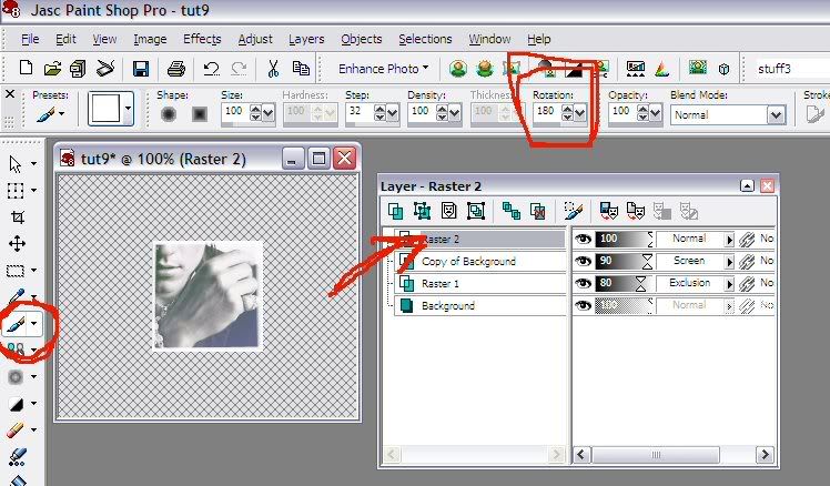
--always apply all your brushwork to a New Raster Layer above the image layer, not directly to the image itself. It just saves you lots of hassle in the long run.
--you can change the Rotation of the brush quite easily, so it's almost like having four brushes in one; just remember your square rotations: 0, 90, 180, & 270.
And here's some resources for brushes I turn to often:
-- teh_indy ; isabellecs ; pekeana ; dorky_duck ; quebelly ; ghostarmy ; gamin1432 ; miggy
I know this tutorial isn't all-inclusive; I just wanted to give a bit of a jumping point to newbies who maybe just need a bit of push in the right direction. I didn't include text-treatment, though that's very important, because that's something I personally still have a lot of difficulty with, even after all this time. XP
So I have no idea how helpful this might be-- it's a tutorial for people very, very new to icon/graphics-making; it's just a few of the basic tricks I like to use, stuff like image selection, cropping, brushes, gradients. Most people will already know all these tricks; newbies will not. If there are already 109838 tutorials out there like this, I apologize! But let's continue.
01 Quality Image
The first rule of graphics-making is this: quality images make for a quality result. Quality means, usually, BIG. Unfortunately, these sorts are the most difficult to come by. A couple sites I like to rely on are the Anime Project Alliance Gallery, and Outnow (for movies). Searching for these sorts of scans and pictures does, I admit, take lots and lots of patience sometimes. But it will pay off in the end, believe me.
02 PNG versus JPG
The second rule applies to how you SAVE your image when you're done with it. PNG will preserve MUCH more of pristine quality than, say, JPG or GIF. The problem is, it does use a bit more memory. Like many others, I use Photobucket for image hosting, and they don't allow images bigger than 250kb. Which will happen if you save your larger graphics, like banners and wallpapers and headers as PNG. So usually I have to make the sacrifice and go to JPG, for those. But for icons, you are usually safe with PNG-- so stick to it.
(btw-- for the purposes of saving PB some bandwidth, all images used in this tutorial are JPG. So bear than in mind when looking at them critically.)
03 Cropping
On to the tricks of the trade. This one you are probably all familiar with: Cropping. The trick is this: centered images are-- hate to break it to you-- visually blase and boring. So when cropping, try to pick ways of cropping your image that put it off-center, or focused on a particular part of the subject. It will add more interest and appeal to your icon. I'll show you what I mean:
You see here I've started with a big picture (Ioan Gruffudd, of King Arthur fame. Isn't he pretty? <3 Moving on.)
Now to pick a crop for my icon: I'll use the selection tool, choose out a portion, copy, paste it to a new image, and resize it to 100x100 to get an idea of what it would look like as an icon. I'll do this several times, till I get a crop I'm happy with. Here are some examples:
your basic, centered image:
some off-centered and subject-focused examples:
04 Image Enhancement
Once you've picked the crop you like, undo the resize and spiffy the image up a bit. This means, usually, applying all or just some of the following adjustments:
+Adjust---> Add/Remove Noise---> Edge Preserving Smooth
+Adjust---> Brightness and Contrast---> Hightlight/Midtone/Shadow
+Adjust---> Brightness and Contrast---> Clarify
+Duplicate the layer; then apply Gaussian blur (radius: 1.00) and Brightness/Contrast (approx. 15/15); then lower the opacity of the altered layer to somewhere around 50%
The Automatic Contrast/Saturation/Color Balance Enhancements can work well, too-- you have to be careful of them, though, they can turn out. . . drastic.
Once you get it resized to 100x100, you'll usually want to Sharpen it, just because resizing sometimes has that affect of blurring it a bit. What I have after all this looks like so:
(Something else I did to it was run the Soften brush set at a low opacity all the harsh edges, making it nice and smooth.)
05 Gradients
I heart gradients. They're not always applicable, but they can add a lot of pizazz in the right situation. The simplest way they work is like so:
pick a foreground and background color:
select "gradient" by clicking the little "black button" and choosing the circle that has white/gray/black. If it doesn't automatically turn out as a foreground/background blend, click the eyedropper in the middle of the foreground box and the edit screen should pop up. hit the Edit button and find the "foreground-background" gradient. Then drag on the little line to shift the angle of the gradient.
Once you've got that, make a New Raster Layer for your image, and Flood Fill it with your gradient.
Having accomplished that, there's several things I like to do with this layer's Blend Mode (found on the Layer Palette next to the Opacity bar.) Basically you'll want to just experiment with blend modes and opacities till you find something you like. Like so:
+Multiply
+Color
+Exclusion (duplicate the bottom layer, move it to the top, set it as screen, lower the opacity somewhat.)
06 Brushes
Brushes are your friend. Lots of beautiful brushes are out there-- you just gotta go out and find ones that catch your fancy. Most people/websites will give you instructions on how to install them, so I'm not gonna bother. Just a few things to remember:
--always apply all your brushwork to a New Raster Layer above the image layer, not directly to the image itself. It just saves you lots of hassle in the long run.
--you can change the Rotation of the brush quite easily, so it's almost like having four brushes in one; just remember your square rotations: 0, 90, 180, & 270.
And here's some resources for brushes I turn to often:
-- teh_indy ; isabellecs ; pekeana ; dorky_duck ; quebelly ; ghostarmy ; gamin1432 ; miggy
I know this tutorial isn't all-inclusive; I just wanted to give a bit of a jumping point to newbies who maybe just need a bit of push in the right direction. I didn't include text-treatment, though that's very important, because that's something I personally still have a lot of difficulty with, even after all this time. XP