Tutorial: Coloring SN Caps
Ah, Supernatural, with those weird-colored caps that are impossible to icon.
_chokeanddie, who's icons are brilliant, so I dunno why she's asking me what I did ;), asked if I'd explain "HOW on god's green EARTH" I colored the icons from my last batch, so to oblige, I'm finally getting around to doing a tut. No icon was specified, so I chose this one. Actually this cap wasn't so weridly-colored, but oh well. Hopefully it will be useful for someone out there.
The Tutorial:
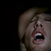
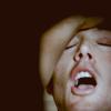
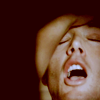
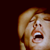
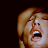
Going from this to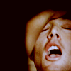
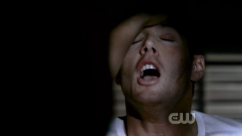
Step 1: Start with this cap (made by someone else who's nicely credited in my user info somewhere... I'm afraid I can't remember who's caps are who's though ;) Do tell if it's yours). Crop it. Since this was an HD cap I didn't do anything to it but crop.
Step 2: Duplicate the base twice. Screen the top layer, then set the middle layer to Fill: 30% and Gaussian Blur it at 0.9. This doesn't make much of a difference now, but I think it looks a bit nicer/cleaner once there's a lot of color layers on there.
Step 3: Add a curves layer, RGB, with two points:
New point in the middle at Input: 175, Output: 197
Bottom end point moved to Input: 9, Output: 0
Step 4: Color fill layer, #230d04, set to exclusion.
Step 4: Another color fill exclusion layer, this time #181402. Set fill to 55%.
Step 5: On to the fun stuff where I do most of my playing around with color! First, a color balance layer with the following settings:
Shadows: Cyan/Red +15, Magenta/Green 0, Yellow/Blue 0
Midtones: Cyan/Red 0, Magenta/Green 0, Yellow/Blue -20
Highlights: Cyan/Red 0, Magenta/Green 0, Yellow/Blue +10
Step 6: Selective color layer, with just one adjustment which is tiny but makes a big difference in the end:
Blacks: Black +15
Step 7: Duplicate the first color balance layer (from step 5) and drag it up to the top.
Step 8: Another curves layer, this time with the following settings:
New point in the middle at Input: 178, Output: 184
Bottom end point moved to Input: 11, Output: 0
Step 9: Selective color layer with the following settings:
Reds: Cyan -15, Magenta 0, Yellow +10
Yellows: Cyan 0, Magenta 0, Yellow +10
Magentas: Cyan 0, Magenta +50, Yellow 0
Whites: Cyan 0, Magenta 0, Yellow -15
Neutrals: Cyan +1, Magenta 0, Yellow -5
Blacks: Black +5

Step 10: Levels layer, RGB, wih the following settings:
Input Levels: 4, 0.87, 255
(Yes, this does make it darker.)
Step 11: One last curves layer, with the following settings:
New point in the middle at Input: 190, Output: 199
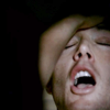
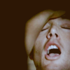
And you're done!

Note: this icon is actually a bit rare in that it has no hue/saturation layers. Usually I saturate almost every icon at least a bit.
If you have any questions, just ask! In fact, this tut was a lot less scary to do than I thought it'd be, so I may just do more in the future ;)
This is just one of many, many, many methods, obviously, and I do lots of different things myself... I usually tweak my method around a bit each batch, even. But this is kind of the basic stuff I did for that batch, give or take lots of steps :p
_chokeanddie, who's icons are brilliant, so I dunno why she's asking me what I did ;), asked if I'd explain "HOW on god's green EARTH" I colored the icons from my last batch, so to oblige, I'm finally getting around to doing a tut. No icon was specified, so I chose this one. Actually this cap wasn't so weridly-colored, but oh well. Hopefully it will be useful for someone out there.
The Tutorial:
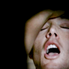
Going from this to
Step 1: Start with this cap (made by someone else who's nicely credited in my user info somewhere... I'm afraid I can't remember who's caps are who's though ;) Do tell if it's yours). Crop it. Since this was an HD cap I didn't do anything to it but crop.
Step 2: Duplicate the base twice. Screen the top layer, then set the middle layer to Fill: 30% and Gaussian Blur it at 0.9. This doesn't make much of a difference now, but I think it looks a bit nicer/cleaner once there's a lot of color layers on there.
Step 3: Add a curves layer, RGB, with two points:
New point in the middle at Input: 175, Output: 197
Bottom end point moved to Input: 9, Output: 0
Step 4: Color fill layer, #230d04, set to exclusion.
Step 4: Another color fill exclusion layer, this time #181402. Set fill to 55%.
Step 5: On to the fun stuff where I do most of my playing around with color! First, a color balance layer with the following settings:
Shadows: Cyan/Red +15, Magenta/Green 0, Yellow/Blue 0
Midtones: Cyan/Red 0, Magenta/Green 0, Yellow/Blue -20
Highlights: Cyan/Red 0, Magenta/Green 0, Yellow/Blue +10
Step 6: Selective color layer, with just one adjustment which is tiny but makes a big difference in the end:
Blacks: Black +15
Step 7: Duplicate the first color balance layer (from step 5) and drag it up to the top.
Step 8: Another curves layer, this time with the following settings:
New point in the middle at Input: 178, Output: 184
Bottom end point moved to Input: 11, Output: 0
Step 9: Selective color layer with the following settings:
Reds: Cyan -15, Magenta 0, Yellow +10
Yellows: Cyan 0, Magenta 0, Yellow +10
Magentas: Cyan 0, Magenta +50, Yellow 0
Whites: Cyan 0, Magenta 0, Yellow -15
Neutrals: Cyan +1, Magenta 0, Yellow -5
Blacks: Black +5
Step 10: Levels layer, RGB, wih the following settings:
Input Levels: 4, 0.87, 255
(Yes, this does make it darker.)
Step 11: One last curves layer, with the following settings:
New point in the middle at Input: 190, Output: 199
And you're done!
Note: this icon is actually a bit rare in that it has no hue/saturation layers. Usually I saturate almost every icon at least a bit.
If you have any questions, just ask! In fact, this tut was a lot less scary to do than I thought it'd be, so I may just do more in the future ;)
This is just one of many, many, many methods, obviously, and I do lots of different things myself... I usually tweak my method around a bit each batch, even. But this is kind of the basic stuff I did for that batch, give or take lots of steps :p