Icon tutorial #01 / Textures & Brushes
Hey look, a tutorial by me. Now that's a first. It was requested by shadowmyst, and I've done my best trying to explain what to do, as I usually suck at it.
• Made in PSCS, should be easily translatable to most programs.
As I was making this I realized it's fairly easy without any real complicated steps. A few texture and brush layers with a layer mask and that's it. As always, depending on your base you may need to of course add a Curves layer, Selective color layer or similar to bring out the colors of your base, but with this particular image I didn't feel like it was needed.
to
Tutorial: Sucre
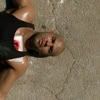
For this tutorial I used THIS cap by me of Sucre from Prison Break 2x22 - Sona and cropped to 100x100 to get the base.
1) BASE

>>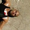
Start by duplicating your base twice and set one to screen and the other to softlight. I set both layers at 50%. Copy merge (Shift+Ctrl+C) and paste as a new layer (Ctrl+V). I do this instead of merging all the layers in case I mess something up, want to go back and change a setting or whatever. You do whatever feels the best.
2) ADDING LAYER MASK

>>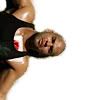
After prepping the base I add a new layer and fill it with white to make it easier to see what to erase. Duplicate the copy merged base and drag it so it's on top the white layer. Add a layer mask and erase the background. Because of the texturing later I don't spend much time to get the edges perfect.
3) TEXTURES

>>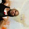
Now is the step to choose textures. I usually don't know what goes on in my head when I choose them, I try out a few and switch them around until I find something I like. For this icon I chose two textures (#1, rotated so the red part was behind Sucre, and #2), both by gender. Paste them as new layers UNDER your base with the layer mask, the first set to normal and second to softlight.
Looks a bit bare, huh? On to brushes!
4) BRUSHES

>>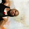
(first brush layer)

>>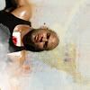
(second brush layer)

>>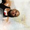
(brushes together)
I love adding different white grungy brushes as they can really compliment and get a more subtle look of the textures you use. For this particular icon I used a few of elli's brushes found at http://ex-posed.com. I can never remember the exact ones I used, but pretty much anything works.
I usually create a new layer for each brush I use in case I mess up or want to delete one of them etc. For this one I only needed two layers with one or two brushes as I felt it was enough for the icon. The first one was added on top of the textures and the other on top of the base and then rotated to cover part of Sucre's arm and also get rid of some of the redness in one of the textures that kept reminding me of blood.
The brush layers were all set to normal 100%, but this of course depends on what you like. Sometimes I fiddle around with the settings as well as change the color of the brush. Experiment!
5) LAST TOUCH (optional)

>>
Lastly I added a Color Balance layer just above the masked layer (to not lose the whiteness of the second brush layer) because I wanted a slight yellow tint to get a warmer look. All I did was lower the blue in Midtones a bit.
Layers:

DONE :)
I hope it's understandable enough. Questions are always welcomed :)
• Made in PSCS, should be easily translatable to most programs.
As I was making this I realized it's fairly easy without any real complicated steps. A few texture and brush layers with a layer mask and that's it. As always, depending on your base you may need to of course add a Curves layer, Selective color layer or similar to bring out the colors of your base, but with this particular image I didn't feel like it was needed.

to

Tutorial: Sucre
For this tutorial I used THIS cap by me of Sucre from Prison Break 2x22 - Sona and cropped to 100x100 to get the base.
1) BASE

>>

Start by duplicating your base twice and set one to screen and the other to softlight. I set both layers at 50%. Copy merge (Shift+Ctrl+C) and paste as a new layer (Ctrl+V). I do this instead of merging all the layers in case I mess something up, want to go back and change a setting or whatever. You do whatever feels the best.
2) ADDING LAYER MASK

>>

After prepping the base I add a new layer and fill it with white to make it easier to see what to erase. Duplicate the copy merged base and drag it so it's on top the white layer. Add a layer mask and erase the background. Because of the texturing later I don't spend much time to get the edges perfect.
3) TEXTURES

>>

Now is the step to choose textures. I usually don't know what goes on in my head when I choose them, I try out a few and switch them around until I find something I like. For this icon I chose two textures (#1, rotated so the red part was behind Sucre, and #2), both by gender. Paste them as new layers UNDER your base with the layer mask, the first set to normal and second to softlight.
Looks a bit bare, huh? On to brushes!
4) BRUSHES

>>

(first brush layer)

>>

(second brush layer)

>>

(brushes together)
I love adding different white grungy brushes as they can really compliment and get a more subtle look of the textures you use. For this particular icon I used a few of elli's brushes found at http://ex-posed.com. I can never remember the exact ones I used, but pretty much anything works.
I usually create a new layer for each brush I use in case I mess up or want to delete one of them etc. For this one I only needed two layers with one or two brushes as I felt it was enough for the icon. The first one was added on top of the textures and the other on top of the base and then rotated to cover part of Sucre's arm and also get rid of some of the redness in one of the textures that kept reminding me of blood.
The brush layers were all set to normal 100%, but this of course depends on what you like. Sometimes I fiddle around with the settings as well as change the color of the brush. Experiment!
5) LAST TOUCH (optional)

>>

Lastly I added a Color Balance layer just above the masked layer (to not lose the whiteness of the second brush layer) because I wanted a slight yellow tint to get a warmer look. All I did was lower the blue in Midtones a bit.
Layers:

DONE :)
I hope it's understandable enough. Questions are always welcomed :)