2012 ICON PROGRESSION
Wow, how is it already the end of 2012? It went by crazy fast in my opinion. Anyway, now that its the end of the year it's high time to have another icon progression post!
My last one is here, if anybody is curious. I will warn you now that it is not a pretty sight.
January
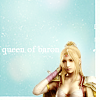

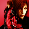

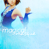
So, by this point I had been back as an LJ icon maker for about a year. I was sorta working on cropping/composition in January, but it was still a bit pedestrian. The third and fourth icons were still a bit more complex than my usual work at that time. As usual back then, a lot of my icons were Final Fantasy ones.
February
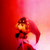
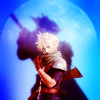
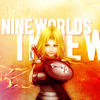
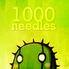
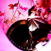
This month I used a lot of hard light textures since I had just figured out the sort of glow and colour they would give my icons. Lots of bright colours, lots of negative space, and three icon posts overall. I think I had just got out of a slump at this point, and was pretty pleased about it.
March
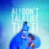
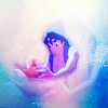
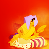
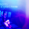

I only made Aladdin icons this month. This was my first attempt at working with Disney caps ever, and I think I went a little overboard with the saturation which caused some eyeburning/sharpening problems on some of the icons.
April
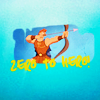
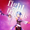
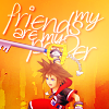

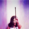
This was the month where I started to experiment with text quite a bit more. It's pretty basic, a lot of the text is just plain white, but it was a start. This was also one of the first times where I really worked with live action caps, because I made a small Glee post which was mainly close crops. I'm pretty sure that on the Glee icons I started to use Paint Daubs as a sharpening tool.
May
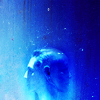
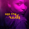
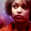

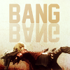
These posts started a foray into monochrome colouring, as you can see for the first two icons. There were more live action icons than April, more text experimentation and I started to take part in a few flash challenges at anon_icon. I think that community was probably what prompted my surge in icon posts at that time.
June

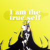
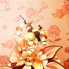
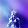
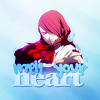
As you can see from the first and fifth icons, I found a composition that I liked and whenever a cap/scan wouldn't work I just ended up shoving it into that formation. I started searching out concrit more around this time and applied more of it to my icons.
July
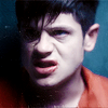


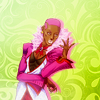
theiconquest started up around this time, so I made four icon posts! The first icon was from a Misfits post I made where I had rather unfortunately discovered Topaz and wanted to use it at every opportunity, but luckily I kicked that habit rather fast. I was making more anime icons at this point, rather than video games like I had at the beginning of the year.
August


I experimented with compositions with my IQ mentor icons! The compositions were more complicated, and I used a more vast array of colours than I had in a while. Unfortunately, I also made some gross icons while trying to struggle with the TDKR trailer caps.
September


More experimentation with text, and I downloaded some of my favourite fonts! The fifth icon is, to date, the only vaguely successful blending icon that I've made like, ever. That is something that I would like to try and practice in the new year.
October


Here I tried to change up my compositions some, because I definitely fell into a negative space and plain, lightly textured background over the last year. I also worked more at making my text work more seamlessly with my icons, which involved rotation to make sure that it flowed with whatever position the subject was in.
November


I started to try out manga colouring this month! I've not made many, mainly because it takes soooo long, but I practice when I can. I think I've overused gradients on my live action icons recently, which is something I will try and fix in the new year.
December


And we're up to the present month! I'm pretty pleased with my improvement over the year, even if it didn't happen quite as quickly as I'd like. Next year I'd like to get better at colouring and more complex compositions, so that will be something that I practice as soon as possible. I'd also like to get better at manga colouring icons.
My last one is here, if anybody is curious. I will warn you now that it is not a pretty sight.
January


So, by this point I had been back as an LJ icon maker for about a year. I was sorta working on cropping/composition in January, but it was still a bit pedestrian. The third and fourth icons were still a bit more complex than my usual work at that time. As usual back then, a lot of my icons were Final Fantasy ones.
February


This month I used a lot of hard light textures since I had just figured out the sort of glow and colour they would give my icons. Lots of bright colours, lots of negative space, and three icon posts overall. I think I had just got out of a slump at this point, and was pretty pleased about it.
March


I only made Aladdin icons this month. This was my first attempt at working with Disney caps ever, and I think I went a little overboard with the saturation which caused some eyeburning/sharpening problems on some of the icons.
April


This was the month where I started to experiment with text quite a bit more. It's pretty basic, a lot of the text is just plain white, but it was a start. This was also one of the first times where I really worked with live action caps, because I made a small Glee post which was mainly close crops. I'm pretty sure that on the Glee icons I started to use Paint Daubs as a sharpening tool.
May


These posts started a foray into monochrome colouring, as you can see for the first two icons. There were more live action icons than April, more text experimentation and I started to take part in a few flash challenges at anon_icon. I think that community was probably what prompted my surge in icon posts at that time.
June


As you can see from the first and fifth icons, I found a composition that I liked and whenever a cap/scan wouldn't work I just ended up shoving it into that formation. I started searching out concrit more around this time and applied more of it to my icons.
July


theiconquest started up around this time, so I made four icon posts! The first icon was from a Misfits post I made where I had rather unfortunately discovered Topaz and wanted to use it at every opportunity, but luckily I kicked that habit rather fast. I was making more anime icons at this point, rather than video games like I had at the beginning of the year.
August


I experimented with compositions with my IQ mentor icons! The compositions were more complicated, and I used a more vast array of colours than I had in a while. Unfortunately, I also made some gross icons while trying to struggle with the TDKR trailer caps.
September


More experimentation with text, and I downloaded some of my favourite fonts! The fifth icon is, to date, the only vaguely successful blending icon that I've made like, ever. That is something that I would like to try and practice in the new year.
October


Here I tried to change up my compositions some, because I definitely fell into a negative space and plain, lightly textured background over the last year. I also worked more at making my text work more seamlessly with my icons, which involved rotation to make sure that it flowed with whatever position the subject was in.
November


I started to try out manga colouring this month! I've not made many, mainly because it takes soooo long, but I practice when I can. I think I've overused gradients on my live action icons recently, which is something I will try and fix in the new year.
December


And we're up to the present month! I'm pretty pleased with my improvement over the year, even if it didn't happen quite as quickly as I'd like. Next year I'd like to get better at colouring and more complex compositions, so that will be something that I practice as soon as possible. I'd also like to get better at manga colouring icons.