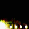
Tutorial #8: Going the Distance
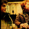
Today we are going from:
-->
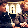
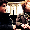
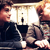
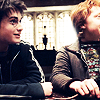
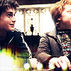
First we pick out this lovely cap and crop it all nice and 100x100. Sharpen it once(or twice) and have it be. If your icon isn't as bright or whatever as this one, then it might be a good idea to tweak it a bit. Increase the contrast and brightness until it looks like this base I made.
Viola, now duplicate it twice, desaturating each(ctrl+shift+u) and setting them to soft light.
Now bring the bottom, colorerd base up top and set to screen about 70% opacity.
This next step seems unimportant but it tints that right side up just a bit so the whole icon has the same color scheme-ish. So set this gradient to overlay.

->
Now we start on some textures! All of these are from Candy Crack, whom is my goddess for all things icon. First, a light texture that we set to screen.
->
Now this is the kicker, and will give us that aged look(see the lovurly crack? it's my favorite). Set this one to multiply.

->
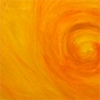
Now because I've lately been obsessed with orange, use this texture. Set to multiply at 58% opacity.
->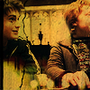
Because this is a little too washed out, go allll the way down and duplicate that base layer up top and set it to soft light at 70%.
Now for the text I just used black, with Palatino at 7pt. To give it a kick(I use photoshop, btw) I went into the blending options(right click the text layer to select it) and did the following: Drop Shadow in #3C4C06(dark green), with distance-0, spread-11, and size-1. ALSO, I did an Outer Glow with the standard they gave. This just outlines and defines the text a bit more. Add some small text in 2pt and there you go!
Done! I hope you love it, and if you make an icon with it I'd LOVE to see it!
-->
First we pick out this lovely cap and crop it all nice and 100x100. Sharpen it once(or twice) and have it be. If your icon isn't as bright or whatever as this one, then it might be a good idea to tweak it a bit. Increase the contrast and brightness until it looks like this base I made.
Viola, now duplicate it twice, desaturating each(ctrl+shift+u) and setting them to soft light.
Now bring the bottom, colorerd base up top and set to screen about 70% opacity.
This next step seems unimportant but it tints that right side up just a bit so the whole icon has the same color scheme-ish. So set this gradient to overlay.
->
Now we start on some textures! All of these are from Candy Crack, whom is my goddess for all things icon. First, a light texture that we set to screen.
->
Now this is the kicker, and will give us that aged look(see the lovurly crack? it's my favorite). Set this one to multiply.
->
Now because I've lately been obsessed with orange, use this texture. Set to multiply at 58% opacity.
->
Because this is a little too washed out, go allll the way down and duplicate that base layer up top and set it to soft light at 70%.
Now for the text I just used black, with Palatino at 7pt. To give it a kick(I use photoshop, btw) I went into the blending options(right click the text layer to select it) and did the following: Drop Shadow in #3C4C06(dark green), with distance-0, spread-11, and size-1. ALSO, I did an Outer Glow with the standard they gave. This just outlines and defines the text a bit more. Add some small text in 2pt and there you go!
Done! I hope you love it, and if you make an icon with it I'd LOVE to see it!