(no subject)
Here is another requested tutorial of this icon.
Made with PSCS, but should be translateable to PSP.
We'll be going from
to
.
Take your picture (I used this picture of Rupert) and crop it to a square. Then resize to 100 x 100 pixels.
Sharpen your image using unsharp mask. My settings were
Amount - 8
Radius - 0.5
Threshold - 0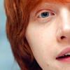
This step is optional. Take your soften tool, and soften Rupert's face, making sure to avoid the eyes, hair, mouth, and also the line defining his nose. My settings were
Brush Size - 6
Hardness - 0
Strength (Opacity) 13
This step is also optional. Take the sharpen brush, and sharpen Rupert's eyes, hair, and lips. My settings were
Brush Size - 9
Hardness - 0
Strenth (Opacity) 5.
Adjustment Layer Now we'll be starting with adjustment layers. In Photoshop CS, these can be found under IMAGE >> ADJUSTMENTS. First is a Brightness/Contrast layer. We want to up the contrast to make the image pop. My settings were
Brightness - -5
Contrast - +40. The amount you up the contrast depends on the image. Make sure that you can still see the subject in your icon.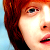

Duplicate your base and desaturate it (IMAGE >> ADJUSTMENTS >> DESATURATE). Set the desaturated copy to Soft Light at 100% opacity.

Make a new layer and fill it with a light, teal-ish blue color (I used #C7E5E4) Set the teal layer on Color Burn at 100% opacity.

Make a new layer and fill it with a light pink color (I used #D18EBF). Set the pink layter on Soft Light at 100% opacity.
There you are! The icon I made in the tutorial didn't turn out as nice as the original icon, but it gets the basic technique across.
Made with PSCS, but should be translateable to PSP.
We'll be going from
to
.
Take your picture (I used this picture of Rupert) and crop it to a square. Then resize to 100 x 100 pixels.
Sharpen your image using unsharp mask. My settings were
Amount - 8
Radius - 0.5
Threshold - 0
This step is optional. Take your soften tool, and soften Rupert's face, making sure to avoid the eyes, hair, mouth, and also the line defining his nose. My settings were
Brush Size - 6
Hardness - 0
Strength (Opacity) 13
This step is also optional. Take the sharpen brush, and sharpen Rupert's eyes, hair, and lips. My settings were
Brush Size - 9
Hardness - 0
Strenth (Opacity) 5.
Adjustment Layer Now we'll be starting with adjustment layers. In Photoshop CS, these can be found under IMAGE >> ADJUSTMENTS. First is a Brightness/Contrast layer. We want to up the contrast to make the image pop. My settings were
Brightness - -5
Contrast - +40. The amount you up the contrast depends on the image. Make sure that you can still see the subject in your icon.
Duplicate your base and desaturate it (IMAGE >> ADJUSTMENTS >> DESATURATE). Set the desaturated copy to Soft Light at 100% opacity.
Make a new layer and fill it with a light, teal-ish blue color (I used #C7E5E4) Set the teal layer on Color Burn at 100% opacity.
Make a new layer and fill it with a light pink color (I used #D18EBF). Set the pink layter on Soft Light at 100% opacity.
There you are! The icon I made in the tutorial didn't turn out as nice as the original icon, but it gets the basic technique across.