Colouring Guide pt 2
I've been doing a lot of stuff in photoshop recently. Things like this and this and this. (These are huge files and not entirely work safe). It helps that the art is sooo pretty (I ENCOURAGE PEOPLE TO READ TENJOU TENGE).
First of all, I'm sharing most of the textures/patterns I've downloaded from the internet. Most of them are small, but I do havea few that are actually uh, kind of big. Also of note are the skin swatches I use in 99 percent of these cases. And here are two skin pallete images.
On to the guide! As a reminder, here are some handy dandy keyboard shortcuts.
[ will make your brush/eraser smaller.
] will make your brush/erase bigger.
Shift + [ makes the edges softer.
Shift + ] makes the edges harder.
You can change the keys as you'd like, but B is usually your brush tool, and E is usually your eraser. These can be changed or viewed under Edt > Keyboard Shortcuts.
So today I'm demonstrating with
.
These are steps I take, and most of this is learned through experimentation. So kick back and have fun. ♥
First, you want to fix up the image. With this one, first I desaturated, by going to Image > Adjustments > DeSaturate (alternately Ctrl + Alt + U+). And then I adjusted the levels until what was SUPPOSED to be white turned out white, and what was black was black.

And then I set the base image to Multiply and made about seven to ten normal layers underneath.
First, I'm going to do Burupya, since there's something ~special~ I wanna do with him. So, I'm laying down Burupya's pink. And WITH THIS, an explanation on COLOUR PICKING.
I. I actually took the colour reference from swornmyoath's one coloured Burupya icon.
Normally you won't be working with such a small source. But here is what I usualy do to get a good sample.
First, magnify the image. I magnified the icon to about eight hundred. What you want to do is magnify it enough to get a good look at the section you're taking the icon from. Then, choose the eyedropper tool. The options are usually set to "point sample". With a larger image, you may want to change it to 5 x 5 average, which will give you that average. For this icon, I'm changing it to 3 X 3. And then I'm choosing the two colours of Burupya's pink, and saving them in my swatches.
And then with the lighter colour, i'm going to go over and cover all of Burupya. Since I'm doing the entire page, that means I'm doing him four times. For now I'm not going to worry about clean up. However, I'm going to make sure that each colour blob is seperated.
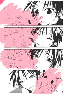
An easy way to make a gradient is to assign the two colours you want to use as the foreground and background colours (by double clicking on each of the squares), and then switching over to the Gradient tool, which is with the paintbucket.
Double clicking on the colours of the gradient will let you add MORE colours to the gradient, as well as let you save it. This page here actually has A LOT MORE about gradients, as well as picture illustrations!
Anyway, I'm going to use a gradient on Burupya's fur. HOWEVER in the interest of not colouring the entire picture? I use the MAGIC WAND tool, which select the like colour and will ONLY work within that colour. Time for my gradients. Remember that if you hold down the shift key, you can select multiple parts at the same time.

After selecting each one and laying the gradient down in turn, it gives me this! I might have added a little bit of white at the beginning of the gradient, but I think it looks fine.
Now to clean up. Depending on the image, if it has clean, closed lines, you can actually use the Magic Wand to select which parts to colour in and to erase. Unfortunately, this scan doesn't have them, so I'm doing it the hard way.
However you clean up the image, do so.

Now, before moving on, I want to add a TINY bit of texture to Burupya. So, I duplicate the layer, and go to filter > noise > add noise. I left it at "uniform" but set the noise level low, to 10%. After that, I set the layer blending mode to Overlay and lower the opacity to about 65%. And for now, I'm going to lock it. Here's an image of Burupya after the noise.
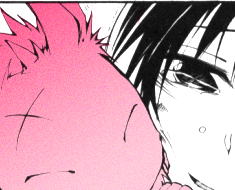
Make a new layer UNDER the noise, but above Burupya's pink. Leave this level set to normal. Go ahead and choose colours, at least two up and two down from Burupya's pink. Since hes gradiated, I went with a lighter pink from the already light pink, and a daker pink from the already dark one.
Then on this new layer, I start putting in the shadows, remembering where the light source is. And when I'm done, I go in with the hightlights with the dark pink. On this gradient, I can actually use the original dark pink as a shadow for the light pink, and the light pink as a shadow in the dark. Don't worry about being too tidy, in fact you want to go over the lines a little.
After I'm finished with those highlights and shadows, I go to Filter > Blur > Guassian Blur and set it anywhere from 2.0 pixels to 4.0 pixels. This will blur the entire layer. If I need to, I'll do it again. After that, set the layer to clipping mask by either right clicking on it, or going to Layer > Create Clipping Mask. This will get rid of the pesky blurs over the line. If there are any spots that are too noticeable, it's okay to go in with the blur tool over them.
I created Burupya's tongue by colour sampling from a picture of a cat's tongue on the internet. :|b

I locked all Burupya's layers and move on to ~Teito~. Once again, I colour sample! And wow, Teito is pale. I'm not going to worry about going over his eyes.

Once I'm finished with his skin, I'll make another layer about that. And just like with Burupya's shading, I'm going to go in. However, I'm going to use the skin palette I have, since Teito's skin is very close to the lightest shade. This means that there will be minimal, if any highlighting.
So I go and shade.
I also create a NEW LAYER and go in with one of the redder/oranger shades right under Teito's eyes, especially in the last picture. This is my own personal preference, yours may vary.
Once again, I gaussian blur, though I set this one to 7 pixels and do it as many times as I want according to taste. And when I'm satisifed, I set them to clipping mask.
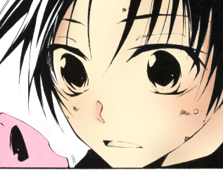
I create a new layer ABOVE Teito's skin, keep it normal. I don't actually use white, but instead a very very light shade of purple silver, and go over his eyes with it, and the tears in the bottom panels. I also put the inside of his mouth in this layer, from a tongue colour sampling from Matsumoto. >_>

Then I make a new layer and put his EYE COLOUR in it. From there, ANOTHER new layer and set this one to screen. I go over the parts of his eye colour that are covered in tears, add about 50% noise, and then gaussian blur the layer at about 2 pixels. And then, I set it to clipping mask.

Now for Teito's hair.
It's a dark brown, but shaded in black. So I FIRST go over the highlights with a light brown. Once I'm done with that. I. . . make a new layer, and go with a LIGHTER brown over his highlights.
After that, it's a Gaussan blur to taste again, as well as a manual blur over any rough patches, and then I set it to clipping mask, and clean up as required.
Yaaay.
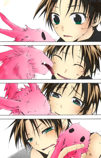
Now I want to do the dark Teito's hair. This is a little tricky, but create a new layer OVER THE BASE IMAGE.
And then go over with a brown colour... over Teito's hair. :D Don't worry about going over the colour, what we want to do is go over the black of his hair. Once that's finished, I set to screen... and to clipping mask. Its at this point that I clean up, because its's easier to see the new shaded lines. It's mostly just the bit of his eyes and the parts of the panel near where the hair overlaps.
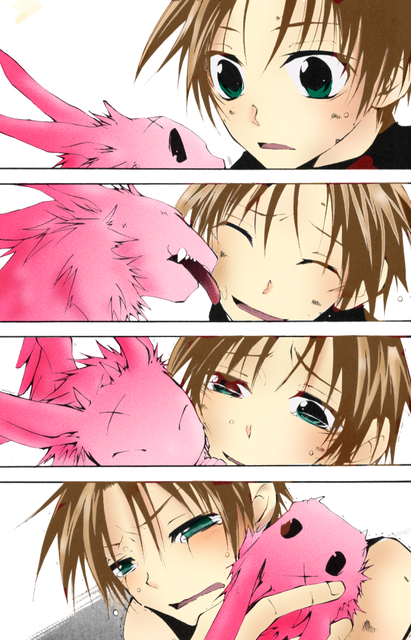
After that, I duplicate this layer, and turn the screen to around 50. And then the original layer is set to overlay, also around 50.

I also go over Burupya the same way, on another layer. But this one I don't screen, and set to Overlay at around 75. He's already very pink. I don't go over his scar or eyes. Once a clean up, it's another new layer set to Screen at 50. I also do the same thing for the scuffs on his skin, and adjust them to taste.

I think I'm finally finished :D
Well, now I have the background. With this image, I'm going to experiment a little, so I colour each of the panels in a different layer. I used a brownish gray texture that's the default in photoshop.
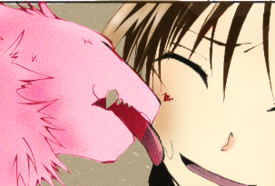
And then I create new layers over the top panel and bottom panel. The top new layer gets set to soft light for now, because I want a lighter shade, and I go over it with one of the black and white patterns obtained from here. Once again I kind of just mess around with it until I find something I like.

The bottom new layer is set to multiply, so that it'll still let the bottom panel's texture come through.
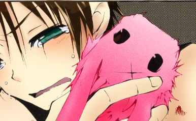
After this, I'm more or less done with it. There's a few more things I could do, but I like the picture the way it is and I don't want to take too much from Burupya. But really, just play around yourself, if you want any kind of special effects (this picture doesn't really lend itself to them), create a new layer on top of the colour or lines and mess around with different things. Photoshop is ENDLESS.
After this, I go and clean up things I might've missed earlier, like peices of skin tone or Burpya that went over, and Burpya's teeth. I also add in lighter green specks into Teito's eyes and finsh cleaning up bits of the background if I need to. To help with this, I crop the image by about two-three pixels on each side and just use the magic wand tool.
Here's more or less the finished product. I might go back in later and mess with it, but for now I'm satisifed with this.
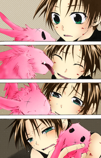
Here's the full size.
(The first guide can be found here, in one of my character RP journals. Although, I tend to make icons much simpler.)
First of all, I'm sharing most of the textures/patterns I've downloaded from the internet. Most of them are small, but I do havea few that are actually uh, kind of big. Also of note are the skin swatches I use in 99 percent of these cases. And here are two skin pallete images.
On to the guide! As a reminder, here are some handy dandy keyboard shortcuts.
[ will make your brush/eraser smaller.
] will make your brush/erase bigger.
Shift + [ makes the edges softer.
Shift + ] makes the edges harder.
You can change the keys as you'd like, but B is usually your brush tool, and E is usually your eraser. These can be changed or viewed under Edt > Keyboard Shortcuts.
So today I'm demonstrating with

.
These are steps I take, and most of this is learned through experimentation. So kick back and have fun. ♥
First, you want to fix up the image. With this one, first I desaturated, by going to Image > Adjustments > DeSaturate (alternately Ctrl + Alt + U+). And then I adjusted the levels until what was SUPPOSED to be white turned out white, and what was black was black.

And then I set the base image to Multiply and made about seven to ten normal layers underneath.
First, I'm going to do Burupya, since there's something ~special~ I wanna do with him. So, I'm laying down Burupya's pink. And WITH THIS, an explanation on COLOUR PICKING.
I. I actually took the colour reference from swornmyoath's one coloured Burupya icon.
Normally you won't be working with such a small source. But here is what I usualy do to get a good sample.
First, magnify the image. I magnified the icon to about eight hundred. What you want to do is magnify it enough to get a good look at the section you're taking the icon from. Then, choose the eyedropper tool. The options are usually set to "point sample". With a larger image, you may want to change it to 5 x 5 average, which will give you that average. For this icon, I'm changing it to 3 X 3. And then I'm choosing the two colours of Burupya's pink, and saving them in my swatches.
And then with the lighter colour, i'm going to go over and cover all of Burupya. Since I'm doing the entire page, that means I'm doing him four times. For now I'm not going to worry about clean up. However, I'm going to make sure that each colour blob is seperated.

An easy way to make a gradient is to assign the two colours you want to use as the foreground and background colours (by double clicking on each of the squares), and then switching over to the Gradient tool, which is with the paintbucket.
Double clicking on the colours of the gradient will let you add MORE colours to the gradient, as well as let you save it. This page here actually has A LOT MORE about gradients, as well as picture illustrations!
Anyway, I'm going to use a gradient on Burupya's fur. HOWEVER in the interest of not colouring the entire picture? I use the MAGIC WAND tool, which select the like colour and will ONLY work within that colour. Time for my gradients. Remember that if you hold down the shift key, you can select multiple parts at the same time.

After selecting each one and laying the gradient down in turn, it gives me this! I might have added a little bit of white at the beginning of the gradient, but I think it looks fine.
Now to clean up. Depending on the image, if it has clean, closed lines, you can actually use the Magic Wand to select which parts to colour in and to erase. Unfortunately, this scan doesn't have them, so I'm doing it the hard way.
However you clean up the image, do so.

Now, before moving on, I want to add a TINY bit of texture to Burupya. So, I duplicate the layer, and go to filter > noise > add noise. I left it at "uniform" but set the noise level low, to 10%. After that, I set the layer blending mode to Overlay and lower the opacity to about 65%. And for now, I'm going to lock it. Here's an image of Burupya after the noise.

Make a new layer UNDER the noise, but above Burupya's pink. Leave this level set to normal. Go ahead and choose colours, at least two up and two down from Burupya's pink. Since hes gradiated, I went with a lighter pink from the already light pink, and a daker pink from the already dark one.
Then on this new layer, I start putting in the shadows, remembering where the light source is. And when I'm done, I go in with the hightlights with the dark pink. On this gradient, I can actually use the original dark pink as a shadow for the light pink, and the light pink as a shadow in the dark. Don't worry about being too tidy, in fact you want to go over the lines a little.
After I'm finished with those highlights and shadows, I go to Filter > Blur > Guassian Blur and set it anywhere from 2.0 pixels to 4.0 pixels. This will blur the entire layer. If I need to, I'll do it again. After that, set the layer to clipping mask by either right clicking on it, or going to Layer > Create Clipping Mask. This will get rid of the pesky blurs over the line. If there are any spots that are too noticeable, it's okay to go in with the blur tool over them.
I created Burupya's tongue by colour sampling from a picture of a cat's tongue on the internet. :|b

I locked all Burupya's layers and move on to ~Teito~. Once again, I colour sample! And wow, Teito is pale. I'm not going to worry about going over his eyes.

Once I'm finished with his skin, I'll make another layer about that. And just like with Burupya's shading, I'm going to go in. However, I'm going to use the skin palette I have, since Teito's skin is very close to the lightest shade. This means that there will be minimal, if any highlighting.
So I go and shade.
I also create a NEW LAYER and go in with one of the redder/oranger shades right under Teito's eyes, especially in the last picture. This is my own personal preference, yours may vary.
Once again, I gaussian blur, though I set this one to 7 pixels and do it as many times as I want according to taste. And when I'm satisifed, I set them to clipping mask.

I create a new layer ABOVE Teito's skin, keep it normal. I don't actually use white, but instead a very very light shade of purple silver, and go over his eyes with it, and the tears in the bottom panels. I also put the inside of his mouth in this layer, from a tongue colour sampling from Matsumoto. >_>

Then I make a new layer and put his EYE COLOUR in it. From there, ANOTHER new layer and set this one to screen. I go over the parts of his eye colour that are covered in tears, add about 50% noise, and then gaussian blur the layer at about 2 pixels. And then, I set it to clipping mask.

Now for Teito's hair.
It's a dark brown, but shaded in black. So I FIRST go over the highlights with a light brown. Once I'm done with that. I. . . make a new layer, and go with a LIGHTER brown over his highlights.
After that, it's a Gaussan blur to taste again, as well as a manual blur over any rough patches, and then I set it to clipping mask, and clean up as required.
Yaaay.

Now I want to do the dark Teito's hair. This is a little tricky, but create a new layer OVER THE BASE IMAGE.
And then go over with a brown colour... over Teito's hair. :D Don't worry about going over the colour, what we want to do is go over the black of his hair. Once that's finished, I set to screen... and to clipping mask. Its at this point that I clean up, because its's easier to see the new shaded lines. It's mostly just the bit of his eyes and the parts of the panel near where the hair overlaps.

After that, I duplicate this layer, and turn the screen to around 50. And then the original layer is set to overlay, also around 50.

I also go over Burupya the same way, on another layer. But this one I don't screen, and set to Overlay at around 75. He's already very pink. I don't go over his scar or eyes. Once a clean up, it's another new layer set to Screen at 50. I also do the same thing for the scuffs on his skin, and adjust them to taste.

I think I'm finally finished :D
Well, now I have the background. With this image, I'm going to experiment a little, so I colour each of the panels in a different layer. I used a brownish gray texture that's the default in photoshop.

And then I create new layers over the top panel and bottom panel. The top new layer gets set to soft light for now, because I want a lighter shade, and I go over it with one of the black and white patterns obtained from here. Once again I kind of just mess around with it until I find something I like.

The bottom new layer is set to multiply, so that it'll still let the bottom panel's texture come through.

After this, I'm more or less done with it. There's a few more things I could do, but I like the picture the way it is and I don't want to take too much from Burupya. But really, just play around yourself, if you want any kind of special effects (this picture doesn't really lend itself to them), create a new layer on top of the colour or lines and mess around with different things. Photoshop is ENDLESS.
After this, I go and clean up things I might've missed earlier, like peices of skin tone or Burpya that went over, and Burpya's teeth. I also add in lighter green specks into Teito's eyes and finsh cleaning up bits of the background if I need to. To help with this, I crop the image by about two-three pixels on each side and just use the magic wand tool.
Here's more or less the finished product. I might go back in later and mess with it, but for now I'm satisifed with this.

Here's the full size.
(The first guide can be found here, in one of my character RP journals. Although, I tend to make icons much simpler.)