HYDE Icon Tutorial
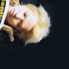
From this: 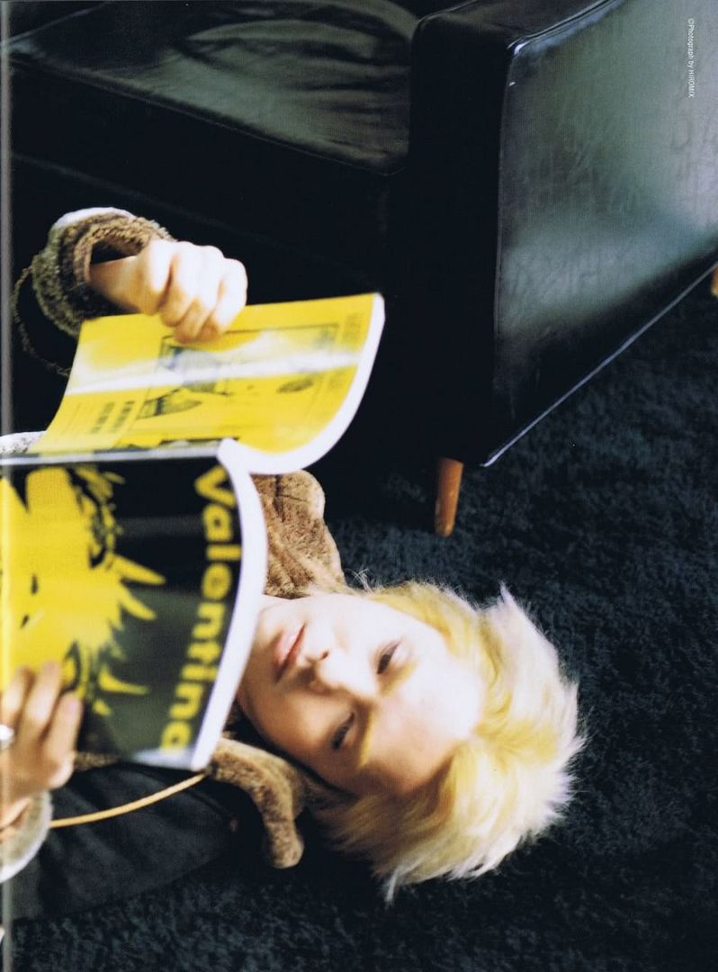
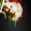
to this:
.
1. First off, I recommend staring fixedly at the base image (which, if you're into J-rock, you're probably going to do anyway), gauging what type of crop would best suit the image in question. After I had mulled it over, I decided to go for something I usually avoid like the plague--cropping the subject's body out of the icon and allowing the subject's head to hover in the upper left corner.
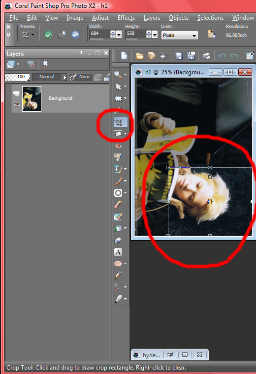
In order to accomplish that, I selected the Crop Tool and tugged on the top and left boundary lines until they rested just a little bit above and to the left of the corners of his mouth, with the distance being about the same either way, to maintain a nice balance. Then I dragged the right and bottom boundaries to the right and bottom edges of the image and completed the crop.
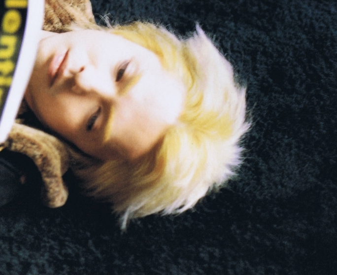
Result:
2. Now to get things set up to employ negative space. First, I resized the image to 500 by 408 pixels. Whenever the image I'm wanted to use to make a negative space icon is more than 500 pixels on one side, I always reduce it to 500, to make it more managable.
Next I created a new layer, changed the background layer to a raster layer that can be moved (by left-clicking the layer and then clicking Convert to Raster Layer), and then switched the layers in the Layers Palette so that the layer with the image is above the empty new layer. Then I changed the canvas size (accessed by clicking Image>Canvas Size) to 500 by 500 pixels.
Why all the fuss just to change the canvas size?
Here's what things look like if those steps are taken:
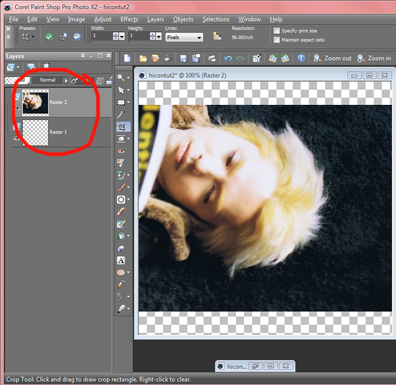
And here's what things look like if those steps are skipped:
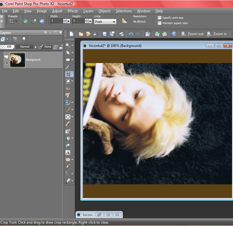
For some reason, Paint Shop Pro automatically fills the negative space with a color of its choice. Personally, I don't like that, so I go out of my way to ensure that I get nothing but an empty, opaque layer beneath. But if the automatic fill doesn't bother you, feel free to go on as you like.
Next I scooched the layer with Hyde up to the top of the image using the Pick Tool. Then I switched to the Dropper Tool (which looks exactly like a dropper that you used to play with as a kid--and probably still do even now) and used it to pick out a color, #0d141a, from the dark blue in the background behind Hyde's hair.
Choosing a color that's already in the image in a great way to ensure that the overall image will look good--especially if you choose the color framing the part of the image you want to keep. Then you don't have to worry about those stupid edges that won't blend in and behave themselves.
3. Now comes the fun part--getting rid of unwanted background noise! After selecting the empty layer in the Layers Palette, I filled it with #0d141a, then switched back to select the layer with Hyde. I created a mask layer by clicking Layers>New Mask Layer>Show All. I always use the Show All feature, so I can see everything I've got to work with.
Result:
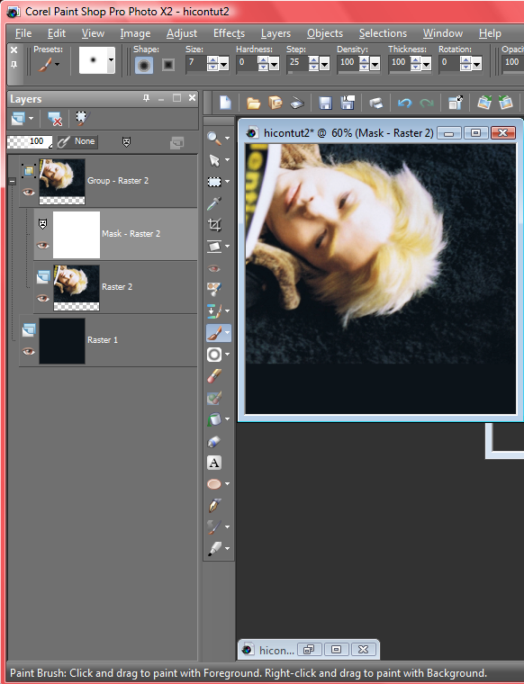
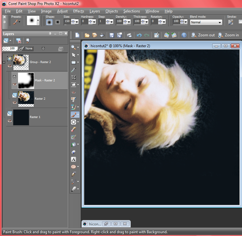
Selecting the Paint Brush and setting it to black (#000000) and Size: 150, Hardness: 0, Step: 1, I just started tapping around lightly around Hyde's head, leaving a little fringe of the original image all around, until it looked as if the original image was melting away into the blue.
Result:
I can't stress how important it is to use a mask layer to block out unwanted background while your background image is still large. When I was first experimenting with negative space, I spend weeks struggling in frustration, because I always used mask layers on little bitty 100 by 100 pixel images, and they never looked smooth or well-blended. I just didn't have the room to perfect the look at such a small resolution. It didn't even occur to me to try using mask layers before I sized my icon down, until I read endelyn's negative space tutorial workshop. Then I wanted to headdesk for a few solid hours.
4. Next, I resized my image to 100 by 100 pixels.
After grabbing this lovely texture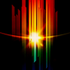
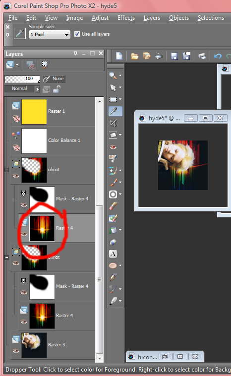
by ohriot, I created another mask layer and used it to block out the part in front of Hyde's face, just as I did before with the background. I set this texture layer to Screen 84--and then I duplicated it and set the duplicate to Screen 14. Selecting the duplicate layer itself (circled in red in the picture below) beneath the mask layer, I clicked Image>Mirror, just to make things a tad more interesting.
Result:
5. Finally, it's time for coloring. My first move is almost always to heighten paleness and blues in the image, and this time it was no different.
I created a Color Balance layer, making sure Preserve Luminance was checked and then setting it to
Midtones:
Red: -68
Green: 18
Blue: 62
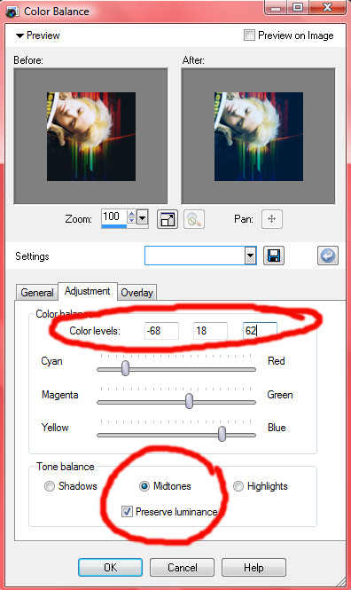
I decided this looked a little too pale and blue after all, so I set the opacity of the Color Balance layer to Normal 31 to tone it down a bit.
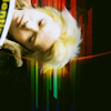
Result:

6. Now I wanted to add a yellow edge to the image, especially deepening the yellow shadows in Hyde's hair, so I created a new raster layer, fill it with #fde129, a warm yellow, and set it to Burn 26.
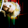
Result:
7. I wanted more a little more blue and still deeper shadows, so I filled a new layer with a pale blue, #c0ccf4, and set it to Burn 73.
Result:
8. Now the coloring looked great--except I wanted a deeper red in those streaks from the texture. So, I filled one last new layer with a light, muted rose, #f4c3a2, and set it to Burn 26.
Result:
Have you noticed that all the fill layers I've used for coloring have employed paler colors? That's deliberate. I prefer pale shades for small, subtle tweaks, because dark shades can be more difficult to work with, at least when you're using the Burn feature. To justify the use of colors that dark, you have to have a super pale, low-contrast base to begin with, or else the icon will look like a muddy mess.
9. Finally, the colors were where I wanted them--so now I had to up the saturation! I created a Hue/Saturation/Lightness layer (Layers>New Adjustment Layer>Hue/Saturation/Lightness) and set the Saturation to 34.
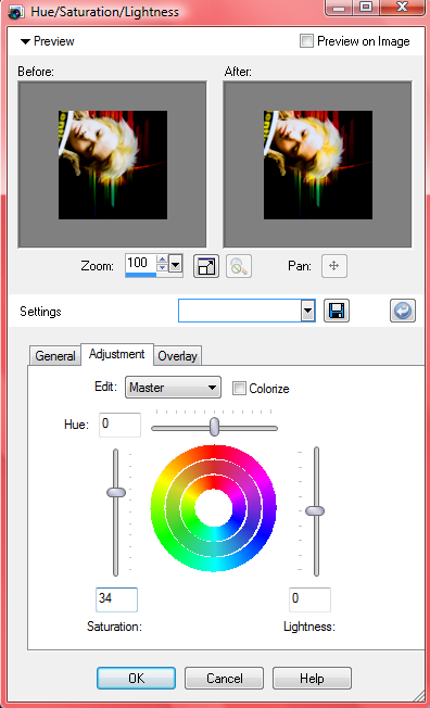
That was a little too bright and garish for me, so I lowered the opacity to 40.
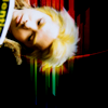
Result:
10. On to the light blobs! I created yet another new raster layer, and using the Paint Brush set on white (#ffffff), Size: 40, Hardness: 0, Step: 1, I scribbled a bit near the lower left corner.
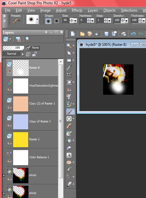
Next, I blurred it by going to Glaussian blur (Adjust>Blur>Glaussian Blur) and set it to Radius 30. Then I set the layer to Normal 70.
I wanted a little bit more light further up on the icon, so I duplicated the blob layer, flipped it the duplicate(by hitting Image>Flip), and set it to Normal 30.
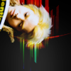
Result:
11. Finally, I sharpened by hitting Copy Merged, pasted it as a new layer, and then hit sharpen twice.
I didn't like it that sharp, so I lowered the opacity to 40. And that's it! All finished!
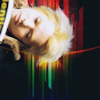
Final result:

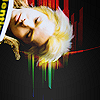
to this:
.
1. First off, I recommend staring fixedly at the base image (which, if you're into J-rock, you're probably going to do anyway), gauging what type of crop would best suit the image in question. After I had mulled it over, I decided to go for something I usually avoid like the plague--cropping the subject's body out of the icon and allowing the subject's head to hover in the upper left corner.
In order to accomplish that, I selected the Crop Tool and tugged on the top and left boundary lines until they rested just a little bit above and to the left of the corners of his mouth, with the distance being about the same either way, to maintain a nice balance. Then I dragged the right and bottom boundaries to the right and bottom edges of the image and completed the crop.

Result:

2. Now to get things set up to employ negative space. First, I resized the image to 500 by 408 pixels. Whenever the image I'm wanted to use to make a negative space icon is more than 500 pixels on one side, I always reduce it to 500, to make it more managable.
Next I created a new layer, changed the background layer to a raster layer that can be moved (by left-clicking the layer and then clicking Convert to Raster Layer), and then switched the layers in the Layers Palette so that the layer with the image is above the empty new layer. Then I changed the canvas size (accessed by clicking Image>Canvas Size) to 500 by 500 pixels.
Why all the fuss just to change the canvas size?
Here's what things look like if those steps are taken:

And here's what things look like if those steps are skipped:

For some reason, Paint Shop Pro automatically fills the negative space with a color of its choice. Personally, I don't like that, so I go out of my way to ensure that I get nothing but an empty, opaque layer beneath. But if the automatic fill doesn't bother you, feel free to go on as you like.
Next I scooched the layer with Hyde up to the top of the image using the Pick Tool. Then I switched to the Dropper Tool (which looks exactly like a dropper that you used to play with as a kid--and probably still do even now) and used it to pick out a color, #0d141a, from the dark blue in the background behind Hyde's hair.
Choosing a color that's already in the image in a great way to ensure that the overall image will look good--especially if you choose the color framing the part of the image you want to keep. Then you don't have to worry about those stupid edges that won't blend in and behave themselves.
3. Now comes the fun part--getting rid of unwanted background noise! After selecting the empty layer in the Layers Palette, I filled it with #0d141a, then switched back to select the layer with Hyde. I created a mask layer by clicking Layers>New Mask Layer>Show All. I always use the Show All feature, so I can see everything I've got to work with.
Result:

Selecting the Paint Brush and setting it to black (#000000) and Size: 150, Hardness: 0, Step: 1, I just started tapping around lightly around Hyde's head, leaving a little fringe of the original image all around, until it looked as if the original image was melting away into the blue.
Result:

I can't stress how important it is to use a mask layer to block out unwanted background while your background image is still large. When I was first experimenting with negative space, I spend weeks struggling in frustration, because I always used mask layers on little bitty 100 by 100 pixel images, and they never looked smooth or well-blended. I just didn't have the room to perfect the look at such a small resolution. It didn't even occur to me to try using mask layers before I sized my icon down, until I read endelyn's negative space tutorial workshop. Then I wanted to headdesk for a few solid hours.
4. Next, I resized my image to 100 by 100 pixels.
After grabbing this lovely texture
by ohriot, I created another mask layer and used it to block out the part in front of Hyde's face, just as I did before with the background. I set this texture layer to Screen 84--and then I duplicated it and set the duplicate to Screen 14. Selecting the duplicate layer itself (circled in red in the picture below) beneath the mask layer, I clicked Image>Mirror, just to make things a tad more interesting.

Result:
5. Finally, it's time for coloring. My first move is almost always to heighten paleness and blues in the image, and this time it was no different.
I created a Color Balance layer, making sure Preserve Luminance was checked and then setting it to
Midtones:
Red: -68
Green: 18
Blue: 62

I decided this looked a little too pale and blue after all, so I set the opacity of the Color Balance layer to Normal 31 to tone it down a bit.
Result:
6. Now I wanted to add a yellow edge to the image, especially deepening the yellow shadows in Hyde's hair, so I created a new raster layer, fill it with #fde129, a warm yellow, and set it to Burn 26.
Result:
7. I wanted more a little more blue and still deeper shadows, so I filled a new layer with a pale blue, #c0ccf4, and set it to Burn 73.
Result:
8. Now the coloring looked great--except I wanted a deeper red in those streaks from the texture. So, I filled one last new layer with a light, muted rose, #f4c3a2, and set it to Burn 26.
Result:
Have you noticed that all the fill layers I've used for coloring have employed paler colors? That's deliberate. I prefer pale shades for small, subtle tweaks, because dark shades can be more difficult to work with, at least when you're using the Burn feature. To justify the use of colors that dark, you have to have a super pale, low-contrast base to begin with, or else the icon will look like a muddy mess.
9. Finally, the colors were where I wanted them--so now I had to up the saturation! I created a Hue/Saturation/Lightness layer (Layers>New Adjustment Layer>Hue/Saturation/Lightness) and set the Saturation to 34.

That was a little too bright and garish for me, so I lowered the opacity to 40.
Result:
10. On to the light blobs! I created yet another new raster layer, and using the Paint Brush set on white (#ffffff), Size: 40, Hardness: 0, Step: 1, I scribbled a bit near the lower left corner.

Next, I blurred it by going to Glaussian blur (Adjust>Blur>Glaussian Blur) and set it to Radius 30. Then I set the layer to Normal 70.
I wanted a little bit more light further up on the icon, so I duplicated the blob layer, flipped it the duplicate(by hitting Image>Flip), and set it to Normal 30.
Result:
11. Finally, I sharpened by hitting Copy Merged, pasted it as a new layer, and then hit sharpen twice.
I didn't like it that sharp, so I lowered the opacity to 40. And that's it! All finished!
Final result: