PS 7.0 icon tutorial: Matsumoto from "Bleach"
Very basic icon tutorial here. It might help to have a base knowledge of how to work Photoshop, but if you're a total novice and you need something clarified, just leave a comment.
How to go from:

to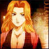
So today we're working with Matsumoto, because I loves me some 10th Division.
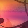
I'll start with this screencap that I got from electra_torch (which I shrunk down here):
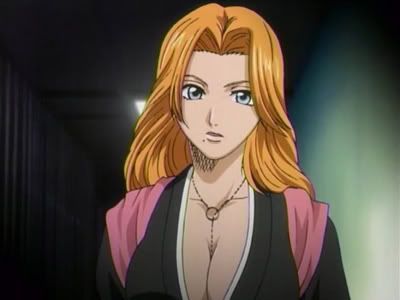
I crop it and resize it to 98x98 pixels; I make it that size because I want to add a 2-pixel border at the end. If you plan on using a border brush or if you simply don't want a border, go ahead and make it 100x100.
I duplicate the background layer and sharpen it (Filter-->Sharpen-->Sharpen), then before I do anything else I go to Edit-->Fade Sharpen and set it to about 50%, then flatten the image. I find it's almost always a good idea to use Fade Sharpen at least a little bit, otherwise you could end up with super-crisp lines and those funky edge lines along the borders (unless you're going for that super-sharp effect that the kids all love these days, in which case, have a ball). I usually fade sharpen anywhere between 20 and 90%.
But luckily, we're going to be doing some blurring later on, so don't worry if you think your image is a bit too sharp.
Anyway, right now I have this:
Look how pretty she is. She's so pretty I probably don't need to do anything else except stare at her prettiness. But I'm going to anyway.
Now we're going into a very awesome trick that I ripped off borrowed and modified from yura. (For the full, unbastardized version of this technique, check out yura's most excellent tutorial.) First, I duplicate the background layer twice and set them both to Hard Light at 100% opacity. I select the bottom Hard Light layer, go to Filter-->Blur-->Gaussian Blur.

Neato!
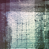
And now I duplicate the blurred layer (making sure the new layer is between the other two), then go to Filter-->Artistic-->Fresco. And I get something funky, like this:

Oh my, that's not what we want at all, is it? So once again, I use Gaussian Blur, and I end up with this:

But that's still rather iffy-looking, so I set the opacity of the middle Hard Light layer to 30% and the opacity of the bottom Hard Light layer to 50%. (Keep in mind, with this technique, that things'll vary depending on your picture. Play with the opacity a bit. You might even want to use Soft Light to get a more subtle effect.)
So!

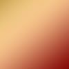
Ah, better. Next I make a new layer at the very top (Layer-->New-->Layer), setting it to Color. Then I fill it with this gradient (made by me, take it if you want it):
Then I duplicate that layer and set the new one to Soft Light, placing it on top.

But I like to keep at least some of the icon's original coloring, so I set the fill of the Color layer to 40%, and I end up with this:

Ah, but she's a bit too bright now. So I go back to the bottom, duplicate the background layer, and set it to Multiply at 25% (keeping this layer down at the bottom).

Huzzah! And now for some fun stuff: I want to give the icon a shiny, golden hue, so I'll be sticking mostly to bright, red/orange/yellow bases.
I make a new layer between the top Hard Light layer and the Color layer, setting it to Soft Light. First I want to see if I can make it shiny and sparkly. So I take this base by gender:
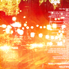
And paste it into the Soft Light layer at 100% opacity.

Most excellent, but I don't like how blotchy her face is. So I use my good friend the Eraser Tool and erase the part of the texture that's covering her face. I also think it's just a wee bit too bright, so I set the fill to 70%.

Hooray! Now I make another Soft Light layer. And looking through my collection of bases, I find this one by colorfilter:
So I paste that one in:

Unfortunately, there's that one part of the base that's covering up her fabulous cleavage, which bugs me for some reason, so I return to my lovely Eraser Tool and use it on her chest and neck.

Yay, we can see her boobies again! Now, another Soft Light layer and I use this base, also by colorfilter:
=

Now she's got even more of a golden tint to her. But I notice it looks a bit too... full, I guess, so I set the fill of that last base layer to 50%.

Excellent. But now I want to add some more rough texture to it, so I take this base by colortone:
And I make yet another Soft Light layer above the others and paste it in.

But wait, her face and chest are covered up again! We can't have that. ERASENATED, over all the skin areas.

Damn, she's hot.
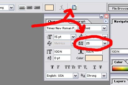
Now I'm going to spruce it up just a wee bit more by adding some subtle text. I use the Eyedropper Tool and select a light golden color from a bright part of her face: #FEECCD. Then with the Text Tool, I type out "MATSUMOTO," Times New Roman, bold, size 15, anti-alias at strong, tracking at 25. Then I go to Edit-->Transform-->Rotate CCW and move it over to the right-hand edge. But I wanted it to be subtle (like tiny text, only BIG!), so I change the blending mode to Linear Dodge, opacity at 40 and fill at 70. And because I like having as many of the textures as possible on top of the text, I place the text layer beneath all but the bottommost base layer.

R0XX0RZ. So now I go to Layer-->Flatten Image, and it's time to make meself a border. I use the Eyedropper Tool and select a reeeeally dark color (#170601 - though sometimes I'm lazy and I just use black, it doesn't matter too much), then, making sure I've got the dark color as the background color, I go to Image-->Canvas Size, 100x100 pixels.
Then I save it as a .png (because I think those look nicer), aaaaand:
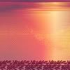
SHE'S FINISHED! And she's even more pretty. If only she wasn't all hung up on Captain Smiles McHappypants.
Questions? Comments? Just let me know. :D If there's interest, I have two other icons that I've been thinking of doing tutorials for.
How to go from:
to
So today we're working with Matsumoto, because I loves me some 10th Division.
I'll start with this screencap that I got from electra_torch (which I shrunk down here):
I crop it and resize it to 98x98 pixels; I make it that size because I want to add a 2-pixel border at the end. If you plan on using a border brush or if you simply don't want a border, go ahead and make it 100x100.
I duplicate the background layer and sharpen it (Filter-->Sharpen-->Sharpen), then before I do anything else I go to Edit-->Fade Sharpen and set it to about 50%, then flatten the image. I find it's almost always a good idea to use Fade Sharpen at least a little bit, otherwise you could end up with super-crisp lines and those funky edge lines along the borders (unless you're going for that super-sharp effect that the kids all love these days, in which case, have a ball). I usually fade sharpen anywhere between 20 and 90%.
But luckily, we're going to be doing some blurring later on, so don't worry if you think your image is a bit too sharp.
Anyway, right now I have this:
Look how pretty she is. She's so pretty I probably don't need to do anything else except stare at her prettiness. But I'm going to anyway.
Now we're going into a very awesome trick that I ripped off borrowed and modified from yura. (For the full, unbastardized version of this technique, check out yura's most excellent tutorial.) First, I duplicate the background layer twice and set them both to Hard Light at 100% opacity. I select the bottom Hard Light layer, go to Filter-->Blur-->Gaussian Blur.
Neato!
And now I duplicate the blurred layer (making sure the new layer is between the other two), then go to Filter-->Artistic-->Fresco. And I get something funky, like this:
Oh my, that's not what we want at all, is it? So once again, I use Gaussian Blur, and I end up with this:
But that's still rather iffy-looking, so I set the opacity of the middle Hard Light layer to 30% and the opacity of the bottom Hard Light layer to 50%. (Keep in mind, with this technique, that things'll vary depending on your picture. Play with the opacity a bit. You might even want to use Soft Light to get a more subtle effect.)
So!
Ah, better. Next I make a new layer at the very top (Layer-->New-->Layer), setting it to Color. Then I fill it with this gradient (made by me, take it if you want it):
Then I duplicate that layer and set the new one to Soft Light, placing it on top.
But I like to keep at least some of the icon's original coloring, so I set the fill of the Color layer to 40%, and I end up with this:
Ah, but she's a bit too bright now. So I go back to the bottom, duplicate the background layer, and set it to Multiply at 25% (keeping this layer down at the bottom).
Huzzah! And now for some fun stuff: I want to give the icon a shiny, golden hue, so I'll be sticking mostly to bright, red/orange/yellow bases.
I make a new layer between the top Hard Light layer and the Color layer, setting it to Soft Light. First I want to see if I can make it shiny and sparkly. So I take this base by gender:
And paste it into the Soft Light layer at 100% opacity.
Most excellent, but I don't like how blotchy her face is. So I use my good friend the Eraser Tool and erase the part of the texture that's covering her face. I also think it's just a wee bit too bright, so I set the fill to 70%.
Hooray! Now I make another Soft Light layer. And looking through my collection of bases, I find this one by colorfilter:
So I paste that one in:
Unfortunately, there's that one part of the base that's covering up her fabulous cleavage, which bugs me for some reason, so I return to my lovely Eraser Tool and use it on her chest and neck.
Yay, we can see her boobies again! Now, another Soft Light layer and I use this base, also by colorfilter:
=
Now she's got even more of a golden tint to her. But I notice it looks a bit too... full, I guess, so I set the fill of that last base layer to 50%.
Excellent. But now I want to add some more rough texture to it, so I take this base by colortone:
And I make yet another Soft Light layer above the others and paste it in.
But wait, her face and chest are covered up again! We can't have that. ERASENATED, over all the skin areas.
Damn, she's hot.
Now I'm going to spruce it up just a wee bit more by adding some subtle text. I use the Eyedropper Tool and select a light golden color from a bright part of her face: #FEECCD. Then with the Text Tool, I type out "MATSUMOTO," Times New Roman, bold, size 15, anti-alias at strong, tracking at 25. Then I go to Edit-->Transform-->Rotate CCW and move it over to the right-hand edge. But I wanted it to be subtle (like tiny text, only BIG!), so I change the blending mode to Linear Dodge, opacity at 40 and fill at 70. And because I like having as many of the textures as possible on top of the text, I place the text layer beneath all but the bottommost base layer.
R0XX0RZ. So now I go to Layer-->Flatten Image, and it's time to make meself a border. I use the Eyedropper Tool and select a reeeeally dark color (#170601 - though sometimes I'm lazy and I just use black, it doesn't matter too much), then, making sure I've got the dark color as the background color, I go to Image-->Canvas Size, 100x100 pixels.
Then I save it as a .png (because I think those look nicer), aaaaand:
SHE'S FINISHED! And she's even more pretty. If only she wasn't all hung up on Captain Smiles McHappypants.
Questions? Comments? Just let me know. :D If there's interest, I have two other icons that I've been thinking of doing tutorials for.