My first Tutorials
SO....@_@ Never made one of these before but aspenfallen requested two so I'll try my best! ^_^ I use Adobe Imageready CS2...WHY I use imageready is a really long story but the only differences from Adobe Photoshop that I can see is less tools to work with (no burn tool for me ;_;). I've never used anything but Photoshop but I think these tutorials should translate well to other programs since they're both relatively simple.
Credit for textures used located here
numbah 1:
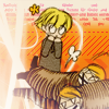
We start out with this image
STEP 1. Crop it and clean it up.
Some people color their images before they crop them but my coloring is a lot softer if the image is bigger ^_^ so I crop mine first.

to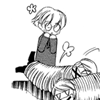
I deleted one of the flowers floating around Hunny's head because it made him look like he had ears D: I also deleted the text and Tamaki's head so we could focus in on Hunny being evil XD.
STEP 2. Coloring
I'm really anal about coloring. If I'm uncertain of the right shade of someone's hair I will pull an image of them into photoshop and use the eye dropper tool to figure out about what color I should be using. Of course I don't always use the exact color the eye dropper gives me, since hues that work in large images don't always look the same on 100x100 px squares. Luckily there was no colors to look up in this tutorial ^_^.
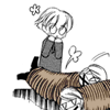
Open a new layer and color in the rope. I used Linear burn instead of my usual Multiply because it darkens the black lines of the rope itself. I thought it looked better ^_^;
Color:#94714B
Blending Mode:Linear Burn
opacity:62%
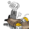
Another new layer to color in fred and george's Hikaru and Kauru's hair.
Color:#F2820A
Blending Mode:Multiply
Opacity:100%
New layer for Hunnys hair. Make sure you use a soft yellow! Hunny's hair isn't Naruto yellow!
Color:#FAF084
Blending mode:Multiply
Opacity:100%
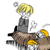
New Layer for Hunny's skin. I use a different color for every character. A Girl's skin (and a angsty/childlike/vampirelike/girly man's skin) is mostly always pinker/paler then guy's skin unless the girl is a real tomboy :D Then I MIGHT make an exception. Hunny is a childlike boy so he falls more on the pink and pale side of my skin spectrum.
Color:#F5E4D2
Blending mode:Multiply
Opacity:67%

New Layer for the twins skin.
Color:#F3E7D4
Blending mode:Multiply
Opacity:100%
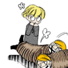
New layer for little flower by Hunny's head
Color:#FED505
Blending Mode:Multiply
Opacity:100%

STEP 3. Fancying it up.
After I'm done coloring my icons, I almost always put a layer filled with #EBD6AC on top. It just gives them more depth and a bolder, stronger look.
Color:#EBD6AC
Blending Mode:Color Burn
Opacity:82%
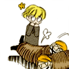
It's still boring, I need a background so after searching through my icon resources I find this:
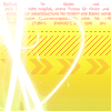
I set it to multiply, zoom in to about 800% and use my erase tool to erase the excess texture on Hunny and the twins (and the flower of course!).
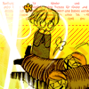
to
Too much yellow in the icon! I go to Image>Adjustments>Hue/Saturation and play with the arrow that controls the hue until I get to -30. Now it looks like this.
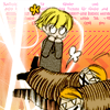
I decided that the solid layer with the colorburn should be on top of the texture too so I brought it to the top.
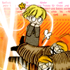
Too bright @_@ So I added one more light texture to soften it up...

Blending Mode:Screen
Opacity:100%

numbah 2:

We start out with this image
STEP 1. Crop it and clean it up.
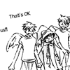
to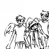
I erased the text and went to Image>Adjustments>Brightness/Contrast
brightness:13
contrast:9
STEP 2. Coloring
Start out with a new layer for the twins skin.
Color:#F2E6D5
Blending Mode:Multiply
Opacity:100%

A new layer for Haruhi's skin.
Color:#F0E2D5
Blending Mode:Multiply
Opacity:100%
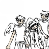
Open a layer for Haruhi's witch costume
Color:#534059
Blending Mode:Multiply
Opacity:100%
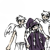
Another new layer for the twins hair
Color:#F2820A
Blending Mode:Multiply
Opacity:100%
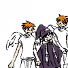
STEP 3. Fancying it up.
Colorfill new layer:)
Color:EDD7AF
Blending Mode:Colorburn
Opacity:63%
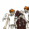
Duplicate the colorburn layer, but instead of colorburn set it to multiply.
Color:EDD7AF
Blending Mode:Multiply
Opacity:33%
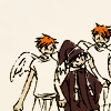
Then I played with this light texture:
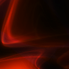
Until I got this:

I set that to
Blending mode:screen
Opacity:54%
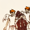
Duplicated it, played around with it some more and got this:
Set that to
Blending Mode:Screen
Opacity:100%
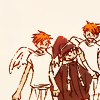
Thought it needed something sparkly so I added this texture:
Blending mode:Overlay
Opacity:100%

Decided I liked the color but not the dots of light so I selected the sparkly light texture and went to Filter>Blur>Gaussian blur and selected a radius of 4.7 px.

Its 4:00 am over here ~_~ I'm going to bed. Any horrific grammatical/spelling errors or missed steps will be fixed when I have had a restful night of sleep. :)
Credit for textures used located here
numbah 1:
We start out with this image
STEP 1. Crop it and clean it up.
Some people color their images before they crop them but my coloring is a lot softer if the image is bigger ^_^ so I crop mine first.

to

I deleted one of the flowers floating around Hunny's head because it made him look like he had ears D: I also deleted the text and Tamaki's head so we could focus in on Hunny being evil XD.
STEP 2. Coloring
I'm really anal about coloring. If I'm uncertain of the right shade of someone's hair I will pull an image of them into photoshop and use the eye dropper tool to figure out about what color I should be using. Of course I don't always use the exact color the eye dropper gives me, since hues that work in large images don't always look the same on 100x100 px squares. Luckily there was no colors to look up in this tutorial ^_^.
Open a new layer and color in the rope. I used Linear burn instead of my usual Multiply because it darkens the black lines of the rope itself. I thought it looked better ^_^;
Color:#94714B
Blending Mode:Linear Burn
opacity:62%

Another new layer to color in fred and george's Hikaru and Kauru's hair.
Color:#F2820A
Blending Mode:Multiply
Opacity:100%

New layer for Hunnys hair. Make sure you use a soft yellow! Hunny's hair isn't Naruto yellow!
Color:#FAF084
Blending mode:Multiply
Opacity:100%

New Layer for Hunny's skin. I use a different color for every character. A Girl's skin (and a angsty/childlike/vampirelike/girly man's skin) is mostly always pinker/paler then guy's skin unless the girl is a real tomboy :D Then I MIGHT make an exception. Hunny is a childlike boy so he falls more on the pink and pale side of my skin spectrum.
Color:#F5E4D2
Blending mode:Multiply
Opacity:67%

New Layer for the twins skin.
Color:#F3E7D4
Blending mode:Multiply
Opacity:100%

New layer for little flower by Hunny's head
Color:#FED505
Blending Mode:Multiply
Opacity:100%

STEP 3. Fancying it up.
After I'm done coloring my icons, I almost always put a layer filled with #EBD6AC on top. It just gives them more depth and a bolder, stronger look.
Color:#EBD6AC
Blending Mode:Color Burn
Opacity:82%

It's still boring, I need a background so after searching through my icon resources I find this:

I set it to multiply, zoom in to about 800% and use my erase tool to erase the excess texture on Hunny and the twins (and the flower of course!).

to

Too much yellow in the icon! I go to Image>Adjustments>Hue/Saturation and play with the arrow that controls the hue until I get to -30. Now it looks like this.

I decided that the solid layer with the colorburn should be on top of the texture too so I brought it to the top.

Too bright @_@ So I added one more light texture to soften it up...

Blending Mode:Screen
Opacity:100%

numbah 2:
We start out with this image
STEP 1. Crop it and clean it up.

to

I erased the text and went to Image>Adjustments>Brightness/Contrast
brightness:13
contrast:9
STEP 2. Coloring
Start out with a new layer for the twins skin.
Color:#F2E6D5
Blending Mode:Multiply
Opacity:100%

A new layer for Haruhi's skin.
Color:#F0E2D5
Blending Mode:Multiply
Opacity:100%

Open a layer for Haruhi's witch costume
Color:#534059
Blending Mode:Multiply
Opacity:100%

Another new layer for the twins hair
Color:#F2820A
Blending Mode:Multiply
Opacity:100%

STEP 3. Fancying it up.
Colorfill new layer:)
Color:EDD7AF
Blending Mode:Colorburn
Opacity:63%

Duplicate the colorburn layer, but instead of colorburn set it to multiply.
Color:EDD7AF
Blending Mode:Multiply
Opacity:33%

Then I played with this light texture:

Until I got this:

I set that to
Blending mode:screen
Opacity:54%

Duplicated it, played around with it some more and got this:

Set that to
Blending Mode:Screen
Opacity:100%

Thought it needed something sparkly so I added this texture:

Blending mode:Overlay
Opacity:100%

Decided I liked the color but not the dots of light so I selected the sparkly light texture and went to Filter>Blur>Gaussian blur and selected a radius of 4.7 px.

Its 4:00 am over here ~_~ I'm going to bed. Any horrific grammatical/spelling errors or missed steps will be fixed when I have had a restful night of sleep. :)