season 1 farscape icons
I wasn't terribly inspired for a lot of these icons, but I sort of made myself finish tonight regardless. 31 icons from Farscape season 1 made for farscape_20in20
( Read more... )
( Read more... )
Comments 12
Reply
Reply
Smell is very quietly beautiful.. and I really like your AC set. :) great work :)
Reply
Reply
I love the colors here and the texture work is amazing, esp. in Favorite color, Fight and alt10. Really love those three.
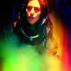
But everything else is so great too. I went 'wow' when I saw Vertical in the preview, the colors and the whole look are just amazing. The levels look in Reflection works great, and the whole ac set is full of pretty, #5 is awesomely interesting and creative, love the light and the crop, and also #1 is super pretty with the smoky effect. #3 has awesome contrast and a really pretty, dramatic look, and #2 and #4 have a lovely vibrancy.
The category et is really pretty too, especially Taste. The soft contrast ties the set nicely together and looks awesome.
Also the coloring of alt3 is wow, I wonder why it's not in the set itself? It's lovely :)
Of course I love the rest too, and will snag a lot of these when I have the time to make userpic updating again. Gorgeous entry again!
Reply
I did go overboard with the textures, as usual, but I think it worked, especially on those ones you mentioned.
Favorite color was my attempt to try to do icons like those more popular/trendy icons these days, except I didn't follow any tutorials, and that was as good as I could figure out on my own.
Also now that I look at it, alt3 probably should have been part of the set, but I was just going with a theme of 'images on left crops' when I was picking the ones for AC's. I don't even know why though!
Reply
Reply
Reply
Reply
Reply
Leave a comment