Men's Versus Women's Poses
And here it is! The very long and image-heavy post nobody asked for, but that's what you get today. But look, it took me forever to put together and hurt my back and I did it all for you, so you should at least humour me and glance over it, right? Right.
As mentioned yesterday, I took some inspiration from Jim C Hines's Striking A Pose blog entry and figured I'd do some experimentation on my own. And hey, while I was at it, why not take things one step further and contrast the female poses with some male poses?
So I wrapped my bad knee and grabbed my husband, some props, and a camera, and we spent the evening doing a rather ridiculous photoshoot. That man has an incredible depth of patience and not only took the photos, but helped me refine my poses to make them a little more accurate. He also made the foam swords I used (although not the lightsaber).
A quick disclaimer before we get into the meat of the project: I am not a professional model (check child-bearing hips) but 15 years of dance training has given me a decent sense of body control. I was on track to becoming a professional ballet dancer before I trashed my knee. So when I say some of these poses are quite painful, it's a pretty good indication that no matter what shape an urban fantasy heroine is supposed to be in, these are not positions she would naturally stand in. Ever.
I figured I'd start with the same pose Jim started out with. He began with a pose from his own cover, a fairly basic pose, but one he had some trouble with due to lack of hips.
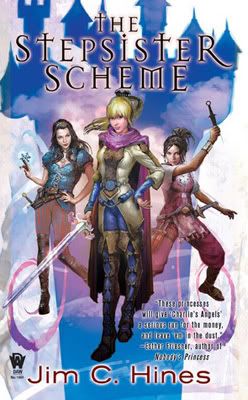
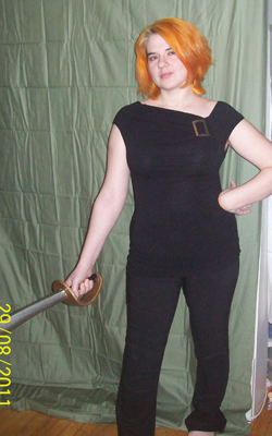
It wasn't terribly painful, but it was pretty unnatural. I think the juxtaposition of the strong grip on the sword and the limp wrist on the other hip threw me off a bit. It's certainly possible to be both strong and feminine; that's not a way a woman would do it.
That wasn't too bad, though. Let's check and see the male equivalent.


So... wow. You know, I feel like I could leave the post here and have made my point. Look at the difference in stance! The "male" pose is strong, competent, and totally natural. While my husband had to tinker with me a bit to get the pose to match The Stepsister Scheme, he didn't have to do a thing when it came to matching Ariel because when you say "here, hold a sword and take a strong stance" this is probably very close to what just about anyone would do. And you know what? I might look strong and confident, but nothing about me looks masculine. No need for coy head tilts or floppy wrists!
That's just one set of poses, though. Maybe we should take a look at another before coming to any conclusions. So let me look through and find some more poses with weapons...
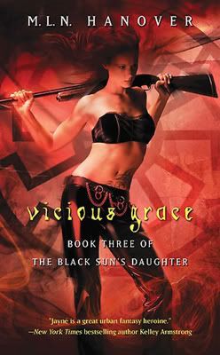
I... yeah, ok, nothing about this says strength or competence. (And if you were hoping for some topless pics, I am sorry to disappoint you. After three kids, though, I'm sure you'd have been much more disappointed if you did get to see me without a shirt on.) I didn't have a rifle onhand, so I improvised with a sword, taking advantage of the fact that I have teeny shoulders.
So obviously I can get myself into that pose, but to hold it for any length of time hurts. And my crazy wind machine was broken, I regret to say.
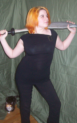
Well, there has to be a gratuitously posed shot of a man with his sword across his shoulders somewhere...
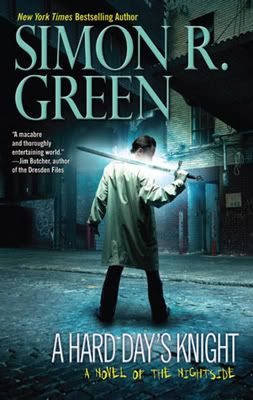
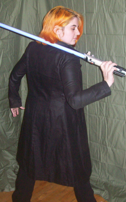
Ah, there it is. (Note: I did have the lightsaber turned on so it was all glowy, but the camera's flash cancelled it out. And nobody could possibly be more sad about this than me.)
Once again, natural pose, comfortable to hold, and the only tweaking the husband had to do was to correct the angle I was holding the sword. Strong? Check. Competent? Well, not as much as the Ariel pose, but at least I don't look like I'm about to have a tragic weapons malfunction, like the cover of Vicious Grace. And frankly, it looks better on the female form than the ridiculous contortions.
Interesting to note, too, that there's a big loose jacket covering what would otherwise be a butt shot. Since the butt shot is a staple of urban fantasy, it's easy enough to contrast the rear view of the male character in A Hard Day's Knight with a female variant:

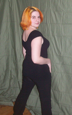
Of course. Leather britches and a painful half turn at the waist. Outside of a book cover, who stands like that? Nobody, that's who. It's unnatural. Even if you'd heard a noise behind you, you wouldn't bend yourself like that because it hurts.
Ok, ok. How about showing off the wardrobe? Leather is all the rage in urban fantasy.
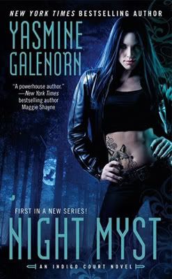
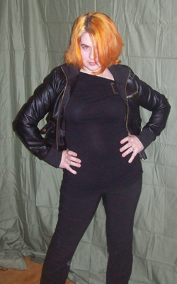
And back to the hips. My lack of midriff doesn't quite do this pose justice. With all the black on black on black, you don't get enough contrast here. On the cover art, her bare stomach is the focal point of the cover; in my version of the pose, the jacket gets more of the attention because I don't have the tattooed contrast point. I could show you my stretchmarks, I suppose, but we don't have to go there for me to be able to tell you that the degree to which her hip is thrust up is unnatural and painful. That look on my face is not me challenging the photographer, it's a look of "please hurry up and snap this because my whole left side is cramping up." I'd like to imagine the cover model is thinking the same thing.

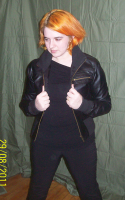
Apparently the male equivalent of the "I have a leather jacket so I'm super tough but also feminine check out my hips, yo" is "I have a leather jacket so I'm super tough and CHECK MY POPPED COLLAR! Bonus cool points!" Ok, I felt a bit goofy in the popped collar (especially since it refused to stay popped), but nothing hurt. I didn't have to stretch myself out after doing this, and there were no cramps. And I look a lot more like someone who could conceivably kick people in the head for a living.
Hmm. You know who's an awesome and gritty female character? Mercy Thompson. Tough, capable, mechanic by day, coyote shapeshifter by night. Let's check in with her. She's got to have some awesome poses going on.

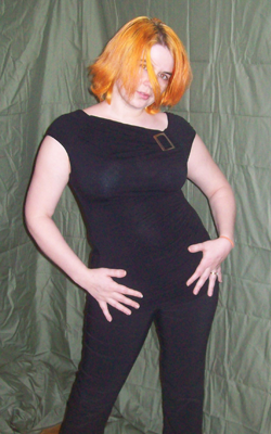
What the--? Who decided a pin-up pose would be the best representation of Mercy Thompson?! Because that's exactly what this is. That pose belongs in a calendar, not on the cover of a book about a woman who tears out the throats of bad guys and then eats them for breakfast.
Well, ok, I'll admit that while it's not the best representative, at least it's pretty, and the pose doesn't hurt to hold. It's pretty natural, and the sexy image has clearly helped to sell many copies of the book, considering the popularity of the Mercy Thompson series. So maybe marketing knows what they're doing here. Let's just do a quick check with the male side of the equation, shall we? What would be a good equivalent for Mercy, at least in terms of marketing? Maybe Harry Dresden?

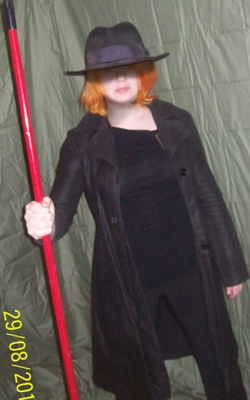
Side note: I like to call this shot "Revenge of the Janitor!" I didn't happen to have a quarterstaff lying around the house, so I made do with what I could find.
The husband enjoys the Dresden series and has all the books, so I checked the covers to look for variety of poses and discovered there isn't. They're all pretty much the same pose with different crops and angles. Front view, side view, back view, all shadowy figure in a long black coat with a hat and staff. Gritty, mysterious... but not sexed up. Never sexed up.
So why the big difference between Harry Dresden and Mercy Thompson? They're marketed for a similar audience, although the primary readership for Dresden is men and the primary readership for Mercy Thompson is women. Yes, I realize both series have readers of both genders and in fact they have a sizable crossover readership. This actually works to underscore my point, rather than working against it, because the difference isn't in the readership. The difference is simply that Harry is a man and Mercy is a woman, and therefore Harry can be mysterious, gritty, and strong... but as a woman Mercy should be sexy first and then she can be whatever else is dictated by the series.
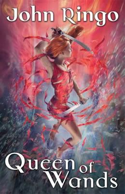
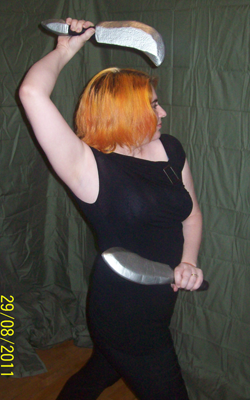
This was by far the most painful pose. In fact, after we did this shot we had to take a break so I could stretch out my poor, abused back, and a day later it still hasn't recovered. As people pointed out in Jim's post, the woman in the cover art is floating, so I didn't bother myself with the legs. The pose from the pelvis up should still be feasible, though, since as far as I know floating doesn't give you a magical revolving spine. (Feel free to let me know if I'm wrong about that.)
I hurt myself cranking my spine around like that, but you'll note it still doesn't quite match the woman in the cover art. A contortionist might be able to replicate it, but then again, she might not.
And the male equivalent is... actually, I looked high and low and could not find a male character doing a pose anywhere near that ridiculous. For the most part, male characters do a variation on this:
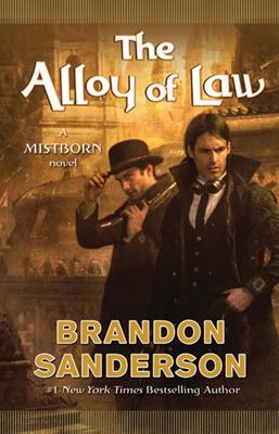

I know, my brow is just not furrowed enough. I blame the cat's antics. Steampunk dude there clearly does not have to deal with a camera hogging cat. Also, he's getting paid to furrow his brow and I'm not. But once again, like every single male pose I tried, it's comfortable and easy to hold. It feels natural, it looks natural, and the strong stance doesn't hide the fact that my form is female. Honestly, do I look more feminine in this picture or in the one above it?
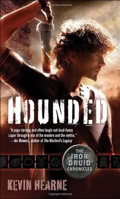
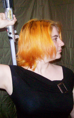
Honestly, I wasn't sure how well this particular pose would translate. It's mostly just head and shoulders, but it ended up being my favourite shot of the bunch. I look awesome, capable and feminine at the same time. Why, hello breasts!
So, uh, why aren't female characters ever shot this way? Cool, confident, capable... and also boobs! It's the best of both worlds! But no, there's not enough twisty hips so it's clearly not feminine enough.
Hey, you know what every urban fantasy heroine needs? Stiletto heels!
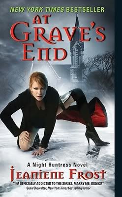
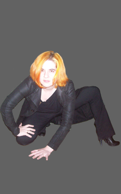
Eagle-eyed viewers will note I had to flip my version of the pose. I did make that concession to my bad knee. Also I figured that while I like you guys, I didn't feel the need to share my underpants with you all, so I kept my pants on instead of adding the short skirt. You're welcome.
I was actually surprised at how comfortable this pose was to hold. It looks really awkward, but it wasn't bad. I'm not quite sure what she's supposed to be doing, though. Is she preparing to pounce? Breaking a hip? Either way, how did she get back up again, especially when stiletto heels are involved? I handle myself really well in heels of all heights and widths, but dropping into a crouch isn't my first choice of position when the balls of my feet are six inches lower than my heels. (I'm exaggerating, those boots only have about a four inch heel. I could have gone higher, but those ones are red, and it would have looked wrong.) And the one leg to the side isn't helping the crouch, it's hindering. That doesn't give me any leverage or help balance. It's not uncomfortable, but it's not natural.
And finally, finally, we come to a two-fer.
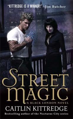
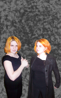
Let's never mind that in this book, the dude is supposed to be a super skinny drug addict and the chick is the tougher of the two of them. We'll ignore that for the time being and just focus on the body language. He's holding his fists up to his chest, showing off muscles bigger than his head, and staring aggressively into the camera. Meanwhile, she has her arms not at her sides, but pushed behind her, forcing her breasts to jut out as she stares somewhere vaguely off screen. She's not dainty exactly, but her feminine attributes are the ones being highlighted, while for him it's all about strength. And ok, I'll be the first to admit that I do look strange and unnatural in this particular male pose, perhaps because of my utter lack of arm muscle, but in trying the female pose, all I could think of was those guys who used to come around and try to convince all the girls to touch their shoulderblades together so they could get a better view of their breasts.
So the summary: men's poses emphasize strength, capability, perhaps with a bit of mystery. They follow the body's natural lines and actually look like something a real person would do. Women's poses emphasize sexy sexy dangerous sex and most vary from awkward to painful to impossible. What puzzles me most about this is that studies show the vast majority of people who read novels with female protagonists are, in fact, female. Unless they're going for a very specific demographic, marketing assumes we're all cisgendered, so why are we using the cover art to objectify characters we're supposed to identify with? Posing like a pin-up is not the only way to be attractive, and twisting your body to the point of OW robs us of anything beyond "T&A." The men's poses are dynamic and interesting, implying the male characters inside are, too. So what are we saying about our female characters?
As mentioned yesterday, I took some inspiration from Jim C Hines's Striking A Pose blog entry and figured I'd do some experimentation on my own. And hey, while I was at it, why not take things one step further and contrast the female poses with some male poses?
So I wrapped my bad knee and grabbed my husband, some props, and a camera, and we spent the evening doing a rather ridiculous photoshoot. That man has an incredible depth of patience and not only took the photos, but helped me refine my poses to make them a little more accurate. He also made the foam swords I used (although not the lightsaber).
A quick disclaimer before we get into the meat of the project: I am not a professional model (check child-bearing hips) but 15 years of dance training has given me a decent sense of body control. I was on track to becoming a professional ballet dancer before I trashed my knee. So when I say some of these poses are quite painful, it's a pretty good indication that no matter what shape an urban fantasy heroine is supposed to be in, these are not positions she would naturally stand in. Ever.
I figured I'd start with the same pose Jim started out with. He began with a pose from his own cover, a fairly basic pose, but one he had some trouble with due to lack of hips.


It wasn't terribly painful, but it was pretty unnatural. I think the juxtaposition of the strong grip on the sword and the limp wrist on the other hip threw me off a bit. It's certainly possible to be both strong and feminine; that's not a way a woman would do it.
That wasn't too bad, though. Let's check and see the male equivalent.


So... wow. You know, I feel like I could leave the post here and have made my point. Look at the difference in stance! The "male" pose is strong, competent, and totally natural. While my husband had to tinker with me a bit to get the pose to match The Stepsister Scheme, he didn't have to do a thing when it came to matching Ariel because when you say "here, hold a sword and take a strong stance" this is probably very close to what just about anyone would do. And you know what? I might look strong and confident, but nothing about me looks masculine. No need for coy head tilts or floppy wrists!
That's just one set of poses, though. Maybe we should take a look at another before coming to any conclusions. So let me look through and find some more poses with weapons...


I... yeah, ok, nothing about this says strength or competence. (And if you were hoping for some topless pics, I am sorry to disappoint you. After three kids, though, I'm sure you'd have been much more disappointed if you did get to see me without a shirt on.) I didn't have a rifle onhand, so I improvised with a sword, taking advantage of the fact that I have teeny shoulders.
So obviously I can get myself into that pose, but to hold it for any length of time hurts. And my crazy wind machine was broken, I regret to say.
Well, there has to be a gratuitously posed shot of a man with his sword across his shoulders somewhere...


Ah, there it is. (Note: I did have the lightsaber turned on so it was all glowy, but the camera's flash cancelled it out. And nobody could possibly be more sad about this than me.)
Once again, natural pose, comfortable to hold, and the only tweaking the husband had to do was to correct the angle I was holding the sword. Strong? Check. Competent? Well, not as much as the Ariel pose, but at least I don't look like I'm about to have a tragic weapons malfunction, like the cover of Vicious Grace. And frankly, it looks better on the female form than the ridiculous contortions.
Interesting to note, too, that there's a big loose jacket covering what would otherwise be a butt shot. Since the butt shot is a staple of urban fantasy, it's easy enough to contrast the rear view of the male character in A Hard Day's Knight with a female variant:


Of course. Leather britches and a painful half turn at the waist. Outside of a book cover, who stands like that? Nobody, that's who. It's unnatural. Even if you'd heard a noise behind you, you wouldn't bend yourself like that because it hurts.
Ok, ok. How about showing off the wardrobe? Leather is all the rage in urban fantasy.


And back to the hips. My lack of midriff doesn't quite do this pose justice. With all the black on black on black, you don't get enough contrast here. On the cover art, her bare stomach is the focal point of the cover; in my version of the pose, the jacket gets more of the attention because I don't have the tattooed contrast point. I could show you my stretchmarks, I suppose, but we don't have to go there for me to be able to tell you that the degree to which her hip is thrust up is unnatural and painful. That look on my face is not me challenging the photographer, it's a look of "please hurry up and snap this because my whole left side is cramping up." I'd like to imagine the cover model is thinking the same thing.


Apparently the male equivalent of the "I have a leather jacket so I'm super tough but also feminine check out my hips, yo" is "I have a leather jacket so I'm super tough and CHECK MY POPPED COLLAR! Bonus cool points!" Ok, I felt a bit goofy in the popped collar (especially since it refused to stay popped), but nothing hurt. I didn't have to stretch myself out after doing this, and there were no cramps. And I look a lot more like someone who could conceivably kick people in the head for a living.
Hmm. You know who's an awesome and gritty female character? Mercy Thompson. Tough, capable, mechanic by day, coyote shapeshifter by night. Let's check in with her. She's got to have some awesome poses going on.


What the--? Who decided a pin-up pose would be the best representation of Mercy Thompson?! Because that's exactly what this is. That pose belongs in a calendar, not on the cover of a book about a woman who tears out the throats of bad guys and then eats them for breakfast.
Well, ok, I'll admit that while it's not the best representative, at least it's pretty, and the pose doesn't hurt to hold. It's pretty natural, and the sexy image has clearly helped to sell many copies of the book, considering the popularity of the Mercy Thompson series. So maybe marketing knows what they're doing here. Let's just do a quick check with the male side of the equation, shall we? What would be a good equivalent for Mercy, at least in terms of marketing? Maybe Harry Dresden?


Side note: I like to call this shot "Revenge of the Janitor!" I didn't happen to have a quarterstaff lying around the house, so I made do with what I could find.
The husband enjoys the Dresden series and has all the books, so I checked the covers to look for variety of poses and discovered there isn't. They're all pretty much the same pose with different crops and angles. Front view, side view, back view, all shadowy figure in a long black coat with a hat and staff. Gritty, mysterious... but not sexed up. Never sexed up.
So why the big difference between Harry Dresden and Mercy Thompson? They're marketed for a similar audience, although the primary readership for Dresden is men and the primary readership for Mercy Thompson is women. Yes, I realize both series have readers of both genders and in fact they have a sizable crossover readership. This actually works to underscore my point, rather than working against it, because the difference isn't in the readership. The difference is simply that Harry is a man and Mercy is a woman, and therefore Harry can be mysterious, gritty, and strong... but as a woman Mercy should be sexy first and then she can be whatever else is dictated by the series.


This was by far the most painful pose. In fact, after we did this shot we had to take a break so I could stretch out my poor, abused back, and a day later it still hasn't recovered. As people pointed out in Jim's post, the woman in the cover art is floating, so I didn't bother myself with the legs. The pose from the pelvis up should still be feasible, though, since as far as I know floating doesn't give you a magical revolving spine. (Feel free to let me know if I'm wrong about that.)
I hurt myself cranking my spine around like that, but you'll note it still doesn't quite match the woman in the cover art. A contortionist might be able to replicate it, but then again, she might not.
And the male equivalent is... actually, I looked high and low and could not find a male character doing a pose anywhere near that ridiculous. For the most part, male characters do a variation on this:


I know, my brow is just not furrowed enough. I blame the cat's antics. Steampunk dude there clearly does not have to deal with a camera hogging cat. Also, he's getting paid to furrow his brow and I'm not. But once again, like every single male pose I tried, it's comfortable and easy to hold. It feels natural, it looks natural, and the strong stance doesn't hide the fact that my form is female. Honestly, do I look more feminine in this picture or in the one above it?


Honestly, I wasn't sure how well this particular pose would translate. It's mostly just head and shoulders, but it ended up being my favourite shot of the bunch. I look awesome, capable and feminine at the same time. Why, hello breasts!
So, uh, why aren't female characters ever shot this way? Cool, confident, capable... and also boobs! It's the best of both worlds! But no, there's not enough twisty hips so it's clearly not feminine enough.
Hey, you know what every urban fantasy heroine needs? Stiletto heels!


Eagle-eyed viewers will note I had to flip my version of the pose. I did make that concession to my bad knee. Also I figured that while I like you guys, I didn't feel the need to share my underpants with you all, so I kept my pants on instead of adding the short skirt. You're welcome.
I was actually surprised at how comfortable this pose was to hold. It looks really awkward, but it wasn't bad. I'm not quite sure what she's supposed to be doing, though. Is she preparing to pounce? Breaking a hip? Either way, how did she get back up again, especially when stiletto heels are involved? I handle myself really well in heels of all heights and widths, but dropping into a crouch isn't my first choice of position when the balls of my feet are six inches lower than my heels. (I'm exaggerating, those boots only have about a four inch heel. I could have gone higher, but those ones are red, and it would have looked wrong.) And the one leg to the side isn't helping the crouch, it's hindering. That doesn't give me any leverage or help balance. It's not uncomfortable, but it's not natural.
And finally, finally, we come to a two-fer.


Let's never mind that in this book, the dude is supposed to be a super skinny drug addict and the chick is the tougher of the two of them. We'll ignore that for the time being and just focus on the body language. He's holding his fists up to his chest, showing off muscles bigger than his head, and staring aggressively into the camera. Meanwhile, she has her arms not at her sides, but pushed behind her, forcing her breasts to jut out as she stares somewhere vaguely off screen. She's not dainty exactly, but her feminine attributes are the ones being highlighted, while for him it's all about strength. And ok, I'll be the first to admit that I do look strange and unnatural in this particular male pose, perhaps because of my utter lack of arm muscle, but in trying the female pose, all I could think of was those guys who used to come around and try to convince all the girls to touch their shoulderblades together so they could get a better view of their breasts.
So the summary: men's poses emphasize strength, capability, perhaps with a bit of mystery. They follow the body's natural lines and actually look like something a real person would do. Women's poses emphasize sexy sexy dangerous sex and most vary from awkward to painful to impossible. What puzzles me most about this is that studies show the vast majority of people who read novels with female protagonists are, in fact, female. Unless they're going for a very specific demographic, marketing assumes we're all cisgendered, so why are we using the cover art to objectify characters we're supposed to identify with? Posing like a pin-up is not the only way to be attractive, and twisting your body to the point of OW robs us of anything beyond "T&A." The men's poses are dynamic and interesting, implying the male characters inside are, too. So what are we saying about our female characters?