Full Tutorial
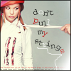
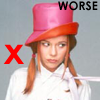
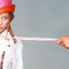
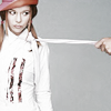
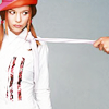
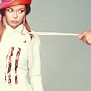
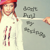
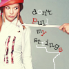
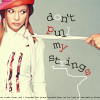
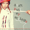
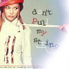
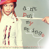
We will (eventually) be going from this to
using PS7 - I have no idea how easily translateable it is.
Image heavy doesn't even come close. I can only apologise - to my Photobucket account if to no-one else :/
This is my first tutorial, written at the request of lozzy_babe06 ;) - thus consider yourselves duly warned that it will most probably be long, tedious, pointless, and uninformative... and I'll ramble a lot, too.
Still want to continue?
Sure?
*cackle*
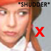
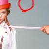
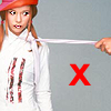
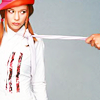
Okay, we’re going to start with this old publicity photo of actress, Kim Cooper…
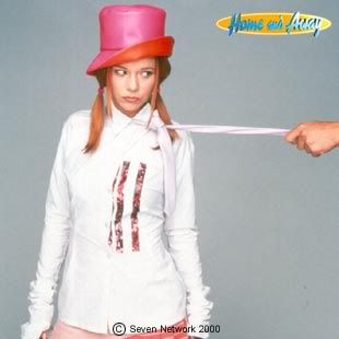
Anyone used to watch 'Home And Away'? ...no? Figures.
Not wanting to disappoint on the tedious front, I'm going to go through cropping/sharpening/smoothing etc... a little (read as: too much). Even though you'll undoubtedly be able to find the same (though more articulate) ideas in the memories section. So, if you've already read through enough tuts like this to want to claw your own eyeballs out with a blunt purple stick, you might just want to skip this whole section.
*sigh*
Step 1. Cropping.
First we select the... wait for it... 'crop' tool from the tools palate (or hit 'c' on your keyboard). I prefer to crop straight to 100x100 px, though some people like to crop larger and then resize at the end. Personally I wouldn't even consider this unless working with a much larger and better quality cap/pic/photo.
In the cropping options bar at the top, type 100 px into the width and height boxes, 72 into resolution and ensure pixels/inch is displayed in the drop down box next to it.
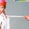
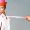
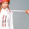
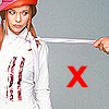
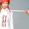
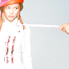
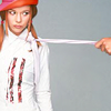
Click and drag over the image to define your crop, you can move and readjust the area after. And we want to go for *unusual* angles and such here, people. Placing something right. in. the. middle. will not make a good icon, and people will point at you gleefully and laugh - loudly. Okay, so maybe that's a slight exaggeration, they won't point. It doesn't take a genius to do this well: cut bits off, resize or rotate, don't go too close that you lose image quality, or so big an area that you're left with an ant sized subject with enough surrounding... busyness to give viewers an epileptic fit, and leave yourself enough room for text and/or other details. Ye olde cropping examples...
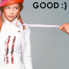
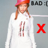
Ideally I would've liked her face to be a little larger in the 'good' cap, but for the text I had in mind (which *never* usually happens, btw) I kinda needed the hand to be shown too.
Something random: If you ended up with a cap like this... (just because)
...with the ugly sign on it (*coughignorethatitstheownerofphotocough*), then never fear. All you need to do to remove it (because *joy* it's a flat one-colour background) is to select the 'eyedropper' tool from the tools palate ('i' on your keyboard) and click on an area near the bit you want to get rid of, i.e. click on the grey part, genius, to set the colour. Then select the 'brush' tool ('b') and set it to something sensible like a 9 px soft round brush from the drop down menu in the options bar at the top, and paint over the sign. You might find yourself left with your fiddling being noticeable, like so...
See it? That little bit of darker grey at the top? ...no?
There? ...nope? I know, this is ridiculous. So shoot me.
All you need to do now is to select the 'smudge' tool (right click the 'blur' tool if you can't find it) - set the brush to soft round 17 px or something like that, the mode to normal and the strength to 30%-ish. Now 'smudge' in circular movements until you can no longer see the darker grey area...
Fin.
Step 2. Sharpening.
So we have our crop...
Ugh! Blurriness.
Filter > Sharpen > Sharpen.

Better, but this to me looks a little too sharp (see note below), so before you do anything else (!), Edit > Fade Sharpen. Slide the opacity to something that looks better, I was okay at 75%. Though *kicks laptop* it's kinda hard to tell.

Note: Over sharpening is not big, and it is not clever. It just looks *wrong*. It should also be noted that singling out eyes and lips does not allow you to get away with it. Stop it!
Sorry, I digress.
Step 3. Smoothing.
I am perpetually afraid of the blur tool, I can't seem to stop it attacking other bits of the icon. So I play safe and use the 'smudge' tool instead.
Select the smudge tool ('r') - mode: normal, strength: 8% (warning - go no higher), brush: soft round 5/9/13 px (dependant on what you're smoothing, usually face details need 5 px).
Zoom right in so you can actually see what you're doing - as this is always a good start (or 'ctrl' and '0' for full screen). Then smudge everywhere that can stand it (i.e. leave the eyes well alone - unless you icon is just one big eye... oooh) using circular movements on the skin. For large!lips/hair/clothing it's usually best just to follow the... grain, if that makes any sense at all. If I'm ever allowed to make another tut again (and that in itself is doubtful), I might try explaining this more with a better example (since I can't find the tut I originally saw it in, unless I dreamt that part, which is always possible :/).
Caution: Do not over smooth, the porcelain doll effect can scare those of us with a nervous disposition.
This usually works best on a larger face than the one in my icon, so I only smoothed a little, just to get rid of some of the bright pixely areas (which you probably can't see, 'cause it's not a good example :P)...
to
Possibly you might want to sharpen (and fade!) again at this point. I didn't.
*pokes you*
Bored yet?
Step 4: Colouring.
I'm really not a huge fan of the colouring in this icon, I'm actually not a huge fan of this icon in any way. Still, in my quest to tediously ramble, I'll go through it anyway.
Right click on the layer > Duplicate layer. At the top of the layers palate, change normal to screen.
Woah, sunglasses! Lower the opacity if necessary (*so* necessary here - Opacity: 6%. I know, I know, what is the point?).
Duplicate layer again. Soft light. 100%. I *really* don't like the colouring on this icon.
Bright, no? To make this a little more natural, I usually desaturate the soft light layer. I didn't do that on this icon though. Instead I duplicated the base ('normal') layer and desaturated that (Image > Adjustments > Desaturate)...
The only reason I duplicated the layer was so that I could fade the opacity of the new desaturated layer (see, always thinking). (To 31%)...
Usually I have to play around with lots of different effects (different parts desaturated, different opacities, sometimes hard light instead of soft light etc...) and open them all in new windows (right click at the top and duplicate). Please someone else say they do this too...?! :/
Create a new layer by clicking this...
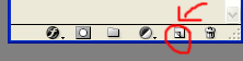
...at the bottom of the layers palate.
Click on the box where you set the foreground colour and select a dark blue. I used #060146. Select the 'paint bucket' tool (right click 'gradient' tool if you can't find it) and flood fill the new layer.

Agh! Where has my icon gone?! *rolls eyes* I'm sorry. Set the layer to exclusion, 100%. Then drag this layer underneath everything but the background layer - as this is where it usually works best. Why? *shrug*
If you're slowly losing the will to live right now, here's something really infuriating just to push you that little bit further.
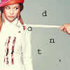
Step 5: Text. ...oooh.
Select the 'type' tool ('t') - of the horizontal persuasion. Set the following, Font: Courier (T1), Size: 12 pt, anti-aliasing: smooth (important!). Click anywhere on your icon, a new layer will automatically be created, and type in a lower case 'd'. Click on the 'd' layer in the layers palate, just because. :P Then click anywhere not near the 'd' to create a new layer, and type 'o'. Do the same again three times to finish the word.
Select the 'move' tool ('v'). Drag each letter to the appropriate place (you might want to zoom in again while you do this).
Still with the move tool selected, click on the 'd' layer. Move the mouse outside one of the corners of the selection box until you see the little arc arrow, then rotate the letter. Caution: Do not resize the letters in any way or they will look odd, if you do so, hold 'ctrl' and 'z' to undo. Rotate all the letters in the word until you are satisfied that they look pretty.
Repeat the above for the other words (don't worry if your layers palate looks like it's going to crash you program at any moment, just put up with it). There's probably a *much* easier way to do this, but I do not know it.
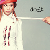
Oooh, look, aren't we clever.
This, to me, looked a little plain. So I decided to add some colour. Click the little colour box in the text option bar and click somewhere on your icon - find a nice, matching colour. Colour letters randomly - intended!random not totally!random (like ruffled bed hair that you want people to think is accidental but has actually been purposely ruffled *g*). Experiment a bit with this. I ended up with...
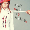
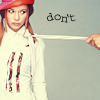
When you're happy with your positioning and colouring you can merge the layers. This will also raseterize the text (meaning you won't be able to use the 'type' tool on it to edit it) so duplicating the icon first is usually a good idea, then you can always change your mind later.
Click on the 'd' and make it the active layer. Then click in the box in between the eye and the big T of the next letter to link the layers. Do this for all the letters of the word 'don't'. Then Layer > Merge Linked ('crtl' + 'g'). You should then have just one layer for the word 'don't'. Amazing :/
Repeat this for the other words, until your layers palate forgives you.
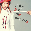
You can, if you want, make the words stronger by duplicating each layer. Then possibly fading the opacity of the layers to something like this...
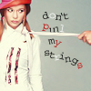
However, I chose not to, as I felt the one layer gave the text a more... fittingly dishevelled look. Isn't it *fun* to be able to defend anything with nonsense? XD
At one point I also erased part of the word 'pull' by zooming in and using the 'eraser' tool ('e')...
...but didn't like it so ctrl and z'd it.
Note: starry_night10 also wrote a (much better) tutorial on jagged text recently, showing a different way to go about it. Go read :)
Step 6: Detail
Text like this usually needs a squiggle of some sort to complement it - especially if your text happens to contain the word 'strings'. Select the brush tool and set it to a hard round 1 px brush. Opacity: 100%.
Draw a squiggly type thing somewhere on your icon. Tip: Always keep your first attempt, it usually turns out to be the best one - for me at least. Put each one on a separate layer if necessary, then delete the unused layers when you've made your choice. Lower the opacity (to 71%).
Again it's best to draw your squiggle in a colour from your icon (using the eyedropper tool).
Next. I don't seem able to make an icon without putting some form of tiny text on it any more. So again select the 'type' tool, but change the size to 2 pt. Click anywhere on the icon and type in... something, I always type the lyrics of the song I'm currently listening to as I hear them, even better if they actually fit with the icon. Type enough to stretch all the way across the width of the icon. Then move the mouse away from the text a little, until you see the arrow with the little move sign underneath it. Click here and drag to move the text - I placed mine along the bottom of the icon. Lower the opacity (to 70%)...
Duplicate the text layer, change the colour, and move it slightly above the other text layer...
Lighting.
Open this (by... I honestly/annoyingly have no idea, I'm not even sure if I made it or not...?!)...

...and click it's icon in it's layers palate and drag it onto your icon (or just copy and paste it from here). Set it to 'screen'.
Hmm, now you can't see parts of the icon that've actually been worked on, and the text is making no sense - which is always fun. Select the move tool, and resize and rotate the lighting until only a little can be seen in the corner. Desaturate it...
If you want you could add a 1 px border. If you're lazy, like me, it's probably easiest to use this border brush by quebelly...
Fade the opacity (to 68%).
And, *gasp*, that's actually it! I really wasn't lying at the beginning ;)
Feel free to try it out, ask about something you don't understand, leave any ideas on better techniques or tutorial writing (though "you suck" will be mocked)... or simply to tell me to shut up. XD
Comments @ Personal Journal