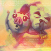
The 'Hey Let's Do Something Random And Cool!' Icon Tutorial

The 'Hey Let's Do Something Random And Cool!' Icon Tutorial: using Adobe Photoshop 7.0 (easily translatable)
- Get the main image ready. Like, sharpen, delete extra parts, whatever you need to do to get it ready. Then put it aside because we're not going to use it just yet.
- Now, open up a random gradient, texture, image, whatever you like. Make sure it's relatively simple and not too busy. This is going to be our base.
I chose a "vintage" squares pattern.
- Slide in another random gradient or texture in another layer and set it to "lighten" at 100%.
Mine was a pink gradientlike texture.
- We slide our main image in now (you know, the one we cast aside for a brief moment) in a separate layer on top. You can use whatever layer setting is most appropriate for your image.
In getting the Animal Crossing image ready, I deleted everything but what I wanted in the icon. I copied the layer and used the gaussian blur filter on the bottom main image layer. Then for the top, I just smoothed out the edges. Both layer settings were on "normal".
- On top of that layer, choose another gradient or texture (or even image if you found something you like) and set it to whatever setting you like best at whatever opacity.
I had a green-to-orange gradient thing that I set on "darken" at 100%.
- Let's choose a mostly black texture with brightish parts from your no doubt extensive texture collection (if you have not yet acquired this, have fun browsing my resources!) and set that on "lighten" or "screen" at whatever opacity works best.
I had an all-black-except-for-a-rainbow-like-curve texture that I set to "lighten" at 74%.
- Now we're going to add little bubble-light thingies! You know the type I'm talking about. Little light blurbs. Errr. Textures that are black except for blobs of color! Anyway. Put that on "lighten" or "screen" at whatever opacity you like.
My little bubble-light thingy actually didn't have much black. It was just blobs with varying degrees of a pinkish red. I set that to "lighten" at 67%.
- Our image is pretty cool now, isn't it? Well, we're going to add tiny little touches to it now. Consider a white brush border. Now consider that brush border at a very low opacity. See? It's just a tiny touch.
I had a little white brush border at 18%.
- For the finishing touch, I added white tiny text and set it to "soft light" at 100%.
See? We are so cool! Show me your icon experiments! You automatically get an A+ for effort!