Tutorial #2
Tutuorial #2
- - >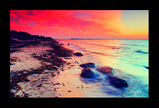
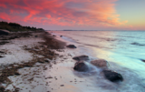
o1. First I started off with this image, resized it to 400 px wide
o2. Next I duplicated the image and set the duplicate to soft light 100% opicaty
o3. Then I added another layer filled with #181A38 set to exclusion 100% opicaty
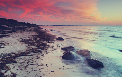
o4. I added another layer filled with #AFE7F5 set to color burn 65% opicaty
o5. Again I added another layer #FBF6EF set to color burn 100% opicaty
o6. Next I went to Layers -- New Adjustment Layer -- Levels and changed the following
RED - input levels -- 0 ; 1.5 ; 255
RED - output levels -- 10 ; 255
GREEN - input levels -- 5 ; 1 ; 250
GREEN - output levels -- 20 ; 245
BLUE - input levels -- 5 ; 1; 255
BLUE - output levels -- 5 ; 255
o7. Next go to Layers -- New Adjustment Layer -- Hue/Saturation and change the following and then set to Saturation 100% opacity
Master saturation -- 55
Red saturation -- 11
Yellow saturation -- -22
Blue saturation -- 22
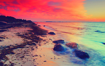
o8. Then you go to Layers -- New Adjustment Layer -- Brightness/Contrast and set
Brightness -- 5
Contrast -- 10
o9. Then I duplicated the original picture and moved it to the top of all layers and set it to Soft Light set at 55% opacity
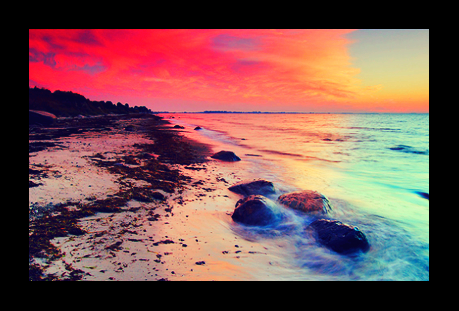
1o. And finally I flattened the image and added a 30px black border to it. I found that black really brings out all the colors and makes them stand out.
-----
I basically just messed around with these colors and different settings/opicaty and the different levels on each of the banners I made with the same technique HERE. It all depends on your image this combination is also a good one for steps o6 & o7
o6. Layers -- New Adjustment Layer -- Levels
RED - input levels -- 0 ; 1 ; 255
RED - output levels -- 5 ; 255
GREEN - input levels -- 10 ; 1 ; 255
GREEN - output levels -- 25 ; 255
BLUE - input levels -- 0 ; 1.5 ; 240
BLUE - output levels -- 20 ; 240
o7. Layers -- New Adjustment Layer -- Hue/Saturation
Master Saturation -- any amount (from 10-60) just depending on how it looks and you can play around with the other colors to match the colors of the graphic.
- - >
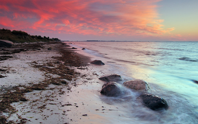
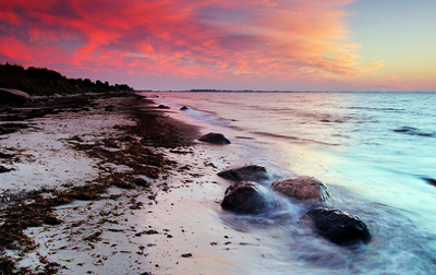
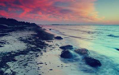
o1. First I started off with this image, resized it to 400 px wide
o2. Next I duplicated the image and set the duplicate to soft light 100% opicaty
o3. Then I added another layer filled with #181A38 set to exclusion 100% opicaty
o4. I added another layer filled with #AFE7F5 set to color burn 65% opicaty
o5. Again I added another layer #FBF6EF set to color burn 100% opicaty
o6. Next I went to Layers -- New Adjustment Layer -- Levels and changed the following
RED - input levels -- 0 ; 1.5 ; 255
RED - output levels -- 10 ; 255
GREEN - input levels -- 5 ; 1 ; 250
GREEN - output levels -- 20 ; 245
BLUE - input levels -- 5 ; 1; 255
BLUE - output levels -- 5 ; 255
o7. Next go to Layers -- New Adjustment Layer -- Hue/Saturation and change the following and then set to Saturation 100% opacity
Master saturation -- 55
Red saturation -- 11
Yellow saturation -- -22
Blue saturation -- 22
o8. Then you go to Layers -- New Adjustment Layer -- Brightness/Contrast and set
Brightness -- 5
Contrast -- 10
o9. Then I duplicated the original picture and moved it to the top of all layers and set it to Soft Light set at 55% opacity
1o. And finally I flattened the image and added a 30px black border to it. I found that black really brings out all the colors and makes them stand out.
-----
I basically just messed around with these colors and different settings/opicaty and the different levels on each of the banners I made with the same technique HERE. It all depends on your image this combination is also a good one for steps o6 & o7
o6. Layers -- New Adjustment Layer -- Levels
RED - input levels -- 0 ; 1 ; 255
RED - output levels -- 5 ; 255
GREEN - input levels -- 10 ; 1 ; 255
GREEN - output levels -- 25 ; 255
BLUE - input levels -- 0 ; 1.5 ; 240
BLUE - output levels -- 20 ; 240
o7. Layers -- New Adjustment Layer -- Hue/Saturation
Master Saturation -- any amount (from 10-60) just depending on how it looks and you can play around with the other colors to match the colors of the graphic.