Loki icon tutorial Part 2: Creating the base, with coloring and texturing
-->

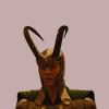
There are two steps I start with for the base. I tend to choose a random color, one that possibly fits the image and use it as the background. I have used #84865e.

-->
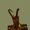
Second step is sharpening the loki layer. The fact that we are using the smart object makes it a lot easier because we don't damage the actual layers.
Choose the "Loki" Layer and then use use Filter > Sharpen > Sharpen.

-->
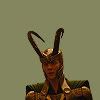
The little eye next to Scharfzeichnen (Sharpen) can be blended in and out by clicking on it.
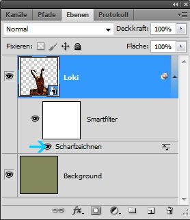
Clicking on the arrows opens a new pop up which lets you change the opacity of the sharpness. It also lets you use blend modes on the smart objects. I used 25% opacity here.

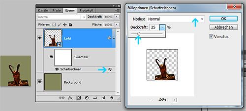
Then I duplicate the Smart Object "loki" layer and set the layer setting to "screen". This to me is the easiest way to make the image brighter.

-->
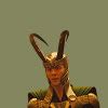
Next, create a new layer, then the color from the background and choose a darker shade (#696b41). Then use the brush tool with a normal 150 Px size and no hardness and paint a bit on the bottom half of your icon to create a gradient. Creating a gradient in this fashion can make the icon look more interesting later on, because it's not quite so linear.

-->

After that, create a new layer with another variation of these the background in this case lighter (#abad80).

-->
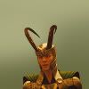
After than I changed the opacity from 100 to 48%.

-->
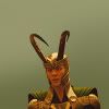
You can create more layers with different variations of the color to liven up the background further. It really depends on what you like.
Now I think Lokis color is far to orange so I want to change that. I will use adjustment layers to do this. I have written a tutorial on adjustment layers a while back you can check out for more information.
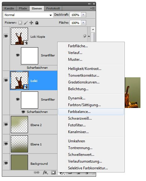
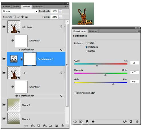
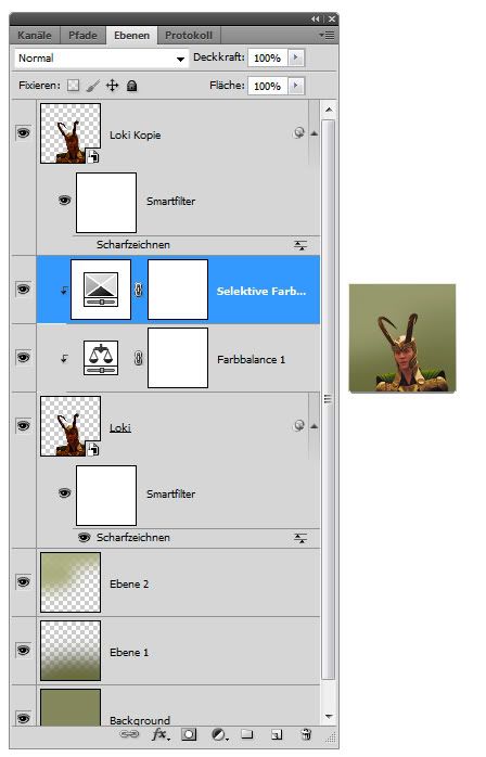
After that I do the same thing for selective color. I change the colors red, yellow and green. Also remember to lock the layers together like in the previous tutorial. I did this, because I only want to to affect the cropped Loki and not the background.
Settings for colorbalance:
- Midtones (Cyan-red:-14, magenta-green:+17, yellow-blue: +48)
-->
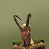
Settings for selective color:
- Red (Cyan:+18, Megenta: -9, Yellow: -100. Black: 0)
- Yellow (Cyan:+33, Megenta: -21, Yellow: 0. Black: 0)
- Red (Cyan:+98, Megenta: -52, Yellow: -68. Black: 0)
Now I have decided I don't like the backgroun d coloring so much. So I'm going to create another adjustment layer. This time I will use Hue/Saturation And place the layer right on top of the background layers under the bottom Loki.
- Color: +125
- Saturation: -49

-->
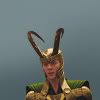
Then I create two other adjustment layers and put them on top. The first layer is place direktly above the top Loki and is a cruves layer. Once you see the pop up. Press the center point and move the curve upwards and a bit to the left.
- 162
- 162

-->
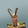
The top layer is another color balance with the settings:
- Midtones (Cyan-red:-5, magenta-green:+26, yellow-blue: +48)

-->

Now I want soe more texturing in the icon. I'm often using this texture. It is one of my own. A large version can be found here.
I will place it under the bottom loki (1), move it down (2) and use the brush tool (3)to create another gradient. I want it to fade out. Then I change the layer mode to soft light (4).
1.
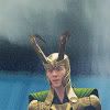
2.
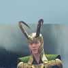
3.

4.

After that I decided I didn't like the color quite so much yet and added annother selective color layer on top.
- Yellow (Cyan:++30, Megenta: +32, Yellow: 0. Black: 0)
- Green (Cyan:+80, Megenta: -5, Yellow: -71. Black: -19)
- White (Cyan:+9, Megenta: -71, Yellow: -56. Black: 0)
I love using the selective white to change color in the images because I think it makes for gorgeous coloring and effects.

-->
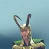
Now like we did for the bnackgorund, we create a new layer on top and call it highlight. Choose a color from the background again and lighten the blue and used size 80. Make a highlight next to Loki's head. Just press once.

-->
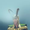
Then change opacity to 50% and use the erasor so it doesn't completely cover the face.

-->

And since I'm not quite happy with the color yet, I throw to more adjustment layers on top. First, I use color balance. this time I will not change the Midtones, but the Lights.
- Lights (Cyan-red:+17, magenta-green:+10, yellow-blue: +27)
Then I add another Hue Saturation on top. It feels to me, like the icon is a bit color less, so I change the saturation to +14.

-->

I'm gonna end the tutorial here. Usually, I play with colors and textures and brushes for ages. Add stuff, change stuff, take stuff away. I hardly ever have a plan where I want to go with the icon, but just see where the image takes me. So I'm not always using color layers first or last or adding textures in the same place. I play with it. That's what to me makes iconing fun and why I take so long to make a single icon. And because of this, I always end up with tons of variations of one icon.
This icon, which I made for capchallange is a prime example ;)
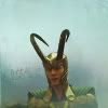


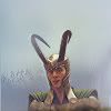
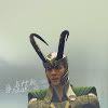
ps: I'm finally done!!!! I hope you enjoy. Feedback is welcome. If you have ideas or comments or don't understand certain things, please ask.
Check out Part 1: Creating the crop.