First Tutorial!
Heyy everyone. Sorry I've been dead. I was on vacation to for a week and also was trying Nanowrimo, and it took over my November for the most part. I failed at the Nano because of said vacation.
Anyway, I have a tutorial for you all.
I was about halfway done with writing it when LJ decided it was going to get rid of it. =headdesk=
So here I go again.
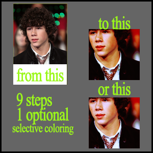
Step One: Crop, resize, sharpen, the usual. This tutorial will make your image darker, so even if you think your image doesn't need to be duplicated and screened, it might. I usually wait till I finish with all my steps to see if I need the screen layer. It will make a lot of a deference.
Step Two: Layer>New Adjustment Layer>Selective Coloring
Red:
Cyan: -42
Magenta: +16
Yellow: +35
Black: +38
Whites:
Cyan: +87
Magenta: -1
Yellow: +81
Black: +41
Neutrals:
Cyan: 0
Magenta: -10
Yellow: 0
Black: 0
Blacks:
Cyan: 0
Magenta: 0
Yellow: 0
Black: +10
Step 3: Layers>New Adjustment Layer>Curves
RGB: New point.
Input: 143
Output: 125
NOTE! This layer is optional. If used the result is this. If not used the result is this. Remember each image is different so it's up to you if you want to use it or not.
Step 4: Layer>New Fill Layer.
Fill with #170d07, set to exclusion 100%.
Step 5: Layer>New Adjustment Layer> Curves
RGB:
new point
input: 52
outpout: 56
another new point
input:195
output: 182
Green:
new point
input: 180
output: 176
another new point
input: 36
output: 32
Blue:
new point
input: 71
output: 76
another new point
input: 183
output: 192
Step 6: Layer>New Adjustment Layer>Curves
RGB:
new point
input: 43
outpout: 21
another new point
input: 94
output: 62
another new point
input: 177
output: 179
Blue:
new point
input: 36
output: 23
another new point
input: 183
output: 201
Step 8: Layer>New Adjustment Layer> Color Balance
Midtones: +21, +31, +25
Shadows: 0, 0, -5
Highlights: -10, 0, 26
Perserve Luminosity Is Checked.
Step 9: Layer>New Adjustment Layer> Selective Color
Red:
Cyan: -41
Magenta: -16
Yellow: +28
Black: +46
Yellows:
Cyan: 0
Magenta: 0
Yellow: 0
Black: -20
Whites:
Cyan: -56
Magenta: 0
Yellow: 0
Black: +54
Neutrals:
Cyan: -27
Magenta: +2
Yellow: +3
Black: +24
Blacks:
Cyan: +33
Magenta: +49
Yellow: +1
Black: +28
And you're done!
Like I said, if you feel your icon is too dark, go back to the base and duplicate, set to screen. Do it as many times as you think is sufficient. The same with step 3. Go back to the layer and turn the visiblity on and off, and decide whch you like better.
The icon needed to be screened once. And it looked good with both the first curves layer, and without. :)
Other Examples:
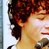

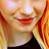

These + More will be found in my next batch. Which I will be posting soon.
I'm doing 10x10varited of Jonas Brothers, and when I'm done I'll post that as well as a few other icons.
I'd love to see what you guys make out of this. I've found it comes up with very different results. :)
Remeber to Join and Watch the community for updates!
Anyway, I have a tutorial for you all.
I was about halfway done with writing it when LJ decided it was going to get rid of it. =headdesk=
So here I go again.

Step One: Crop, resize, sharpen, the usual. This tutorial will make your image darker, so even if you think your image doesn't need to be duplicated and screened, it might. I usually wait till I finish with all my steps to see if I need the screen layer. It will make a lot of a deference.
Step Two: Layer>New Adjustment Layer>Selective Coloring
Red:
Cyan: -42
Magenta: +16
Yellow: +35
Black: +38
Whites:
Cyan: +87
Magenta: -1
Yellow: +81
Black: +41
Neutrals:
Cyan: 0
Magenta: -10
Yellow: 0
Black: 0
Blacks:
Cyan: 0
Magenta: 0
Yellow: 0
Black: +10
Step 3: Layers>New Adjustment Layer>Curves
RGB: New point.
Input: 143
Output: 125
NOTE! This layer is optional. If used the result is this. If not used the result is this. Remember each image is different so it's up to you if you want to use it or not.
Step 4: Layer>New Fill Layer.
Fill with #170d07, set to exclusion 100%.
Step 5: Layer>New Adjustment Layer> Curves
RGB:
new point
input: 52
outpout: 56
another new point
input:195
output: 182
Green:
new point
input: 180
output: 176
another new point
input: 36
output: 32
Blue:
new point
input: 71
output: 76
another new point
input: 183
output: 192
Step 6: Layer>New Adjustment Layer>Curves
RGB:
new point
input: 43
outpout: 21
another new point
input: 94
output: 62
another new point
input: 177
output: 179
Blue:
new point
input: 36
output: 23
another new point
input: 183
output: 201
Step 8: Layer>New Adjustment Layer> Color Balance
Midtones: +21, +31, +25
Shadows: 0, 0, -5
Highlights: -10, 0, 26
Perserve Luminosity Is Checked.
Step 9: Layer>New Adjustment Layer> Selective Color
Red:
Cyan: -41
Magenta: -16
Yellow: +28
Black: +46
Yellows:
Cyan: 0
Magenta: 0
Yellow: 0
Black: -20
Whites:
Cyan: -56
Magenta: 0
Yellow: 0
Black: +54
Neutrals:
Cyan: -27
Magenta: +2
Yellow: +3
Black: +24
Blacks:
Cyan: +33
Magenta: +49
Yellow: +1
Black: +28
And you're done!
Like I said, if you feel your icon is too dark, go back to the base and duplicate, set to screen. Do it as many times as you think is sufficient. The same with step 3. Go back to the layer and turn the visiblity on and off, and decide whch you like better.
The icon needed to be screened once. And it looked good with both the first curves layer, and without. :)
Other Examples:


These + More will be found in my next batch. Which I will be posting soon.
I'm doing 10x10varited of Jonas Brothers, and when I'm done I'll post that as well as a few other icons.
I'd love to see what you guys make out of this. I've found it comes up with very different results. :)
Remeber to Join and Watch the community for updates!