tutorial 3 - alex pettyfer popart.
So at 10variations , one of the challenges was to make the icon look like popart. I had some trouble making it actually look like popart, since my canvas could only be 100x100 pixels, so I just changed the four different parts of the icon into four different poparty colors.
-made in PS7
-selective coloring! That's pretty much ALL this tutorial is!
-includes quick layer mask tutorial
-includes quick gray background behind text in icon tutorial.
-with PSD!
DIFFICULTY: advanced easy. there's a few things i don't explain, but for the most part you could pick this up with little knowledge of photoshop.
from

to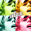
1. Start with your desired picture.

Chop it however you'd like, down to 50x50.

****If you want to adjust your 50x50 at this point, go ahead, but it really doesn't make that much of a difference since it's so small.
2. Copy your 50x50 into a 100x100 canvas four times, so it comes out like this:
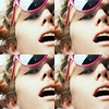
It is not crucial to keep them all four separate layers, and this tutorial will work no matter how you leave it. However, I'm going to keep going as if they were separate, so skip the steps about making layers to 0% opacity and all that.
3. Make all other layers besides one 0% opacity.
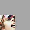
there isn't actually a grey background, i only use it to differentiate between the white of my journal.
4. SELECTIVE COLORING!
This is the blue one!
Reds: +100, -100, -100, 0
Cyans: -100, -100, -100, 0
Whites: +100, -100, -100, 0
Neutrals: +100, -8, -12, -9

5. Create a layer mask that removes the selective coloring layer's influence EVERYWHERE BUT THE DESIRED SPOT.
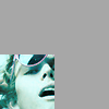
5.1! Since I am constantly surprised by the amount of people that don't use the magnificence that is layer masking!
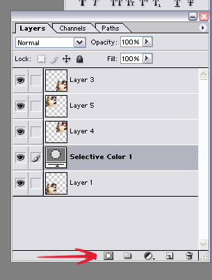
Click this little button here. It makes a lovely layer mask.
Which then looks like this!
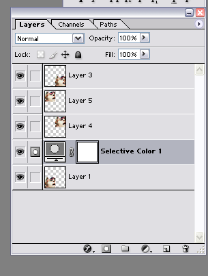
Pick up your wand tool (W), and select the big open space you have above your little square.
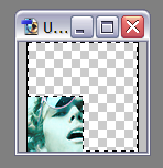
MAKE SURE YOU CLICK ON THE LITTLE WHITE BOX THAT'S LOCKED TO YOUR SELECTIVE COLORING LAYER, then fill(g, unless you've it on gradient) the little L with black.
It doesn't look like it really makes a difference, but when you pull one of your 50x50 layers back up to 100% opacity, the blue doesn't affect it.
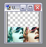
Keep the other one 50x50 at 100%, because
6. SELECTIVE COLORINGGGGG (the pink!)
Reds: -100, +100, +100, 0
Yellows: -100, +100, -100, 0
Whites: -100, +100, -31, 0
Neutrals: -37, +27, 0, -25
7. Repeat that whole LAYER MASK deal, but this time, make sure the L is facing differently.
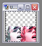
and then to
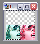
Fill it with black, yadda yadda, bring the next 50x50 up to 100% opacity for your next
8. SELECTIVE COLORING LAYER (YELLOW)
Reds: -100, -100, +100, 0
Cyans: -100, -100, +100, +13
Whites: -100, 0, +100, 0
Neutrals: -43, 0, +36, 0
9. LAYER MASK THING
I'm not going to tell you guys how to do it again, but this is the finished:
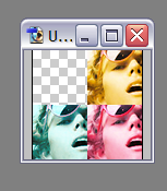
bring the last 50x50 up to 100% opacity!
10. SELECTIVE COLORING! GREEN!
Reds: +100, -100, +100, 0
Cyans: +100, -100, +100, 0
Greens: +100, -100, +100, 0
Whites: +100, -100, +100, 0
Neutrals: 0, -25, 0, 0
11. LAYER MASK!
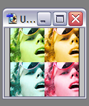
YOU CAN STOP HERE OR
12. TEXT LAYER!
start a new text layer! I used Marcelle Script, which is downloadable at dafont.com.
Drag to start a new layer, then type in the name of the person, or whatever you want to type.
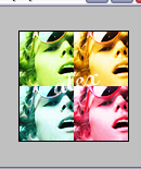
This looks terrible, so let's give it that grey background thing.
DOUBLE CLICK on your text layer so the layer style window pops up.
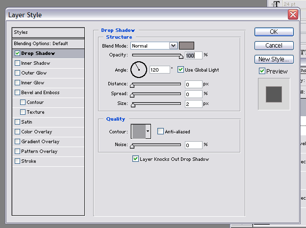
This is the layer style window for the grey background. It's pretty self-explanatory; set yours to match these settings and it should come out similarly.
If you have any specific question on how I achieved part of this, ask specifically, please!
AND THAT'S IT.

I'd like to see everyone's results, so post them! I won't bite!
Also
ANY QUESTIONS?!
HERE for the PSD.
-made in PS7
-selective coloring! That's pretty much ALL this tutorial is!
-includes quick layer mask tutorial
-includes quick gray background behind text in icon tutorial.
-with PSD!
DIFFICULTY: advanced easy. there's a few things i don't explain, but for the most part you could pick this up with little knowledge of photoshop.
from

to

1. Start with your desired picture.

Chop it however you'd like, down to 50x50.

****If you want to adjust your 50x50 at this point, go ahead, but it really doesn't make that much of a difference since it's so small.
2. Copy your 50x50 into a 100x100 canvas four times, so it comes out like this:

It is not crucial to keep them all four separate layers, and this tutorial will work no matter how you leave it. However, I'm going to keep going as if they were separate, so skip the steps about making layers to 0% opacity and all that.
3. Make all other layers besides one 0% opacity.

there isn't actually a grey background, i only use it to differentiate between the white of my journal.
4. SELECTIVE COLORING!
This is the blue one!
Reds: +100, -100, -100, 0
Cyans: -100, -100, -100, 0
Whites: +100, -100, -100, 0
Neutrals: +100, -8, -12, -9

5. Create a layer mask that removes the selective coloring layer's influence EVERYWHERE BUT THE DESIRED SPOT.

5.1! Since I am constantly surprised by the amount of people that don't use the magnificence that is layer masking!

Click this little button here. It makes a lovely layer mask.
Which then looks like this!

Pick up your wand tool (W), and select the big open space you have above your little square.

MAKE SURE YOU CLICK ON THE LITTLE WHITE BOX THAT'S LOCKED TO YOUR SELECTIVE COLORING LAYER, then fill(g, unless you've it on gradient) the little L with black.
It doesn't look like it really makes a difference, but when you pull one of your 50x50 layers back up to 100% opacity, the blue doesn't affect it.

Keep the other one 50x50 at 100%, because
6. SELECTIVE COLORINGGGGG (the pink!)
Reds: -100, +100, +100, 0
Yellows: -100, +100, -100, 0
Whites: -100, +100, -31, 0
Neutrals: -37, +27, 0, -25
7. Repeat that whole LAYER MASK deal, but this time, make sure the L is facing differently.

and then to

Fill it with black, yadda yadda, bring the next 50x50 up to 100% opacity for your next
8. SELECTIVE COLORING LAYER (YELLOW)
Reds: -100, -100, +100, 0
Cyans: -100, -100, +100, +13
Whites: -100, 0, +100, 0
Neutrals: -43, 0, +36, 0
9. LAYER MASK THING
I'm not going to tell you guys how to do it again, but this is the finished:

bring the last 50x50 up to 100% opacity!
10. SELECTIVE COLORING! GREEN!
Reds: +100, -100, +100, 0
Cyans: +100, -100, +100, 0
Greens: +100, -100, +100, 0
Whites: +100, -100, +100, 0
Neutrals: 0, -25, 0, 0
11. LAYER MASK!

YOU CAN STOP HERE OR
12. TEXT LAYER!
start a new text layer! I used Marcelle Script, which is downloadable at dafont.com.
Drag to start a new layer, then type in the name of the person, or whatever you want to type.

This looks terrible, so let's give it that grey background thing.
DOUBLE CLICK on your text layer so the layer style window pops up.

This is the layer style window for the grey background. It's pretty self-explanatory; set yours to match these settings and it should come out similarly.
If you have any specific question on how I achieved part of this, ask specifically, please!
AND THAT'S IT.

I'd like to see everyone's results, so post them! I won't bite!
Also
ANY QUESTIONS?!
HERE for the PSD.