Icon tutorial #001 - using a note book texture
I have made this tutorial as a guide for those wanting to start using different paper textures on their icons, and this one is using a note book texture from my previous post.
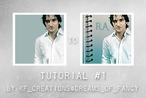
So - I start of with the base image - in this case a manip I did of Richard Armitage from one of the red mag photo shoot pictures (thanks Paige *flower*)

First I duplicated the image, sharpened it (I sometimes reduce the opacity of the top layer if I don’t want the image to be over crisp)

This gradient was then used 3 times:

Overlay opacity 100%

Soft light opacity 45%

Colour Burn 5%

The paper texture next:
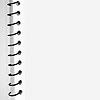
Again this layer was used 2 times
Darken opacity 100%

Multiply opacity 100%

Depending on the subject or the smoothness of the paper texture, I will eat away at the blank area of white that overlaps the main figure of the icon, using a 70px very soft edge round brush, and that was what I did in this example to both layers, so that the notebook effect was left . If the background texture of the paper was more defined rather than flat and I wanted it to add a texture to the main figure I would have missed this step.
All that is left now are the text layers.
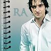
Written in ‘Ringbearer’ font available from Dafont.com the main initials, and the small white decorative text running up the side of the paper coil.
And that is the icon complete.
Thanks :-)