Tutorial: An interesting Black/White picture
Here's the tutorial I promised yesterday. This time I'll (try to) show you how you can make interesting black and white pictures. Like this:
I really love black and white, but mostly when I make black and white icons I only desaturate and play around with contrast etc. That makes my icons always look boring and I have to add textures etc. With some other techniques you can get really interesting effects. This time it's much playing around. I'll just tell you what I did on one picture. It's very simple actually... But if you have some basic knowledge in photoshop, you can "play" more^^
Just to show you what I mean:

the first is a simple black and white photoshoot. Looks kinda boring although photoshoots are usually quite good in contrast etc. The second one looks much more interesting (at least I think that^^) and now we will try to achieve something like that.
First of all: Don't desaturate your picture!
I started with this wonderful picture of Rose Tyler (and cropped it to bannersize, of course^^). Then make a new adjusment layer:hue/saturation above your base. Turn the saturation down to -100. The picture is great itself, so the desaturated banner doesn't look too bad, but still boring^^
=>
Now: Everything will be done beneath this saturation layer!
To get the whole picture darker (in a "smooth" way), create a new layer, fill it with a beige like #DBCCAB and set this layer to multiply at 100% opacity. Duplicate that layer and reduce the opacity to 50%
=>
To rise the contrast create another fill layer with a light blue like #BDDEE5 and set it to color burn 100%
=>
Now it's too dark. To light it up interesting create another fill layer with a lighter beige like #EDE5C6 go soft light 100%. Duplicate that layer and set it to 50% opacity.
=>
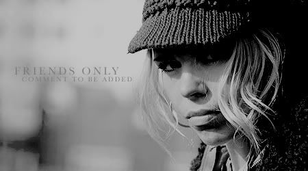
Well, that's it with this picture. It was a really great one;) I just added the "Friends Only" text in Baskerville #898579 beneath all the color layers and... done! Without the saturation layer it would look like this: (pretty interesting, isn't it? I really love this coloring*lol*)
=>
Okay: That's only ONE possibilty. Just PLAY! Maybe you don't even need a color fill layer. The thing is that you don't simply desaturate your picture and play around with curves and contrast etc. Make the saturation layer and then benath do anything you want!!!
Just to show: Here I took a selective colour layer above all the fill layers and simply pushed the rulers(??? don't knwo the right word) around and around... Cyan to 0, red to 100, magenta to... whatever.
=>
Without the saturation layer it would look like that: (totally crazy, isn't it?)
=>
Here with changing a bit on the levels:
=>
Now try to deactivate some of your layers. How does it look now? Go playing, guys! I hope you have fun:D
I really love black and white, but mostly when I make black and white icons I only desaturate and play around with contrast etc. That makes my icons always look boring and I have to add textures etc. With some other techniques you can get really interesting effects. This time it's much playing around. I'll just tell you what I did on one picture. It's very simple actually... But if you have some basic knowledge in photoshop, you can "play" more^^
Just to show you what I mean:
the first is a simple black and white photoshoot. Looks kinda boring although photoshoots are usually quite good in contrast etc. The second one looks much more interesting (at least I think that^^) and now we will try to achieve something like that.
First of all: Don't desaturate your picture!
I started with this wonderful picture of Rose Tyler (and cropped it to bannersize, of course^^). Then make a new adjusment layer:hue/saturation above your base. Turn the saturation down to -100. The picture is great itself, so the desaturated banner doesn't look too bad, but still boring^^
=>

Now: Everything will be done beneath this saturation layer!
To get the whole picture darker (in a "smooth" way), create a new layer, fill it with a beige like #DBCCAB and set this layer to multiply at 100% opacity. Duplicate that layer and reduce the opacity to 50%
=>

To rise the contrast create another fill layer with a light blue like #BDDEE5 and set it to color burn 100%
=>

Now it's too dark. To light it up interesting create another fill layer with a lighter beige like #EDE5C6 go soft light 100%. Duplicate that layer and set it to 50% opacity.
=>

Well, that's it with this picture. It was a really great one;) I just added the "Friends Only" text in Baskerville #898579 beneath all the color layers and... done! Without the saturation layer it would look like this: (pretty interesting, isn't it? I really love this coloring*lol*)
=>

Okay: That's only ONE possibilty. Just PLAY! Maybe you don't even need a color fill layer. The thing is that you don't simply desaturate your picture and play around with curves and contrast etc. Make the saturation layer and then benath do anything you want!!!
Just to show: Here I took a selective colour layer above all the fill layers and simply pushed the rulers(??? don't knwo the right word) around and around... Cyan to 0, red to 100, magenta to... whatever.
=>

Without the saturation layer it would look like that: (totally crazy, isn't it?)
=>

Here with changing a bit on the levels:
=>

Now try to deactivate some of your layers. How does it look now? Go playing, guys! I hope you have fun:D