Hello there, happy new year!
So, the inspiration to this Tut and a big thank you go to valliegurl!!! Bow down to the master xD
Tutorial 1 - GIMP
From this: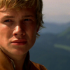
to this: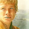
Allright, so I started out with the base:

and sharpened it (40) and used the tear drop tool to sharpen his eyes and mouth a little.
Then I went to Layers->Colors->Curves until it was as light as I wanted (sorry, I forgot to take a screenshot and save it...just try yourself) until it looked like this:
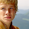
Next thing, I added a layer and filled it with the color: #ba2222 put that to "Layer - 45,9%"
Then I added this Texture by angel_elf, put it to "Layer" and mirrored it verticle:
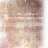
Next, I added the color: #5bba6f. Screen - 43.1%
By now, your Icon should look like this:
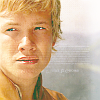
The only things you need to do now are adding this colors:
#150b5e (Layer - 58%
#5f44ab (Grain Extract - 38%)
And a smallish text, if you like, or a border and finished it is :)

Other then that, I'm sorry for my absence but I'm moving and doing an internship (AT A GRPHIC DESIGNER!) at the same time and as of yet I don't have a computer in my new flat so this journal is kinda on hiatus.
All my love and be sure to show me your results!
Tutorial 1 - GIMP
From this:

to this:

Allright, so I started out with the base:

and sharpened it (40) and used the tear drop tool to sharpen his eyes and mouth a little.
Then I went to Layers->Colors->Curves until it was as light as I wanted (sorry, I forgot to take a screenshot and save it...just try yourself) until it looked like this:

Next thing, I added a layer and filled it with the color: #ba2222 put that to "Layer - 45,9%"
Then I added this Texture by angel_elf, put it to "Layer" and mirrored it verticle:

Next, I added the color: #5bba6f. Screen - 43.1%
By now, your Icon should look like this:

The only things you need to do now are adding this colors:
#150b5e (Layer - 58%
#5f44ab (Grain Extract - 38%)
And a smallish text, if you like, or a border and finished it is :)

Other then that, I'm sorry for my absence but I'm moving and doing an internship (AT A GRPHIC DESIGNER!) at the same time and as of yet I don't have a computer in my new flat so this journal is kinda on hiatus.
All my love and be sure to show me your results!