.tutorial 1 - vector study collage
I love vacation, because it lets me do things like this, a tutorial (my first ever!) for sgkoneko, who wanted something to do with the vector studies that appeared in the last icon collection.
Go from this to...

I went ahead and broke the icon down into its component parts: color background, vector study, and subject. It's not terribly difficult, technique-wise, but it's time-consuming with several elements. This tutorial is also complete in the sense that I'm going through all the coloring and cropping stuff, so please excuse the length :)
Notes: This icon was done in PS7, and as PS7 is the only one I've worked with, I can't say how easily it translates to other programs. Also, I saved all the draft files for the tutorial as .pngs, for a reason that escapes me now (I'm sure I had one), so imagine the white backgrounds don't exist; you need a transparent background for the vector study and subject. *facedesk* I suck at teaching people. Check out the final graphic, which displays the layers for the icon, to see what the constituent layers should look like.
A. Background
Take this texture by unmasked_icons, duplicate 2x and set both new layers to Screen 100%.

>
Set aside to cool. (Yes, there is a texture there, it's just really pale.)
B. Vector study
1. The source for this is from "Designed to Help," a collection of seven different .ai vector studies done by design bum. I cropped out this one:

2. Duplicate 1x and set to Screen 100%. Merge visible (Shift + Ctrl + E).
3. Using either the polygonal lasso tool or the magnetic lasso (or both), set to feather 0px and crop out the background. It doesn't need to be exact, just close enough.
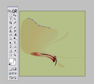
4. Once you've gotten rid of the background, reduce size to 100x100px. Duplicate and set the new layer to Color Dodge 100%. Merge visible (Shift + Ctrl + E).
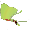
Set aside.
C. Shep!
Crop out the relevant portion of your stock, in this case John Sheppard (taken from this screencap, from 3.13 "Irresponsible"). Because there will be cropping later, I tend to keep the image at full size until after that's done, so I have an easier time.
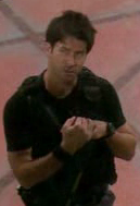
Now to make him pretty:
1. Image > Adjustment > Curves > RGB, with input 194 and output 225
2. Image > Adjustment > Saturation -4
3. Duplicate layer, set to Screen 100%
4. Still in the screen layer, Image > Adjustment > Saturation +16
5. Staying in the screen layer, Image > Adjustment > Brightness +9, Contrast +18
6. Duplicate the screen layer. Do it! XD
7. New Fill Layer > Color Burn D8FEFE 100%
8. New Fill Layer > Multiply 874E0C 21%
9. New Fill Layer > Color Burn EFEFEF 100%
10. Merge visible > Duplicate > set to Soft Light 100%
11. Image > Adjustments > Desaturate, then go to Edit > Fade Desaturation. Fade to 56%.
12. Merge down.
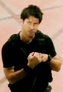
Okay, this is more or less what you'll use for the icon. Now, though, you must crop out all the background stuff.
13. Copy the new and improved base into a new document. My own custom is to magnify one or two times, and to crop using the polygonal lasso tool set to feather 1px (unless the image is very small, in which case I dont feather at all), saving the regular lasso for hair (also set to feather 1px). This does need to be cleaner than the crop of the vector image. Once you're done, resize to something with a height ca. 100px. and sharpen.

>
14. Almost there! The vector study I used prefers curves, not angles, so we're not quite finished yet. Using the ellipse marquee tool, play with circular/ovoid crops. I tried to make the curve along Shep's left shoulder match the vector curve as closely as possible.
Once you have a circle/oval that works, right click > Select Inverse > Cut/Ctrl-X. This should leave you with only the part of the subject you need (in this case, the upper 1/4th of Sheppard's body).
15. Resize once more to somewhere in the neighborhood of 55-60px high. I also sharpened this up a bit, using Unsharp Mask (Filter > Unsharp Mask), set to Amount 49%, Radius .6px, Threshold 0. The final version looks like:

>
Yay! Done! Now it's just a matter of assembling things.
D. The Icon
1. Open a new 100x100 document, with a white background.
2. Paste in the vector study.
3. Paste in Sheppard, set to Linear Burn.
4. Paste in the texture from Step A, set to Linear Burn.
I decided to add a little extra detail to the icon, so I pasted in this light texture by [? If you know, please tell me!] underneath Sheppard, set to Screen. To bring out the contrast a bit more, I went into the Sheppard layer and darkened things up using Image > Adjustments > Selective Color > Black (in dropdown menu) > Black +15 (or thereabouts).
The final layer order looks like this:
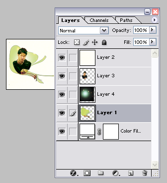
And here's your icon!

And there you have it!
Other icons done with design bum-inspired sources include:



And some more can be found here.
Enjoy! Hope you get something useful out of this :)
Go from this to...

I went ahead and broke the icon down into its component parts: color background, vector study, and subject. It's not terribly difficult, technique-wise, but it's time-consuming with several elements. This tutorial is also complete in the sense that I'm going through all the coloring and cropping stuff, so please excuse the length :)
Notes: This icon was done in PS7, and as PS7 is the only one I've worked with, I can't say how easily it translates to other programs. Also, I saved all the draft files for the tutorial as .pngs, for a reason that escapes me now (I'm sure I had one), so imagine the white backgrounds don't exist; you need a transparent background for the vector study and subject. *facedesk* I suck at teaching people. Check out the final graphic, which displays the layers for the icon, to see what the constituent layers should look like.
A. Background
Take this texture by unmasked_icons, duplicate 2x and set both new layers to Screen 100%.

>

Set aside to cool. (Yes, there is a texture there, it's just really pale.)
B. Vector study
1. The source for this is from "Designed to Help," a collection of seven different .ai vector studies done by design bum. I cropped out this one:

2. Duplicate 1x and set to Screen 100%. Merge visible (Shift + Ctrl + E).
3. Using either the polygonal lasso tool or the magnetic lasso (or both), set to feather 0px and crop out the background. It doesn't need to be exact, just close enough.

4. Once you've gotten rid of the background, reduce size to 100x100px. Duplicate and set the new layer to Color Dodge 100%. Merge visible (Shift + Ctrl + E).

Set aside.
C. Shep!
Crop out the relevant portion of your stock, in this case John Sheppard (taken from this screencap, from 3.13 "Irresponsible"). Because there will be cropping later, I tend to keep the image at full size until after that's done, so I have an easier time.

Now to make him pretty:
1. Image > Adjustment > Curves > RGB, with input 194 and output 225
2. Image > Adjustment > Saturation -4
3. Duplicate layer, set to Screen 100%
4. Still in the screen layer, Image > Adjustment > Saturation +16
5. Staying in the screen layer, Image > Adjustment > Brightness +9, Contrast +18
6. Duplicate the screen layer. Do it! XD
7. New Fill Layer > Color Burn D8FEFE 100%
8. New Fill Layer > Multiply 874E0C 21%
9. New Fill Layer > Color Burn EFEFEF 100%
10. Merge visible > Duplicate > set to Soft Light 100%
11. Image > Adjustments > Desaturate, then go to Edit > Fade Desaturation. Fade to 56%.
12. Merge down.

Okay, this is more or less what you'll use for the icon. Now, though, you must crop out all the background stuff.
13. Copy the new and improved base into a new document. My own custom is to magnify one or two times, and to crop using the polygonal lasso tool set to feather 1px (unless the image is very small, in which case I dont feather at all), saving the regular lasso for hair (also set to feather 1px). This does need to be cleaner than the crop of the vector image. Once you're done, resize to something with a height ca. 100px. and sharpen.

>

14. Almost there! The vector study I used prefers curves, not angles, so we're not quite finished yet. Using the ellipse marquee tool, play with circular/ovoid crops. I tried to make the curve along Shep's left shoulder match the vector curve as closely as possible.
Once you have a circle/oval that works, right click > Select Inverse > Cut/Ctrl-X. This should leave you with only the part of the subject you need (in this case, the upper 1/4th of Sheppard's body).
15. Resize once more to somewhere in the neighborhood of 55-60px high. I also sharpened this up a bit, using Unsharp Mask (Filter > Unsharp Mask), set to Amount 49%, Radius .6px, Threshold 0. The final version looks like:

>

Yay! Done! Now it's just a matter of assembling things.
D. The Icon
1. Open a new 100x100 document, with a white background.
2. Paste in the vector study.
3. Paste in Sheppard, set to Linear Burn.
4. Paste in the texture from Step A, set to Linear Burn.
I decided to add a little extra detail to the icon, so I pasted in this light texture by [? If you know, please tell me!] underneath Sheppard, set to Screen. To bring out the contrast a bit more, I went into the Sheppard layer and darkened things up using Image > Adjustments > Selective Color > Black (in dropdown menu) > Black +15 (or thereabouts).
The final layer order looks like this:

And here's your icon!

And there you have it!
Other icons done with design bum-inspired sources include:


And some more can be found here.
Enjoy! Hope you get something useful out of this :)