.zomghuge tutorial (08): fractals, brush collage, smudge improv
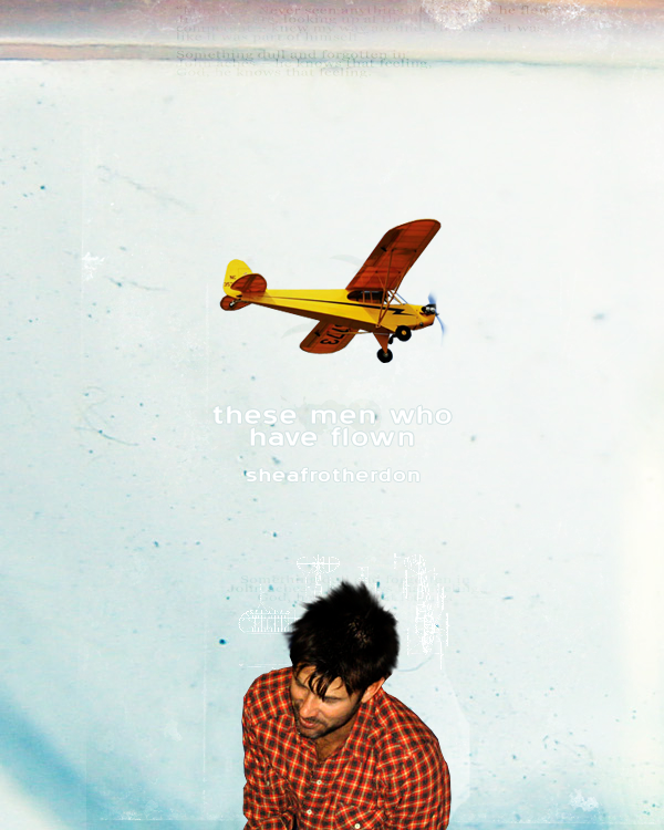
At long last, another zomgHUGE tutorial! theblackeyeddog requested something with fractals and brush collages, so I put together a tutorial for a 500.200 SPN header that focuses mostly on element arrangement, but with a couple little tricks for turning an unlikely screencap into something to work with.
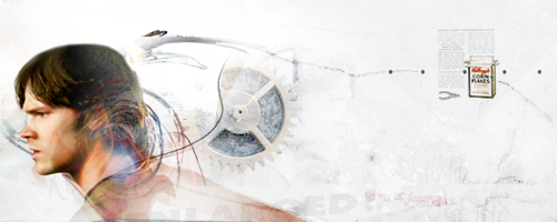
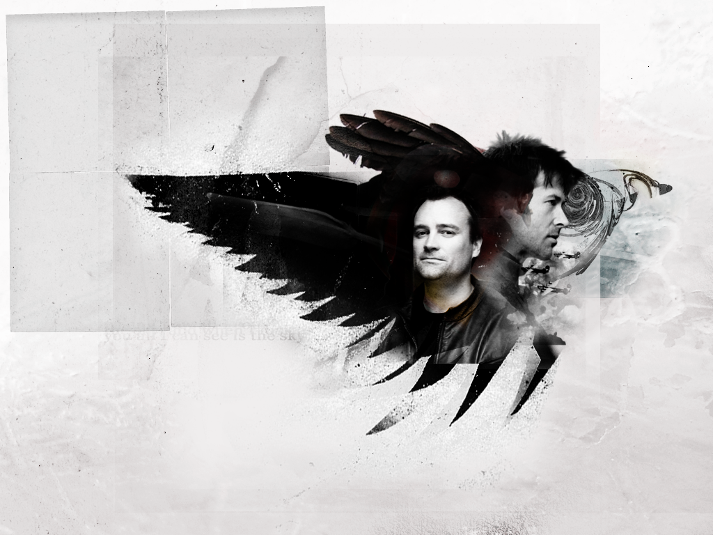
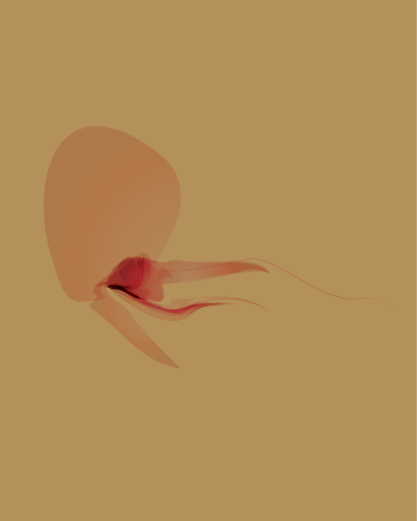
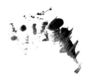
Today, we will be making this:

.preface
This tutorial, like all the others, is a general guide to thinking about the various topics it addresses (especially color correction, smudging to pick up cropped-out elements, erasing, transparency, color relationships), but how you use the information here will depend on a lot of factors in your own particular composition. Consequently, while you can't duplicate the tutorial precisely, you can take its suggestions and expand/modify/apply them to your own work :) As with the last tutorial, I've put the associated .zip file up at DA, with all project-related images so you can toss stuff together and see what happens if you'd like.
.caveat
For stuff like this, really the best thing to do isn't covered in a tutorial, and that is to experiment and mess about. I've probably learned as much through wondering "What would happen if I do this?" (a better philosophy for PhotoShop than, say, touching hot stoves) as reading through tutorials. My process of putting collages together essentially consists of hunting for interesting-looking stock, playing with the color a bit, pasting it in, trying different blending styles, erasing things, and seeing what happens.
Software: PS7
Difficulty: Hardish? But if you could follow previous tutorials, especially 05, you can follow this. Works with selective coloring, variations, erasing and smudging; however, the focus is on the arrangement of various elements.
Now, come with me and Sam, and let's get started, shall we?
As is my custom, this is a full tutorial subdivided into remarks on composition, image prep, background, and assembly (subdivided into blending and texture work).
A. On composition
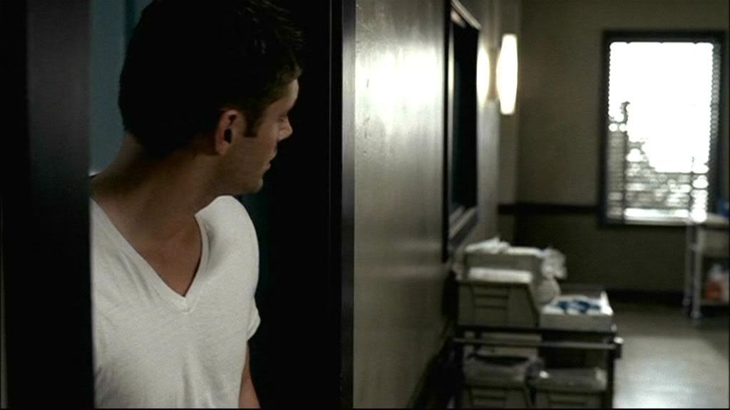
I wanted to do something that allowed me to work with some fractal brushes I've done, and in the past profile-type portraits have served me well. I decided to modify that slightly by using a profile cap of Sam Winchester. So that's what I'll do here. (I'd originally tried with this cap of Dean, but it didn't quite work.)
B. Image prep
The cap isn't as bad as a lot of SPN caps: the lighting is pretty decent and the color and saturation are okay. It still needs some work, but not as much. I kept this at full size for color work and smudging
Color correction
1.) Duplicate > Screen > duplicate Screen layer 1x
2.) In the top Screen layer: Image > Adjustments > Variations > MORE YELLOW 1x, LIGHTER 1x
->Edit > Fade Variations > fade to 55% > set mode to Multiply
3.) In the lower Screen layer: Image > Adjustments > Variations > MORE BLUE 1x
4.) New Adjustment Layer > Selective Coloring > (WHITES) B -15; (NEUTRAL) C +4, Y +4, B -8; (BLACK) B +9
5.) New Adjustment Layer > Hue/Saturation > Sat +15
6.) New Fill Layer > #DDDDDD to Color Burn
7.) DO NOT Merge/Flatten image; leave it as is.
result
AT THIS POINT, SAVE A SEPARATE COPY OF THE .PSD FILE, YOU MAY NEED IT.
Smudging (#1)
The texture of Sam's skin came out a little too rough for me, so I decided to soften it with the smudge brush. (Some people do this right away, I do it last because sometimes color work brings out or suppresses various textures.) You need the extra .psd file, or at least an extra, hidden, copy of the lower Screen layer, in case you mess up and need to start over.
Especially for larger pieces where smudging can be more obvious, I use brushes of varying types and sizes, set to low opacity, for smudge work; type and size depend on the texture I'm working with, as well as the space in which I'm working. For Sam's face, I used my all-time favorite brush (inxsomniax).
When smudging, I try as much as possible to follow contour and direction, so I pay attention to things like bone structure, fabric creases, lines in skin and hair, the grain of various textures. Beneath the step below
In the lower Screen layer (the one with the blue variation):
1.) Starting with the smudge brush set to 98px at 34% strength, smooth out Sam's cheek, neck, and shirt, taking note of his cheekbones and jawline and his neck, which is turned slightly.
2.) Switch to a smaller brush size now, around 56px and smooth out his forehead, nose, chin, and underneath his jaw.
result
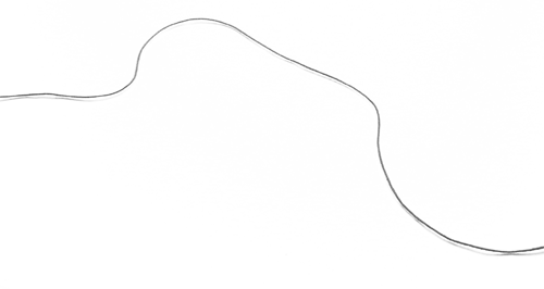
This bit would make a lot more sense if I was technologically advanced and had video screencapturing so I could show you exactly what I did, but this admittedly very, very crude map will have to do. The arrows indicate the general direction I moved my brush in:

Now you can Merge All (CTRL + E).
Cropping
Crop all the background stuff; I typically use the Polygonal Lasso set to 1px feathering for the body and 2px for hair.
->Cropped .psd is in the .zip file.
And speaking of hair...
C. Hair
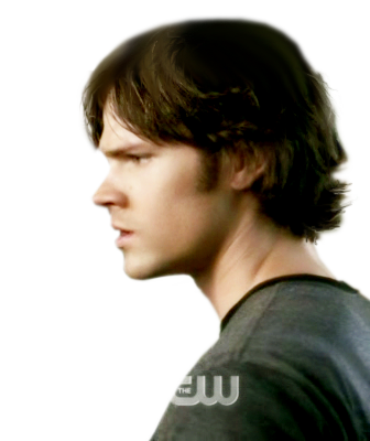
As you may have noticed from the cap, the top fifth or so of Sam's head is missing:

And in the preview, his head is very clearly intact. After screwing around with another cap for a while, I lost all patience and decided to use the first halfway decent image that had Dean or Sam in profile, and this was it. So as you can see, there is some work to do; there aren't many steps to it, but it does take a bit of time, and some care--as well as, if you have it, an image with the subject in a similar position but without the camera cropping off the top of his/her head, for purposes of reference. I didn't, but I'm ashamed to say I've perhaps contemplated Jared Padalecki's head more than I should.
It also goes without saying that you really really really need to make sure that you have an extra .png file hidden or saved somewhere. One of the things I also do is work with the subject with a white fill layer as background so I can see a bit more clearly the adjustments I'm making; for this one, I also dropped a layer in behind Sam and drew in a very very rough sketch of the top of his head to give myself an idea of where to stop.
[Note: you can see the brushes I used in Sam's hair in the smudge guide above]
1.) Image > Canvas Size > increase to 400px high and move Sam to the bottom margin.
2.) Using the smudge brush (I used this, which is also in the Natural Brush 2 preset in PS7) set to 49px at 79% strength, start with the large dark area somewhat toward the back of Sam's head, a few pixels beneath the crop line. Carefully run the brush upward--I went diagonally lower right to upper left just because my hand is steadier that way. Repeat until you have worked your way across the section, but stop before you get to the thin strands of his highlights.
3.) For the highlights, switch to a smaller brush size (about 19px, same opacity), and following the fall of his hair, keep smudging. Change the brush size as needed, though 19px is pretty much what you'll need, for highlights and shadows.
4.) Keep going until you've come to where you think a reasonable stopping place might be, making sure your movements start to follow the (hypothesized) contours of Sam's skull and hair. A lot of this is extrapolating from the image you can see, and making sure that your strokes follow the pattern that you're guessing at. Eventually, that brings you to the point where you've once again given him a full head of hair. I used this brush (another Natural Brush 2) set to 20px to round off the top of Sam's head.

(in progress; .psd in .zip file)
5.) Now for a couple touch-up things. Using the Polygonal Lasso at 2px feathering, I cut out some of the blurriness at the top of Sam's head, to give him a smoother appearance.
6.) To get rid of the rough, chunky-looking bits from when I cropped Sam out earlier, and to add some detail, I went through one last round of smudging (brush, 2px, 79% strength) and tried to give the impression of individual strands. Like before, the work here is somewhat subtle; shorter strokes for shorter hair, longer strokes for longer, following about where you think the hair should fall.
This works really well, I've found, for people with spiky hair, like John Sheppard (SGA), and even Dean, when he's rumpled.
result
OMG, done! Finally! Set aside to cool.
D. Background
A rule I've found useful for brush/portrait collages like this one is that the background should be kept to a minimum in terms of obvious elements and in terms of color; otherwise, the entire piece is too busy and the eye is distracted from the subject. This is especially true with the fractal brushes I've used, which are in and of themselves fairly complex-looking--so the fewer things you have competing with them, the better.
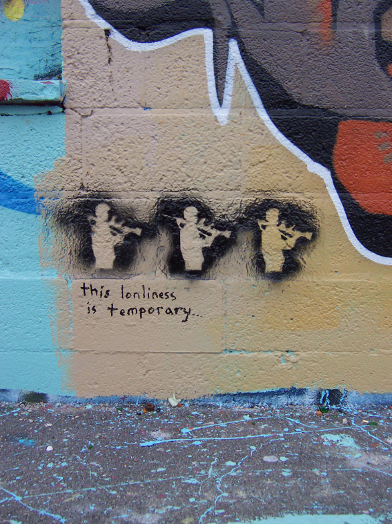
That isn't to say the background can't have a lot of elements; it can, and this piece does. The key is subtlety, and a willingness to erase or diminish opacity to let only a couple of interesting things stand out so that background isn't completely monotone. I found that this worked well with Wing, a wallpaper I did last year. (And it even won something! /preening)
[Note: in the .psd file for the project, background elements are marked with 'bkg']
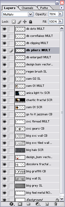
[Another note: there are quite a few layers in this; it helps to label each of them so you keep yourself straight.]
1.) Open a new document, 500.200
2.) Starting with this stock texture (FEEL, which is a totally awesome site!):
->Resize to 500px wide
->Image > Adjustments > Desaturate
->Duplicate 2x > set both to Screen
->Merge Down and paste into the 500.200 document
->Move down so that the top of the ridge in the texture is just above the lower margin
3.) rough paper texture (sxc)
->resize to 500px wide
->Image > Adjustments > Desaturate
->Paste in > Soft Light
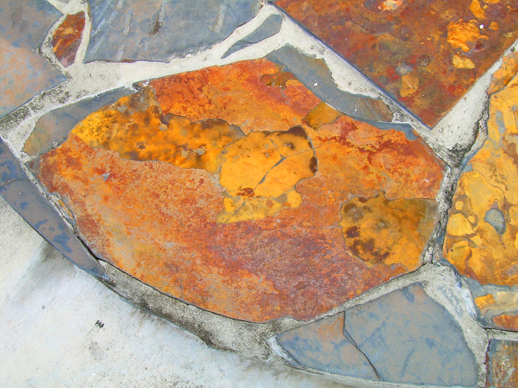
4.) wall texture (sxc)
->Resize to 500px wide
->Image > Adjustments > Desaturate
->Duplicate 1x > set to Screen
->Merge down and paste in > Soft Light
5.) graffiti (sxc)
->Image > Adjustments > Desaturate
->Crop out the musicians and paste into a new document
->Resize to about 300 px
->Paste in, move to lower right side > Color Burn
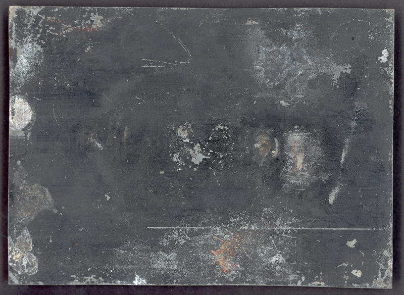
6.) scratched board (halo)
->Resize to 500px wide
->Paste in > Screen
->Move around to your satisfaction
7.) tiled wall (sxc)
->Resize to 500px wide
->Image > Adjustments > Desaturate
->Paste in > Color Burn
E. Assembly
Okay, getting there! Slowly.
Blending
1: Erasing!
I covered a substantial bit of this is tutorial 05 when I talked about erasing; the same kind of techniques are used here, and even with the same brush.
After resizing the canvas to about 200px high, paste Sam into the 500.200 document and move him over to the far left side. Then:
1.) With the fuzzy brush set to about 143px to start, erase the crop line on the right and lower margins, the CW, and Sam's back up to the seam that runs down his shoulder.
2.) With a slightly smaller brush (about 98px), erase the back of his neck.
2: Some color work (I try to do this after the major erasing is done)
1.) To sharpen Sam a bit first:
->Filter > Sharpen > Unsharp Mask >
2.) Duplicate Sam 1x > Set top to Multiply and lower to Screen
3.) In the Screen layer:
->Image > Adjustments > Hue/Saturation > Sat +100
4.) In the Multiply layer:
->Image > Adjustments > Hue/Saturation > Sat +8
Texture work
Now the next fiddly part comes in, when you start arranging the detail elements--the fractals, brushes, and light textures. Again, there are similarities to tutorial 05 here. My process behind this was really just to grab stuff that looked interesting or promising and play with it. If it fit, great. If it didn't, I scrapped and started over. There really is no system to the process at all, so the following steps reflect an order that doesn't actually exist.
[NOTE: Pay attention to where the layers go! I'm working from the bottom up for the most part, but a couple of the textures are below Screen!Sam and between him and Multiply!Sam. Also check out the final layer order; the names in bold below match those in the layer palette.]
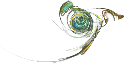
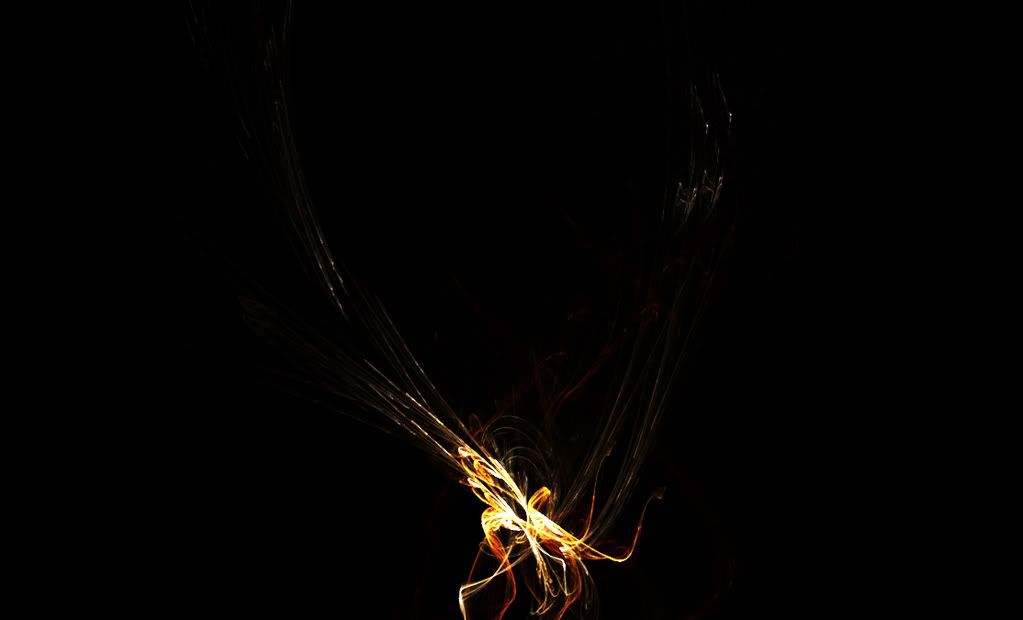
1.) discolore fractal (discolore)
[Quick note on the fractal: I made this in Apophysis, a freeware fractal-generating program. I am probably one of the least qualified people to explain how to make the things, so I will suggest that you check out Apophysis' Wiki, which has links to tutorials of all sorts.]
->Desaturate
->Paste in above: bkg graffiti CB > Multiply
->Edit > Transform > Flip Vertical
->Edit > Transform > Flip Horizontal
->Edit > Transform > Rotate (clockwise) a few degrees
->Move behind Sam's head, so the center is somewhere just beneath his head, erase a bit of the center and the long "tail" and tendrils [example]
2.) vector (design bum, Designed to Help series)
->Image > Adjustments > Replace Color > click anywhere in the main body > Lightness +100 (i.e. render white or pale grey)
->Paste in above: discolore fractal > Multiply
->Rotate, though I messed around so much I lost track of what I did [example]
->Move to the back of Sam's neck; the curve of the vector comes close to matching the line of his neck and shoulder
->Erase most of the background and the beige/tan parts of the vector--you just want the red, mostly
3.) gears (sxc)
->Resize to 150px high
->Paste in above: bkg sxc tiled wall CB > Color Burn
->Move to the right of Sam's head
->Erase pretty much everything except the large solid gear in the center [example]
4.) thread (sxc)
->Paste in above: sxc gears CB > Multiply
->Move so some of it overlaps Sam's shoulder
->Rotate counterclockwise so that part of the thread matches the curve of Sam's shoulder and neck, and the thread seems to loop over the top of the gears (it won't be exact, but close) [example]
5.) In a new layer above sxc thread MULT, you can either paste in this or with a 2px round brush paint in your own little bit of text. I used "Go to it, Jazzman," from a Carl Sandburg poem.
->Set to Color Burn
->Move to low on right side
The next couple of layers are light textures to brighten Sam up a bit.
6.) chaotic light (chaotic)
->Paste in above: sam 01 SCR
->Set to Screen
->Move so the light texture overlaps the desaturated fractal--you should pick up some thin threads of yellow values in Sam's skin
7.) blue light (Anica)
->Paste in above: chaotic fractal SCR > Screen
->Edit > Transform > Flip Horizontal
->Move so one of the blobs of light overlaps with Sam's neck (I positioned them low and to the back)
8.) Sam's hair is a bit too heavy and dark, so using the fuzzy eraser at about 150px, click a couple times near the back of his head--not much, just enough to lighten him up a little.
9.) Duplicate the Multiply!Sam layer
->Move the duplicated layer so it's on the right side of the gear
->Desaturate
->Duplicate 1x > set both duplicates to Screen
->Merge Down (CTRL + E) > Soft Light
->Flip Horizontal
->Erase all hard lines with a small eraser (you don't need to be careful; the idea here is just to hint at Sam enough so that his gaze takes you back across the image).
[From now on, all new layers except the last mentioned will be above: sam 02 SL]
10.) Open this brush (apparating)
->With the Brush option in your palette selected > Edit > Define Brush
->Back in the document, set color to #B97074 and click the brush once
->Edit > Transform > Flip Horizontal
->Move so the thicker part of the brush is over the fractal, running (about) through Sam's hair and with a couple of the splatters following his cheekbone and temple. This adds some red values to balance out the ones in the design bum vector
->Set to Soft Light
11.) Speaking of design bum... brush, adapted from a vector study)
->Define Brush, as above
->Back in the document, set color to #FFFFFF (white) and click the brush once
->Edit > Transform > Flip Horizontal
->Move so the outer curve runs (about) along Sam's cheekbone
->Set to Soft Light
12.) For fun, (design bum)
->Desaturate
->Paste in very low (some of it is actually cropped out by the margin), around the red vector study.
13.) Now just a few last things to balance out all the weight on the left side. The following three elements (pliers, clipping, cornflakes), and dots are from the same study as #12.
->The only prep you need to do is to desaturate clipping and flip it horizontally, and scale cornflakes down to about 45px high
->Paste in all four elements and move them to near the upper right-hand corner. dots will be positioned (roughly) about 1/3rd of the way down the canvas--it's actually a little higher, but somewhere in the neighborhood is fine.
->I tried to give the impression of a rectangle here, with pliers pointing to one formed by clipping and cornflakes.
->All elements are set to Multiply
14.) One last thing! To tie the small collection of stock in its lonely right-hand corner with the collage proper over on the left, I decided to revisit what thread gestures at, and to see if I could find some way to "continue" the thread, so to speak, so there would be a continuous, if subtle line, between Sam and the pliers/cornflakes/clipping/dots collection. I didn't have thread stock that did what I wanted, so I used this instead: wall (sxc)
->Resize to 500px wide
->Duplicate 1x > Screen
->Merge Down (CTRL + E) > Desaturate
->Paste in above: bkg sxc tiled wall CB
->Set to Color Burn
->Edit > Transform > Rotate counterclockwise so the contour of the upper line of the crack in the wall seems to flow out of the end of thread and connects with dots before flowing off the page.
Holy God, done at last!
FINAL LAYER LIST
.the point: This seems like an awful lot of work--and probably is--for something that really doesn't seem to have a lot to show for it. Despite that, I like it! Collages with complex elements like fractal designs are a good way to practice how to achieve nuanced effects that, on their own, don't seem to add up to much, but collectively all work together to produce various interplays of texture, light, and color. And there are also a lot of different types of material here-stock scans, splattery and messy brushes, elegant fractals and clean-lined vectors, cracked walls, tile walls, smooth metal, light and shadow, and all sorts of things. So it's not a lot of the same stuff, but a lot of different flavors that, unlikely as it may be, can taste great together.
As ever, the magnificent resource post, freshly updated as of the 10th with some tasty new things.
Like with all previous tutorials, anything in the .zip file is free for you to use for your own nefarious purposes--just please provide links/credit to the appropriate stock/texture/brush artists in accordance with their policies :> And, if you make something, feel free to link me to it! I would love to see it.
Today, we will be making this:
.preface
This tutorial, like all the others, is a general guide to thinking about the various topics it addresses (especially color correction, smudging to pick up cropped-out elements, erasing, transparency, color relationships), but how you use the information here will depend on a lot of factors in your own particular composition. Consequently, while you can't duplicate the tutorial precisely, you can take its suggestions and expand/modify/apply them to your own work :) As with the last tutorial, I've put the associated .zip file up at DA, with all project-related images so you can toss stuff together and see what happens if you'd like.
.caveat
For stuff like this, really the best thing to do isn't covered in a tutorial, and that is to experiment and mess about. I've probably learned as much through wondering "What would happen if I do this?" (a better philosophy for PhotoShop than, say, touching hot stoves) as reading through tutorials. My process of putting collages together essentially consists of hunting for interesting-looking stock, playing with the color a bit, pasting it in, trying different blending styles, erasing things, and seeing what happens.
Software: PS7
Difficulty: Hardish? But if you could follow previous tutorials, especially 05, you can follow this. Works with selective coloring, variations, erasing and smudging; however, the focus is on the arrangement of various elements.
Now, come with me and Sam, and let's get started, shall we?
As is my custom, this is a full tutorial subdivided into remarks on composition, image prep, background, and assembly (subdivided into blending and texture work).
A. On composition
I wanted to do something that allowed me to work with some fractal brushes I've done, and in the past profile-type portraits have served me well. I decided to modify that slightly by using a profile cap of Sam Winchester. So that's what I'll do here. (I'd originally tried with this cap of Dean, but it didn't quite work.)
B. Image prep
The cap isn't as bad as a lot of SPN caps: the lighting is pretty decent and the color and saturation are okay. It still needs some work, but not as much. I kept this at full size for color work and smudging
Color correction
1.) Duplicate > Screen > duplicate Screen layer 1x
2.) In the top Screen layer: Image > Adjustments > Variations > MORE YELLOW 1x, LIGHTER 1x
->Edit > Fade Variations > fade to 55% > set mode to Multiply
3.) In the lower Screen layer: Image > Adjustments > Variations > MORE BLUE 1x
4.) New Adjustment Layer > Selective Coloring > (WHITES) B -15; (NEUTRAL) C +4, Y +4, B -8; (BLACK) B +9
5.) New Adjustment Layer > Hue/Saturation > Sat +15
6.) New Fill Layer > #DDDDDD to Color Burn
7.) DO NOT Merge/Flatten image; leave it as is.
result
AT THIS POINT, SAVE A SEPARATE COPY OF THE .PSD FILE, YOU MAY NEED IT.
Smudging (#1)
The texture of Sam's skin came out a little too rough for me, so I decided to soften it with the smudge brush. (Some people do this right away, I do it last because sometimes color work brings out or suppresses various textures.) You need the extra .psd file, or at least an extra, hidden, copy of the lower Screen layer, in case you mess up and need to start over.
Especially for larger pieces where smudging can be more obvious, I use brushes of varying types and sizes, set to low opacity, for smudge work; type and size depend on the texture I'm working with, as well as the space in which I'm working. For Sam's face, I used my all-time favorite brush (inxsomniax).
When smudging, I try as much as possible to follow contour and direction, so I pay attention to things like bone structure, fabric creases, lines in skin and hair, the grain of various textures. Beneath the step below
In the lower Screen layer (the one with the blue variation):
1.) Starting with the smudge brush set to 98px at 34% strength, smooth out Sam's cheek, neck, and shirt, taking note of his cheekbones and jawline and his neck, which is turned slightly.
2.) Switch to a smaller brush size now, around 56px and smooth out his forehead, nose, chin, and underneath his jaw.
result
This bit would make a lot more sense if I was technologically advanced and had video screencapturing so I could show you exactly what I did, but this admittedly very, very crude map will have to do. The arrows indicate the general direction I moved my brush in:
Now you can Merge All (CTRL + E).
Cropping
Crop all the background stuff; I typically use the Polygonal Lasso set to 1px feathering for the body and 2px for hair.
->Cropped .psd is in the .zip file.
And speaking of hair...
C. Hair
As you may have noticed from the cap, the top fifth or so of Sam's head is missing:
And in the preview, his head is very clearly intact. After screwing around with another cap for a while, I lost all patience and decided to use the first halfway decent image that had Dean or Sam in profile, and this was it. So as you can see, there is some work to do; there aren't many steps to it, but it does take a bit of time, and some care--as well as, if you have it, an image with the subject in a similar position but without the camera cropping off the top of his/her head, for purposes of reference. I didn't, but I'm ashamed to say I've perhaps contemplated Jared Padalecki's head more than I should.
It also goes without saying that you really really really need to make sure that you have an extra .png file hidden or saved somewhere. One of the things I also do is work with the subject with a white fill layer as background so I can see a bit more clearly the adjustments I'm making; for this one, I also dropped a layer in behind Sam and drew in a very very rough sketch of the top of his head to give myself an idea of where to stop.
[Note: you can see the brushes I used in Sam's hair in the smudge guide above]
1.) Image > Canvas Size > increase to 400px high and move Sam to the bottom margin.
2.) Using the smudge brush (I used this, which is also in the Natural Brush 2 preset in PS7) set to 49px at 79% strength, start with the large dark area somewhat toward the back of Sam's head, a few pixels beneath the crop line. Carefully run the brush upward--I went diagonally lower right to upper left just because my hand is steadier that way. Repeat until you have worked your way across the section, but stop before you get to the thin strands of his highlights.
3.) For the highlights, switch to a smaller brush size (about 19px, same opacity), and following the fall of his hair, keep smudging. Change the brush size as needed, though 19px is pretty much what you'll need, for highlights and shadows.
4.) Keep going until you've come to where you think a reasonable stopping place might be, making sure your movements start to follow the (hypothesized) contours of Sam's skull and hair. A lot of this is extrapolating from the image you can see, and making sure that your strokes follow the pattern that you're guessing at. Eventually, that brings you to the point where you've once again given him a full head of hair. I used this brush (another Natural Brush 2) set to 20px to round off the top of Sam's head.
(in progress; .psd in .zip file)
5.) Now for a couple touch-up things. Using the Polygonal Lasso at 2px feathering, I cut out some of the blurriness at the top of Sam's head, to give him a smoother appearance.
6.) To get rid of the rough, chunky-looking bits from when I cropped Sam out earlier, and to add some detail, I went through one last round of smudging (brush, 2px, 79% strength) and tried to give the impression of individual strands. Like before, the work here is somewhat subtle; shorter strokes for shorter hair, longer strokes for longer, following about where you think the hair should fall.
This works really well, I've found, for people with spiky hair, like John Sheppard (SGA), and even Dean, when he's rumpled.
result
OMG, done! Finally! Set aside to cool.
D. Background
A rule I've found useful for brush/portrait collages like this one is that the background should be kept to a minimum in terms of obvious elements and in terms of color; otherwise, the entire piece is too busy and the eye is distracted from the subject. This is especially true with the fractal brushes I've used, which are in and of themselves fairly complex-looking--so the fewer things you have competing with them, the better.
That isn't to say the background can't have a lot of elements; it can, and this piece does. The key is subtlety, and a willingness to erase or diminish opacity to let only a couple of interesting things stand out so that background isn't completely monotone. I found that this worked well with Wing, a wallpaper I did last year. (And it even won something! /preening)
[Note: in the .psd file for the project, background elements are marked with 'bkg']
[Another note: there are quite a few layers in this; it helps to label each of them so you keep yourself straight.]
1.) Open a new document, 500.200
2.) Starting with this stock texture (FEEL, which is a totally awesome site!):
->Resize to 500px wide
->Image > Adjustments > Desaturate
->Duplicate 2x > set both to Screen
->Merge Down and paste into the 500.200 document
->Move down so that the top of the ridge in the texture is just above the lower margin
3.) rough paper texture (sxc)
->resize to 500px wide
->Image > Adjustments > Desaturate
->Paste in > Soft Light
4.) wall texture (sxc)
->Resize to 500px wide
->Image > Adjustments > Desaturate
->Duplicate 1x > set to Screen
->Merge down and paste in > Soft Light
5.) graffiti (sxc)
->Image > Adjustments > Desaturate
->Crop out the musicians and paste into a new document
->Resize to about 300 px
->Paste in, move to lower right side > Color Burn
6.) scratched board (halo)
->Resize to 500px wide
->Paste in > Screen
->Move around to your satisfaction
7.) tiled wall (sxc)
->Resize to 500px wide
->Image > Adjustments > Desaturate
->Paste in > Color Burn
E. Assembly
Okay, getting there! Slowly.
Blending
1: Erasing!
I covered a substantial bit of this is tutorial 05 when I talked about erasing; the same kind of techniques are used here, and even with the same brush.
After resizing the canvas to about 200px high, paste Sam into the 500.200 document and move him over to the far left side. Then:
1.) With the fuzzy brush set to about 143px to start, erase the crop line on the right and lower margins, the CW, and Sam's back up to the seam that runs down his shoulder.
2.) With a slightly smaller brush (about 98px), erase the back of his neck.
2: Some color work (I try to do this after the major erasing is done)
1.) To sharpen Sam a bit first:
->Filter > Sharpen > Unsharp Mask >
2.) Duplicate Sam 1x > Set top to Multiply and lower to Screen
3.) In the Screen layer:
->Image > Adjustments > Hue/Saturation > Sat +100
4.) In the Multiply layer:
->Image > Adjustments > Hue/Saturation > Sat +8
Texture work
Now the next fiddly part comes in, when you start arranging the detail elements--the fractals, brushes, and light textures. Again, there are similarities to tutorial 05 here. My process behind this was really just to grab stuff that looked interesting or promising and play with it. If it fit, great. If it didn't, I scrapped and started over. There really is no system to the process at all, so the following steps reflect an order that doesn't actually exist.
[NOTE: Pay attention to where the layers go! I'm working from the bottom up for the most part, but a couple of the textures are below Screen!Sam and between him and Multiply!Sam. Also check out the final layer order; the names in bold below match those in the layer palette.]
1.) discolore fractal (discolore)
[Quick note on the fractal: I made this in Apophysis, a freeware fractal-generating program. I am probably one of the least qualified people to explain how to make the things, so I will suggest that you check out Apophysis' Wiki, which has links to tutorials of all sorts.]
->Desaturate
->Paste in above: bkg graffiti CB > Multiply
->Edit > Transform > Flip Vertical
->Edit > Transform > Flip Horizontal
->Edit > Transform > Rotate (clockwise) a few degrees
->Move behind Sam's head, so the center is somewhere just beneath his head, erase a bit of the center and the long "tail" and tendrils [example]
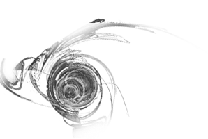
2.) vector (design bum, Designed to Help series)
->Image > Adjustments > Replace Color > click anywhere in the main body > Lightness +100 (i.e. render white or pale grey)
->Paste in above: discolore fractal > Multiply
->Rotate, though I messed around so much I lost track of what I did [example]
->Move to the back of Sam's neck; the curve of the vector comes close to matching the line of his neck and shoulder
->Erase most of the background and the beige/tan parts of the vector--you just want the red, mostly
3.) gears (sxc)
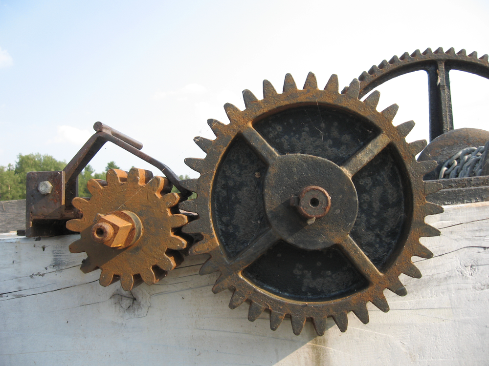
->Resize to 150px high
->Paste in above: bkg sxc tiled wall CB > Color Burn
->Move to the right of Sam's head
->Erase pretty much everything except the large solid gear in the center [example]
4.) thread (sxc)
->Paste in above: sxc gears CB > Multiply
->Move so some of it overlaps Sam's shoulder
->Rotate counterclockwise so that part of the thread matches the curve of Sam's shoulder and neck, and the thread seems to loop over the top of the gears (it won't be exact, but close) [example]
5.) In a new layer above sxc thread MULT, you can either paste in this or with a 2px round brush paint in your own little bit of text. I used "Go to it, Jazzman," from a Carl Sandburg poem.
->Set to Color Burn
->Move to low on right side
The next couple of layers are light textures to brighten Sam up a bit.
6.) chaotic light (chaotic)
->Paste in above: sam 01 SCR
->Set to Screen
->Move so the light texture overlaps the desaturated fractal--you should pick up some thin threads of yellow values in Sam's skin
7.) blue light (Anica)
->Paste in above: chaotic fractal SCR > Screen
->Edit > Transform > Flip Horizontal
->Move so one of the blobs of light overlaps with Sam's neck (I positioned them low and to the back)
8.) Sam's hair is a bit too heavy and dark, so using the fuzzy eraser at about 150px, click a couple times near the back of his head--not much, just enough to lighten him up a little.
9.) Duplicate the Multiply!Sam layer
->Move the duplicated layer so it's on the right side of the gear
->Desaturate
->Duplicate 1x > set both duplicates to Screen
->Merge Down (CTRL + E) > Soft Light
->Flip Horizontal
->Erase all hard lines with a small eraser (you don't need to be careful; the idea here is just to hint at Sam enough so that his gaze takes you back across the image).
[From now on, all new layers except the last mentioned will be above: sam 02 SL]
10.) Open this brush (apparating)
->With the Brush option in your palette selected > Edit > Define Brush
->Back in the document, set color to #B97074 and click the brush once
->Edit > Transform > Flip Horizontal
->Move so the thicker part of the brush is over the fractal, running (about) through Sam's hair and with a couple of the splatters following his cheekbone and temple. This adds some red values to balance out the ones in the design bum vector
->Set to Soft Light
11.) Speaking of design bum... brush, adapted from a vector study)
->Define Brush, as above
->Back in the document, set color to #FFFFFF (white) and click the brush once
->Edit > Transform > Flip Horizontal
->Move so the outer curve runs (about) along Sam's cheekbone
->Set to Soft Light
12.) For fun, (design bum)
->Desaturate
->Paste in very low (some of it is actually cropped out by the margin), around the red vector study.
13.) Now just a few last things to balance out all the weight on the left side. The following three elements (pliers, clipping, cornflakes), and dots are from the same study as #12.
->The only prep you need to do is to desaturate clipping and flip it horizontally, and scale cornflakes down to about 45px high
->Paste in all four elements and move them to near the upper right-hand corner. dots will be positioned (roughly) about 1/3rd of the way down the canvas--it's actually a little higher, but somewhere in the neighborhood is fine.
->I tried to give the impression of a rectangle here, with pliers pointing to one formed by clipping and cornflakes.
->All elements are set to Multiply
14.) One last thing! To tie the small collection of stock in its lonely right-hand corner with the collage proper over on the left, I decided to revisit what thread gestures at, and to see if I could find some way to "continue" the thread, so to speak, so there would be a continuous, if subtle line, between Sam and the pliers/cornflakes/clipping/dots collection. I didn't have thread stock that did what I wanted, so I used this instead: wall (sxc)
->Resize to 500px wide
->Duplicate 1x > Screen
->Merge Down (CTRL + E) > Desaturate
->Paste in above: bkg sxc tiled wall CB
->Set to Color Burn
->Edit > Transform > Rotate counterclockwise so the contour of the upper line of the crack in the wall seems to flow out of the end of thread and connects with dots before flowing off the page.
Holy God, done at last!
FINAL LAYER LIST
.the point: This seems like an awful lot of work--and probably is--for something that really doesn't seem to have a lot to show for it. Despite that, I like it! Collages with complex elements like fractal designs are a good way to practice how to achieve nuanced effects that, on their own, don't seem to add up to much, but collectively all work together to produce various interplays of texture, light, and color. And there are also a lot of different types of material here-stock scans, splattery and messy brushes, elegant fractals and clean-lined vectors, cracked walls, tile walls, smooth metal, light and shadow, and all sorts of things. So it's not a lot of the same stuff, but a lot of different flavors that, unlikely as it may be, can taste great together.
As ever, the magnificent resource post, freshly updated as of the 10th with some tasty new things.
Like with all previous tutorials, anything in the .zip file is free for you to use for your own nefarious purposes--just please provide links/credit to the appropriate stock/texture/brush artists in accordance with their policies :> And, if you make something, feel free to link me to it! I would love to see it.