Text Guide Part Deux
This is a continuation of the Text-Based Icon tutorial I did earlier. You can view it here. It is not necessary to read it to follow this one, but I highly recommend it, especially if you're a beginner! This tutorial is geared towards those with solid Photoshop/Image Ready skills, just as an FYI. So without further ado, I bring you
Text-Icon Guide Part 2: Animation
Part I: Why Animate?
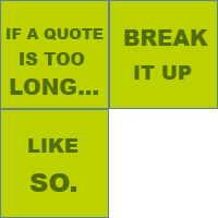
The reason why people make animated text icons is to split up a quote. Remember when I said to keep it short? Here's how to use that longer quote you like so much.

vs.

But be careful how much text you put on a frame!

Part II: Speed
The speed can be a difficult thing to get down right. Compare these examples:

(4 seconds)
vs.

(0.3 seconds)
vs.

(2 seconds)
If you're unsure how fast to make an icon, get someone else to read it! You already know what the icon is supposed to say, so get someone who doesn't and ask them if they can read it.
Part III: Distinction, Distinction, Distinction!
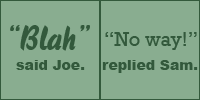
If you have more than one person being quoted (a conversation, for example), use different fonts to seperate the speakers.

For this, I used Arial Black the whole way through.
But look how interesting this is:

"Blah" was written in BlizzardD and "No way!" was written in Rockwell.
Part IV: Transitions Are Your Friends
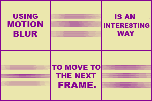
To make an animated icon more interesting (and this goes for all animated icons in general, not just text-based), use scene transitions. I won't get into how to do that, unless someone really doesn't know how.
Here are two different ways to change from frame to frame.

or

Here's an example I made using almost every technique covered in both tutorials. It's from an Eddie Izzard show.
There's an interesting background, readable text, emphasis on certain words, scene transitions, different fonts to seperate speakers and the speed is slow enough for people to read.