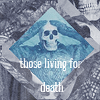
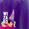
Ask the maker: A guide about text on icons.

I was asked for a guide to how i put my text in icons and which are my most favourites fonts, so I will try to explain, hoping will be useful for who reads this to win the everlasting interior battle with typography (muscle icon here lol)
So let's begin. First of all, I spend so much time searching for interesting fonts. Periodically I start my adventure (?) to find the unfindable D: I suggest you all to keep checked free fonts sites (or payment even, if you want ;) The best is creative market or behance ♥)
Well, for a start, before losing your mind about the "how" part, you must lose it in finding what you want to write.
Something that could help you is searching for fanmixes and playlists about the character or fandom you are working with, songs can suggest beautiful sentences, or maybe some quotes from the series/movie/wathever.
This is my personal delusion, like when I hang out socks and I can't help but put them in pair *lol*, I just can't put random text ç__ç (no ok, I can, but it's difficult XD)
My life will be easier otherwise DDD:
But let's not digress XD
Once you know what to write, you must know HOW ò___ò
I printed all my fonts, because also with the list in photoshop, with many of them could be difficult as well D:
I used printmyfonts -> click me ♥
BOLD / SANS SERIF FAT & UPPERCASE (?) FONTS


They're suitable for almost all subjects, so I use it like a jolly; when I don't find the right font, I just jump on sans serif. The good part is the readabiliy of it even with small text. (Not all fonts, but there are many of them you can use in 10px or less!). I usually pick bold and uppercase.
Also if I have to write a long sentence, I rely on serif.

SERIF


More delicate than sans serif, I like to use it in vintage coloring the most, but it's not a rule I follow everytime. I like to mess it up a bit, approaching big and small letters, warp, curve, incline, stretch it!
Sometimes I like to use the font textures, because I'm not very experienced with this type of fonts D: my bad - so thanks to all who make that kind of textures ♥


lookslikerain / lemonpunch / northerndawn / aguamentis

+ nouvelle vague, rockwell, jwh
HANDWRITTEN YOUNG AND WILD TEXT (?)


I decided to put all that smaller and particular kind of fonts togheter. I adore them for icons: can be brushed, calligraphic - most become from the "script" category, something that could be someone's writing. As I said, usually they're a bit smaller than other fonts, so they're easy to read also in 8/10 px - ideal for icons with long sentences!
So, considering that they're naturally "messy", they can be easily placed in very creative ways!
These are the kind of textures I use the most, because of their versatility and "playfulness"

+ bon iver, colors of autumn, bombshell pro, mallows
GOTHIC. COME TO THE DARK SIDE!


Thruthfully, I created this category just because personally I'm a huge fan of gothic.I don't really have a category for this kind of typo, I use it mostly for bad characters, dark, macabre context. I like to use it in ancient scenes (well, this is obvious. ò.ò), but also for a mere esthetic reason!

+ atreyu
RETRO' AND VINTAGE FONTS


Vintage fonts. I use them also with no significant meaning, I think they're beautiful. I didn't used them quite a lot, beacuse they're difficult to insert in a modern context for me. They're good with pale and pastel colorings, not much in brilliant (as you can see in 3rd one :/)
LostType.com has the most beautiful collection of vintage/retrò fonts! I suggest you to download them all if you didn't already ♥

MASH UPS


gothic + sans serif / serif + sans serif / serif + sans serif / gothic + script
Mixed fonts are top. You can show up a word by changing its font, maybe mixing types!
Even two kind of fonts of the same type can improve the appearence of your text ;)
POSITION OF TEXT


over the subject / behind the subject / both over and behind / centered


lateral / spaced out / bottom / top


between subjects / inside / both sides / top& bottom (clipped or not xD)
Before writing, I try to individuate where I will put my text. My question is: Text as a focal point or a mere decoration of my icon?
If the first option I have to remember that my text needs to be clear so I use sharp and bold fonts (mostly sans serif) or, even so with an acceptable dimension. For it to be more clear, I also increase spacing between letters and/or line spacing.
If the second, well I mess around with letters, fonts, I use very very tiny text and cover it a bit with textures or material or stretch, blur, destroy. I often put the text on the background as a "pattern", set to "soft light" or "overlay".
I made a list of my favourite places to put a text, I usually like to use the empty space (especially in negative spaces) or as a patch to where I made mistakes in coloring or textures (or simply where I see flaws)
Even the lenght of the sentence could be crucial to the success of your final result: sometimes a poem just doesn't fit into it. (a single keyword could be better)
LET'S DO THE WARP (TIME AGAAAAIN ♪) - TRANSFORM + COLOR + ADD EFFECTS IDEAS


oblique / messed / labeled / gradient


shadowed / wavy / damaged/ flipped


semi transparent (overlay or soft light) / contouring subject / as a pattern / stretched


half coloured / following subject / curved / boxed
FINAL TIPS!
♥ ANTI-ALIASING could be your bff: don't stuck on "sharp mode" - crisp, strong and rounded are sexy too *mlmlml* (and sometimes - in case of small text - can improve the legibility of the words!)
♥ As always, nothing is math, in this context. You read my tutorial? A hundred other tutorials about text? forget them. Test, invent, dare, risk. Maybe you can be the one who revolutionize typography in icons!
♥ try different points of view. If the result is not like you'd expected, before deleting try to change position, color, font. Try everything, if it's still ugly, then surrender.
WHOA. This guide has become quite long XD
I really hope have not written too many nonsense and it could be useful and inspiring to people who gets mad about typography (INCLUDES ME )!
Let me know your impression in comments below and also, VERY IMPORTANT, correct my grammar / lessic mistakes because I need also to improve my english!
Many thanks to kirtash_girl and sietepecados who request me to write it. Hope it's what you were looking for!
ps. Since there are some fonts not free I decided I won't create a pack. If you want me to pass you some fonts, you can contact me privately ♥